Friday, July 30, 2010

Project Review: Out Takes PART II

Wacom Tablet Side Clamp.

The Hand Scanner needed a custom built Cradle to sit into.

A Recurring Theme in the Design was the Powder Coated Truss that is used .

For The final Design these were the pivot covers for the main CRT.

The Custom Built Metal Clamps used to hold the CRT's in an Alternate Design.

Out Takes
PART II
Universal City Walk 1992

Client: Out Takes Via Eric Allard at All Effects.
Art Director: Eric Allard.
Project Date Summer 1992

Before I was working full-time in 2D television animation I had a one month gig to work out at Eric Allard's All Effects in the Valley on the Out-Takes project as can be reviewed in the first post HERE.

Out-Takes was a blue screen photography studio at Universal's City Walk Outdoor Mall in California, and this second post covers the parts drawing that were needed to build two of these tables. As a designer vs. an Illustrator we need to be able to build what we design so parts drawings are always a part of the job when you have an outside team doing the construction. When I build my own designs part breakdowns are usually not needed , at least to such a degree as needed with outside builders, so that is one more area where the client saves time and money with a designer builder combo.

Cheers, THOM

Thursday, July 29, 2010

Project Review: SAW VI

The Merry-Go-Round 3D Prop from Saw 6 Posters.

A Big Cage shaped into a "6" for eight victims with a TV from the film.

A Halo of Syringes for Main Character One Sheet Comps.


SAW 6

Client: Lionsgate via The Cimarron Group.
Art Director(s): Calvin Sumler and Chris A. Hawkins.
Project Date: Summer 2009.

While at The Cimarron Group running 3D Design the Saw 6 project came by with just a few days of work on some prop creation. I needed to build out a Merry-Go-Round used in the film so they could re-create it for the one sheets. I built it and rendered it out at various angles for comps for Art Director Calvin Sumler. I also built out a huge "6" out of metal cages that were to filled with actors from the film in various situations. And the last props I built were a set of syringes that were to be a "Halo" around the head shots of various characters.

Cheers, THOM

Wednesday, July 28, 2010

Project Review Race to Atlantis Part II

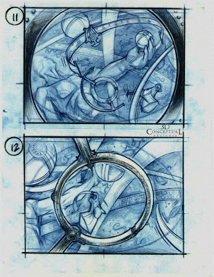
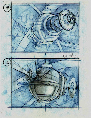
As we fly into the Celestial Orb we see lots of spinning artifacts.

We approach what seems to be the center attraction a huge planetary devise with rings spinning.

We do a 360 fly around see the various contraptions and a light shoots out of the doorway we want.

The Doorway reads ATLANTIS so we fly into it.

Once inside we are inside a huge deep thunderstorm.[ to be continued...]


RACE TO ATLANTIS

PART II

Client: Rhythm and Hues.
Art Director: na.
Project Date Summer 1996.

In this second part to my work on the 3D ride-film storyboards for the Atlantis Ride Film We continue after being launched by a huge crossbow into space and ended approaching the window.

You can view PART I here

So we now have flown through the window into a huge time clock room where we will pick the world we enter in the ride. There are many large celestial orbs that are rotating and spinning in orbit along with an enormous statue floating in the sky as well. We point to the ATLANTIS ring and enter into it, ending up in a huge thunderstorm, until the next installment...

Part III Coming soon.

Cheers, THOM

Tuesday, July 27, 2010

Project Review: The Great Food Truck Race

A Front 3/4 view of the Truck about 95% done[ 20 Hrs.of work]

Exterior of Food Truck Model with a Placeholder Kitchen.

Exterior 3/4 Rear view of the Truck.

Interior of the Final Kitchen looking back.

Interior of Final Kitchen Looking Forward.

A Close Up detail Shot of the 30Lb. Deep Fryer.

A wide shot looking to the center.

A Ceiling Down Fish eye Shot showing the entire interior of the Food Truck.


The Great Food Truck Race

Client: Food Network via Big Picture Group BPG. Art Director Steph Sebbag. Project Date Summer 2010.

I just finished up building out a 3D model of a food truck to be used for Print and AV work on the new Food Network show "The Great Food Truck Race" which is premiering in a few weeks. I was tasked with building out a full 360 model of a food truck with a full interior. First I built the exterior of the truck with full undercarriage and dropped a placeholder h kitchen in from another file to test it. Once It was approved I rebuilt the interior as well from scratch to tear-sheet specs of actual product that would fit into a truck. The 30 Lb. fryer and 36" Griddle were in the script and needed to fit into the truck so I did a bit of space planning as well.

The models were all built as Quad models to receive a mesh smooth operation to procedurally increase the resolution for film. The files were then passed over to Dean Fowler who rigged the trucks to drive and did all final animation and texturing for the client. Renders were outsourced to a Render farm for quick HD turn around as well.

You can see a spot with the truck in it here.

Cheers, THOM

Monday, July 26, 2010

Project Review Phantom 2040 Poster: PART XXI

The Final Painting Done by Bill Dely for the Phantom 2040 Series.

The Full Layout sketch for the poster.

Close Up on Sagan Cruz in the Final Painting.

Close Up on Sagan Cruz with Gun in Hand that was latter removed.

Close Up on the Phantom on the Final Painting Done by Bill Dely.

Close Up on my Final Sketch Layout for the painting.

Close Up on the Phantoms "Big Head' on the Painting.

The Big Head of the Phantom 2o4o in my sketch.

The final pose of Graft used in the Poster with a clenched fist.

My Sketch Pose was him with an outstretched arm[ latter changed]


The Phantom 2o4o POSTER
PART XXI

Client: Hearst Animation Productions.
Art Director: Myself.
Project Date: Late 1994.

When Art Directing The Phantom 2040 series for television, I designed the Layout via sketches for the One Sheet Poster, and hired out an Illustrator to paint the final. Bill Dely was my roommate at Art Center and we actually met back in Detroit at CCS in the 80's and we both came to California and he has been in Animation for years as a top Background painter for many features. You can see Bills work on his site here:

http://www.billdelyart.com/


The Poster was done in an Art Nouveau style to match the theme I put on the show so the Poster has Mucha stylistic tones in the overall design. The best story I can say is that we were instructed to take the gun out of Sagan's hand in the lower left, even though she is a police officer, and replace it with a electronic device, oh and make her chest larger. So guns are bad, and big boobs are good, got it!

Sadly the Poster was shelved and not used , but sure was a fun project to work on, and with Bill again.

Cheers, THOM

Friday, July 23, 2010

Project Review: SALT:PART I

A KGB crest for a One Sheet concept for Adrienne Burk.

A Curved face Design done for Art Director Chris A. Hawkins

A tube bevel of the above font for Art Director Chris A. Hawkins.

A Heavy Rusty Iron Russian styled Logo done for Art Director Chris A. Hawkins.

A Multi layered curved face logo for Art Director Chris A. Hawkins.

A Design in aged metal done for Art Director Chris A. Hawkins.

A Nice brushed steel look for Art Director Chris A. Hawkins.

A Tube profiled logo decoratively cut into revealing neon inside done for Chris A. Hawkins.

A Logo done for Art Director Calvin Sumler done flat faced in Steel.

A similar font with a rounded profile done for Art Director Calvin Sumler.

A liquid bloody logo done for Art Director Calvin Sumler.

A Gradient brushed look done for Art Director Calvin Sumler.

A Double layered Logo with a red Neon edge and cross hairs done for Art Director Calvin Sumler.

A split font with a cross hair inside done for Calvin Sumler as well.


WHO IS SALT?

Client: Columbia Pictures via The Cimarron Group.
Art Director(s): Calvin Sumler, Chris A. Hawkins, Adrienne Burk.
Project Date: Winter 2008.

I began working on SALT in the winter of 2008 while still running the 3D Department at Cimarron. I did only print work on the campaign no AV was books so I focused mainly on 3D Logo designs for the One Sheet.

With the Russian themes that are in the plot, I did a KGB pin design as well as a Russian style to the fonts and textures. A fun design exercise though nothing finished, they went 2D for the Logo.

Cheers, THOM

Thursday, July 22, 2010

Project Review: Phantom 2040 Hop Ups: Part XX

A Concept design for Maxs' Hop Up futuristic Hot Rod.

The original sketch used for the Hyper-cruiser Design for the shows.

A 3/4 View Color Key for the Police Hyper cruiser.

A Side View Color Key for the Police Hyper cruiser.


Phantom 2040 Part XX
Hop Up's

Client: Hearst Animation Productions.
Art Director: Myself.
Project Date 1993.

In this twentieth installment on my ongoing posts reflecting the body of work I did while working on the Phantom 2040 series at Hearst Animation in the early 90's we will focus on a few fun vehicles I designed for the characters in the show.

The first Image above has Max standing next to it and it is Max's Hop up, or Hot Rod of the future. Super low and fun to drive an fly! The second design was used in the show as the Enforcer Hyper-Cruiser that all police drove in the 65 episodes.

Cheers, THOM

Wednesday, July 21, 2010

Project Review: Cirque Du Soleil KA 2007


The Finished One Sheet with the 3D Logo.

The final 3D artwork used.

An Early concept done for the AV dept.

An inverted "Single Point Bevel" Logo with water drop effects from the show on the surface.

The Koi Skin Logo treatment.

The Underwater version of the KA Logo in Single Point Bevel.


Cirque Du Soleil KA
Las Vegas

Client: Cirque Du Soleil Las Vegas via The Cimarron Group.
Art Director(s): Chris A. Hawkins, Adrienne Burk, Calvin Sumler, Joseph Stamper.
Project Date 2006-7.

While still at The Cimarron Group in 2006 I helped out with the design process to update the KA show out in Las Vegas presented by Cirque Du Soleil. The logo was done already, so it just needed to be re-imagined into various looks. The client decided to go with a 3D design as the first one was 2D. I did work for both the AV and the Print groups on various logo treatments.

The finish was made by Adrienne Burk as a sort of 2D fake done in 3D as I had to match a 2D interpretation of 3D done in 2D.

Cheers, THOM