Showing posts with label GUI-Graphic User Interface. Show all posts

Monday, April 29, 2013

Project Review: Online Emoticons 3D Design and 3D Animation:PART I Chattering Teeth 2007

 The final 3D Design for the main Chattering Teeth Emoticon I did back in 07'
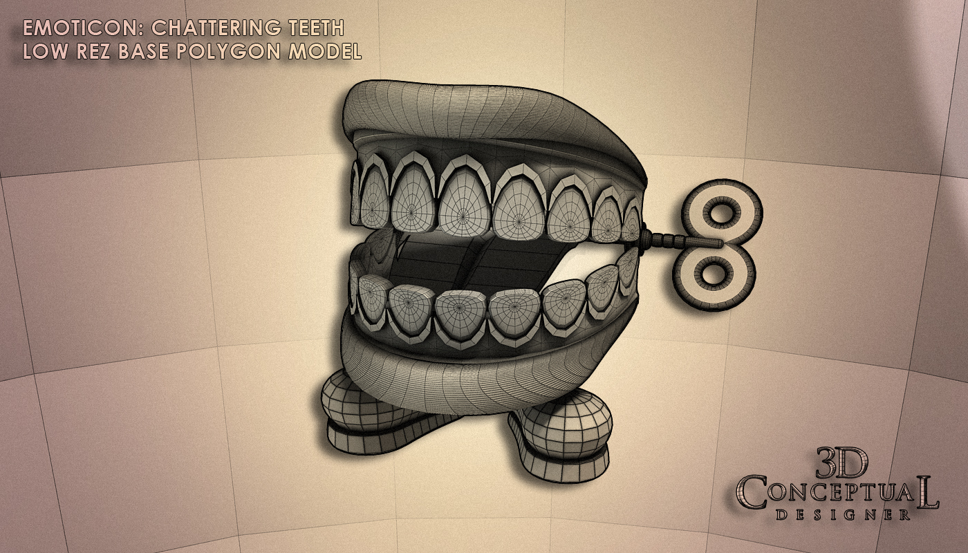

 The base model I made for this design I did all in 3D[ though I do sketch some]


 The subdivided 3D asset with smoothing added the the half of parts that are build as Quads.


 The Sombrero version was rendered at a higher angle to show off the hat more[ as directed].


 The base model with the hat addition included in this alternate concept.


 A fully smoothed out version of the model.


 Here is a Exploded view showcasing all the various parts I made in the creation of this little 3D Animated Character I designed in 2007 while at The Cimarron Group.

Project Review
Online Emoticons 3D Design and 3D Animation
PART I Chattering Teeth 2007

Client: Cimarron Interactive Division.
Art Direction: Scott Addison Clay.
Project Date: May 2007.

Back in 2007, I was still running my 3D Department of 1+ at The Cimarron Group providing 3D Design, 3D Modeling, and 3D Animation services to a full mix of advertising clients in Print, Web, and AV, and for today's posting, I am covering a project where I was tasked with creating some 3D Emoticons for an online project.

An "Emoticon" is an emotional animated Icon we see in e-mails with a little face, but taken to a much higher level to an actual 3D Character design. I was tasked with designed out four to five of these little gems that in final form were only 100 x 150 pixels in size[ a button], and would animate across the screen when you interacted with them.

Fist up in this series, is my PART I, covering the chattering teeth.

I did two versions, as they wanted one plain without a hat, and one with a hat, specifically a Sombrero. I created the base design in just under an hour and began to rig it for the animations and adjustments that would come. I built about half of the file as a subdivision model so I could increase the complexity if they did want it rendered or seen much bigger, but the micro final size of 150 pixels is so small it was not necessary to build it all that way, because as with all 3D jobs, the budget was micro so I had to create this much faster at the lower cost for them, so I went with a fast and dirty approach to the file.

As a 3D Designer trained in Industrial Design The "widget" or product in this case a cartoony styled set of chattering teeth is only the first part of my responsibility, as I must design it to fit the budget and parameters of the project and actually work for a paying client. That is something that goes well beyond a mere deadline on a piece of design or artwork, but the creation of a workable production line to create the 'wdiget' on time, on budget, and approved by the one paying for it.

Look for PART II in the future with a few more of these 3D Animated Emoticons.

                                Cheers, THOM

Wednesday, April 24, 2013

Project Review: Reels Slot Machines:Facebook App 3D Gamescreen Modeling 2012

 The final Subdivided 3D Model shot sent over to Chris at Blind for the App Reel Slot Tournament.

 The Base Quad Polygon Model without subdivision as delivered to the team and exported out as an OBJ and FBX for the Maya and C4d users.

 An overall Birdseye screen shot showing the build out for this App Game Screen.

 A close Up shot on the switch and blub panel from the lower right of the screen[ NOTE: The curled filaments inside the vintage 'nipple-top'bulbs]


 A close up on the Horn, and Marque details built and designed out in 3D for the App on Facebook.

 The Flipping/Rotating Player cards were built out in a tube frame to the LEFT.

 The original scrap I stated with on this one day Game Screen 3D Design and Modeling Gig from the Summer of 2012.

 A small screen Cap taken from the Facebook page of this App as it was finished out by the folks at Blind.


Project Review
Reels Slot Machines:Facebook App
3D Game-screen Modeling 2012

Client: Reels Slots Apps via Blind.
Art Direction: Chris Do.
Project Date: June 2012.

I had worked with Chris Do in the past on the Raveonettes Music Video where he won an Emmy for the Art Direction on it[ I did get Honors], and he had another fun task, only this time he needed 3D Modeling done for a game-screen for a slot App on Facebook.

I gladly took the work and was given a direction sheet to work off of and had a day or less to complete the job. I built out the assets as all subdivision models since this was to be exported out to their in house 3D team for finishing up.

A very fun assignment as I got to do 3D Design while I built it out as the direction gave me room to explore the designs a bit, and it was super fun to do. Enjoy the posting.

You can review my prior work with Chris Do from the Raveonettes here.

Cheers, THOM

Thursday, July 5, 2012

Launch City Part IX[Nine] Launch City Redesign Build-Out for Issue #41

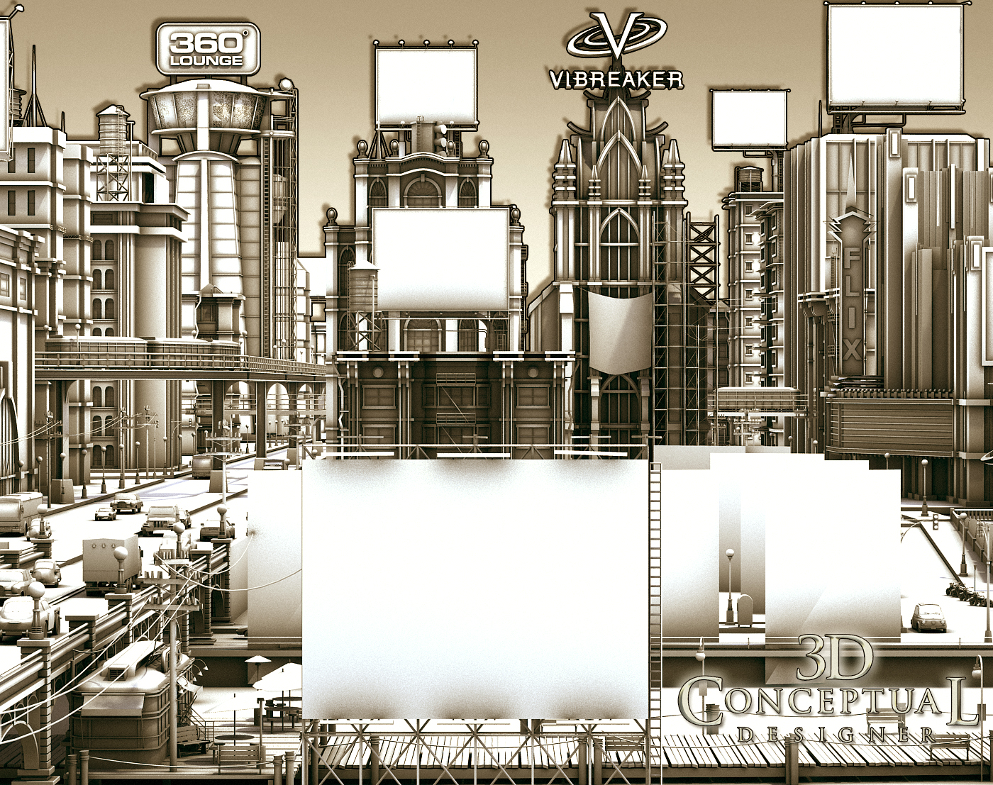
 Here is the final geometry for the Launch City Re-Design I did back in 1999 for Launch.Com


 An overhead shot shows how I placed each building to fit into the Camera-Cone with actual geometry "walls' for the cone, to let me know where I was in camera when designing.


 This was a 640x480 side scrolling interface three screen wide and here is the Left side of the model close up.

 Here is a close up of the Middle of the city with the little diner up front.


Here is a geometry close-up of the right side of the city


Here is a re-posted shot of the fully rendered City I designed for Launch.com

 Launch City Part IX[Nine]
Launch City Redesign Build-Out for Issue #41

Client: Launch Media Inc.
Art Director: Myself
Project Date: 1999

NOTE: I was off for the fourth of July so this is from yesterday


In this, my 9th post on LAUNCH city for Launch.com, I am posting the city itself in more detail, with close up renders of the geometry I designed and built out to create the new wide format 'virtual' city for the CD-zine back in the last of the 90's.

I was brought in to fully redesign the city, and as a prior Disney Imagineer, this was right up my alley.

I thematically gave each part of town a distinctive look to the architecture so that the human mapping ability would be used through color and shape language, so the viewer would recognize where they are in the city based on design and not just graphic directions.

I have many posts covering the various locations that we sold off as virtual real estate to advertisers, the links are all below.

Cheers, THOM

To view PART I on Launch City you can go here.

To view PART II go here.

To view PART III for the Train Station "Twitch" look here.

To view PART-IV look here.

To view PART V- you can click here.

To view PART VI [ the sub!] go here. 

To view PART VII-The Vault, go here.

to view PART VIII-Target-Jukebox Twitch, go here.


Monday, February 27, 2012

Project Review: Launch City PART VIII[ 8th]-The Target Jukebox Design 1999.

Here is the original final shot for Launch CD-zine Issue #40 from 1999 @ 640 x 480 the size limit at the time fro shockwave to run smoothly.


I did a quick open and re-render at a higher rez to show some details[missing a few maps though after 14 years...]


Here is the main screen shot in geometry showing the model details I added in.


The set was a two wall configuration and I built a little conduit with the parked gum pushed up in the crack.


Here is a shot of the full to the floor jukebox as geometry for Launch.com

 Launch City Part VIII
The Target Jukebox design for Issue #40

Client: Launch Media Inc.
Art Director: Myself
Project Date: 1999

In this 8th post on LAUNCH city, I am posting work done on a jukebox built out for a Target sponsored space with a fully animated 3D jukebox.

This was one of my very first projects I worked on when I joined the three man team as Art Director in 1999. I love to model in 3D, and that seems to be something that many people do not like. 
To me the fun part is the build itself. I love the process of construction. This may be due to the fact that I am an avid woodworker, copper smith, and I love to sculpt and create, so naturally I would love virtual building too.
I made the model close to, but not exact to a famous iconic Juke box from the 50's for the project, and I passed it over to Cayce Justus and he skillfully rigged it up and animated the arm and curtains inside for me.
As a point in 3D history this is the project where I made a material editor breakthrough in 3DSmax with Chrome and Glass and applied it here in the default scan-line rendered. 
Remember this was 14 years back, pre GI and all the good render tools we know see as commonplace were not out yet, so lots of ambient lights to simulate bounce etc.

Cheers, THOM

To view PART I on Launch City you can go here.

To view PART II go here.

To view PART III for the Train Station "Twitch" look here.

To view PART-IV look here.

To view PART V- you can click here.

To view PART VI [ the sub!] go here. 

To view PART VII-The Vault, go here.


Image for Jake Commented that he wanting to see inside[ cut away]


Friday, July 22, 2011

Project Review: Thales PART II-GUI-Icon and Logo designs for the 3D Alioscopy Display

Here is the main Thales Logo done as sandwiched metal over a blue glass center, Yummy!


An overall view of the GUI 3D Icon buttons I designed for use on the Alioscopy HD glasses free TV's with one blank one extra.


A fish-eye lens view as a concept to explore.


A standard Lens looking up at the Graphic User Interface G.U.I I designed.


A close up view showing the 3D Icon with pencil and 3D page turned Icon. All Icons had some color sandwich in them.


A Geometry view showing the build out for the main GUI buttons done as 3D Icons.


The Movie Poster Button with Poster and video room.

Project Review
Thales PART II
GUI[ Graphic User Interface] icon designs and Logo in 3D for the 3D Alioscopic [http://www.alioscopy.com/ ] Display

Client: Thales via Wellbrand, Inc.
Art Director: n/a.
Project Date: Summer 2009.

When I was in-house at The Cimarron Group I brought in some technology for glasses free stereoscopic viewing[ eD TV]. I was introduced to them via Wellbrand Inc., and a fellow ACCD alumni, Goutam Mitra.

In this second posting on the 3D work I did for the Thales presentation while at The Cimarron Group, I focus on type and GUI designs.

I built out these little rounded trays that represented 3D st buttons with 3D versions of Icons seen in a typical GUI design. I also did the main Title Logo for the piece as well as a modified tray to hold a Movie Poster and play a trailer clip via a touch screen stereoscopic display.

You can view PART I with the future-jet I designed and built from earlier in the week here.

Cheers THOM