Showing posts with label Marker Rendering. Show all posts

Thursday, June 7, 2012

Project Review: SEGA Interactive- Molecule Man 1995 Part III


Molecule Man in his Metal form battle the two Alligator Girls.You can view the sketched clean line-art here.


He was eaten by the gator in his liquid form and bursts out the back in his metal form.


Look UP! A Giant Robotic Tarantula spider.


  Molecule Man as vapor fighting vultures with rockets attached to their wings. The original linework is here.


Project Review:
SEGA Interactive- Molecule Man 1995
Part III

Client: SEGA Interactive Group.
Art Director n/a.
Project Date: Summer 1995.

This is my third posting for the brief work I did for Sega out in Diamond Bar CA. back in 1995 for the video game called Molecule Man, and today I have posted some of the marker color style frames I did for the presentation showing o the hero in action.

Internally each team 'pitched' their game designs to the owners and they used artwork like this to help them get the idea across. I did half a dozen or so images like this over the few weeks I did work for them.


You can review my first post here, and my second posting here.

Cheers, THOM

Thursday, April 26, 2012

Project Review: Phantom 2040-PART LXXXXIX[99th] Marker Comp-Color Keys


 A B.I.O.T Laser Rifle Color Key done in 93' with a wrapping hand grip[ Art Nouveau theme ]

 I forgot about the Phantom 'age spots' as we called them on the Ghostwood. I added in a hint of Purple into the Jungle leaves to give a source or origin to why he chose purple in his suit.


 A very early Phantom Cuff design originally had a 'snake eye' cut out to reveal the purple suit through the slot. This cuff shot was for the Day-Glo Lime green Inductive Rope being Color Keyed out.


 Here we  have some B.I.O.T'ic assisters for Sagan Cruz, for her arms and legs


Phantom 2040
PART LXXXXIX[99th]
 Marker Comp-Color Keys

Client: Hearst Animation Productions.
Art Director: Myself.
Project Date Spring 1993.


This is my 99th post for the work I did on the TV show[ Uno Mas to 100!], The Phantom 2040 from in the early ninety's, and I have posted a few more of the color keys that I did for a variety of props here today.

I was trained in their Automotive Design program in the late 80's and early 90's during the Pre-Computer rendering era at Art Center, and our primary fast color work was done with markers, chalk, and colored pencils, [ with a touch of Gouache'], so this is how I keyed the colors for the show since we were not using traditional painting of the cells for our production, but the then new, digital ink-n-paint , as this was very early on in 93'.

If you are a FAN of The Phantom 2040, and on FACEBOOK, there is a group for that....  here.

There is a TAG on the list to the RIGHT for other Phantom 2o4o entry's, but you can click this as well.

Cheers, THOM

Thursday, March 22, 2012

Project Review: The Phantom 2040-PART LXXXXVi[96th]- More Character Color Keys


 A BIOT Mechanic in an orange Jumpsuit with a Readout mounted to his forearm.

 A Female BIOT named Pavlova from that episode. If I remember she was 'self aware" and unique.


 A Short BIOT on tracks, seen here as a sketched design.


 Here is Guran in a trench coat and mirrored glasses.


Phantom 2040-PART LXXXXVI[96th]
More Character Color Keys

Client: Hearst Animation Productions.
Art Director: Myself.
Project Date Spring 1993.


This is my 96th post for the work I did on the TV show, The Phantom 2040 from in the early ninety's, and today I have posted a set of marker comp color keys for a variety of characters.

As Art Director for the 52 episodes,  I was responsible for the overall visual themes and color language used for all characters, sets, and props for the series, and since we were doing the production digitally we did all color keys in markers and chalk rather than Cel Vinyl.

I always love taking my Conceptual Designs to the next phase and to bring the to life with color. As a Transportation graduate from ACCD, we are trained specialists in using markers and chalk to render out our concepts, as that was the preferred method prior to the advent of the digital painting technique that has replaced it, so I went with it, since the renderings were scanned and PMS colors were assigned to match on Korea for the final production.

If you are a FAN of The Phantom 2040, and on FACEBOOK, there is a group for that....  here.

There is a TAG on the list to the RIGHT for other Phantom 2o4o entry's, but you can click this as well.

Cheers, THOM

Thursday, November 17, 2011

Project Review: Silvestri California Trim a Home 1992


The main gate entryway I helped design for the Trim-a-Home Collection of architectural fixtures at Silvestri Ca.

Inside the Trim-a-Home area looking to the side at the matching post architectural stone[ faux] column overlays.    

Project Review
Silvestri California 
Trim-a-Home Sketches 1992

Client: Silvestri California.Art Director: Bill Daniels.Project Date Fall 1992

In this fifth posting, on work I did back in the early 90's right out of Art Center, for the Fashion Industry Manufacturer of interior design elements for major department stores, Silvestri California, I have a quick 2 sketch posting for you to review.

Bill, had a rough doodle concept to show the fixtures in the specific store in Chicago, so I did these two 11 x 17 velum Marker Renderings for the presentation we sent out for approval.

You may notice that I did the sketch using the ship curves I use to get the fish-eye perspective for a more dramatic view to sell the concept to our clients.

The design were eventually built as the X-mas display that year for 1992.

You can view my alternate Silvestri California work right here.

Cheers, THOM

Thursday, October 27, 2011

Project Review: The Phantom 2040- PARTLXXXIV [84th]-Misc Color Key Marker Rendering


 One of many Accessories that our hero, The Phantom, has concealed in his outfits Power-Cuffs, a video card design.


 A Tablet Palm PC[ Hey it was 1994!], with a stylus pen...


 A Color Key I did in Markers for a small generic Electric vehicle for The show, The Phantom 2040.


 A Color Key I did for The Phantom 2040, and this was a revision of the first draft design for Maxwell Madison's Hyper Cruiser.


Phantom 2040-PART LXXXIV [84th]
Misc. Color Key Marker Rendering


Client: Hearst Animation Productions.
Art Director: Myself.
Project Date Spring 1993.


This is my 84th posting here on my design blog for my contributions of Art Direction, and Head Conceptual Designer roles for The Phantom 2040, and today I am posting some added color keys that I did with markers for the show development.

I am trained in marker rendering as all Transportation Designers were back before the advent of digital rendering, so it was natural to so this for the color key work. It works quickly in markers and pencil, and since this show was digitally ink-n-painted anyhow the medium was not an issue the color most certainly was, and we scanned it all in for the South Korean Studio to finish..

I originally was directed to make sure I used Purple[ Te Phantom Signature color], as well as green to show the Ghost Jungle, at least in color for a city centered series with metal and cement as the main materials.

You will see this influence in all the Color Keys I did, though we muted the color a lot as we headed to production.

If you are a FAN of The Phantom 2040, and on FACEBOOK, there is a group dedicated to the show here.

There is a TAG on the list to the RIGHT for other Phantom 2o4o entry's, but you can click this as well.

Cheers, THOM

Thursday, September 29, 2011

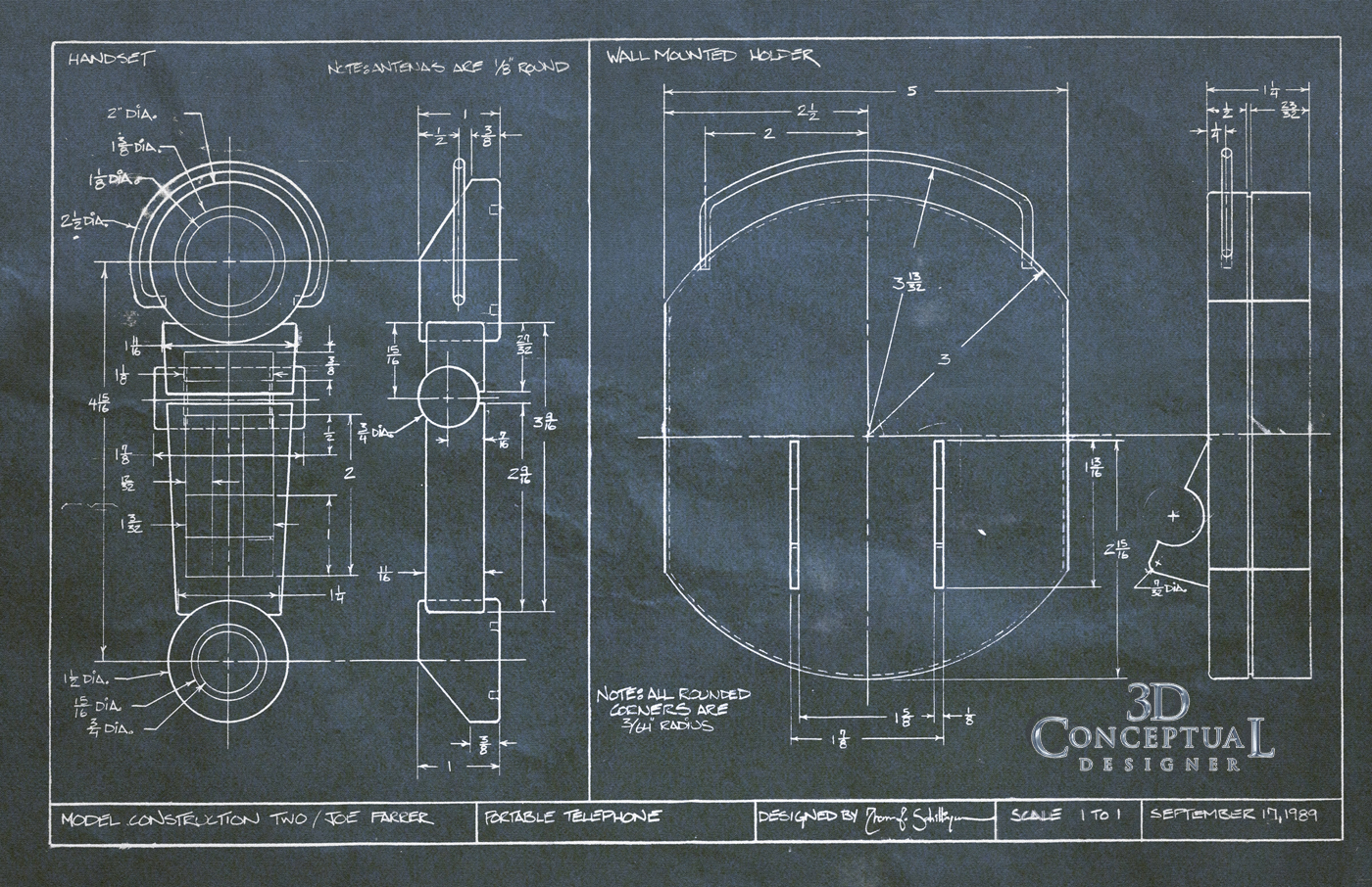
Project Review: A.C.C.D.- 3rd Term Shop class Product Model

 A 14 x 17 Marker Rendering I did for the final shop class project for the phone model.


 Here is a shot of the Product Design model I built at Art Center back in 1989 of a cordless phone and wall base.


 A shot of the same model with the phone "hung up" on the polished aluminum charging tabs.


My drafting image blueprint I designed to build the model in Joe Farrar's shop class in 89'

Project Review: A.C.C.D.
3rd Term Shop class Product Model

I started Art Center in the fall of 1986, and left for almost 3 years before I returned to finish my training, and this model was built my first term back, 3rd in the fall of 1989. Joe Farrar was the instructor for nature of materials[ Shop], and we had to build a product model of some sort , so I did two, with this phone as my first one.

I wanted to use both metal, and plastic in the design, so I created a deco styled portable phone that charged on some nice metal tabs. Remember this was 1986 and pre-cell phones, so we had no idea how advanced things would get in just a few years from then.

I had been a professional Cabinet Builder the year prior, so I was well accustomed to parts drawings, and I had training in drafting from 9th -12th grade as well in our vocational programs we had in Colorado in the 80's.

The staged photos were taken in my apartment back in 89, and I still have the model today and it is in good shape.


I have additional Art Center projects up via the TAG on the right.


Cheers, THOM


Thursday, August 4, 2011

Project Review: Dreamquest: Mitsubishi and Chrysler TV Spot- Set Design 1992

Here we see the Mitsubishi 1993 Diamante Japan Edition with Diamonds floating over the paint in slow motion[ VFX done by Dreamquest in 1992]

Some style frames for the Mitsubishi 1993 Diamante done in 1992 for Dreamquest.


A Mitsubishi ripping up the leaves on the ground
[ that turned to gems via some Dreamquest VFX].


A Dodge Colt Wagon passing the gas station[ Fuel Economy ]


A Style frame I made from the storyboards of an Eagle Talon at a castle.


A Full Color Marker comp style frame for the Talon.


Dreamquest
Mitsubishi and Chrysler
TV Commercial Set Design/Style Frames 1992


Client: DQ Films.
Director: Hoyt Yeatman.
Project Date: Summer 1992

I did full freelance my first year after graduation from Art Center in Pasadena California back in 1992. I had a regular few companies I did set design for, and Dreamquest was a huge VFX shop in town out in Simi Valley that I would do regular jobs for.

Above you see examples showing the product from back to back jobs I did, simultaneous for automotive commercials with a lot of Visual Effects for Dreamquest. A few Marker Comps, and line drawings.

The Mitsubishi spot was for a Japan only model the Emarude[ emerald] and the Diamante[ diamond] competing in a slow dance duel with shards of the gems floating around the cars. A fun conceptual piece with a lot of VFX.

The Chrysler Corp spot was for the Jeep Eagle brand for two cars with some stylizes sets as shown. Most jobs were , in and out 6-8 hrs. and I was done, and this was no exception. The Set Design world was a fast a furn around as advertising seems to have.

Dreamquest eventually spun off DQ Films, the TV division of the VFX work, and I have some added postings here and here on storyboards and set designs I did for them continuing to 1997.

Cheers, THOM

Wednesday, March 23, 2011

Project Review: Novel Comics Gumboman

Recently I built a Cajun Swamphouse [ buy it on Turbosquid!] that was influenced by this story Gumboman from Novel Comics.


Gumboman himself!

A Swamp truck from the project.


A yummy bowl of Gumbo!


The Alligator triplets.


A Color Key I did of the Gator Boys.


The Banjo Twins.


A Demonic Urinal. Imagine that coming your way, Yikes!


Half Man and Half Crawfish!


The Who-Doo Queen.


An old Gumbo shack I did back almost a decade ago as a test in the first 3DS max in 1995.


GUMBO MAN

Client: Novel Comics.
Creative Director: Bryan Thompson.
Art Director: Myself.
Project Date: 1994-96.

Back in the mid nineties when I was full time at Hearst Animation Productions working on The Phantom 2040, and The New Adventures of Flash Gordon, I met and worked with Bryan Thompson who worked at Hearst with me. He wrote a great treatment for his original story GumboMan, and after reading it I wanted to do some visuals for the story.

After leaving Hearst I helped Bryan out with visuals for the project with some preliminary character concept sketchs and some various vehicles to support the project that you see above. Brian has a company called Novel Comics that he does all his story work out of as a freelance writer in Hollywood CA.

A very fun project that took place in the swamp, and I return to the swamp house theme in my 3D as seen above with the model I sell of the Cajun Swamphouse on TurboSquid[ link on sidebar>>].

Friday, October 8, 2010

Project Review: A.C.C.D. 7th Term CALTY Project -PART 1

An early sketch showing the small wheelbase and "wedge" profile.

A second sketch in B?W of the Calty Project work.

An Early Marker Comp of the final Design.

A Final Marker Comp of the Calty "Small and Secure" Design #2.

A Side shot of the fifth scale model I built of the Design #2.

A 3/4 back view of the fifth scale model.

A 3/4 front view of the design intent model.


Art Center 7th Term 1991
CALTY Project PART I

My 7th term at Art Center which is equal to your Senior year in Collage we had out Transportation Design Class sponsored by California Toyota or CALTY which is responsible for advanced design for Toyota and Lexus.

For my project the theme was "Small and Secure" and the idea was to try and short circuit the thinking that a small car cannot be safe. I was to design a mini or microcar, "Kei" class in Japan that looked and used developments in safety. I designed two vehicles one more conservative which is this one and one a higher type of concept.

You will see development sketches along with some marker color renderings and finally the fifth scale model I built of the design. This term I did two cars so look for a follow up post in the future.

Cheers, THOM