 I did a more "Industrial Metal" looking concept for the Eye Door for Lemony Snicket as well as seen here.
A Series of Unfortunate Events
PART II
PART II
Client: Paramount Pictures via BLT and Associates
Art Director(s): Dawn Baille, and Jeroen
Project Date: Fall 2002.
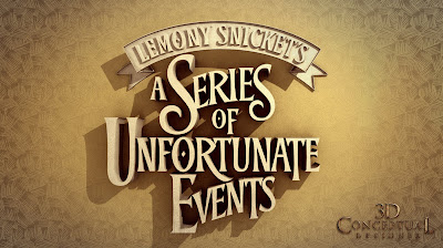
In this, my second posting for the film adaptation of the book, Lemony Snickets A Series of Unfortunate Events, I am posting the finished door designs we went with in 3D Illustration for the teaser Poster Ideas, as well as a few Logos we did and presented. My prior post was for a few monochromatic designs of just doors, and this was the range we went with for the final presentation as to the doors.
At the time of production, the film was far from being in the can and we had no assets from the film to design from, so we designed based on the book series and the graphic illustrations that were used in the popular series as a starting point for our designs. We knew the "eye" was a central feature, so that is found all over the designs. A fun project that we had for a month or so.
At the time of production, the film was far from being in the can and we had no assets from the film to design from, so we designed based on the book series and the graphic illustrations that were used in the popular series as a starting point for our designs. We knew the "eye" was a central feature, so that is found all over the designs. A fun project that we had for a month or so.
You can view my prior post for the door variations here.
Cheers, THOM


No comments:
Post a Comment