Friday, July 29, 2011

Project Review: Confessions of a Dangerous Mind 2002

A Black and White deep extrusion Logo with a rounded bevel for Confessions of a Dangerous Mind, done at BLT back in 2002.


A fun red hot-line comp with script font mixed with a Bold one.


Another B-n-W comp done with a stacked 3D logo with differing extrusion depth and treatment.


A red glass look was used for this thin extrusion with a strong bevel on the face with some webbing in the highlight of the paint material I built.


I always enjoy in 3D doing an overlap stack up, as it really emphasizes the 3D quality and depth that cannot be achieved thou a 2D fake in Photoshop. A simple logo but fun to lay out.


This Logo used the above type with some red hot-lines on the lower part done in metal.

Project Review
Confessions of a Dangerous Mind 2003

Client: Miramax Films via BLT and Associates.
Art Director: Ronnie Blumenberg.
Project Date:August 2002.

A new film directed by George Clooney, Confessions of a Dangerous Mind tells the story according the IMDB, "An adaptation of the cult memoir of game show impresario Chuck Barris, in which he purports to have been a CIA hit-man." I was tasked with creating some Noir' Logos so we went with a Black and White look with a bright blood red highlight effect.

This was a fast half day job, and the project was never revisited as the finals went with a 2D look. Fun none the less.

Cheers, THOM

Thursday, July 28, 2011

Project Review: Halloween 8: Resurrection 2002

Here are the first two shots I did with the haunted house I built for Halloween 8.


Here is the last shot I did for a final comp done w/o and lighting coming out the windows and a bit more light showing some details.


I had to build fast so no Sub-D quad modeling here at this time in my 3D development, as this is almost a decade old.


Here is the Virtual-Photoshoot I did with a window boarded up showing Mike Myers.


This is an image of the Geometry for the boarded window in Halloween Resurrection, a fast simple scene with some bent nails.

Project Review
Halloween 8: Resurrection 2002

Client: Dimension Films via BLT and Associates.
Art Director:n/a.
Project Date: Summer 2001-Winter 2002.

Sorry for the late post, I was juggling seven client jobs today, so I am posting a bit late, thank you for your patience today.

I did a bit of 3D set Illustration for the film Halloween 8 back in 2001 while at BLT and Associates in Hollywood doing 3D for the Theatrical Print Posters.

The team needed an iconic old house for a dark comp design, so I quickly built out a house with some volumetric lighting coming out the windows, this was done super fast in about 1.5 Hrs. I then did a higher resolution image of a boarded up window that different cast would put into various scenes of horror. With a 3D asset I can easily take one scene make some quick changes and get a different window with different boards and nails. Once the first is done the second takes 1/10 the time to create. 3D lends itself to iterations and little changes as it stays "a live set" that can be revisited years later as I did doing the Quad renders for the geometry you see here.

Cheers, THOM

Wednesday, July 27, 2011

Project Review:Sure Grip PARTII: Avenger DA-45 Roller Skate Plate Design


The first concept design for the Sure-Grip International's new Quad Plate the Avenger a DA-45 based skate.


The original design was a 10 degree Super-X based product as seen above, though we moved to the DA-45.


Here I have side-by-side the DA-45 and the Super-X 10


I took a bit of the "spoiler" off the nose in this iteration of the concept.


The final design for the Avenger is shown with a few sections.


Here is the 3D file showing the build process using Subdivision -Surfaces that were used for prototyping.


A Stereolithography model of the Avenger sitting on Steven Balls desk back in March...


Here is the original revised DA-45 truck I did for SGI back in 2010. It was adjusted in-house and is what comes on the Avenger and other DA-45 SGI products.


The Process in Stereolithography: 3D Model->Plastic Prototype->Metal Casting->CAD->Mold.


Sure-Grip International PART II
The Avenger DA-45 Rollerskate Plate Design

Client: Sure Grip International.
Art Director: Myself.
Project Date Spring 2010.

This is my second post covering work I have done for Sure Grip International[ SGI], the largest and oldest skate manufacturer in the USA. I did some 3D-Logo work last year for them posted here. Today my first full production Roller skate design hits the market at Roller-Con 2011 as I type called the Avenger , a Dual-Action 45 degree skate plate.

Having gone to transportation design school at Art Center we love things that roll, not just cars, and for me Quad skates are TOP's. The original Non-Inline design is making a huge comeback due to the popularity of Derby around the world, so I found a nitch, that I actually was well informed on. This has allowed me to get into the design and concept phase for new products for this large manufacturer of skates based out of So Cal.

I had done a few concepts on my own here, and I forwarded them to the top US builder of Quad-Skates at Jam-n-Speed, Fred Benjamin known as Doc Sk8" whom I have chatted with via the skateLOGforum, the top online community for Quad-Skaters, and we discussed talking to Sure Grip. Well I did a few designs and was introduced to SGI in March of 2010, and we begain develpment of products, and what yopu see here is the first plate to come forward designed for Derby, The DA-Avenger-45.

We wanted the plate to NOT look like a copy of a copy of what exists in quad plates, as they all follow a similar line for look. I applied the angles, and the shapes of triangular "Stealth Fighter" anti-radar shapes, as well as giving it a black finish to follow in line with the "Darth-Invader" that is what this is to replace as a Derby purpose built short mount skate.

I also helped reshape the DA-45 truck too. We use a process called Stereolithography, or some call it 3D-Printing. This is where we can make an actual part from the 3D model I build in the computer, so we go from Art, to a Part so to speak, and fast.

We mocked up the parts , and then SGI molded a few in metal and adjusted as needed and finally go to the mold making team for production.

Many thanks go out first to Doc, for connecting up and making the connection to SGI, and also to Sure-Grip for using my services as I get to participate in something I love. As an avid Old-School Quad skater myself, this is personal design for me, and am grateful.

Cheers, THOM

Tuesday, July 26, 2011

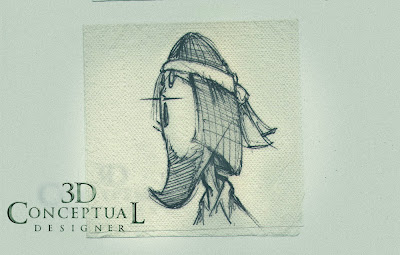
Napkin Sketching and Doodles: PART VIII-More Character Designs

Sketched out a Q's Billiards in Pasadena back in 1996, some 'dude' at the bar....


"Side burn Man" was a guy with extra Looooooong lambchops that was ripe for a character design.


Dracula with a hair curl inspired by the Tim Burton 'Nightmare' look.....\


Pencil Thin Rasta guy was playin' pool at Q's that same night....Soul Glo is calling!

This design was a full character design that I was going to sculpt in clay, some kind of Gremlin.


Napkin Sketching Part VIII
More Character Designs

In this eighth installment of the Napkin Sketches, and Doodles I do during times of relaxation I have posted more character designs I did back in the mid 90's while marinating in Newcastle Nut Brown Ale in Pasadena contemplating my future. [ Ahh, I miss that!]

I base most characters in some form on someone I see or meet. I am an avid people watcher, and you get the best ideas just opening up your eyes and looking around you. Character interpolation is a great way to get you design skills honed as you must make choices fast to get the 'essence' of the design as simple and quickly as possible.

If "Joe-Six-Pack" can ID the design fast you have achieved a good design. Enjoy the designs.

You can view the other parts here:

PART I

PART II

PART III

PART IV

PART V

PART VI

PART VII

Cheers, THOM

Monday, July 25, 2011

Project Review: Alias Spin off:SD-6-Logo explorations for ABC 2002

A badge of sorts, or a lapel pin type of logo I designed for SD-6 the spin off series planned from Alias for ABC in 2002.


A 3D Logo with a holding device around the edges in double layer chrome and gold, a standard look asked for.


A brass SD-6, Alias Logo done for ABC on a dark metal plate.


I put this logo on a sounded barrel like surface so the letter sit on a curved surface for lighting and shadowing smoothness.


A rough edged look to the font for this version for SD-6 the ALIAS spin off series for ABC Television.


A bold large Icon created early on in the process with brushed metals from the X2 development.


Here is the rendered 3D Logo for Alias that I matched up to the original.


ALIAS: Spin Off SD-6
3D Logo designs

Client: ABC via BLT and Associates.
Art Director: Scott Painter, Luis Sola.
Project Date: 2002

Back in 01' while running the little 3D division at BLT and Associates in Hollywood CA, I had a Home Entertainment staple of work that was brought to us by ABC, and the show Alias was planning a spin off with a show called SD_6, which according to Wikipedia states: "The Alliance of Twelve, with SD-6 being one of its subsidiary cells, is a fictional international organized crime group in the television series Alias."

I recreated the Alias Logo along with a series of looks for the spin off show. All metal like the X2 they loved that I did was the basic direction, with a military feel, so I did a bit of "brass" to match up the the look in the OG logo as well as the "brass" they wear on their uniforms.

Cheers, THOM

Friday, July 22, 2011

Project Review: Thales PART II-GUI-Icon and Logo designs for the 3D Alioscopy Display

Here is the main Thales Logo done as sandwiched metal over a blue glass center, Yummy!


An overall view of the GUI 3D Icon buttons I designed for use on the Alioscopy HD glasses free TV's with one blank one extra.


A fish-eye lens view as a concept to explore.


A standard Lens looking up at the Graphic User Interface G.U.I I designed.


A close up view showing the 3D Icon with pencil and 3D page turned Icon. All Icons had some color sandwich in them.


A Geometry view showing the build out for the main GUI buttons done as 3D Icons.


The Movie Poster Button with Poster and video room.

Project Review
Thales PART II
GUI[ Graphic User Interface] icon designs and Logo in 3D for the 3D Alioscopic [http://www.alioscopy.com/ ] Display

Client: Thales via Wellbrand, Inc.
Art Director: n/a.
Project Date: Summer 2009.

When I was in-house at The Cimarron Group I brought in some technology for glasses free stereoscopic viewing[ eD TV]. I was introduced to them via Wellbrand Inc., and a fellow ACCD alumni, Goutam Mitra.

In this second posting on the 3D work I did for the Thales presentation while at The Cimarron Group, I focus on type and GUI designs.

I built out these little rounded trays that represented 3D st buttons with 3D versions of Icons seen in a typical GUI design. I also did the main Title Logo for the piece as well as a modified tray to hold a Movie Poster and play a trailer clip via a touch screen stereoscopic display.

You can view PART I with the future-jet I designed and built from earlier in the week here.

Cheers THOM

Thursday, July 21, 2011

Napkin Sketching and Doodles: PART VII-Submarines

A small sketch of a submarine I did in 2000 of a small two seater with a slick body design and one big fan prop out back.


This submarine sketch is a k hammered copper with rivets for the texture, but with aerodynamic fluid shapes to the body itself.


A small one man craft with dual props since this version also fly's in the air. Based on my research for fan-powered vehicles for the Phantom 2040


A small sketch done with a interlocking speed form body[ like a car]


My favorite sketch was this "fish" with the bubble up front based on my bubble car design from ACCD. I love the tail and side fins, all would be finished in copper, and brass.


Napkin Sketching Part VII
Submarines and Underwater Craft


In this seventh installment of the Napkin Sketches, and Doodles I do during times of relaxation I have posted a set of submarines I did back in 2000 when I was working in Spokane WA for Cyan, the nice folks who made the Myst and Riven Video games.

I was creating a mini submarine design for the game, so naturally I had watercraft on the brain, and while I was relaxing at a great steak house, or sushi bar in downtown Spokane, I sketched out these designs.

You can view the other parts here:

PART I

PART II

PART III

PART IV

PART V

PART VI

Cheers, THOM

Wednesday, July 20, 2011

Project Review: Thales PART I-Future-Jet for the 3D Alioscopy Display

A 3/4 top render of the Super Jet I designed for the Thales Presentation back in 09'


A 3/4 bottom render of the Super Jet I designed for the Thales Presentation back in 09'


A super high down view of the Plane Concept I built out for the Presentation. I designed this in 3D while I built it.


Here is the final model after a two step Turbo smooth was burned in and I modified the model a bit more.


The Phase One Quad-Sub-D model I built to block in the big parts first from underneath.


The Phase One Quad-Sub-D model I built to block in the big parts first from underneath.


A full 3DHDTV frame for the Aliscopy Display I tested out.


The plane in Black as an advanced surface continuity test.


The plane in Black as an advanced surface continuity test from the tail side[ looks like a bird!] :o).

Project Review

Thales PART I
Future Jet for the 3D Alioscopic [http://www.alioscopy.com/ ] Display

Client: Thales via Wellbrand, Inc.
Art Director: n/a.
Project Date: Summer 2009.

When I was in-house at The Cimarron Group I brought in some technology for glasses free stereoscopic viewing[ eD TV]. I was introduced to them via Wellbrand Inc., and a fellow ACCD alumni, Goutam Mitra.

In this first of two parts we can review the future plane that I did for the project in designing, and modeling, a plane for exportation to a Maya based VFX house for finishing work. You will also see the test image created for the 3DHDTV, as well as the construction images when I started out as a Subdivision Model.

They asked for a cross between a stealth fighter jet and a super sized jumbo jet so I came up with what you see above. I spent about 5 hours total designing and building the model for exportation.

I will be posting the Icon and Logo graphics I built out, as well for this soon, enjoy!

Cheers THOM