Friday, January 30, 2015

Project Review: Art Beats- 3D Stock Motion Graphics [ MGFX] concepts- 2008 PART I

 The final Style-Frame I created using a very simple 3D scene, and a bit of post color correction and Z-depth added for Art Beats from back in 2008.

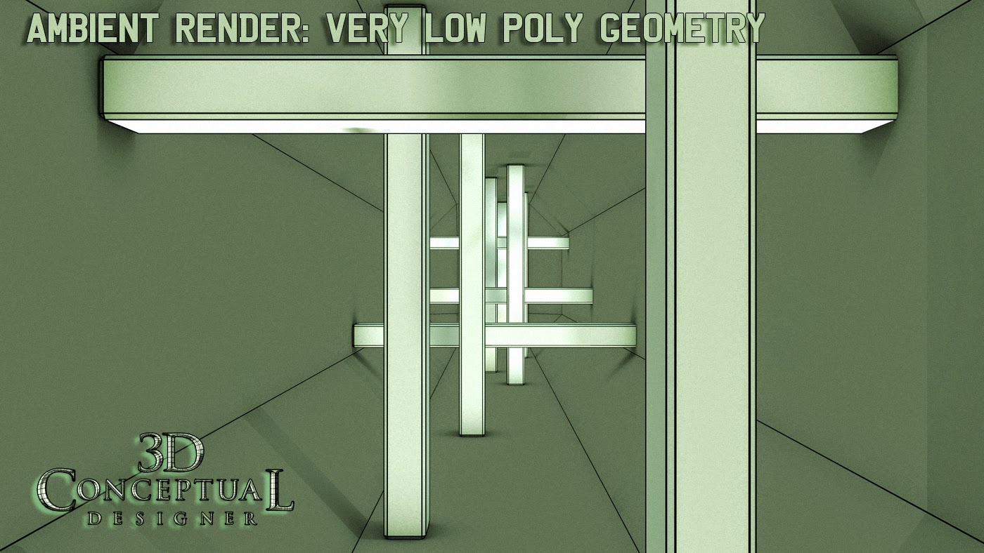
 The ambient render shows the 8 sided hallway that was textured with a Mirror texture, as well as the simple chamfer boxes used for the glass posts.

 An overhead Birds-eye shot with the hallway sectioned in half, and moved out to see this long hall 3D move at 600 frames.

A raw 3D render with on ray-tracing levels at zero, shows a very dark set in this simple 3D scene.

With just two ray-trace bounces, you begin to see quite a bit more going on down the hall here in frame 600 of the MGFX piece.

At four levels of reflections and refractions, you begin to see the walls a lot more and the brightness is getting higher with each added raytrace pass.

 At 8 raytrace levels it is getting brighter still and a has much more going on in the walls.

 At 16 levels it is looking close to final.

 The final 32 raytrace levels in this final raw 3D frame before color correction and post work was done with the Z-Depth mask.


Project Review
Art Beats
3D Stock Motion Graphics [ MGFX] concepts
2008 PART I


Client: Art Beats via The Cimarron Group.
Art Direction: Myself.
Project Date January 2008.

I did a bit of Motion Graphics 3D exploration for Art Beats back in January of 2008,  to develop some 3D background looks for a pitch for assets for the company to develop. I was running my one man show there,and had a friend get me the contact at Artbeats, so they agreed to a small 8 hour test.

Though the project was cancelled early on, what I liked about it was the concept itself, which was primarily to create living 3D scenes that could be customized at the company for any end client, and for my first concept I create a 'tech' like background based on a very simple scene.

I had done reflective backgrounds before, namely for Timeline a few years earlier for the trailers for that film, and I have always loved the 'infinity' effect you get in an elevator with mirrored walls, so I create a hexagonal hallway.tunnel-room with a few glass posts that animated and once I bumped the ray trace levels way up to 32, the 3D reflections in reflections got very interesting.

I will have added posts in the future for this quick MGFX work, so stay tuned!

Cheers, THOM

Wednesday, January 28, 2015

Project Review: TRANSFORMERS[2006] PART II-Optimus Prime 3D Build

The 3D Peterbuilt truck I made for the Style framed prior to full production for the first Transformers film. I based it off the TV series and toys.

A nice nose shot. [ More shots in PART I here]

 The build out with trailer as a Polygon render with wireframe OL.

The Cab and bumpers were NURB conversion objects, as seen in the triangulation of the mesh[ Non sub-D, or Quad]

 A birds Eye view down showing the visor and top lighting build out.
 
I put is some detailing behind the cab as well.

 A low height ambient 3D rendered shot of the nose and passenger side door of Optimus in 3D.

 An exploded view of all the parts I hand built in 3D to create this model for the style frames.


A worms eye view looking up at the exploded parts render of Optimus Prime from Transformers.


Project Review
TRANSFORMERS
PART II

Optimus Prime 3D Build

Client: Paramount Pictures via The Cimarron Group.
Art Director: Myself.
Project Date: Spring 2006

In this, my second posting for work I did for the advertising for the first Transformers film back in 2006, today I am going behind the art and focusing on the build out of the Old Peterbuilt Truck that is Optimus.

The film was in production, so we did not have any shots of the truck they were going to use, so I went with the 80's flat faced Peterbuilt design for my style frames[ seen here, here, and here].

I built this using NURBS converted to POLYS for many of the bigger parts including the main cab body. I used the Npower BREP tools at the time. I used my automotive lighting set up and rendered out a set of style frames as well as some 3D camera moves on the truck areas for a teaser trailer.

It was a fun gig, though it did not finish, I got to build a truck, which as a Transportation Design Grad I love, since any time I get to deal with wheels and a motor, this is good!

As a side, I recently saw the re-boot from 2014, and I like that they went back to the OG Peterbuilt truck at the begining of the film, and that inspired me to dig these out and post them up!

You can view PART I here a basic overview of the work I did here.

Cheers, THOM
Monday, January 26, 2015

Project Review: Key Art 3D Illustration for WAR of the WORLDS PART V- Additional Logo Exploration.

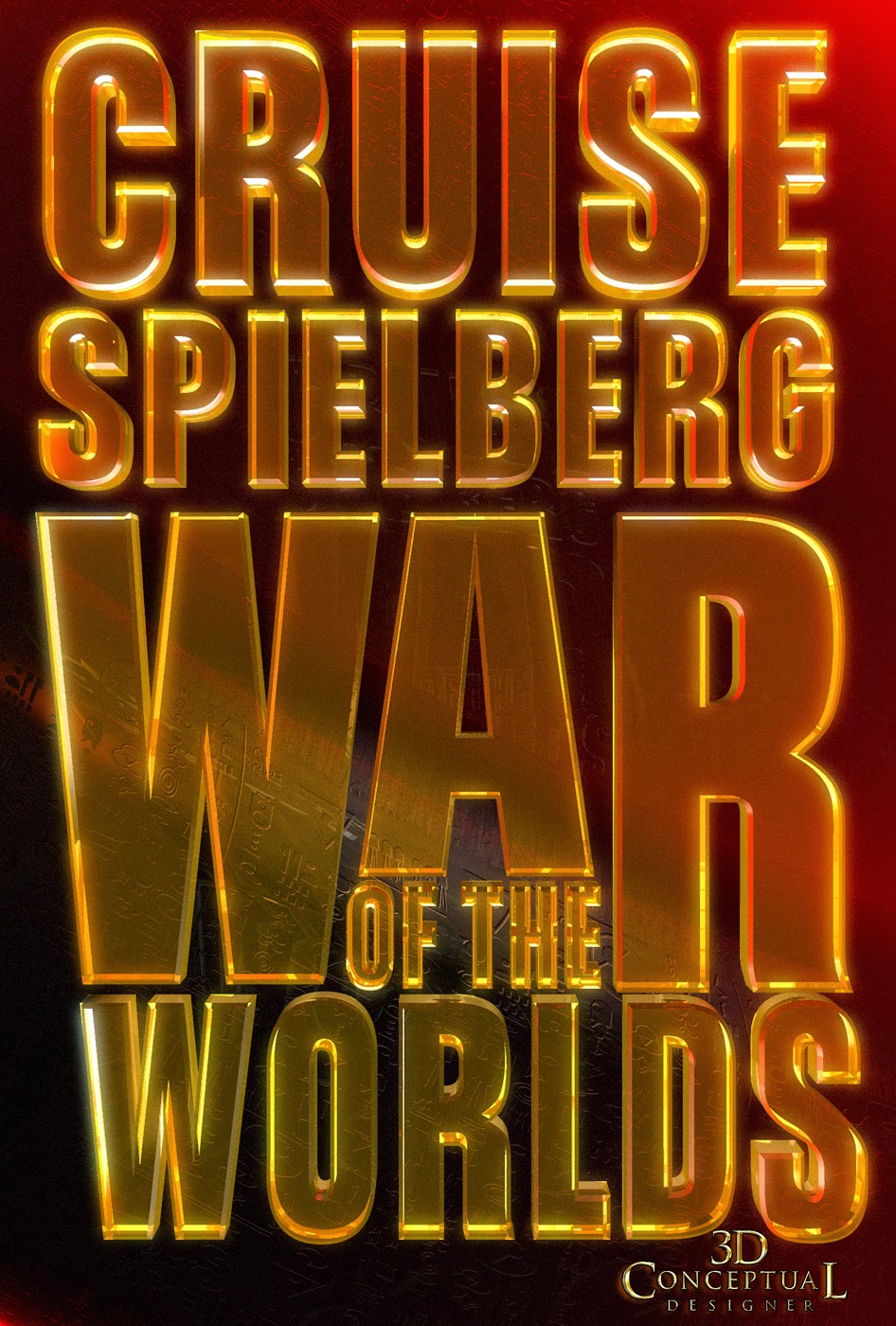
Very Early design with the 1960's Alien ship silhouette cut out of the title type for the remake of War of the Worlds, for the Key Art Development.

 A skinny font staked up with a blue back light in a Ben-Hur'esque low angle.


I really liked this font set up with the warm low light on the edges of the metal 3D Logo build out.


Another great font given to me to stack up and add 3D dimensionality. Always a favorite is the 'Double-Stack", a cool metal top type object on a gold lower wider holding device.


A fun Saturn-Like ring on the lower type in the 'O', in War of the Worlds, with a good taper to the torus object.

A big "W" for War cut into a fully scorched globe with volumetric Lighting coming out. This was a 'bug' or Icon design we did while developing Title Treatments.


 This full type teaser design was a off-shoot of the red-glass looks here, and here.

Project Review
Key Art 3D Illustration for
WAR of the WORLDS
PART V- Additional Logo Exploration.

Client: Paramount Pictures via The Cimarron Group.
Art Director: Calvin Sumler, and Chad Robertson.
Project Date Fall 2004

Today I am posting PART V, covering the 3D Design work I did for the Theatrical advertising pitches back in 2004 for the Spielberg remake of War of the Worlds, and today I have posted added 3D Title Looks for the Print campaign that was developed simultaneously with the MGFX.


For print I was supplied all vectors in Illustrator type laid out from both Calvin and Chad, Art Directors from in the Print Division to build out.

I did a total of about 100 logos during the process before we finished. The one sheet contains the 'BIG LOGO" and the 3D iron look for the world ,and these are my 3D contributions that went to the final, or finish for the Movie Poster. I did not finish for any AV work.

Look for more posts in the future for this project.

You can view PART I  an overview posting here.
You can view PART II: The blood Moss 3D Illustrations for Print and AV here. 
You can view PART III the Blood-Moss type looks here.
You can view PART IV: the Motion  Graphics 3D Card GRFX here.
Cheers, THOM

Thursday, January 22, 2015

Project Review: S.W.A.T. The Movie 2003 PART IV Night-Vision Binocular Model for MGFX Teaser Trailer

My deliver was a OBJ export to the 3D Animation Dept and this was the final 3D Model I designed and made. 

A render with DOF[ Depth-of--Field] as seen in the Teaser.

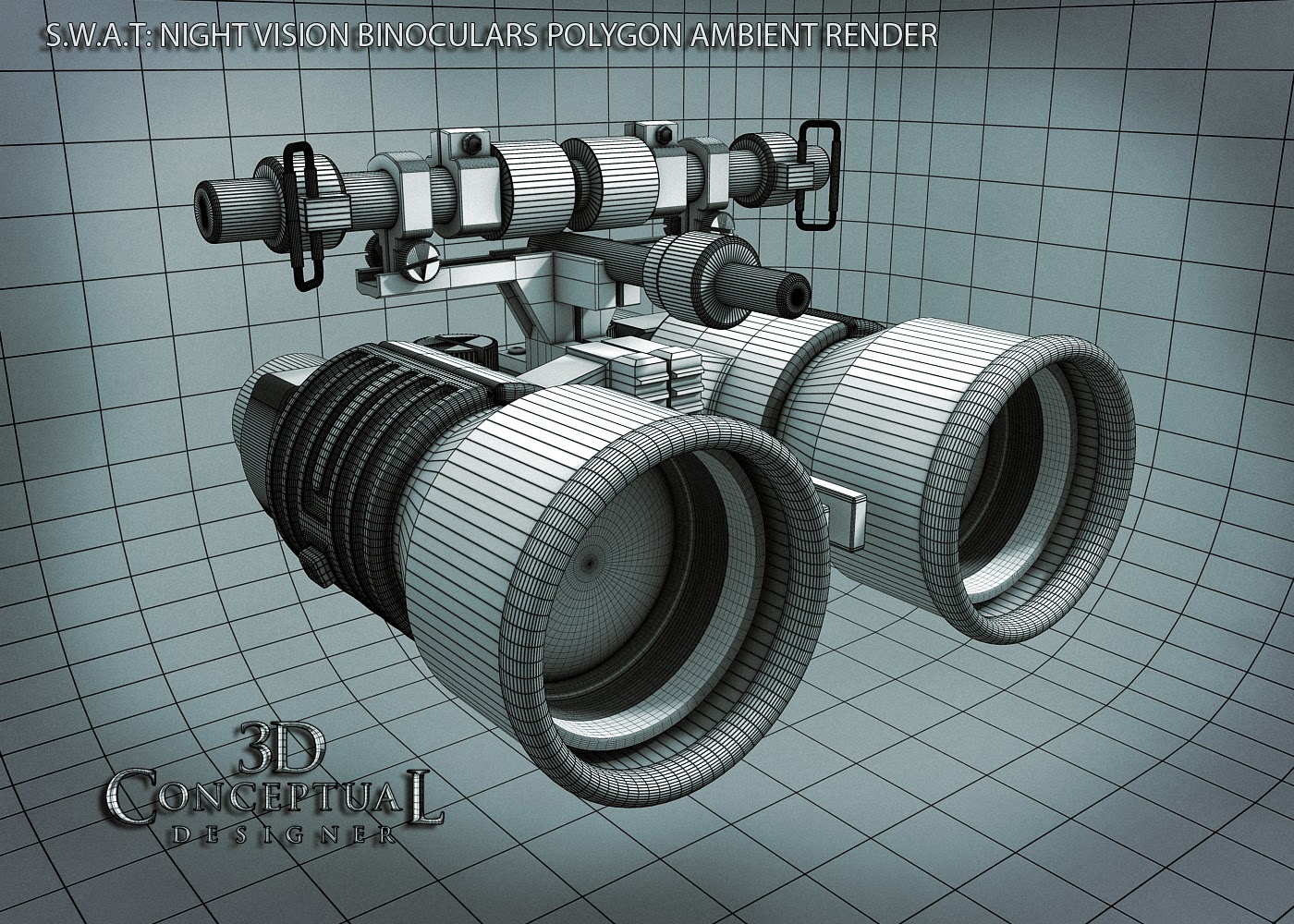
 A Birds-eye overhead front shot of the 3D Night Vision Goggles in Ambient with wires.

 The fully textured and rendered  S.W.A.T. Night Vision Goggles.

 I built this Pre-Sub-D, so some funky geometry on those thumb screws.
I'd go full Quads today in a build.


The 3D file still renders out fine.
 
 A Side view, with the hand grip as the only full Sub-D asset in the build. They are actually a cut down version of the front grip from the M4 Carbide model here.

A Side View 3D Render fully textured with DOF and ready as a style frame.
 
 The 3/4 rear view shows the lens inside the tubes with the appropriate glass, O-ring,and lens retention threads.

 The rendered back shot of the SWAT Night Vision Goggles , also used for the Home Alone work latter on here.

Exploded View shows the build.

 A second render of the prop as an exploded view of the 3D Night Vision Binoculars I made for the Teaser Trailer for the film S.W.A.T. back in 2003.

Project Review
S.W.A.T. The Movie 2003

PART IV

Night-Vision Binocular Model for MGFX Teaser Trailer


Client: Columbia Pictures Inc. via BLT and Associates.
Art Directors: Myself.
Project Date: Winter 2003.

It this, my fourth posting for the work I did for the TV to film adaptation of S.W.A.T., from almost a decade back now, today I am covering the Night Vision Binoculars I designed and made for the Theatrical Teaser Trailer back in 2003 for Matt Hartle the head of 3D-Animation.

I regularly built 3D Illustrations for the Print work at BLT, but I also did quite a bit of work for the MGFX[ Motion-Graphics] team for the AV Trailers as well, and for the new at the time film, S.W.A.T., I was asked by Matt in the 3D Animation dept., to make some very high resolution models for the back plates for the internal and the Title Card graphics.
 
I have more posts on S.W.A.T., both for Print and AV 3D Models I made that I will try and post up in the future, so keep an eye out.

You can View the logos in PART I here.
You can view the M4 Carbine I built here for PART II
You can view PART III, the SWAT van here.

Cheers, THOM

Tuesday, January 20, 2015

Project Review: I-Robot [2004]- 3D Gear Logo-PART II

 The Main first design I did of the iRobot 3D Icon Logo in brushed steel with a cool blue reflection.

I did this alt with a black-and-white reflection map and lighting set-up in 3D, so it was mostly monochromatic.

 I then rendered out this fully transparent version. I had done a transparent glass Walther PPK for the bond series at BLT,and this was referenced for the look.

The legibility with glass is a serous issue to deal with so for the next pass I put a wider softer diffused highlight on the face of the logo to cover some details out front. 

This was a post FX built comp in Photoshop, that I had overlay and underlay shuffling with the two versions of steel and glass to create a transparent aluminum captain!

  The base exterior 3D Logo build file in ambient wireframe for iRobot.

 The exploded view shows all the bits and pieces inside this 3D logo. This was referenced for my Astroboy Logo with robot parts inside years latter, as seen here.

Close up details included heat-sinks, gears chains, fans and various resistors etc.

 I scaled and fit these parts to fit inside each letter.

Retainer springs posts and some sub structure was needed inside these letters.

A reverse shot shows the hollow face type that was filled with these pieces.

The chain was comp'ed in fast so I did not go fully around the gear[ not enough time].

I also did this alternate, a reverse with the type cut fully thru the "I-box". This is the steel render. 

The transparent version with a very electric blue based on the light color on the robots from a film shot we finally received to match color to.
 
 Another combo version with metal and glass rendered out and painted over in Photoshop by the AD's

 I did a final version for this type layout with a volumetric light coming out of the 'type hole' in this darker 3D render of the 3D Logo for iRobot I did back in 2004.


Project Review
I ROBOT
3D Gear Logo
PART II

Client: Twentieth Century Fox Film Corp. Via The Cimarron Group.
Art Director(s): Chad Robertson and Calvin Sumler.
Project Date: Late Fall 2003.

My first job for The Cimarron Group was to do some 3D logos for the upcoming i-Robot feature with Will Smith. I had worked with Chad Robertson over at BLT so this was a continuation of our working relationship, just now moved over to another company, so we explored transparent logos with gears and misc. machinery inside the type.

Today I cover in detail that first concept I did in PART II.

I was asked to build out a hollow logo with robot parts inside, so as usual I was given the type layout, this time as a bitmaps, so I used Vector-Magic to convert it to an Illustrator file to build off of,and I proceeded to fill the logo with parts.

None of the logos finished, but it was a good exercise that helped work out some challenges with transparent logos that were used a few more times over the following years.


You can review my first post with a small overview here.

Look for more posts on this project in the future.

Cheers, THOM