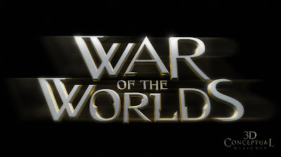
 In the film there is a "rotation" on the ground during the reveal of the Aliens, we put it in the type.
Project Review
Key Art 3D Illustration for
WAR of the WORLDS
Key Art 3D Illustration for
WAR of the WORLDS
Client: Paramount Pictures via The Cimarron Group.
Art Director(s): Chad Robertson, Calvin Sumler.
Project Date Fall 2004
One of my first assignments over at The Cimarron Group was on the new Spielberg remake of War of the Worlds back in 2004. Great subject matter for a big logo exploration.
I did about 100 logos during the process before we finished. On the one sheet the logo and the world are my 3D contributions that went to the final, or finish for the Movie Poster.
I will be posting additional images on this project as I did well over 80 logos and illustrations for the project.
I did about 100 logos during the process before we finished. On the one sheet the logo and the world are my 3D contributions that went to the final, or finish for the Movie Poster.
I will be posting additional images on this project as I did well over 80 logos and illustrations for the project.
Cheers, THOM


No comments:
Post a Comment