Tuesday, November 15, 2011

Napkin Sketching and Doodles: PART XII-Even More Character Design Sketches.

I have always loved to sketch little green men from space, this one is angry at the bar I visited...


Big Mouth was based on a guy who had a comb over and the BIGGEST TEETH I have ever seen.


A perturbed little chap in a turtle neck sweater, He was at Q's Billiards in Pasadena when I sketched this character based on him.


This angry 'big chin smoking guy', was out front waiting in line so he was my last "victim' of a doodle.

Sketching Part XII
Even More Character Design Napkin Sketches
 In this twelfth installment of the Napkin Sketches, Drawings, and Doodles I do I have put up four more character designs that I created over the years.

Character design, as I noted in my last post, is a great creative exercise to keep your degin skills on point. You deal with proportion, emotion, character, and feelings as well as a themed look, all in one design. Find what you love to draw, and do it often, put the mouse down a bit.

Napkins have always been my "mini canvas" and I am always tempted to sketch on one, every time I have the chance, or even better yet, a blank backed cardboard coffee coaster and a ball point is all I really need.

You can view the other parts as follows:

PART I

PART II

PART III

PART IV

PART V

PART VI

PART VII

PART VIII

PART IX 
PART X

PART XI

Cheers, THOM

Monday, November 14, 2011

Project Review:The Brothers Grimm-3D Logo Exploration 2004

 A Metal 3D Logo based on a design by Chad Robertson for The Brothers Grimm.


 Here is an alternate 3D Logo for The Brothers Grimm with a slight reflective surface indicated below the render.


 Rusted metal no a metal wall in this design concept I presented back to the Poster Design Division.


 A warm 3D rock material built using DarkTree's procedural texture program was used on this Grimm Logo.


 A cool blue-green metal render done for a design from the Art Directors.


 The final Grimm Logo design I did in 3D for the project.


Project Review
The Brothers Grimm
3D Logo Exploration 2004

Client: Miramax Films+Dimension Films via The Cimarron Group.
Art Direction: Chad Robertson and Joesph Stamper.
Project Date: Spring 2004.

I did a about two days on designing 3D logos based on Illustrator files given to me in my little 3D Department over at The Cimarron Group, back in the spring of 04 on The Brothers Grimm for the Theatrical Print Department.

Most Logos were done for Art Director[AD] Chad Robertson, but I also did a few for AD, Joseph Stamper as well. The AD's provide me with an outline path of the live font as an "ai" file to build it out based on the Vector file in 3DSmax for the comps. In max you build right off the 2D file, it becomes the actual first edge of the model.

I rendered every 3D design twice, so the AD's could paint in Photoshop between the rock material version I did of each, and the scratched and rusted metals version as a layer in PSD to adjust and blend. I did render a few in 3-4 materials as well, the sky is the limit with 3D textures especially with procedurals as they are mathematical textures and not tied to a picture or photo with it's limitations.

Cheers, THOM


Friday, November 11, 2011

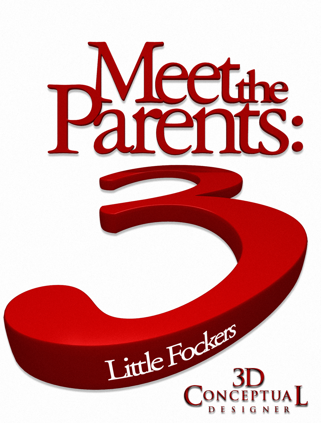
Project Review: Meet the Fockers 3: Little Fockers 3D Title Treatment Designs 2010


 I was asked to do some extreme angles on the type as what you see above was one that finished out.

 This early concept did not make it to the presentation, but it was a fun experiment using just type in two colors only for Little Fockers, the third film in the Meet The Parents trilogy.

 Using the parts from the above Little Fockers comp I moved the camera up top to look down and changed the layout up a bit , and took out Meet the Parents too.


 This was done for the 30-sheet and billboard presentation, they wanted a huger render at 10K wide for this pass.


 This version has the main type on a wall in back with a curved cyclorama feel, with the tag type below at a 45 degree angle.


 The main "Meet the Parents" 3D Logo model is floating above the white wall with the "3" hole cut through, with the main tag inside the three cht-out, floating as well. I upp'ed the color bounce to get the red to bleed a bit more in this pass.


Project Review
Meet the Fockers 3: Little Fockers
3D Title Treatment Designs

Client: Universal Pictures via The Cimarron Group.
Art Director: Calvin Sumler.
Project Date January 2010.

Some jobs are not about complicated detailed 3D Logos, I have done plenty of those, this job for the third installment of Meet the Parents, aptly called, Little Fockers, was about clean simplicity. 

Red and white in color, and that is it. The font was locked from the prior films, so our basic exercise was to develop a series of 3D takes, or looks on the main title for the Key Art presentations they were doing at The Cimarron Group.

I put a bit if a rounded extrusion to the font for this project, to soften the edge a bit, and I used my Car Paint material I developed using the Final Render Plug-In in 3DSmax. We did positive extrusions and cut outs, big letters, and small, and different planes for each part of the title as well. I even finished this out in 3 other languages.

Now it did end up finishing for some International Poster work, but the US posters were all just a 2D Logos, though the process and working with a great Art Director, like Calvin,  is always a fun deal.

Cheers, THOM

Thursday, November 10, 2011

Project Review: The Phantom 2040- PARTLXXXVI [86th]-More Vehicle Schematics


A Section of the Assault Transport Vehicle I have here, and here.


Sean One Lived in Space on Trumball Platform a Huge Space Station, and this was the cut away sectional view


Dr JAK's Multi-Cruiser 3 -View with the original Ball Prop out back.


A Multi-View of Kit Walker/The Phantom 2040's Multicruiser with both modes shown in front view with the skull face open and closed.

Phantom 2040-PART LXXXVI [86th]
More Vehicle Schematic Sketches


Client: Hearst Animation Productions.
Art Director: Myself.
Project Date Spring 1993.


This is my 86th posting here on my design blog for my contributions to The Phantom 2040. I have put up a few added schematics, and multi-view drawings, for some vehicles from the Television Animated Series that I created these designs for, so the animators and layout teams were clear on the basic layout of the various vehicles.

I was trained in Architecture, Product Design, and Transportation Design and doing Mufi-View Renderings or Parts Drawings is a standard need when sending any design to another person.

This is the most vital tool to ensure that the design will, or can be followed accurately. It is always the designers responsibility to make sure whomever executes the final design, that they have adequate information to follow through.

If you are a FAN of The Phantom 2040, and on FACEBOOK, there is a group dedicated to the show here.

There is a TAG on the list to the RIGHT for other Phantom 2o4o entry's, but you can click this as well.

Cheers, THOM

Wednesday, November 9, 2011

Project Review: Heat on DVD Home Entertainment Motion Graphics

 The style Board Frames for the Vault opening "wipe" I made for the editor to use for the DVD release of HEAT.


 The TV spot ends with the Heat DVD up from the bank vault drawer and the disc animated out the side.


 As we travel into the vault I did the "waiting room" to enter the lock box room.


 Here is a Geometry view showing the structure of the High-Rez 3D Models I built as a two wall set for the last shot.


Project Review
Heat on DVD
Home Entertainment Motion Graphics

Client: via The Cimarron Group.
Art Direction: Paolo Ledesma, and Sejal Patel.
Project Date: November 2004.

Back from 2003-2009 I ran a small "One Man Army", 3D Design department in-house at The Cimarron Group, and The Home Entertainment Department, was one internal client that I did 3D backgrounds still and moving for the motion graphics pieces for on various DVD releases, and HEAT, being one of my favorite movies was a joy to do a few things for.

All images were bank vault related, from the big thick door swinging open, to the drawer opening up in the vault itself, with the DVD that animated out and the Disc rolls to the side[ as usual].

I built all 3D models as high-rez only models at the time, today I would do quads to get a bit more derails, but it still holds up after seven years alright in my opinion.

Cimarron still sells a few parts from the scene at Turbo-Squid, and you can get the little key and lock here.

We also re-used the vault door[ I made it taller] for the film Jumper, a few years later, at Cimarron as well, you can see it here.


Cheers, THOM

Tuesday, November 8, 2011

Project Review: The Phantom 2040- PARTLXXXV [85th]-Misc Small Props

 Maxwell Madison trained in this Virtual Reality Training Sphere to fight The Phantom.


 For one flashback sequence, Graft and the Phantom[ 22nd Kits father] fight and this was one of the "sharp edged" older styled weapons.


 Another sharp edged older weapon used by NIA.


A Sleep inducing headband was a simple prop but I took time to develop the way it opened and animated as it was used. Years later saw one in Minority Report as the writers used real tech to develop the shows.

Phantom 2040-PART LXXXV [85th]
Misc. Color Key Marker Rendering


Client: Hearst Animation Productions.
Art Director: Myself.
Project Date Spring 1993.


This is my 85th posting here on my design blog for my contributions of Art Direction, and Head Conceptual Designer roles for The Phantom 2040, and today I am posting some more small props I designed during the time I spent on the series for almost 3 years at Hearst Animation.

FOr a world of the future everything needs to be designed from a small plate or form all the way up to an entire city. Every vehicle and prop needed to be themed to a few eras since we would regularly falsh-back since this Phantom was the 23rs in a long line of Phantoms, so 2040 ans 2020, and even 2010 were visited in the series.

Today is a sampling of what I had to design each week for each new script.

If you are a FAN of The Phantom 2040, and on FACEBOOK, there is a group dedicated to the show here.

There is a TAG on the list to the RIGHT for other Phantom 2o4o entry's, but you can click this as well.

Cheers, THOM

Monday, November 7, 2011

Project Review: Monty Python's Spamalot at the Wynn Casino 2006

 A rounded bevel and holding plate, but no deep extrusion on this Monty Python 3D Logo. All letters overlap and are rotated to read.


 Here is the above logo extruded back into space along with a dropped camera angle to accentuate the depth in the 3D Logo.


 I did an all red version of the Monty Python Logo as well using a dirt shader to darkened and age it up a bit.


 I also was asked to go back to the first top concept and do a straight on with deep extrusion version as well. This 3D Logo version I did almost made it to final.


 Here is what finished as final: The Monty Python  3D Logo, the SPAMalot 3D Log, and the mark for Wynn Casino.


 A little pick-up was to do a web tag to match the font in Monty Python so I built this out and gimbaled the letters with this to match.


Project Review
Monty Python's Spamalot at the Wynn Casino 2006

Client: The Wynn Casino Las Vegas via The Cimarron Group.
Art Director Mary Ellen Schrock.
Project Date: August 2006.

I did a variety of 3D logos over the years when I was the in-house 3D Design Department of One[ a.k.a.: The One Man Army] at The Cimarron Group in Hollywood, CA, and being a huge fan of Monty Python , when Mary Ellen brought this job to me, I was very excited to take a quick stab at it.

The Logo was locked in , all they wanted to see was a dimensional version of what they had been using for a few years, so I did a series of 3D versions or, interpretations of the 2D into 3D.

What worked well since the original logo was all overlapped text, where the kerning[ spacing betwix the letter forms] was negative, I decided to gimbal the text at 5 degrees to allow a trailing and facing edge to accentuate the overlap, you see that in all the titles I did.

For Spamalot and the Wynn casino, I did simple extrusions with some color modifications. A quick 4-5 hr gig that was a fun solve though whith a locked pallette and design and just over half a day I needed to work fast.

Cheers, THOM

Wednesday, November 2, 2011

Personal Project: My Bubble Car Design 1989-2011-PART III-More 3D Color variations


A Candy Paint in Magenta done using Cebas Final Render 3.0 for the renderer.


Here we see My Bubble Kar in Dark Moss Green Metallic Paint


Candy Apple Red! BAM!


A Dark Espresso or Mocha Metallic Paint, that rolled real dark as it falls on the back shapes. This was to emulate an old Candy Apple red technique where they would shoot black paint in the body folds to appear even deeper in the shadows.


I even did one in Bubble Car in basic primer grey to get the lighting down for a flat paint set up as well


Here is the Bubble Car is Suede paint, or a flattened black popular in the current Hot Rod culture.


Personal Project
My Bubble Car Design 1989-2011
Part III- More Color 3D Renders

This is my third post covering my personal project on My Bubble Car that was started back while I was still at Art Center in Pasadena CA. back in 1989 during my thirst term in Transportation Design 1. You can view the original design from that era here.

Today I am posting a few added color variations that I did back in 2007 on the project. I had a double use for the tests. I was setting up a base scene for a car render in the various colors so that when a job came in, like Mitsubishi did, I was ready to light and render a car fast in any color that they would want.

One thing I did was to meet with a fellow A.C.C.D. grad who specialized in Automotive Photography, and Jerry Garns was very helpful to our whole team of myself, Goutam Mitra, and Dean Fowler on a Honda pitch. we eventually won.

One thing I knew, and was reinforced even more, is that the car color requires a new light rig for every color as each paint scheme reacts very different to light. Lighter colors will wash out with the bright lights needed for a black sleek render, and a darker lighting scheme for a bright paint is too dim for a dark car paint as well.

Also as a Hot Rod and custom car enthusiast, I had to do a suede paint, or flattened black look in there too, I was inspired by a friend I do 3D design work for, Coby Gewertz in the Movie Poster world, who dubbed the Bubble Car, the future Model-T, ...the next T-bucket. It needs some Von Dutch pinstripes though IMAO.

I plan to revisit the design in the next few months if I have some downtime, to continue the design, as I have not touched it in over 4 years, and I am way past due, but I have been busy, so it can wait if needed.

PART I: here

PART II: here

Cheers, THOM


Tuesday, November 1, 2011

3D Conceptual Designer Thom Schillinger Finishes Year Two!


The 3D Conceptual Designer Design Blog 
Marks Completion of Year Two


It has been two years as of today [NOV 1st ], that I officially launched this design blog for the work I do in the entertainment and other industries as a 3D Concept Artist and 3D Designer.

I thank all my clients, both new and old, for the business that they bring to me, and I am grateful that I get to do what I love for my living. I specifically can thank The Cimarron Group, for closing my 3D Department in OCT 09', because had they kept me there in-house , I would not have this 3DCD design blog, and also would not have moved to a self supporting position that I enjoy today. I also still get a chance to work with the fine folks who remain there at Cimarron, so it is the best of both worlds.

I have now posted 2,931 images from the work I have performed over my almost 20 year career, and I plan to continue the Design Blog moving forward. If you have not tried the Google Search Bar above, on the LEFT, take a spin, it helps sort through the almost 3000 images found on my Design Blog here, and assists you to finds posts quickly for reference.

This year marks the first time a product is to come to market I have had the privilege of designing, and for me the Sure Grip International Avenger, Quad Speed and Roller Derby Skate, is my first product design, or is it Transportation Design, it has wheels!

I also am back Imagineering again for "The Mouse" over at WDI doing Theme Park Designs, I always loved doing work for them, as the end product is a real world design that can be seen and felt, and for a 3D CG artist, that is refreshing!

I have done in the past 8 weeks, a huge volume of work, doing 60+ hour weeks, and working on some big name properties, I have had more fun in the last 60 days than in almost any time prior, and a good portion of the work is with new clients and great new Art Directors. In the weeks and years to come when I am free to post this newest work, I hope you all enjoy it.

Thank you, to all who visit this site, as I begin year three today...


Cheers, THOM


Monday, October 31, 2011

Personal Project: The Akira Kaneda Bike: A Re-Visioned redesign 1.0

 Here is the base mock-up pf the bike[ half day] rendered in Quads for massing.


 A front 3/4 view with the massive springer front end on Kanedas Bike prominent in the design.


 A rear 3/4 view pf the Akira Bike Re visioned, showing the single sided swing arm rear area with the shock mount exposed as well.

 
 A simple side view, a bit high up, of the Akira Bike Re-Visions internal structure.


 The base parts exploded out in this view of the Akira Re-Vision.


Personal Project
Kaneda's Bike for AKIRA
A re visioning Experiment.

Akira holds a close spot for all Art Center Grads like myself, it is a must see film required by all Transportation majors informally in the program. Simply put, it is a masterpiece.

My associate Dean Fowler over at Machine Films, offered me an invitation to join in Project Akira he is on to develop a "what if", from me. Every transportation design major, has envisioned this bike at some point in their career, it is a perfect fun package, with a full recline sit down rocket bike, what could be more fun!

I am an avid biker and after having owned a Ducati, I am a huge fan of using the frame itself as a main focus of the design, not hidden as in the original but much more a Hooligan or 'naked" bike as they call it in motorsports, so that is where I started.

As with all transportation projects, I started with the base 95th percentile male figure, seated him, and built the frame around him to the close proportions of the original adjusting to allow the bike to actually function as a real vehicle, to fit the engine and items needed to ride this beast. 

I am building this out all as an all subdivision surface model, so what you see is the blocking Low-Poly views showing the base design elements from the hyper springer front end, to the tipped V twin 150ci down low, to the single sided swing arm with internal oil tank. 

The finals will be as close to the stylized Photo Real I do for most all my projects

This is just a first post, as I have about a half day into the project, and thought I'd post this early, so I can show regular updates as I revisit the design and you can follow the progress.

        Cheers, THOM

Friday, October 28, 2011

Project Review: Green Lantern- Key Art 2010


 The Iconic Lantern for the films One Sheet was designed by someone else, yet I had to replicate it for a Poster alt as show here.


 All rough metal Green Lantern Logo with type and the lantern layered for the client.


 A Green Lantern Title with a holding device plate of bevels metal done in 3D for the Key Art presentations.


 This is an Alt on the above font without the background plate, and I extruded it way back and pulled the end down to exaggerate the forced One-point perspective look they were after.


 The client requested a Generic blurred soft chrome look for the Green Lantern Logo in 3D


 A Green Lantern Logo with a tint of green to the rusted metal plates.


Project Review
Green Lantern 2010
3D Logo exploration for Key Art Presentations

Clinet: via Art Machine A Trailer Park Company.
Art Director Rigel Morrison.
Project Date: December 2010.

This is the frist job I did for Art Machine back about one year ago, for the Superhero flic Green Lantern, currently on Demand now, so I thought I'd post the Logos I did.

This was a relatively short project, and I spent a bit on the Lantern Icon first, as I had to match texture and lighting to someone elses 3D image, and they had no access to the files.

A good portion of the work I do is to "re-do" a logo that existed in a 3D form, yet is not available to us for the alt. Sometimes, like with this, it needed to match very close, but in most cases,  I am given a bit more room to explore, but this was late in the game and the client just wanted an alternate view.

I then jumped to do about ten, or so 3D logos for the film. I have done a few dozen Superhero logos in the recent past, so this is a standard request I get, and with the popularity of Superheros as the source for films, I get a good amount of these fine jobs.

Funny I did Green Hornet and Green Lantern work the dame week!

Cheers, THOM