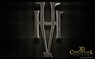
A very early pass at a Van Helsing Icon with two separate Initials with a holding device in gold for each. We call this the "Tomb Raider" pass, since they liked that logo so much I did almost every 3D logo in that two layer look while I was there.
A modified version of the above model from Van Helsing, with a deeper extrusion and a lot rougher of a texture to this 3D logo.
A triple layered V-H tiled back from camera with a procedural texture used for the chipped metal feel.
A pinched bottom on this design for the advertising of Van Helsing done by me in 2002-3, with a very deep brass sided extrusion while using a rough steel fell up front.
A straight on shot of the prior model re-textured now with all the parts having that rougher pitted galvanized metal.
An early Sub-Surface Scattering test using the great renderer from Cebas, Final Render version 0.
A two layer red glass with a bit of back glow. I also removed the "H-bar' out of the center of the V this round for a clearer read.
Here is a version I dubbed, "The Mood Ring" as it was a glass encased VH, for Van Helsing as if it were in a ring that main Character wore.
Project Review
Van Helsing 2004
Icon Logos PART II
Van Helsing 2004
Icon Logos PART II
Client: Universal Studios
Art Director: Hunger Lam
Project Date: Fall 2002.
I had not posted my additional Van Helsing 3D illustrations that I did a decade ago while in-house running a little 3D Design department at BLT and Associates, so today I have put up part II covering some of the VH-Icons I designed out utilizing the Initials that was to be used as a teaser Icon, though we ended up using the Vampire Stake I made instead for this purpose seen here, and here.
As a product of the 80's I found it difficult to not think of Van Halen the entire time I made these, though I had great time doing these different looks, since they gave me some room to design a bit on most projects at BLT.
For some clients I am a just a wrist, and others but my grey matter is a bit more of a factor, but either way I love the work.
This was an early use of the Simbiont Procedural Textures now have as a permanent part of my little production pipeline I have in my home studio now.
You can View PART I here.
Cheers, THOM
As a product of the 80's I found it difficult to not think of Van Halen the entire time I made these, though I had great time doing these different looks, since they gave me some room to design a bit on most projects at BLT.
For some clients I am a just a wrist, and others but my grey matter is a bit more of a factor, but either way I love the work.
This was an early use of the Simbiont Procedural Textures now have as a permanent part of my little production pipeline I have in my home studio now.
You can View PART I here.


No comments:
Post a Comment