Thursday, April 11, 2013

Project Review: Paramount Home Entertainment-The Blue Standard: 3D Logo Exploration 2008

 A thin extrusion with the metal plates front and back with a blue glass layer sandwiched between them.


 This is an alt on the above file with the camera dropped down and the text extruded back 50x to show a deeper and heavier icon.


 This was the scissor move we did for MGFX[ Motion-Graphics] animations where the top Icon and the type spin in opposite directions, and this logo was a still frame from that move.


 A version with a very heavy font: Same metal and glass build for all concepts.


 A very deep extrusion was added tot he type here and the glass sows off a good amount of refraction artifacts which in motion were very compelling.


 A wide format Logo design with the Paramount mountain and Stars tilted at 45 degrees and placed at the end of the type treatment.


 Here is a thinner version, one of my personal favorites, though they went 2D in the end.


Project Review
Paramount Home Entertainment
The Blue Standard
3D Logo Exploration 2008


Client: Paramount Home Entertainment via The Cimarron Group.
Art Director: Darren Keller.
Project Date: July 2008.

I ran an in-house 3D Design Department over at the Cimarron Group for about six years from November 2003, to October 2009. I came into Cimarron back in 03' and set up the 3D Design Department to provided 3D Design, and 3D Illustration, and 3D Animation services to the multiple internal divisions. It was like having a set of seven dedicated clients, and I regularly got a quick little half day gig like this one I am posting on today.

Often in the process of designing a logo for a client, each division would ask me to add dimension to the look they had established, and do a pass with a 3D logo and the divisions would come to me to assist in the presentations.

For this posting I did a quick pass at a few concepts that the client had picked out to make dimensional, and I proceeded to do a few versions of each file with a flatter,and a deeper extruded version to see. Four hours of work is a typical 3D Logo base time frame for budgeting, but I do get ultra minis, like the finish for The Expendables, that was about 30 minutes total, but 4's and 8's rule the day for the most part.

All the colors were locked up front, so blue and brushed metal was the choice of the day so I set the files up and rendered thru the various comps and delivered to the Home Entertainment Department. They went 2D in the end for the finish, but it is always fun to experiment with a three dimensional look.

Cheers, THOM

Monday, April 8, 2013

Project Review: Menagerie Creative-Steampunk Styled Website 3D Design Illustrations for user interfaces 2009

     The final Rolodex design concept I designed out and rendered in 3D back in late 2009.


This ambient render shows the geometry in the build.
 

A 3/4 angle shot on the depth in the scene.


The polygon shot shows the cabin from the flying luft-craft I did here was reused.


The mail screen as a final render.


       The polygon shot of the main web-mail interface I helped design and build in 3DSmax.


 This 3/4 shots shows a few parts were 'faked' to match some of the 2D Art Direction I received.  Sometimes it is faster to quickly match the 2D and back-fit it later


 The 3/4 view in polygons for the mailbox scene I did in the steampunk look for Menagerie.


Project Review
Menagerie Creative 
Steampunk Styled Website 3D Design Illustrations for user interfaces 2009


Client: Menagerie Creative.
Creative Director: Cheryl Savala.
Project Date: November 2009.

I was asked to help out and design a steam-punk styled website to match the logo flying craft I helped out with here, so I created tow main screens for the website design and we can review those now.

The first design of two, was a Rolodex like address roll design for the site that would be animated by Dean Fowler once the design was locked. I created a few versions for Cheryl and rendered out a still for approvals. Once this was done I sent it off and Dean animated it and got sign-off with Cheryl for the move itself. I then took it back and rendered out the moves using my lighting and rendered.

I next did a communications interface with a mailbox that would animate up turn, and open on up. I did a few rounds in 3D Design on that one as well. Once the still image design was locked and tweaked out on their end, we got the animation over to Dean to lock in all motion as well, then I rendered the finals again in Cebas' Final-Render product for the finish.

A fun project to design and implement, and I always love working with a great motion designer like Dean.


Cheers, THOM

Thursday, April 4, 2013

Project Review: 'Certirad' 3D Illustrations for Print Advertising 2009.

The final 3D Illustration I created for Rhythm and Hues back in 2009 for a new medication called Certriad.


The first pass on the building blocks 3D Conceptual Illustration I created.


For the final we flipped the camera around in 3D space, and added a lot more of the secondary blue color that were the specified ones for the project.


The first pass F1 layout was from the back, and we eventually flipped it around.


Here is the final render with 2D post work over the 3D render. We added another step in the transition so I built a third F1 morph car to complete the job.

Project Review
Certirad 3D Illustrations for Print Advertising 2009.

Client: Astra Zeneca and Abbot via Rhythm and Hues.
Art Director: Marta Knudsen.
Project Date: Dec 2009.

Today I am posting some conceptual 3D Illustrations that I did in December 2009 for Rhythm and Hues for a possible new drug called Certriad. I always loved R-n-H jobs, as they allowed me to actually design quite a bit in the process, and with this job it was three concepts to create.

The basic concept was a hand pushing a small child's toy in stages morphs into an actual fully detailed 3D illustration. I started with the toy train to a high speed one, and once we were well enough on that, I moved to the "Lego" concept with little block building morphing over to a full modern skyscraper. The last and most fun one was the F1 race car from a push toy concept.

I built out the 3D models in the various stages and composed the shots first to get approval to go ahead. I then tweaked and painted quite a bit in post work in PhotoShop to complete the advertisements, which were a two page wide format spread.

A fun project that unfortunately was cancelled due to the company stopping the move ahead with the new drug. Sadly Rhythm and Hues filed for bankruptcy a few months back so I will miss these great concept 3D Illustration jobs from them.

If you want to see added Rhythm and Hues work I have done, you can click here.


Cheers, THOM

Tuesday, April 2, 2013

Project Review Solar Energy Robot Design 2011 PART II

The Final Design with the Character Design Sheet with turns: Full render Medium REZ.

The base Quad Polygon Models for the Turn Around.


A simple pose with the head up.


A Worms Eye up angle shot on the Energy Robot I did for The AIM Agency.


The final was to have minimal "anamatronic" use, so the arms would move around to greet folks at the conventions.


A a subdivision model it is good from long shots, to close ups and the data can be used for 3D printing of the parts with the subdivision set high, or it can also be converted for Solid Works data as well with this.

Project Review
Solar Energy Robot Design 2011
PART II

Client: The AIM Agency.
Art Direction: Jeff Symon.
Project Date: October 2011.


This is my second posting on this little "Energy Robot" I designed out for the AIM Agency here in California back in 2011, and today I cover what we ended up with as a final to be built out for the convention use.

Shorty, as I called him became that way when I took out an entire digit from the legs to bring the size of the Robot to a proportion so we could get a bigger touch screen in the chest. I also simplified the solar arrays and wrap mounted them right onto the "Bot".

The character "Sunny" a Solar Energy Robot also needed some sunglasses added to give him a bit more fun in his disposition, so they were built as well.

The client liked the Golds Gym bodybuilder feel to him which was a bit intentional as I called him a Shorty Terminator, and the glasses helped that out as well.

It is always fun doing Robots.

You can view PART I here.

Cheers, THOM

Wednesday, March 27, 2013

Project Review: Blockbuster Video- Pavillion: Themed VR-Cafe 2001

 The final shot rendered out over a decade back for the Blockbuster VR Pavilion Concept.


 A Z-Depth pass so post work is easier was also generated. Grey scale is based on camera distance so Tilt-Shift and other FX can be added in PSD.


 The Mesh of the scene is all medium to higher rez, no quad-modeling back in 2001 for me yet.


 A birds Eye view outside the Themed Attraction Pavilion[ with the roof hidden] to show the extent of the build.


 A  close up shot of the balcony rooms with glass swing up enclosures.

Project Review
Blockbuster Video- Pavilion
Themed VR-Cafe 2001

Client: Blockbuster via Luc Mayrand.
Art Direction: Luc Mayrand.
Project Date: Summer 2001.

Over a decade back in 2000, I did my first Theme park design project with all designwork done in 3D for WDI on the Millenium Village Scotland Exhibit back right before Y2K. 3D was just getting good for projects like this so I jumped in.

So a year later, I was reconnecting with Luc Mayrand, whom I worked at both Landmark Entertainment, and Walt Disney Imagineering with, and he wanted me to block out his design sketch in 3D to help assist the pitch for the project.

I built out the 3D room and we did about 30 rounds back and fourth until the design was locked. I then rendered out a large 3000 pixel wide shot which back then was a good 7 hour render to do. 

This is why we went without full textures as this was a design pitch concept so the money would come later on if it was approved to go.

Sadly it was scrapped, but a fun project none the less, and it was a foreshadow of a whole lot of what I have done since then using 3D as a great 3D Design tool.


Cheers, THOM


Monday, March 25, 2013

Project Review: Steath "Blackhawk" Helicopter for Key Art 2012

A low side view on the Stealth Blackhawk Helicopter 3D Model I built for Key Art for Cold Open.

A Low angle 3/4 front view with a darker carbon-fiber like surface.


A view up from the ground on the stealth blackhawk.


A direct side shot of the Stealth Helicopter


 Here is the model with one level of subdivision to add enough detail to the model for a good mid-level render.

 The front view on the base poly model with all subdivision removed.


 A shot looking up at the 'copter belly.


 The same view with all subdivision removed[ base model].


 The 3/4 side shot showing the subdivision surface.


 The Low Poly count view from the same camera angle.


 A shot from overhead showing the vents and details around the main rotor.


 Here is the Low Poly of that same shot of the Stealth Blackhawk.

Project Review
Steath "Blackhawk" Helicopter for Key Art 2012

Client: Cold Open 
Art Director: Gardner DeFranceaux
Project Date: March-August 2012.

A year ago I began a little 3D build for a regular client of a ultra modern Stealth "Blackhawk" Helicopter used for covert missions for some key art use they had so off I went to build it out. As with most advertising deadline I had under one day to build it out and get a set of renders over att various angles with some 3D blur on the main bladed so they could quickly comp the thing into the Key Art.

I was given some scrap reference to follow and I built out the Helicopter as a subdivision model so we could up the resolution for close ups, and lower-rez was good for grouping shots.

All the little angles and honeycomb parts were all hand built for the final object. I was not tasked with landing gear, or an interior at the time, so I built the model as an outside only model with no interior.

A fun build, as a Transportation Design graduate from Art Center, if it moves we MUST build it! :o)


Cheers, THOM

Thursday, March 21, 2013

Project Review: Out Takes PART VIII Universal City Walk Mall 1992


A round two pass for Out Takes with the curved front look final design with wood and bronze accents up front.

The first rougher design sketch for the tubular space frame look that did end up as the final design here.


 This first sketch defined a simple bump curve that was off center on the face of all designs in this category. It utilized a sandwich approach to the materials with a thin strip of wood or bronze showcased in the steel structure.


Project Review
Out Takes PART VIII
Universal City Walk Mall 1992.

Client: Out Takes Via Eric Allard at All Effects.
Art Director: Eric Allard.
Project Date Summer 1992

 Sorry for the lack in posts, I was very ill, but I am up and going today so I have a new post.

In this my eighth posting for the design work that I performed for All Effects back in 92' on the City Walk Out Takes Furniture, Cabinets, and Camera structure designs, I have posted today some added concept designs I did as I worked out the final designs for the main desk that the operator worked from in the public window showcase.

Out-Takes was a blue screen photography studio at Universal's City Walk Outdoor Mall in California back in the late 90's, and the motion cotrol rig was the basis for the final design with the girder framework and matte-black baked finish, but we did experiment in half a dozen directions as todays added sketches show.

The process started with about six looks with a few alternates on each. I then narrowed to two looks the girder, and the "Lexus" we called it with the curved wood sandwich layers as seen in the face ans side of a few designs. They picked the girder as it matched the industrial look of the main equipment that filled the store and it was cheaper to produce as well.


Cheers, THOM


PART I is here.
PART II is here.
PART III is here. 
PART IV is here. 
PART V is here. 
PART VI is here.
PART VII is here

Wednesday, March 13, 2013

Project Review: Jack The Giant Slayer 2013 Key Art 3D Illustration PART II The Rock-Head Sculpt

 Here is the side render of the rock head sculpt with the beanstalk from my first post here.


 A low poly base render of the head sculpt I built for Jack the Giant Slayers Key Art.


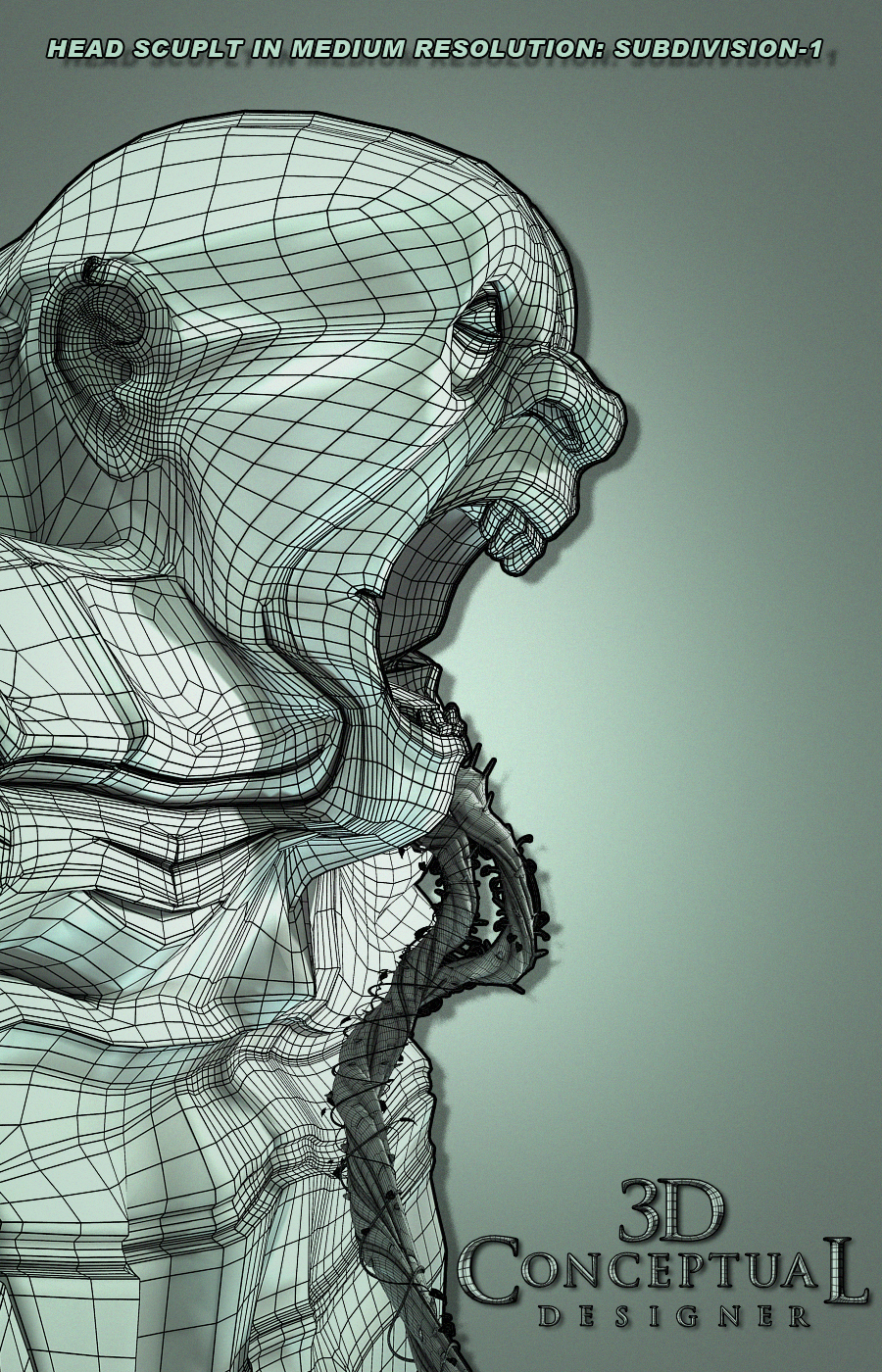
 For long shots I used only one level of subdivision as seen above.

 
 For closer shots here you see the geometry subdivided at a higher level of 2 rounding and softening the shapes up.
 

 A 3/4 front view on the stone sculpt from Jack the Giant Slayer Key Art production.
  

 The Low resolution base mesh as built before subdividing.


 Here is the mesh subdivided at a low level.


 Here I show the base mesh with subdivision on with two levels.

Project Review
Jack The Giant Slayer 2013
Key Art 3D Illustration PART II
The Rock-Head Sculpt

Client: Warner Brothers Pictures via Cold Open.
Art Director: Jeff Barnett, Gardner Defranceaux.
Project Date(s): Intermittent from Summer 2011- February 2013

I had the pleasure of working on the recent Key Art Movie Posters for the new film, Jack the Giant Slayer, and today in my PART II posting in the series, I will cover the head sculpt that I did that was used in the final artwork here.

Building out any face is a good amount of work, especially in the fast paced world of print advertising, since you will only get a day or less as the typical deadline is that same day, so you gotta work real fast.

The head sculpt was to be comped into some existing terrain shots they had, as they needed the head at a variety of angles for some waterfall mouths, and this is where building it in 3D shines, since you build once, and render twice[ or multiple times], rather than paint out for each view which is a time consuming process to matte paint these out each individually.

This project spanned three years of work, and a few versions of 3DS-max[ 2010, 2013] so I had to re-link and revise these files in production as well on this model too, but all part of production.

A fun project, and I may have a post or two more on it in the future.

Cheers, THOM