Tuesday, December 10, 2013

Project Review: Master and Commander:The Far Side of the World- 3D Illustrations for Key Art 2003

 There were a few comps on deck looking down so I did a series of birds eye shots on the cannon model I made for Master and Commander:The Far Side of the World back in 03'


The polygon shot from above showing the simple build[Pre-Quads for me]
 

A rear view of the cannon was rendered out for a few comps as well.


The poly view of the back of the Cannon.

 
We did some detailed shots of the firing mechanism so I put a good level of detail into the hammer and spring flintlock like tech. So Fun to make!

 
The wireframe.


A Side view of the Master and Commander Cannon from the virtual Photoshoot.


A lower 3/4 front view of the 3D Model.


A true birds-eye looking down on deck with the cannon


 An exploded parts view showing the various pieces and construction for the 3D model.


Project Review
Master and Commander:The Far Side of the World
3D Illustrations for Key Art 2003

Client:Twentieth Century Fox Film Corp. via BLT Communications.
Art Director: myself.
Project Date: May 2003.

When I was in-house in Hollywood running the 3D Design Department at BLT Communication back in 2003, I was regularly utilized in building out virtual props for various Theatrical, Home Entertainment,and Video Game key art, and today I am covering a 3D Cannon I made for the Film Master and Commander: Far Side of the World back in 2003.

BLT used me like a photographer, in that I would shoot virtual shots of various props for comp presentations for key art.

I was a one man show for these illustrations, so I would research, build, texture, light, and finally shoot off a series of 3D Images that the various Art Directors could use in the comps they were pitching for the finish. 

I usually had a day or less for these type of things, as the need came up that day, so I had to work very fast. As an artist you always want more time, but in the world of advertising that is not the way it works, where as in film and television production, you get a great deal of time per image.

The cannon you see above was a typical small gig I had on a daily basis, fun and new each day.

Cheers, THOM

Wednesday, December 4, 2013

Project Review: NINE-2009 PART II-More 3D Logos

In my first post for the film Nine, you will see parts from this logo there, here is an alt floating at a worms eye view with some volumetric lighting added in post. 


 I did a series of glass versions for a few type treatments given to me by the great team of Art Directors, and this one sitting on a gloss black backdrop allowed the caustics reflections and refractions to be highlighted.


 An aged smooth concrete/metal like texture with a strong warm to cool lighting color environment. We tried all lower-case for a few passes for the film title in 3D for Nine.


 Another 3D Glass logo that I built out as hollow to get the brighter edges and internal caustics. I lit this one with a more warm set of lights and reflection maps.


 An Old Subway tile feel to this 3D film Logo. I used a procedural shader for this one and the mapping wraps well.

 
 A Single Point Beveled type treatment in severely water damaged concrete. A combo of procedurals and bitmaps for this 3D Logo design pass.


 In Part I you will see posted this metal grate logo over a matching window with volumetric lights shooting out, and they liked it enough to render just the 3D virtual iron-work by itself. I went with a more aged copper in the shader for this pass though.

 
 A blocked out version of the 3D Nine Logo for the film,  built out from a vector pass with a good amount of noise on it to feel like a paint stamp.


The same file in a flatter plate with some simple scaffolds behind it similar to this more detailed version I posted in PART I


Project Review
NINE-2009 PART II More 3D Logos

Client: The Weinstein Company via The Cimarron Group.
Art Director(s): Calvin Sumler ,Chris A, Hawkins, and Joseph Stamper.
Project Date: Spring 2009.

The successful Broadway Play "Nine" was made into a feature film and today I am posting another set of 3D Logo concepts I built for the Theatrical Print Advertising campaign while I was still the in-house 3D Design Director at The Cimarron Group.

This was a very fun project for many reasons , but mainly because of the team itself. I cannot emphasize enough how important to creativity the team attitude and work environment is to create great work, and with this team, I was stoked.

I did many variations with a wide range of materials and found objects, and was given a full week to build out the various designs that we came up with.

Sadly for me, the client went to pure 2D flat white logo for the finish, but it still was a fun ride going through the motions.

You can view my first post PART I here.

Cheers, THOM

Monday, December 2, 2013

Project Review: ICE AGE 2:The Meltdown-Motion Graphics work Part II

The main final FOX Marque I did for Ice Age 2 was sans the snow with the smaller cracks in the ice material .


 Here was the same version with the snow caps added back in.


A greener version with a smoother surface was another pass I did for Ice Age 2.


This one had a rough pumice type of Procedural texture applied to the ice to make it more rustic.


This one used a hammered look with sharp edged cup like bumps over the ice materials.


 Here is the final model I built for Ice Age of the TV FOX Marque.


 An overhead shot showing the simple Ice Age FOX Marque scene in 3D.


 I always give the teams I work with a Z-depth mask so they can select the pixels based on distance from camera to save them post production time and costs for adjusting full animated Motion Graphics sequences.


Project Review
ICE AGE 2:The Meltdown
Motion Graphics work
Part II


Client: 20the Century FOX via The Cimarron Group.
Art Director: myself.
Project Date: Summer 2006.

Today I am posting the second piece in the Motion Graphics 3D work I did for the film Ice Age 2: The Meltdown, from back in January of 2006, while I was in-house running the 3D Design Department at The Cimarron Group.

Today I am covering the FOX Marque 3D Ice version I built out for the project to match the cards I posted last week, that can be seen here. As with the text, I also built out a few variations as Ice materials for type can be tricky as it has serious legibility issues with the transparent and translucent areas on the 3D asset that can interfere with readability.

I experimented with various internal blurs and specular levels in the shaders to achieve a look that would work. I also did some with and some without some show on top of the ice parts as well.

A fun addition to the cards, to build out the FOX marque which I have done four times so far.

You can view my Ice Age 2: first post wit the cards for MGFX here.
If you wan to see my Ice Age 3 work you can go here.

Cheers, THOM

Thursday, November 28, 2013

Happy Thanksgiving 2013


Happy Thanksgiving 2013

Much to be thankful for, enjoy the Holiday!

Cheers, THOM

Wednesday, November 27, 2013

Project Review 2008 Honda pitch- 3D Shaders: Sketch and Graphic [Toon] PART IV

A sketch shader was used with an aged paper background for this 'Sketchbook" look I did in 3D using Cebas' Final Toon.


 The first pass was a bit dark and the lines were a darker value of the base color keeping the scene monochromatic.


 I adjusted the lines to a brighter color while still retaining the red in there for the next round.


 I went fully white for the lines in this Ink-n-Paint look. Note the reflections on the ground as I used a FR_Raytrace Map in the 'toon' reflection channel.


 A version with thinner black outlines for the last one.


 A small render test more realistic but styilized none the less. 
I learned better car lighting right after this stage of the project and can be seen here.


 The basic set up with the geometry from the Camera view. Harder shadows work best for toonz'.[IMAO]

 
 A Screen shot overhead showing the base scene set-up.


Project Review
2008 Honda pitch- 3D Shaders: Sketch and Graphic
[Toon]
PART IV

Client: Goutam Mitra
Art Director: Myself
Lighting Consultant: Jerry Garns.
Project Date: Fall 2008

In his fourth post for the work I did back at The Cimarron Group securing Honda as a client, today I have posted some shader experimentation work I did for the project to achieve a graphic 2D look using the 3D models.

During the project pitch I was asked to create these various looks for a Honda spot to pitch to the company and we went with a Graphic 2D look using 'Cartoon Shaders' in 3D to achieve this look. I had prior experience in 2D Animation, so I had a few things I addressed for the look including the line fill and shadow, as well as the the sketch styles.

These were eventually animated and cut into a few 30 and 15 second TV spots to sell them on the look. One big advantage is that the production time for this look is very reasonable in cost as the shader frames are one 50th the render time.

A fun shader project that though did not go to finish, I did gain valuable experience in setting up a 'toon' scene for production in a MGFX pipeline.


You can view PART I here,
You can view the 3D Logo work here.
You can view PART II just below in sequence to this post, or click here.
You can view PART III here.


Cheers, THOM

Wednesday, November 20, 2013

Project Review ICE AGE 2:The Meltdown Motion Graphics work Part I

A 3D Motion Graphics Card I rendered out in a custom made Ice-Shader for the TV spots for Ice Age 2 from back in 2006.


I also cut the type into these jagged blocks of ice as an alternate look that we went with on a few spots too.


I cut into the type and Boolean'ed out big areas of the type which helped to sell the Ice look they approved.


 Another Ice card from the Motion Graphics work from Ice Age 2 TV spots.


 I did a set of score cards that were 'lifted up into frame as wipe elements in the spots as well.


I hand built each card so the Ice shape and cuts were each unique.


A wider card that 'flipped' into frame[ with long renders per frame]


The final "Perfect 10" MGFX card I rendered out for the project Ice Age Two.


A shot of all the models I built out as polygon mesh models.


 A close up shot of the card models I made in 3DSmax.


Project Review
ICE AGE 2:The Meltdown
Motion Graphics work
Part I


Client: 20the Century FOX via The Cimarron Group.
Art Director: myself.
Project Date: Summer 2006.

Today I am posting the first in the Motion Graphics 3D work I did for the film Ice Age 2: The Meltdown, from back in January of 2006, while I was in-house running the 3D Design Department at The Cimarron Group.

For these 3D Cards, I was asked to create a block of Ice look to the type and various assets for the TV spots for the Theatrical Advertising campaign. Ice is not an easy look to make legible, so this was both a modeling and a texture and shader challenge.

I built out a few variations and they went with the blocks of Ice look for many of the cards as seen in the images above showing off various scores that were shown within the various TV spots.
I also applied that material directly to the text that was emulating the font in the title, though we went with the Ice rather than the familiar snow material as can be seen in my work from the third film here.

A fun job that lasted a few days, as we did quite a few TV spots with the various type cards rendered out in 3D.

If you wan to see my Ice Age 3 work you can go here.

Cheers, THOM

Tuesday, November 19, 2013

Project Review: Code Name: The Cleaner 2007-Home Entertainment Packaging

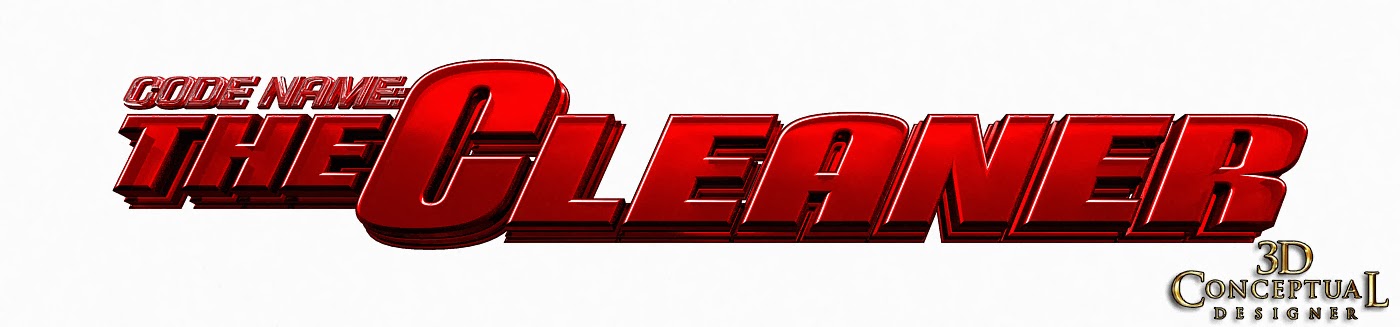
A flatter extrusion done early on for the 3D logo exploration I did for the DVD packaging for Code Name:The Cleaner.


 A fun glass deep extrusion version of the title in 3D.


 This version was an middle level extrusion with a black rubber holding device on the main title.


 For this version I added a brighter lower light to up-light the deep extrusion a bit more.


 A ruby glass version again and with this round I did all three plates on the main title in ruby glass and used green glass on the tagline.


 For this last round, I removed the holding device and rubber edge on the main title and did a hollow glass logo using the 3D Shell modifier in 3DSmax. You get good internal caustics with a hollow model.


 A version sans the tagline was done as well.


 The basic 3D Scene set-up for the 3D Logo. You can see the Rectangle Light[ box-light] up top of the frame.


A birds eye shot of the overall scene with the camera there in the lower right of the render.

Project Review
Home Entertainment Packaging

Client: New Line Home Video via The Cimarron Group.
Art Direction: Emily Fernandez.
Project Date: January 2007.

Back in 2007 while in-house running the 3D Design Department at the Agency The Cimarron Group I did many 3D Logos for Both Theatrical Print, as well as for the Home Entertainment division which would do the follow up Key Art of the DVD and On Demand release for the properties.

Today I cover the quick 3D logo exploration I did for the film Code Name The Cleaner.

A fast half day project was tasked to me to take the font they had locked in for the project and to do some dimensional versions of the type treatment as a 3D Logo. I built out the various plates and created a set of differing red material as this was the basic direction given by Art Director Emily Fernadez.

A fast fun little gig, typical of my daily work. Sometime I get a full day build of an entire city or location,a d sometimes I am able to fine tune a 3D logo for a few hours as I was afforded here.

I enjoy both types of work as they are both design challenges, and this allowed me to do a bit of material experimentation with the ruby red glass. 

Cheers, THOM