Friday, June 17, 2011

Project Review: James Bond 007:Die Another Day 2002 PART-II

A Simple Chrome double plate logo I designed for the Die Another Day ad campaign in 02'.


Here I used the glass material I worked out for the Walther PPK here.


A rough brushed metal logo with a smooth text overlay. This one was extruded with thicker rounded profile for more weight.


Using the thick Model I did for this version for Die Another Day in golds and a warmer palette.


We liked the feel of the larger holding bevel on this version with the glowing text, I did half a dozen alternates on this model for 007 Bond.


Die Another Day
James Bond 007
PART-II

Client: MGM via BLT and Associates.
Art Director: n/a.
Project Date:Summer and Fall 2002.

This is my second posting on "Die Another Day" the Bond Film I did 3D Illustrations and Logos for back in 2002 for the Theatrical release of the film. I posted the props I build and rendered here, so today I cover a few looks we explored for the type treatments.

While designing over at BLT and Associates I always had a fun project come my way, and 007 is a great property to illustrate for. I experimented with glass and ice as the teaser had a ice gun explode and we were tasked with a few looks to compliment that existing campaign. We also explored Golds and polished metals as well.

Cheers, THOM

Thursday, June 16, 2011

Project Review: Absolut Vodka "Bot Bar" PART III

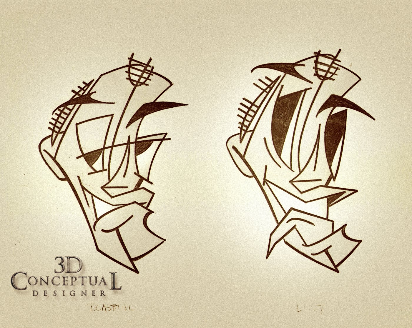
Here we have the emotions showing a smile and a "Come On", for the Emodicon chat room character "Rocker"


Here we see "Rocker" showing extreme like, and showing some lusting.


Here we have Ingratitude and Sly, for the Emodicon chat room character "Rocker"


Here we have Disinterest and Smirk, for the Emodicon chat room character "Rocker"


Here we have the base emotions of Love and Anger, for the Emodicon chat room character "Rocker"


Here we have Bummed out and fake, for the Emodicon chat room character "Rocker"


Absolut Vodka Website
"Bot Bar" Character Designs
1996
PART III


Client: Absolut Vodka via Troon Ltd.
Art Director: Chris Trages.
Project Date: April 1996

This is my third post covering the series of characters or "emodicons" for an online chat room for the website for Absolut that I created back in 1996. I was contracted by the Design Studio in Santa Monica, Troon LTD.

Here we see my designs for "Rocker" and older hip 70's and 80's rocker dude done in a Picasso-esque style as abstract art character for the chat room. I had a lot of fun with all of them but he was a combo of Eddie Van Halen, Animal from the Muppets, and Eddie Vetter.

In doing these emoticons with the variety of emotions I cannot recommend any higher the great work of Jack Hamm with his book on Cartooning as he has a veritable dictionary of emotions and what the face muscles do in each which made this task a whole lot easier to accomplish his book is here.

You can see the first character "Manhattan" here.

You can see the second " Trophy" here.

Cheers, THOM

Wednesday, June 15, 2011

Project Review: The Accidental Spy 2002 PART II=Gadgets

This "Pen" Gadget was to sit in Mr. Chans front shirt pocket in the poster.


A Tuff covered Walkie-Talkie I designed in 3D for The Accidental Spy Poster artwork.


I Handheld GPS Device made from Carbon Fiber I designed in 3D for the Project.


A Smaller Listening device[ Like a Quarter Sized Walkie-Talkie] I designed for Accidental Spy in 2001.


A PDA with a Glowing globe screen for the posters[ an early design]


Jackie Chan wore a special watch for the Poster on his punching hand at first.


The Accidental Spy
PART II Gadgets

Client: Dimension Films via BLT and Associates.
Art Director: n/a
Project Date: Winter 2001-2002

One of my early projects while running a small 3D department at BLT and Associated, was a direct to video release of the Jackie Chan Action Film The Accidental Spy, as I have posted the Logo that finished here a while back, so here are the gadgets I did.

One advantage in hiring a trained Product Designer is that when you ask of a gadget I can make one up in 3D while I go, which saves my clients time and cash. On most of these I had about 30 minutes each to design, build, texture, and render for the posters.

You will notice that most are warm glowing in color, and this is due to the finished poster background was used by my as the reflection so the p little gadgets would drop easily into the Art Directors comp ideas and match up. Here is the final finished poster.

The Main character played by Jackie Chan was a "James Bond" type, and they wanted him to be filled up with PDA's and spy watches etc. I had a lot of fun with the fast pace this one had.

Cheers, THOM

Tuesday, June 14, 2011

Project Review: The Phantom 2040- PART LXVIII[68]

Here is the 26th Phantom that visits Kit in 2040 with a respirator mask to breath with as part of his outfit.


I did an overlay over Kit to get the designs for the belt and cuff just a generation back in design for his father as The Phantom.[ 22nd]


This one was FUN! I really old phantom from a few generations back[ not the striped shorts]


Here is a sketch for Kit where I revised the sidearms from what another artist had done[ a bit too fat].


Phantom 2040-PART LXVIII [68th]
Phantom Character Designs for Other Phantoms


Client: Hearst Animation Productions.
Art Director: Myself.
Project Date Spring 1993.

In this 68th post on "The Phantom 2040" television Animation Series I have posted some of the overlay sketches I worked out for various other Phantoms for the show that I based on the design done a year earlier by Peter Chung, who did our main character line up before I came on board.

In Phantom 2040 , Kit Walker is the 23rd Phantom in a long line of them, so I did a few past Phantoms, Like his father, and great great grandfather. I also had a Future Phantom visit with a respirator attachment as the air was unbreathable in the future in the series since the "Ghost Jungle" was in danger by Maximum Inc.

The Television Series was an amazing experience to help develop the look for the whole world in the Phantom 2040. I have over 400 images uploaded now here on my design blog, that I have scanned and xeroxed, you can search via the Google Search bar up top, or use the Phantom 2040 Tag to the right.

Cheers, THOM

Friday, June 10, 2011

Project Review: Virtual Set Illustrations or Virtual Photography PART II

This Virtual Set Image was done for Beyond X-mas DVD release for Creative Director Cheryl Savala at The Cimarron Group in 2003.


A Rooftop for the main Superhero to stand on above the school for Superhero Movie. Previous Work Here, here, and here.


A Large Metal Bank Vault Door Image I made for "Jumper" One Sheet Ideas while at The Cimarron Group.


A low angle on the street in a generic big city done for a one sheet for Yes Man back in 2008. My prior post for 3D Illustrations on Yes Man is here.


An up angle on a Virtual Photoshoot I did for the Home Entertainment group at Cimarron for Art Director Darren Keller.


I did this Virtual Set for Art Director Chris A. Hawkins for a Poster Idea for "Banana Shpeel" for The Cimarron Group. Logos I also did are here.

Behind the Art

Virtual Set Illustration or Virtual Photography
PART II


Client(s):20th Century FOX Home Entertainment via The Cimarron Group[Beyond X-mas]
20th Century FOX via The Cimarron Group[ Jumper]
Warner Bros. Pictures via The Cimarron Group[ Yes Man]
My Network TV via The Cimarron Group [Sinners and Saints 2007]
Dimension Films via The Cimarron Group[ Superhero Movie]
Cirque Du Soleil via The Cimarron Group[ Banana Shpeel]
Art Director(s): Calvin Sumler,Chris A. Hawkins, Joseph Stamper, Charyl Savala, and Darren Keller.
Project Date(s): 2003-2009.

This is my second posting on the Virtual Photo shoots I do for my Advertising clients. About half my work consists in this type of deliverable, a Smart 3D asset, where some think that 3D Logos is all I do.

I have posted a few examples from various projects where I needed to create anything from a full vignette of a big city, as I did for YES MAN, and a small building top ledge for Superhero Movie.

Sometimes I can re-use the model from a prior project and adjust the proportions as I did with the big Bank Vault Door I did for the HEAT DVD TV spots, I modified it to fit a Theatrical One Sheet for Jumper comp ideas.

Cheers, THOM
Thursday, June 9, 2011

Project Review: Absolut Vodka "Bot Bar" PART II


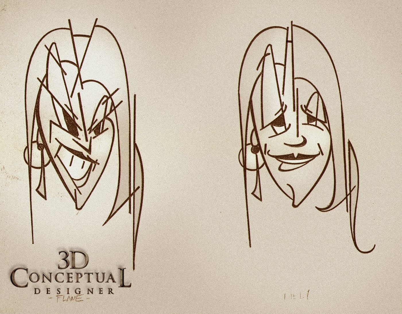
Here we have the emotions with a Coy and a "Come On" portrayed by the female character "Trophy".


Here we have the emoticon Designs, a "Smile" and a "Frown" portrayed by "Trophy".


Here we have the emotions of I'm Impressed, and I could care less, as portrayed by the female character "Trophy".


Here we have the emotions with Sad feelings and being Sassy, as portrayed by "Trophy".


Here we have the strong emotion of FLAME[ pissed off], and Jelly, as portrayed by my character design for "Trophy".


Here we have the base emotions of Love and Hate, as seen in "Trophy".


Absolut Vodka Website
"Bot Bar" Character Designs
1996
PART II

Client: Absolut Vodka via Troon Ltd.
Art Director: Chris Trages.
Project Date: April 1996

In this second post I am covering the series of characters or "emodicons" for an online chat room for the website for the Vodka brand Absolut that I created. I was contracted by the Design Studio in Santa Monica, Troon LTD.

The characters were to be done in a Picasso-esque style as abstract art characters, and the second character I designed was the "Trophy Wife" called aptly "Trophy". They wanted a ditsy looking club hopper with costume jewelry, so I designed her around this look.

I had to come up with 12 separate emotions for each character and each was an exaggerated look to identify the feeling as these were eventually scanned in and put on the web back in 1996 and they were tiny, like 256 x 256 at the largest resolution.

Actual Size as Used

You can see the first character "Manhattan" here.

Cheers, THOM

Wednesday, June 8, 2011

Project Review: Virtual Set Illustrations or Virtual Photography PART I

This 80's styled classroom Virtual Photoshoot was done for Superhero Movie.


I did this dramatic door shot for the remake of The Fog a few years back with the evil light coming thru the cracks as the young child has taped the door shot trying to keep the FOG out!

I did this Virtual Set for Art Director Chris A. Hawkins for a Poster Idea for Table for Three back in 2009 while at The Cimarron Group.


For It's Complicated they had a bathtub shot and needed a new room to drop the photo into so I did this for The Cimarron Group back in 09' as well.


I did this Virtual Set for Art Director Chris A. Hawkins for a Poster Idea for "All Good Things" Starring Ryan Gosling, back in 2009 while at The Cimarron Group.


Behind the Art

Virtual Set Illustration or Virtual Photography
PART I


Client(s):Magnolia Pictures via The Cimarron Group[All Good Things]
Anchor Bay Entertainment via The Cimarron Group[ Table for Three]
Universal Pictures via The Cimarron Group[ It's Complicated]
Columbia Pictures via The Cimarron Group [The Fog 2008]
Dimension Films via The Cimarron Group[ Superhero Movie]
Art Director(s): Calvin Sumler,Chris A. Hawkins, and Joseph Stamper.
Project Date(s): 2006-2009.

About half my work is doing 3D Logos for films and various clients in Advertising, Video games, DVD's etc., but the second half is sometimes missed and that has to do with virtual sets. Clients have a few choices so they often miss the advantages to the Virtual shoot.

Stock Photography is a HUGE business, and it has been a staple resource for advertisers for years. Hiring a Photographer and a Set Design firm is also a way to go and shoot what you need.

The Virtual photo shoot however gives the client full control over everything in the shoot on a level that traditional ways cannot. 3D Illustration is different in that the 3D Designer is doing all the artwork in 3D, and delivering a finished piece. A Virtual shoot provides an asset to a Art Director to use in a comp or idea they have where they may already have a masked actor ready to go but need something like the room they stand in, or prop they are holding.

As to cost, 3D beats stock photography every time just in the royalties and usage because the client owns the 3D image outright. Enlargements are just a render away, and because it is 3D, a different angle, or lighting version alt is fast to add to the mix.

I have posted a few examples from various projects where I needed to create a wall or backdrop of some sort for a Movie Poster comp as seen.

Cheers, THOM

Tuesday, June 7, 2011

Project Review: Absolut Vodka "Bot Bar" 1995 PART I

Here we have the emotions of Boastful and Lust portrayed for the Absolut Vodka Website from 1996 for the character "Manhattan".


Here we have the emotions of Impressed and Fake portrayed by "Manhattan".


Here we have the emotions of Love, and Meaness portrayed by "Manhattan".


Here we have the emotions of the stare, and the smirk portrayed by "Manhattan".


Here we have the emotions of Inrgatitude and "Punny" portrayed by "Manhattan".


Here we have the emotions with a Smile and a "Come On" portrayed by "Manhattan".


Absolut Vodka Website
"Bot Bar" Charaacter Designs
1996
PART I

Client: Absolut Vodka via Troon Ltd.
Art Director: Chris Trages.
Project Date: April 1996

Back in 1996 when the Internet was still just a few years into the public life, I had a chance to create a series of characters or "emodicons" for an online chat room for the website for the Vodka brand Absolut. I was contracted by the Design Studio in Santa Monica called Troon LTD and I worked in-house for a week to create a series of characters for the site.

The characters were to be done in a Picasso-esque style as abstract art characters, but a bit stereotypical so they could be recognized easily on the screen in the chatr oom format. I had a rocker, a hippie, a bombshell etc.

What I have posted today is the first part in the series of characters I designed for Troon, called "Manhattan", who was a rat pack aging man in his late 50's. I had to develop the basic structure of the character, and then present about 12 basic emotions that would cycle about as you spoke to one another in the chat room online in the bot bar as they called it. "Manhattan" was designed with a widows peak and slick greased back hair with an exaggerated look to his cheeks and lips.

This is the first post in a series on the character designs I did for Absolut, so check back for additional characters to come.

Cheers, THOM

Monday, June 6, 2011

Project Review: X-Men: First Class PART II

On X-Men 3 I did a bunch of Cerebro styled round portal doors with logos superimposed over them, and this was a continuation of that theme for this film.


Same angle as the finish for X-Men 3's teaser poster I did, with new font use. This was the direction given. We often re-explore an earlier films direction since we deal with the same people, and they tend to stay with certain themes.


A big giant X with a bit of surface part lines added to give the simple metal a bit of detail without changing the look rendered for photography to be overlayed on top of the cast from X-Men:First Class.


A higher view over the big Metal X with some strong fish eye on the lens.


A negative space X with the shape as a cut out with severe motion blur.


In this comp I added some glass geometric shapes reflecting on the simple wall for the prior designs adding in a bit of second read details for the X-Men:First Class look.

X-Men:First Class 2011
PART II

Client: Twentieth Century FOX Film Corporation via The Cimarron Group.
Art Director(s): Calvin Sumler and Joseph Stamper.
Project Date: Summer 2010.

This is PART II of the posts I have for the 3D Illustrations I did Last Summer, I had a chance to work on these Logos for the next installment in the X-Men Origins series with the newest film X-Men First Class which hit theaters over the weekend.

We explored text only teasers, as well as some large concepts of huge metal monoliths, where all the characters would be standing on top on a giant "X". Also revisited the Cerebro Door concept wit a few logos over the round doorway look[ altered], as a way of paying homage back to the original x within a circle from X-Men one.


My Prior posts for the X-men Movie Series:

Over 200 Logos from X-Men 2.
Logos for X-Men 3.
Logos for the Origins spin-off X-Men: Wolverine .
PART I of these X-Men:First Class Logos.

Cheers, THOM