Thursday, September 19, 2013

Project Review: Timeline 2003-PART II: Helmet Material Ideas

A pass at the "Tee Helmet" I designed out for the advertising ideas done up in a procedural rusted metal look for Timeline 2003.


 A Hammered Copper one is always a pass I do as I do a bit of Copper-smithing myself and am an avid Arts and Crafts buff.


A very heavy rusted helmet version here.


I used a procedural rock texture and replaced the color with a DA metal texture bitmap for this pass.


A 3/4 shot of the above scratched up steel look for this Timeline helmet.


 This texture is called rusty paint, but I modified it with a reflection channel and added the scratched steel on this too. One of my faves.


 The base mesh built is "non-quads" with a Boolean thru for the parts.


The 3/4 shot of the polygons.


Close up on the lower lip overhang and rivets.


A close shot of the Tee hole opening and overlap[ purposeful] to get a double highlight.


 A Dirt shader version with low levels of dirt.


I went 10X on the dirt for this second pass.


The final has almost no reflectivity due to full bleed on the dirt out on the steel.


Project Review: Timeline 2003
PART II: Helmet Material Ideas

Client: Paramount a Viacom Company via BLT and Associates.
Art Director(s): Rick Lynch, Zack Ris, and Jeff Barnett.
Project Date: Fall 2003.

This is PART II covering the work I did a decade ago now while in house at BLT Communications out in Hollywood for the film Timeline, and for this second part I cover the material texture work I did in finding a material for the helmets used in the One-sheet presentations.

I used Darksims Dark Tree editor sorftware to adjust and use shaders from the Simbiont Max plug in. Once the mesh was ready to go, I did a variety of pases of various materisla from copper to lead some new, and some aged.

Once the project was done, a new plug in for my renderer Final Render came out with a Dirt Shader, and I did a little experimenting with that, as seen above using the Simbiont Procedural Shaders as well. 

You can dial in and out the total amount of aging you desire, and for jobs like this I will typically render a few passes at various levels so the Art Director can paint between a few version to get the right ammount of scuff where they want it, as this method gives them total control.

I ended up getting the finish for the posters and for AV, but the helmets were never used in the finals. You can view PART I here.

Cheers, THOM

Wednesday, September 18, 2013

Project Review: Menagerie Creative-FOX Studio Classics: Key Art Home Entertainment 3D Design Illustration 2009

The final 3D Illustration that I delivered for FOX Studio Classics.


Here is the first draft image that was adjusted in color and details[ neon added]


 An ambient render of the final design set


A close examination shows bulbs and bases for each lite in the main title. A neon edge wraps both front and back and is 'clipped' to the tin sign itself.


 A close shot on the big Arrow shows the neon inset in the edge channel as well as some higher resolution vintage 'nipple' bulbs.


 The 3/4 view in polygons as a screen-cap shows the extent of the build for this 3D Illustration work I did.


Project Review
Menagerie Creative 
FOX Studio Classics Key Art 
Home Entertainment
3D Design Illustration 2009


Client: Menagerie Creative.
Creative Director: Cheryl Savala.
Project Date: December 2009.

I was asked to help create a 3D illustration for a new Home Entertainment One-sheet promoting the Studio Classics from the FOX collection, as they were re-releasing a series of older movies on Blue-Ray Disc and wanted to promote the launch using the iconic FOX marque in the design.


This build only used a few base parts from the marque, along with the specific lights, and I built out a neon and bulb based marque topper with a big reel of old-school 35mm film as the main item sitting on the big cement base.

I delivered it with a brighter red neon and more tin and steel up top at first, but then we moved to the lighter yellow bulbs with some added cool blue neon around the film reel as well as around the base sign area. I also adjusted the colors over to the warmer cement colors from the existing logo.This finished out and I rendered it at 5000 pixels tall for the final 3D Illustration I delivered.

I rendered this in multiple layers with and without the type, as well as with and without the volumetric lights, so that Cheryl's team could paint as needed to use the 3D asset for the Key Art finals both online and in print media. A fun 10 Hr job.

Cheers, THOM

Thursday, September 12, 2013

Project Review Monsters vs. Aliens. Part V. 3D Logo-Main Title Color Variations

Here is what finished for the Theatrical Trailers for the 3D main Title Logo I made in 2009.


 This is the same model form above put into a red environment for the plate match shot for the TV spots.


 The first pass at different colors was to remove the orange so the stereoscopic glasses with orange and green would work better.[ a Non-Anti-aliaised render BTW]


Here we went with brushed metal and blue completely away from green and orange.


We did a more acidic green which would still read thought the 3D effect was compromised.


A blue green version with bubbles int he monsters.


A closer version with just the orange to yellow and green to acidic green shifts here. All were tested Left and Right renders


A close up shot reveals the cuts int he alien type.


 The subdivided "Monsters' type in final form.


The base mesh consisted of four elements for "Monsters": The extrusion, the face with edge, and the bubble overlay "gel' layer with spherical bubbles inside.


Project Review
Monsters vs. Aliens.
Part V.
3D Logo-Main Title Color Variations

Clients Dreamworks via The Cimarron Group.  
Creative Director: Steven Viola
Project Date: Fall 2007.

This is PART V covering my 3D Design work I did for the Theatrical Advertising done on Dreamworks 3D animated feature, Monsters vs. Aliens from back in the Late Fall of 2008, and today I have to review the variations on the final logo that were done for the various applications.

We had to produce the 3D main title I built out for the Theatrical trailer in stereoscopic 3D for a few 3D delivery systems and each had some color issues.

One version, done for a 3D television system was for the super bowl that year, and it had orange and green lenses, so we needed to address the fact that the logo was orange and green and would have issues, so we experimented with variations using blues and colder metal colors to get a better 3D effect.

I also had to drop the logo into a film clip and I colorized and reflected the scene itself into the logo and this toned the textures to fit the shot colors and lighting.

The logo design itself was finalized at Dreamworks in 2D, but I reproduced the look as a real 3D asset including the cuts into the metal "Alien" type which was a 2D fake in the scrap, though I chose to cut the part-lines into the type itself.

You can view the MGFX city I built in just over a day for the trailers in PART I here,
You can view the full 3D logos here for PART II.
You can view Part III with more 3D Logos here.
You can view PART IV here with added button logos.

You can also see the final 3D Animation of the Title at the front of my MGFX reel work in the right column link.

Cheers, THOM

Tuesday, September 10, 2013

Project Review: Hancock BlueRay-KeyArt 2008

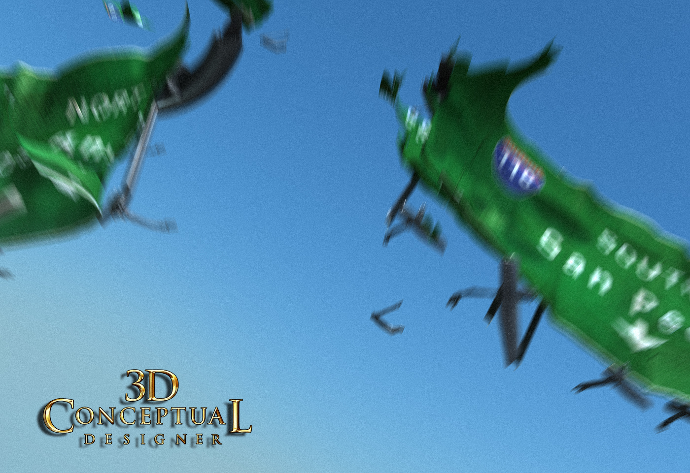
The first shot I delivered for the shredded freeway sign for the Key Art for Hancock back in 08'

 
 The final shot trucked in and rotated a bit. This is the clean render I delivered.


 The final shot with some 3D Motion Blur added to the signs. This was used as an overlay with the above render for the finals.


 The base models used for the shot. I built them all out clean, and then cut them up.


 The Subdivision Mesh of the final model used for the Hancock Blue-ray Key Art.

 A Screen-shot of the basic scene I built for Hancock back in 2008 for Sony's Blue Ray release.

Project Review
Blue-Ray-KeyArt 2008

Client:  Sony Pictures Home Entertainment via The Cimarron Group.
Art Direction: Cimarron Home Entertainment Team.
Project Date: July 2008.

In the Summer of 2008 I was asked to create a 3D Digital Illustration for the packaging for the film Hancock. I was asked to build an LA freeway sign in shreds in mid air for a flying shot of Will Smith for the Key Art. 

I sourced some scrap reference and created a custom texture-map for the signs, and I built out the sign and then destoyed it using the great Pro-Boolean tool in 3DSmax.

I proceeded to render a few angles as well as a shot with some 3D motion blur to overlay the final artwork. A fun little partial day gig.

Cheers, THOM

Friday, September 6, 2013

Project Review: The Atlantis Resort 3D Logo Design 2004.

 The final Hero shot for the Atlantis Resort.


 A low light opening frame from the Motion Graphics style boards.


 I did a series of off angles as well for interstitial moves in the AV work as well.


 A pulled back lower angled view here.


 The Quad view of the scene. The wall was well over a million faces.


 A close up shot detailing the triple layered 3D Logo I designed out.


 A screenshot view showing the extent of this simple build.

Project Review
The Atlantis Resort 3D Logo Design 2004.

Client: The Atlantis Resort via The Cimarron Group.
Art Direction: Myself.
Project Date: December 2004.

Almost a decade ago I did a pass at the Atlantis Casino for  a Presentation as both a Print and AV[ Motion Graphics piece to pitch the casino. I regularly did these for the Corporate Adverting wing of Cimarron, and I created this underwater look with the golden bronzed logo.

I was given the file for the logo as a bitmap and made a vector using Vector Magic, and proceeded to do a triple layer plated logo. 

I then built out a displaced mesh for the bricks and used the Final Renders Dirt shader to get the grit needed. I then added the caustic reflections from the metal up onto the wall. 

The water caustics are a fake, using a bitmap of real caustics from a pool projected up to showcase the theme of underwater for the Atlantis based Casino.

I later animated the 3D-Logo, and the water FX for the Motion Graphics piece that accompianed it. A fun little one day gig.

Cheers, THOM

Wednesday, September 4, 2013

Project Review R.I.P.D-3D Virtual Set The Gold Fileroom Gravillis Inc. PART III

This early comp also used the white perp-rooms I made for another comp [Soon to post] floating in the space.

 In this last comp of the gold file-room for RIPD, I added in long drawers with photos and folders. This has the inset showing the comp alignment.

 I also did this version with a floor surface to line up with photography.
[ You can see the perspective difference which is needed to line up to the camera in the scrap]


A close up wall shot on one of the doorways in the RIPD golden fileroom.


A re-visist to the floating room version with more depth to this room.


A shot of just the room from R.I.P.D.

Project Review
R.I.P.D-3D Virtual Set
The Gold Fileroom
Gravillis Inc. PART III

Client: Universal Pictures via Gravillis Inc.
Art Direction: Vince Tran.
Project Date: Sept 2012.

I was sick for a few days, so my posting was delayed....

This is my fifth post for work I did for the Theatrical Advertising for the film R.I.P.D, as well as my third posting for R.I.P.D work that was performed for the Agency Gravillis Inc.

I was contacted by Vince to work on this next room. This  room was a big endless file room with the walls lined with file cabinets that they wanted to re-create for the posters, so I was off to build out a series of virtual backgrounds for the poster presentation.

As with all 3D Illustration we got creative with versions having floors and various openings so they could try a multitude of ideas all in one day. A 3D scene is easy to duplicate and adjust to create dozens of ideas all based on a few images from the film.

In 3D space, you build once and render many times,and this is where the saving is to be found, and I can create a series of variations using the same set pieces reconfigured a bit for each pass.

You can view the Gravillis Inc's R.I.P.D work as follows:

PART I here, the bank vault room.
PART II, the white jails.


Cheers, THOM

Wednesday, August 28, 2013

Project Review R.I.P.D.-3D R.I.P.D. Concept Badge 3D-Logo Icon Design for Key Art 2011. Cold Open PART II

 Here is the final Design presented for the R.I.P.D. Badge Concept for the Teaser Posters I built out in 3D.
 
 I did a warmer metal version with less dirt and aging for this one. The idea was to be able to paint between the two renders to get a dual finish feel, so the edges could be worn back to the brass casting etc.
 
 A darker version with a bit of edge lighting to it for RIPD.
 
 STEP I:
To create the badge as a single molded part I first create all the parts separately.
 
 STEP II:
Here are all the parts placed and ready for the Pro-Boolean operation. NOTE: I always save this[ and all steps separately] in case I need to go back to adjust, since all Booleans are a bit squirly.
 
 STEP III:
Here all parts are combined into one with the mesh output set to QUADS.
 
 STEP IV:
A apply a bend in both X and Y directions to dish the badge.
 
 STEP V:
The second bend is applied to the modifier stack in 3DSmax.
 
 STEP VI:
The final design with the subdivision added[ here it is with one level, though the finals had 2]
 
 A view of the final R.I.P.D. badge design with the skull and cap with dual firearms added up top.

Project Review
R.I.P.D.
3D R.I.P.D. Concept Badge 3D-Logo Icon Design for Key Art 2011.
Cold Open PART II

Client: Universal Pictures via Cold Open.
Art Direction: Gardner DeFranceaux.
Project Date: December 2011.

This is my fourth post on R.I.P.D., and my second for the Agency Cold Open. They were doing Comps for RIPD, and came up with a great design for a badge so they contacted me to create the 3D sculpted version for the teaser posters.

I received the vector outline files from Gardner, and we discussed the look he wanted to have with it so I proceeded to create the parts necessary to make the badge. Most quicker 3D models I make, are all separate parts and retain a very sharp edge in the parts themselves as well as at the intersections, but when you look close-up on most badges, they are cast and molded parts, with blended parts with filets and rounds thru-out the design, and this was the route that they wated to go.

I had developed a quick technique to do this using the Pro-Boolean in 3DS max, and this technique is dependent on that Plug-In as it can output the file in a Quad" format so that the faces come subdivided and ready to go for the most part.

Once the Pro-boolean was completed I added two bend commands to dish the badge, as all badges are not quite flat but are dished and bent to conform to the human body better, so I applied this onto the mesh output then subdivided the final. I added in the skull with police hat, as well as a pair of firearms[ I had not built the special gun from the film yet, and would have replaced it with them if this did go to a finish].

A super fun concept to flesh out.

                       Cheers, THOM