Thursday, March 10, 2011

Napkin Sketching: PART IV

A sketched design for an Asian girl on stilt-sandals with a fruity drink.


A depressed Nigerian Woman at the bar with a spilled drink in front of her reflection on her life.


A couple of aliens in space gear.


A furry Devil Dog skewered with a Pirate Cutlass.


Happy Fish!

Napkin Sketching Part IV

In this fourth installment of the Napkin Sketches I do while out and about, I am posting some characters I designed while sitting at the bar drinking my Newcastle nut Brown Ale[ back when I could].

Every character was inspired by at least two people I saw, that I and combined attributes from into one character.

I remember back when I submitted my work to Art Center that they wanted my sketch books more than my finished art, and latter I realized they wanted to see my ideas and thinking more than execution. The final Art Execution is what y would nurture, but my initial ideas were what they wanted to see the most. I agree that it is very important to show the development of a design as the road you take will tell your process.

You can view the other parts here:

PART I

PART II

PART III

Cheers, THOM

Wednesday, March 9, 2011

Project Review: Agent Cody Banks 2:Destination London

Here is the rooftop comp I rendered out of the 3D mini car I designed for the shot.


Here is a side view render of the same mini car used for the pitch on Agent Cody Banks 2.

Here is a shot showing the quad model for the car body I built. I had 10 Hrs. to do the whole car.

This 3D Illustration was the James Bond look, with a Agent Cody Banks hanging on a wire between the buildings.


Here is the raw model I built for the rooftop set. I reused a few parts from my Perfect Score Rooftop for this to go faster.


Here's the 3D render used to pitch Agent Cody Banks 2.


Agent Cody Banks 2
Destination London

Client: MGM via BLT and Associates.
Art Director: na
Project Date: Fall 2003.

One of my final in-house projects I worked on at BLT and Associates, was the sequel to Agent Cody Banks, Cody Banks 2: Destination London. Since part two took place in London, and one very fun item I had to make was an original mini cooper, but it needed to be a generic "60's Mini car". As I am trained in automotive design this was a fun proposal, but I had one day to do this, and needed to design, model, and render out the image for the comp ideas.

I did all 3D Virtual Photo shoots and created full street scenes looking down a building to the street below,a s well as a rooftop set with an up angle on the cast back lit by the moon.

All in all this was a very enjoyable project to work on before I left BLT that fall, to work at The Cimarron Group for the next six years.

Cheers, THOM

Tuesday, March 8, 2011

Project Review: The Phantom 2040- PART 51

A Jet Powered Hover-Board Used by Kit and his buddies.


An Auto-gyro used in a quick scene for the series The Phantom 2040.


This was a small hover-toy that Max's cat Baudelaire played with in the show.


An Assault Transport Airship from the series.
[ seen in prior posts in multi views]

Phantom 2040-PART LI [ 51]
Hand-held Prop Design Drawings

Client: Hearst Animation Productions.
Art Director: Myself.
Project Date Spring 1993.

In this 51st post on "The Phantom 2040" television Animation Series I was Art Director and Chief Conceptual Designer on, I have some various Props and Vehicles that I sketched out for the series.

As Art Director I oversaw four teams of artists[ Los Angeles, South Korea, South of France, and Canada], but I myself was a hands on designer ,and designed about 90% of the props and 100% of the vehicles for the series myself. As a first time Art Director , I learned early on that a good majority of "art directors" are finger pointers, and are not doing any designs themselves, and for myself this was not an option. Each team I worked with seemed surprised when I grabbed a paint brush or pencil[ Pre-Computer Design Folks!] and did the work myself, but that is what made this Gig so enjoyable to do.

Each show had between 12-25 unique props per episode, so there were around 650-1200 unique designs done for the full 52 episode series so I had a chance to design just about anything that could be imagined for the world of 2040 where The Phantom lived. Adding to that the vehicles, backgrounds, B.I.O.T.S., and other characters, it was a full time design schedule for the 3 years I worked with them.

Cheers, THOM

Monday, March 7, 2011

Project Review: The Last Castle 2001

Here is the finished Teaser Poster with the 3D illustrated Towers I built used on each side.


A close up of the max file showing the simplicity of how it was made since it was only a long shot model and not for close up work.


This was the final render used for the posters a slight up angle showing just a bit of the underside.


An earlier version with more tip up on the camera for a more dramatic angled comp.


On this one I stretched the tower up twice as tall as the original and lit it a bit graphic.


Here is the first pass model after about two hours or so to research, design, build, and light and texture for the Art Directors.


The Last Castle
2001

Client: Dreamworks Distribution via BLT and Associates.
Art Director(s): Clive Baillie, Rick Lynch, Alon Amir.
Project Date: Summer 2001.

Before I was in-house at BLT and Associated in Hollywood California doing 3D Design, Modeling, Illustration, and Animation, I did a few freelance 3D Illustration jobs for them to test the waters as to what I could do in what amount of time, and I was assigned onto The Last Castle team to help out.

This was a quick small half day job, where they needed a 3D Illustration of a Prison Guard Tower with lights and barbed wire for a One sheet where they did not have a photographic asset to use. To hand Illustrate this would be too time consuming so I did a 3D version in a short time and we varied the angles and proportion of how tall for a few ideas.

This was my first Movie Poster finished 3D Art work used back in 2001. Sometimes the job is very small and fast like this one, but still make it through the crit sessions an onto a finshed piece.

Cheers, THOM

Friday, March 4, 2011

Project Review: Raveonettes Video "Heart of Stone" Emmy Awards Honors PART II

My Primetime Emmy Awards 2009-2010 Honors Certificate I received this week, Nice!


A Re-Posting of the first sketch I did for the project[ my favorite!]


Another Re-Post of the Lungs without and steam to keep them running sketch I did.


Emmy Awards 2009-2010 Honors Certificate
for the
Raveonettes' Music Video: Heart of Stone
PART II

Client: Blind.
Art Director: Chris Do.
Project Date: January 2010

I posted the sketches originally on the blog, about one year back here, and this week I recieved this in the mail. Chris Do, won the Emmy for Art Direction for the Music Video, but theose who helped, also recieved a certificate of Honors as I have scanned above, and just found out about.

I love Steampunk design and Jules Verne looking concepts , so to be able to design these sets for the production was an honor for me. I love the sketch jobs which are fewer and fewer with the majority of my work being 3D Illustrations, and the subject matter for them was a joy to do.

Cheers, THOM

Details are over on Blinds website below:
http://www.blind.com/work/directors/chris-do/heart-of-stone/

Thursday, March 3, 2011

Project Review: Beastly 2011

A 3D Concept for a simple curved extruded logo done for Art Director Joseph Stamper.


I took Joseph's above file and carved out the centers and filled with corrugated metal to emulate a woodcut lettering feel like I did for Sweeny Todd.


A dual layer design with a rusted aged metal heavy beveled look out front, with a pin line neon edge glowing from the back.


This concept Art was done for Art Director Calvin Sumlers Beastly Movie Logo, and the incorporation of the heart into the name was done on the end.


Another concept art piece done for Calvin Sumler with the heart moved out front and into the middle. This version was deeply scratched using Simbiot Max's Plug-In.


One of my favorite treatments using a single point bevel with an aged concrete material used.


An ornate Single Point Bevel bright metal logo done for Art Director Calvin Sumlers Poster Ideas for Beastly. This one has a blurred reflective surface behind the logo to blend out as well.


I took the Illustrator file, and once I hand built the beveled typeface for Beastly, we bent it to curve it around a head for a comp.


Here is Calvins original typeface without the bend, and this round I did a crystal material with some light caustic refractions and reflections.


I did this concept for Art Director Chris A. Hawkins and he added thorns into the typeface he customized so I beveled those as well when I built this logo for his use.


A comic book lighting version of the above logo in a dark reflective metal with warm to cool lighting almost edge-lit only, very dark.


Still one of my favorites is this bolder single point beveled version I did for Art Director Chris A. Hawkins using a masonry material with some aging moss procedural texturing.


No for this alt the reflection map helped create a Damascus folded metal look to the surface with the striped reflections wrapping the bevels on this alt. This is my top pick.


A thin tall glass logo design I built for Art Director Chris A. Hawkins for Beastly Posters Concept Designs.


A flat extrusion with a micro beveled edge and micro holding devise, a very subtle 3D logo concept.


I did this final concept for Art Director Joseph Stamper and this was made to match the liquid metal veins found all over Alex when he is the Beast in the film.


Beastly
Concepts Art for title exploration

Client:CBS Films via The Cimarron Group
Art Director(s): Calvin Sumler, Joseph Stamper, and Chris A. Hawkins.
Project Date: Summer 2009.

One of my final projects that I worked on when I was in-house in Hollywood at the Cimarron Group was to do a full 3D Logo exploration for the new film Beastly, a new adaptation of a Beauty and the Beast theme starring Alex Pettyfer as the beast.

I worked with three Art Directors on the project and they pitched quite a few 3D logos in the Poster Concept Art Presentations. There were a lot of Single Point Beveled type treatments as that seems to be the way that films like this want to explore first, so I spend the time to hand build these typefaces for the film based on Illustrator files supplied to me by the various Art Directors. I also was able to explore a softer liquid look of the veins on the Beast that look like liquid Mercury. I also did do a few bold heavy logos as well as come carved out. They tried a full range of materials from glass to steel or iron, then to various aged metals.

I had a great time working on this project almost 18 months back. If you want to learn more about this film look here.

Cheers, THOM

Wednesday, March 2, 2011

Project Review: Rick Lynch's Animated Series The Frum-Unders

The Frum-Unders(R) Volt-Girl was hiding in the junk drawer.


The Frum-Unders(R) Toothie, hides in the medicine chest.


The Frum-Unders(R) Left-Overs hides in the back of the fridge.


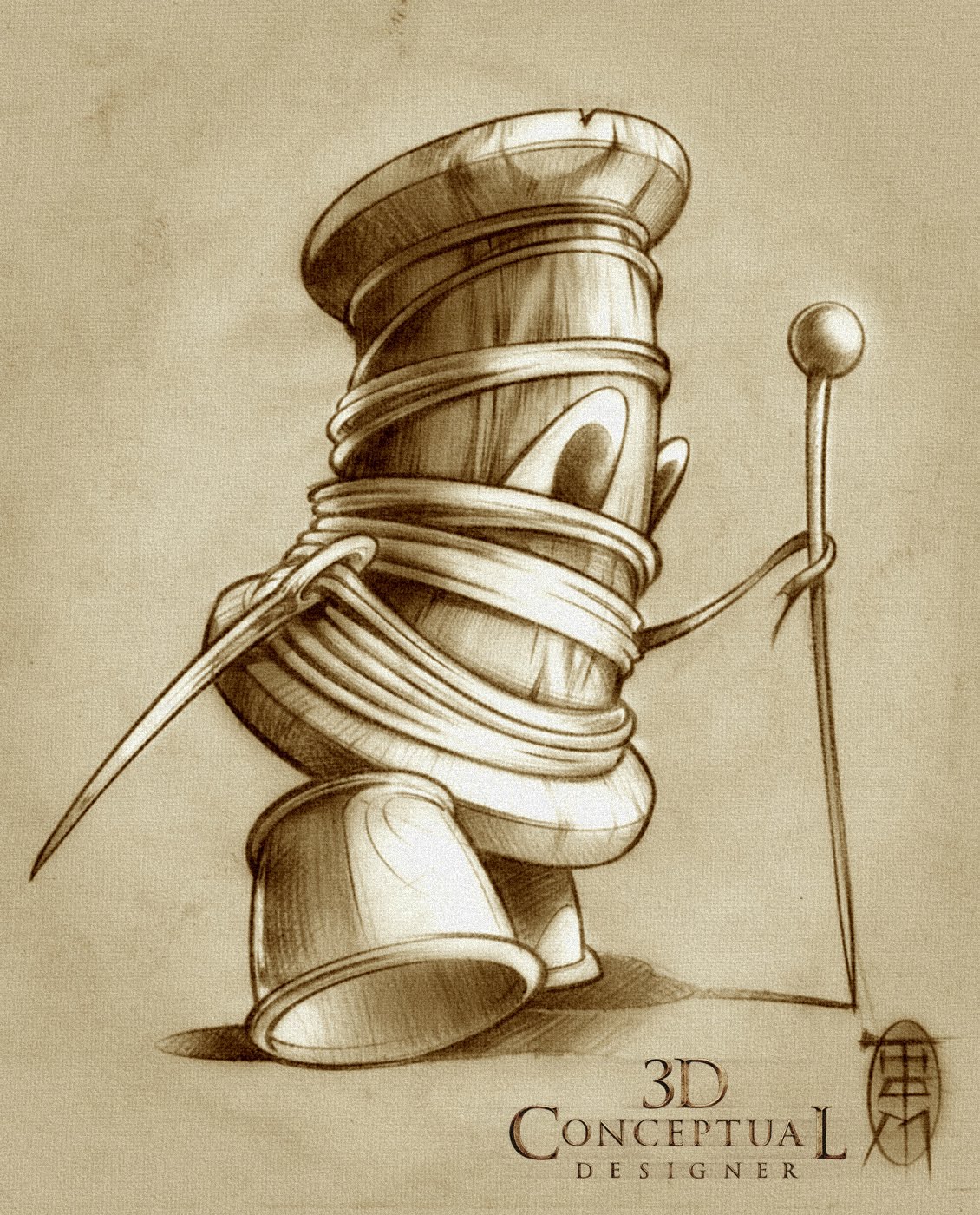
The Frum-Unders(R) Spoolie character is from the sewing machine basket.


The Frum-Unders(R) Linty is from under the dryer, and is my favorite character inspired by the always animated dust cloud following Peanuts Pig Pen.


The Frum-Unders(R) Scrappy, is the left over food from under the seat cushions on the couch.


The Frum-Unders(R) Al' Dante, was hiding in the pantry as left over pasta pieces that come together.


The Frum-Unders(R) Wishbone sits on the shelf near the sink.


The Frum Unders (R)

Client: Rick Lynch + Positive Existence.
Art Director: Rick Lynch.
Project Date: Fall 2001.

When I was full time in house at BLT and Associates the workload was usually very full with 40+ Hours of 3D Modeling, Design, Illustration, and Animation work that filled each week. But, around the holidays you would get a week or so here and there of down time, and one of the principal partners at BLT Rick Lynch always has some fun projects brewing that I got the privilege of working on.

I had previously worked in Television Animation on the traditional 2D variety, and had put out a few pitch packets for shows over the years so I got together with Rick to put together a Character lineup for a series he was pitching.

The concept was a simple show for toddlers on a young level, with a bunch of characters that come out from under things in your home, called "The Frum-unders"(R). What you see above is the first pass I had at a set of characters that eventually would be 3D and be pitched as a CGI Series for television. I had lots of fun on this as the subject matter and concept was and is still strong.

Cheers, THOM

Tuesday, March 1, 2011

Project Review: Battlestar Galactica 2003


The 3D Illustration of the new Cylon for Battlestar Galactica 2003 I made from the concept sketch.

An alternate angle for comp ideas used at BLT and Associates for the pitch.


Here is a version with clean new metal.

Here is an alternate version of a Cylon with distressed metal.


A screen capture shows the geometry, as I used N-powers Pro Nurbs tools for many parts.


My Original 1980's toy Cylon for the original series, as it helps to be a fan when you build 3D Illustrations.


BATTLESTAR GALACTICA

Client: SyFy Network via BLT and Associates.
Art Director: n/a.
Project Date: Summer 2003.

Back in 2003 when I was still in-house at the Theatrical Advertising giant, BLT and Associates in Hollywood CA. I got a really fun one day project to work on for the new re-boot of the 80's TV series Battlestar Galactica. I am from that generation, and still have my Cylon toys, so I was amped.

When I was assigned this there were no Cylons built in CG yet, so we had no reference of the final product, all I was given was a single front view blue-line sketch to build off of. I had to create the Cylon as a photo real asset to sell the ideas from just that so I went to work as I only had one day to do this job, which is typical in advertising with fast turn arounds.

What you see above is the product of a one 8 hr day build+texture+render for various comp ideas for the team working this campaign.

Cheers, THOM