Thursday, February 19, 2015

Project Review: The Princess Bride-Key Art 3D Logo Main Title Build: Blue-Ray Packaging-2014.

 The Final Dark Gold 3D Logo Render used for the newest packaging for The Princess Bride on Blue-Ray Disc 2014.

I also did one 3D Title Treatment, a bit brighter in the development stage.

Also went a cool Silver in a dim, and darkly lit environment as well.

And a 3D Logo done in a brighter silver as well was done for The Princess Bide.

 My last and final delivery of a look, was a Brass one, and this one had a bit less shine than the Gold and Silver versions had in the reflection levels.

 Here is a Camera view in the final Poly-Sub-D[ Subdivision Surfacing] of the file.

 At an angle up close you can see the sculpted serifs.

The base Polygon build out with no subdivision added yet.

Again the close up on this Single Point Beveled font shows the base build out.

An overview of how I typically set up my 3D Title renders.

 A view of the final Key Art for the Princess Bride on Blue Ray.

Project Review
The Princess Bride-Key Art 3D Logo Main Title Build
Blue-Ray Packaging-2014.

Client: 20th Century FOX Home Entertainment via We are BOND.
Direction: Patrick Dillion[ owner @ Wearebond ].
Project Date: October 13th, 2014.

In Theatrical Print, there is always bleed over into Home Entertainment, to translate titles and Key Art into packaging for the DVD and Blue Ray Disc release, and today I cam covering a 3D Title I did last Fall for the anniversary edition of The Princess Bride.

I regularly do work for We are BOND, and have finished a few Theatrical 3D Logos for them[ X-Men 5:2014, The Legend of Hercules:2014, etc], so they asked me to create a 3D title in various metals for the new packages being created for the re-release on Blue-ray Disc last Christmas.

A fast one day job, rendering out titles in 3D for finish at 3K rez, while getting to hone in my material creation for the various finishes. I hand built the font as a Single Point Bevel explained in this first post, and step by step laid out here.

This is my second time I have worked on this property, as I also worked on the DVD menus a decade back as seen here at my prior employer, The Cimarron Group.


Cheers, THOM

Tuesday, February 17, 2015

Project Review: Looney Tunes: Back in Action [2003] 3D Logo Title Treatments PART II

One of the first designs I did for Luis Sola our dedicated 2D Logo designer at the time @ BLT. I did this one with a tapered extrusion reminiscent of the vintage travel postcards.
 
 Another one of my favorite type style layouts for the project. I especially like the 'eyeballs' inside the "O's" that Logo Designer Luis put in there.

 We did a few that were "Action Moive'esque" like this one in a font typically found in Sci-Fi films.

Always a fan of a playfull cartoon font like this one. 
The tagline is a straight font works well to counterbalance the toon one IMHO.

 The above file with a key-Line cut into the face of the main title as an alt.


Here is a design I for Warren Nung. A nice lower curve with the tag line tucked underneath and a soft gradient material applied.


THe second file I did for Warren with a nice deep extrusion over the tagline 'candy-bar' 


Another fave' of mine, done for Art Director, Zack Ris. A very playful font. Love this one.

Project Review
Looney Tunes: Back in Action [2003]
3D Logo Title Treatments PART II

Client: Warner Bros. via BLT Communications.
Art Director(s): Luis Sola, Warren Nung, and Zack Ris.
Project Date:August 2002.
Today in PART II for the 3D Titles I did for Looney Tunes:Back in Action back in 02', I cover more Monochromatic 3D Logos I created for the Key Art title treatment for the then new, Looney Tunes film to be made that year, Looney Tunes:Back in Action.

I had already posted in a cartoon-themed post, some smaller versions of some of the logos as seen here, but today I want to focus again on the sepia enhanced, black and white styled logos I did for the project.

BLT employs some very high end 2D logo designers , so today I have three more designers type layouts I worked on.

Stay 'tuned', as I will be posting the color ones in the future.
If you want to view PART I showing the first set of sepia toned logos go here.

Cheers, THOM

Friday, February 13, 2015

Project Review: Key Art 3D Illustration for Santa Hunters 2014-Nickelodeon.

My First pass at the Virtual Living Room 3D Deign and build for Key Art for the Nickelodeon Special Santa Hunters 2014.

 The wireframe ambient render shows a combination for subdivisions in the fireplace bricks, and standard primitive models for the rest.

 Here is an outside shot with the back wall moved away to show this fully enclosed 3D set.

 The second phase in the 3D Design, lightened up the room, and changed the era to the 50's and 60's, this first render closely matched the original sketch angle.
I also added some logs into the fire.

 Round 2 had the camera change to a higher lens to get the extreme angle on the ceiling a bit less.

All 3D renders are supplied with a Z-Depth pass so the Art Director and finisher can grab pixels based on distance to add effect into post.

Round 3 has the camera now level with the floor as seen the the fireplace side. I added curvature to the lens at this point at about 22 degrees to get a bit of a fish-eye look.

Round 4 here is what went to finish. I had to remove the back wall as the camera was moved thru it, so this became a 3 wall set set up as I had done back in my set design days.
 
 Final shot in wireframe.

 An overview render from outside this set.

Here is the scrap shot given at the start overlaid onto my final render, with the bleed provided. 
I always add bleed to my renders that are edge to edge 3D, since once the camera is locked down, if they want to see more bleed,  it moves everything in the scene around due to the parallax that takes place with any 3D move of a camera.

Project Review
Key Art 3D Illustration for Santa Hunters
2014-Nickelodeon.


Client: Nickelodeon via Buster Design.
Direction: Studio Design Team.
Project Date: July 3-9th, 2014.

I early July last Summer, I was contacted by Buster Design to build out a Virtual 3D shot of a Living Room, for a Kay Art poster for Nickelodeons upcoming special, called Santa Hunters. I had done work with Neville Burtis in the past and was referred to this team to assist.

As with most Print projects in the Theatrical Advertising world, they needed this fast, so I utilized my huge 3D library of parts that I have had made over the last two decades to mock up a room quickly.

I had built out a test room hallway of a Mission styled home[ based on my own home at the time in So Cal], so I had door windows picture rail baseboards and all the fixings for a room. I also grabbed the Sub-D bricks I had built for Don for the old Ford Architectural build to create a fireplace w/o mapping the brick with actual 3D mortar and mocked up a historic room.

Turns out once they saw it, they wanted to go brighter and bit more of a 50's and 60's "Burbank' styled look, so we swapped out the beamed ceiling for a cove one, very typical to that era, and changed out the fireplace and window trim design as well.

Once the look was locked we dialed in the shot, so you will see various camera lens swap outs and height changes. I originally followed the sketch seen above, but it ended up with a much more straight on shot that did go to finish.

You can see the final done at Cabalastudio over here.

Cheers, THOM

Wednesday, February 11, 2015

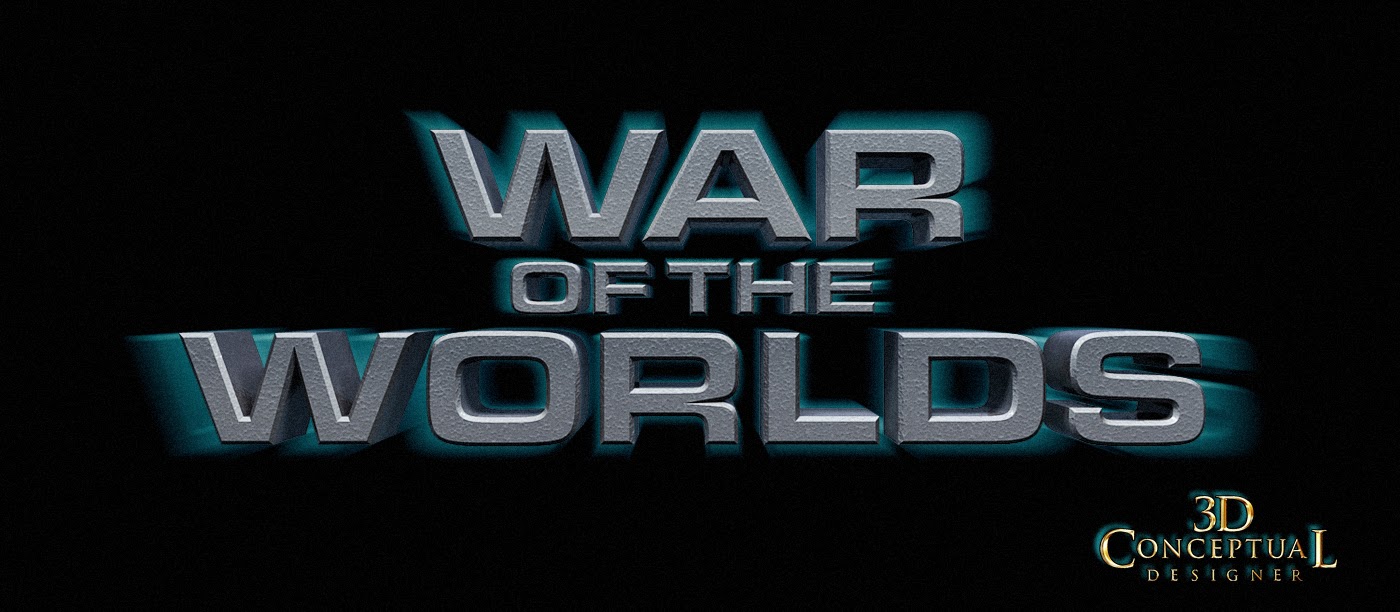
Project Review: Key Art-WAR of the WORLDS PART VI- Additional 3D Logo Exploration.

A 3D Logo I built out for Art Director Chad Robertson a thin font in brushed metal with a blue back light[ soft].

A big block stack of 3D type[ which moved us to final] with a blood red stain on the lower part of this typeface, and seen in the reflection on the glossy floor.

This was one of my personal favorites for type layout provided to me bay Chad Robertson as well in the Print Dept. The lower light with gold accents and the big "WAR' up top as a serious first read headline.

Here we are moving closer to the finish layout here, with a gold holding device extruded back. Textures changes, but the font was beginning to get close.

 I did some fun fonts given to me from Calvin Sumler. You will see these in the AV campaign as well.

A thin version with some red back glow added shot at a lower angle looking up at the typeface.


 This was done for Art Director Rob Russell with a blue glow behind the font as well.

Project Review
Key Art 3D Illustration for
WAR of the WORLDS
PART VI- Additional 3D Logo Exploration.

Client: Paramount Pictures via The Cimarron Group.
Art Director: Calvin Sumler, Chad Robertson, and Rob Russell.
Project Date Fall 2004

Today I am posting PART VI, covering the 3D Design work I did for the Theatrical advertising pitches back in 2004 for the Spielberg remake of War of the Worlds, and today I have posted even more looks I helped develop for the presentation for the 3D Logo.
 
I was supplied all vector files as Illustrator type laid out from Calvin, Chad and Rob, Art Directors from in the Print Division to build out in 3D for their comp presentations.

I did a total of about 100 logos during the process before we finished. The one sheet contains the 'BIG LOGO" and the 3D iron look for the world ,and these are my 3D contributions that went to the final, or finish for the Movie Poster. I did not finish for any AV work.

Look for a few more posts in the future for this project.

You can view PART I  an overview posting here.
You can view PART II: The blood Moss 3D Illustrations for Print and AV here. 
You can view PART III the Blood-Moss type looks here.
You can view PART IV: the Motion  Graphics 3D Card GRFX here.
You can view PART V here: covering Title treatments in 3D.
Cheers, THOM
Thursday, February 5, 2015

3D Stock Model Build Review: Art Lamp-Built and Prepared for online sales 2003.

A Stock 3D model of an Architectural Art Lamp, typical to any Drafting Table. I built this back in 2003 while at BLT Communications to sell online.

A Fully textured and rendered shot of the assembled Art Lamp to show surfacing.
 
A High level of detail was added to each part with part lines, filets and chamfers and all parts are easy to find and work with.

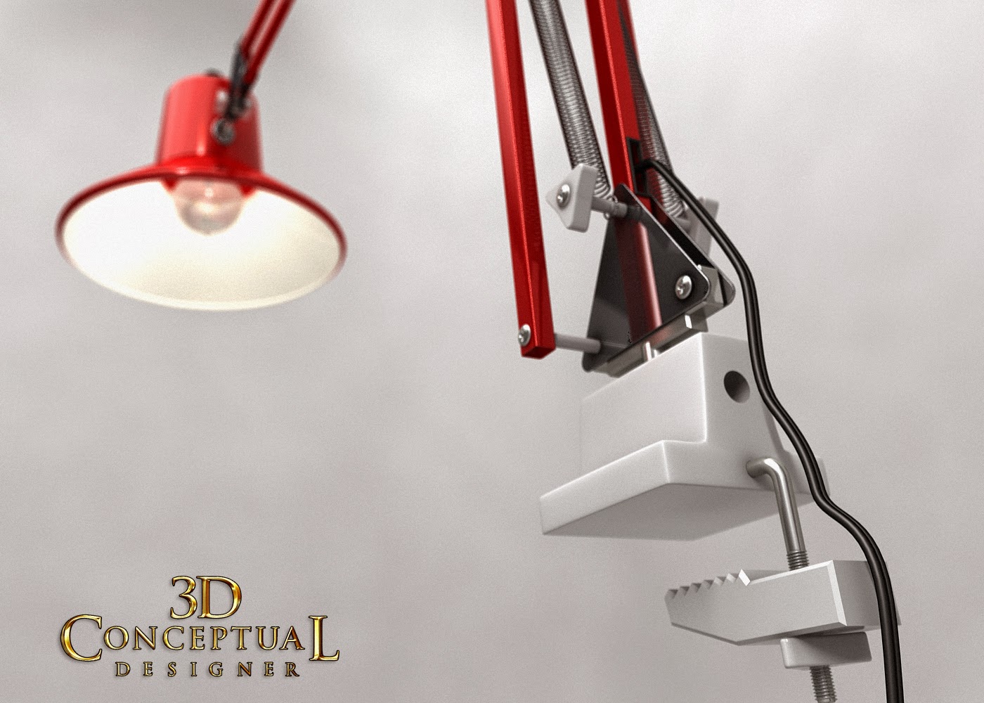
 A close-up Virtual Photoshoot image of the Lamp shade and attachment via some aluminum rivets.

The elbow design was taken directly from my own lamp I used while at Art Center.

 My actual Drafting Lamp was Red so I used that as a place to start with Pre-Viz.

 The Lower base clamp area with removable plastic end parts here in a polygon wireframe render.

The Rendered out base clamp on this stock 3D Art Lamp Model I built.

 Underneath the only part I embellished was the light bulb and did a bit of a vintage take with the nipple top hand-blown glass look to the light.

Rendered out with the textures on the Light bulb and two part shade.

 A back side shot on the elbow details with the c power cored and rubber scrub protectors for the square tube feed thru.

 A bit of Depth of Field [DOF ]added to this Close-UP Virtual Shot.

 A Worms -Eye view of the Geometry with the base part built as Quad that was Booleaned  traditionally.

 Rendered out in 3D fully textured with GI and some DOF.


An exploded parts view as a typical Parts Illustration of the Art Lamp.


A wireframe parts render exploded out identifying the various object sets.


3D Stock Model Build Review
Art Lamp: Built and Prepared for online sales 2003.

Client: BLT Communications for Stock 3D Model Sales.
Art Director: Myself.
Project Date: August 2003.

In '03 I was still in-house at BLT Communications running the 3D Design Department, and I was proposing to the owners that we should sell our 3D models online as stock 3D assets on sites like TurboSquid. I regularly built out highly detailed 3D Models for various projects, so this was a simple and logical way to create a revenue stream from already built objects.

I love to build as a trained Industrial Designer, and I love doing all the micro details found on standard objects. For my generation of artists we did mostly sketching rather than Computer work while training at Art Center, so the Architectural Table Lamp was standard fare for anyone who designed, so I built out this prop to use in house, and eventually sell online.

This model was never posted, as BLT did not get into online 3D model sales.

I will continue showcasing many of the stock 3D models I have from various companys I have prepared them for in future posts, so enjoy!


Cheers, THOM

Tuesday, February 3, 2015

Project Review: Looney Tunes: Back in Action [2003]- 3D Logo Title Treatments PART I

My first Black and White with some Sepia in post 3D Title Treatment for the Key Art presentation back in 2002 for Looney Tunes:Back in Action.


 A Second 3D Logo design I did for Jeff Barnett Directing me.


Here is my first design I made dimensional for Art Director Hunger Lam. A nice low angle showing the extrusion going back underneath


 A Second Design I did for Hunger, and I really liked this one a lot, from the toon-like hand josselin' of the letter forms to the soft gradients.


 The last design I did for A.D. Hunger Lam.


I did just two designs for Kevin Bachman, and this is the letter form that eventually finished. Here is the shallow version with a small back extrusion.


The second design I did for Monkey, had a much deeper extrusion going back with a softer curve to it, as well as some 'eye-balls' added into the title 'O's.

Project Review
Looney Tunes: Back in Action [2003]
3D Logo Title Treatments PART I

Client: Warner Bros. via BLT Communications.
Art Director(s): Jeff Barnett, Hunger Lam, and Kevin Bachman[ Monkey!]
Project Date:August 2002.

Thirteen years ago, back at the end of the Summer in 2002, I was still the in-House 3D Designer at BLT Communications as my One Man Show[ just me], and I was tasked with doing some 3D versions of Logos for the Title for a new Looney Tunes film to be made that year, Looney Tunes:Back in Action.

I had already posted in a cartoon-themed post, some smaller versions of some of the logos as seen here, but today I want to focus on the sepia enhanced, black and white styled logos I did for the project.

BLT employs some very high end 2D logo designers , so I always had a great supply of 2D vector files delivered to me and ready to go for most projects, and for this film, it was no different, as I worked with six Art Director/Creative Directors on various designs.

I am a huge fan of the old 'Tunes',  so for me this was a very fun exploration , especially the vintage sepia look for today post.

Stay 'tuned', as I will be posting the rest of the Sepia set, and then the full color versions and the final finished Logo that went to print in future postings here.

Cheers, THOM