Friday, September 14, 2012

Sure-Grip International PART III The 75th Anniversary Logo Redesign: The Button

 A very early button design using the SG inside the ellipse done for Sure Grip International.


 Here is  staggered the two letter to fit inside the holding device shape. This was all done in the rough textures first as they wanted a rough look for the Derby Catalog.

 As I progressed the Holding plate became a ring with the hollow center showing through. This comp also fit in the 3D 75th in there too.

 A red version, as SGI uses Red, White, and Blue as the primary colors for their brand.


 The final design with the 75th on it done for Sure Grip.


Here is the final Button design I did currently being used in various applications.


Sure-Grip International PART III
The 75th Anniversary Logo Redesign: The Button

Client: Sure Grip International.
Art Director: Myself.
Project Date:  September-December 2011.

This is my third post covering work I have done for Sure Grip International[ SGI], the largest and oldest skate manufacturer in the USA.

I did some 3D-Logo work a few years back when I first began doing work for them that is posted here,

I also, as an Art Center Transportation-ID Design grad designed the look of the new DA45 Plate The Avenger, as a sharp edged stealth look for them and that design post can be seen here.

Today I have posted the first part for the new revised logo I created for them.

The Logo was specific for the Derby Catalog so I did both a clean bright colored look, and an aged heavy metal and concrete look to each design.

They wanted an SG in a circle or holding device, and we eventually went with the tilted ellipse to emulate the original 1928 logo they had. This design went to final and is being used now for various button applications.

I will post the final full type long version of the logo in the next few weeks in added posts.

Cheers, THOM

Thursday, September 13, 2012

Project Review Conceptual Design:Un-Named Teaser Trailer Spaceship Conceptual Designs PART I

 Here is my sketch for the basic design of the Mothership for version "A"


 Here is my 3D spaceship base model I build to sketch over as my 3D Perspective Grid.


 This is my first pass design at a little fighter ship to go along with the mother-ship above for this no-named trailer. I still like the way the fingers in the design seem to squeeze the sides a bit showing a soft body design.


 And this is the very simple grid object I created to sketch over for this concept too.
 

 Here I also provided a sample showing the cluster of fighters forming the nano-net.


 My sketch for the fighter in this alt went much better and closer to the mother-ship look, and YES those are eyes, I often add personal characteristics to vehicles[ look up Coke Bottle]..


Here is a shot of the last 3D perspective grid object I built out.

 Project Review
Conceptual Design:
Un-Named Teaser Trailer
Spaceship Conceptual Designs PART I
 
Client: Rock!T[ Now Method Studios]
Art Direction: Seven Viola.

Project Date: July 2011.

Today I am posting for my regular Thursday 2D post, a fun design project from just over a year ago in the Summer of 2011 that I did for Steven Viola at Method Studios as well.

This time I got to design spaceships, a dream design job for us Industrial Design majors from Art Centers Transportation program. In fact we need to be taught to STOP drawing so many space shops as most of us folks LOVE to deign these craft, that by the time we leave ACCD we have nothing BUT spaceships.

As before, I could do this faster with my 3D perspective grid blocking done in 3D, though I presented the finals as sketches , the base was concepted in 3D first to speed things up and lower the cost substantially for my client.

I did three base designs with a "Mother-ship, or BIG design, and a small "Fighter" that would interlock to form a complex nano-tech like surface as seen in the grouping shot above blocked in 3D.

Today I have posted my first design A, and I will be posting B, and C in the weeks to come, so enjoy the posting. This "A" design did go to a final round in 3D so I will be presenting that as well.

I really still love to draw and design, and 3D and 2D are both tools in my virtual Art Bin!TM

Cheers, THOM

Wednesday, September 12, 2012

Project Review: Vivid Vodka-3D Virtual Photoshoot 2008

 
 The first comp I built out for a pitch to Vivid Vodka a few years back was the female form in the pour of the vodka. 100% 3D virtual set-up.


 Here is the shot of the Geometry for the scene for Vivid Vodka.


 A new Typeface with an inset face, like I did on Sweeney Todd here.


 The shot of the 3D Scene set up for the revised comp.


 With this other comp the spill of Vivid Vodka was to look like the "Trucker Sexy mudflap babe" as I was directed to build it out with a few olives for the 'Gazongas'.

 Here is a Polygon shot of the final comp I built to pitch Vivid Vodka back in 09'.

Project Review
Vivid Vodka
3D Virtual Photo shoot 2008

Client: Vivid Vodka via The Cimarron Group.
Art Direction: Home Entertainment Dept.
Project Date: July 2009.

A little over three years ago, I was still an in-house 3D Design Director at The Cimarron Group in Hollywood CA. I had prior to that Gig set up a 3D Design Department at BLT and Associates, their main competitior, so I was very well prepared for a fun job like this one.

Vivid Vodka was a new product launch that we pitched for back in 2009, and I was tasked with building out the full virtual shoot since we did not have a single asset, including the bottle of Vodka itself, [ just a picture], so I was tasked with a build out of the items in 3D

Now with the womans body prominent in all the comps I built out the files in 3D as this type of work is where 3D really shines as you can create these fanciful images as if they were real, applying real world materials to them to achieve the look you want.

I built out two basic ideas with an alternate on the type design for one, while the second was a spilled puddle in the shape of a sexy female.

I had the olives from my Las Ramblas shoot here, so I reused that and the martini glass I already had in my stock library as well to speed things up.


Cheers, THOM

Tuesday, September 11, 2012

Project Review: Game Show Set Conceptual Design:Roulette Wheel.

 My first design pass I only sketches one section out to confirm the design. I did the shoulder bar design typical in coaster from my Theme Park Design days.


 Here is the base 3D set up I made for the above design first. I did this in less than half what the perspective grid by hand would have taken. 3D is truly the BEST perspective tool there is.


 Here is my second pass sketch still taped to the print out of the 3D framework I designed first.


 Here is the final sketch as delivered to my client.


 Here is the modified 3D asset I built first to speed up the design process.


     Here is a screen grab showing the simple set-up for this 3D scene. I sent this over so they could use it as a base for an animatic as well.


 Project Review
Conceptual Design:Roulette Wheel.
 
Client: Rock!T[ Now Method Studios]
Art Direction: Seven Viola.


Project Date: March 2011.

Today I am posting for my regular Tuesday 2D post, a fun design project from 2011 that I did for Steven Viola at Method Studios for a Game Show client pitch for a Set Design piece.

Steven and myself worked together over at The Cimarron Group for about 6 months back in 2008-9, and he contacted me to help with some sketch Concept Designs for his current project.

I had done Set-Design for a few years right out of Art Center, and I still get a small occasional design project in this area such as this.

A fun concept with a roulette wheel where the contestants were literally strapped into a chair attached to the wheel and would experience a real spin during the game. I did the basic design in a few passes, and I knew I could do this faster with my 3D perspective grid blocking done in 3D, though I would sketch over the base wires to present it as a sketch. I also provided the file back to Steve so they could sell an animatic of the prop as well.

I rarely get 2D sketch work, as I do mostly 3D CGI work, but I long for these fun little gigs, and had a blast working with Steve again on this.

Cheers, THOM

Friday, September 7, 2012

Project Review: 3DX Film Festival 2008: Title Key Art Graphics

 Here is the final Image they picked rendered at 6800 pixels wide for the billboard finishes for the 3DX Film Festival back in 2008.
 
 We went with a Tobacco Green look to a few comps, I was playing off a Direction the the Print Department had , so I matched it up here.


 When I spend the time to do a more advanced surface to a simple logo it is perfect for a glass material since the available faces in the surfaces make for great refractions and caustics inside the type.

 A version with the extrusion at 1000% deeper for a Motion Graphic pitch.


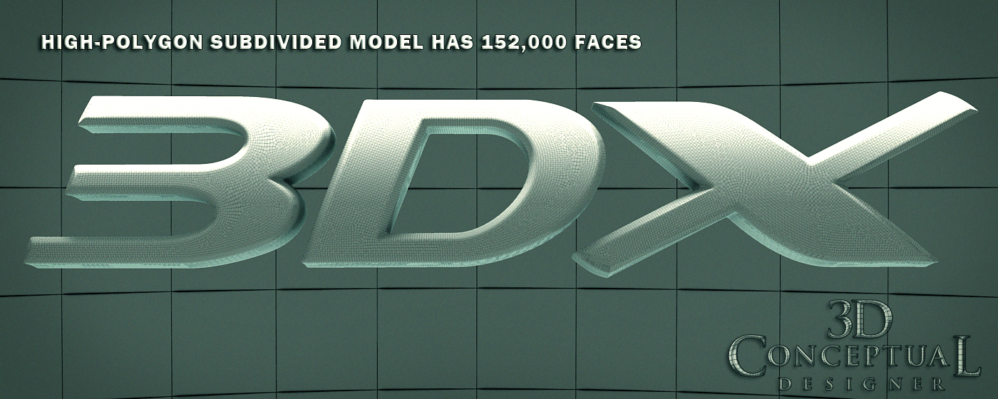
 Here is an ambient render showing the mesh smoothed object with a very dense face count as a Quad model.

 Here is that same shot of my 3DX logo with the Subdivision removed.


 A behind the art look at the various stages: On the Right is the final mesh with two FFD's[ Free-Form Deformation Jigs], In the MIDDLE is the model with just the FFD for curving the face, and on the far RIGHT is the flat original Pro Boolean.


 Here is the way they used the graphics for the event.


Project Review
3DX Film Festival 2008
Title Key Art Graphics

Client: 3DX via The Cimarron Group.
Art Direction: Myself.
Project Date:May-July 2008

With thousands of 3D logos behind me, a simple project like this is straight forward, but it can be done in various ways.

The super cheap way is to basically bevel a spline, throw materials on it, and hit render. If money and time is low this is the way to go.

However, if you want a bit of finesse, that can be added to any logo.

For this project we had a client in Singapore who needed a 3D logo based on the existing design, but done in 3D for the posters and the Motion Graphics work to follow, so I tackled it.

I  wanted to have a softer bevel with a bit of curve to the face, since a computer flat face on any logo has awful reflections since it is just a flat mirror, so a trick we all learned at ACCD for car design is to add some crown[ curve with a high point] to the surface, so I curved the face back to achieve this.
 
This cannot be done to any standard bevel due to the limitations in how the triangulated face is made, but in 3DSmax I use the n-Power built in Pro-Boolean tool and make the results as "quads" and BAM, I have a surface that can be adjusted so much easier.

Cheers, THOM

Thursday, September 6, 2012

Project Review The Phantom 2040 PART CXI [111th] Perspective Grid Background Action Layouts

 Cyberville was a B.I.O.T. based city in the later episodes of The Phantom 2040, and this is a layout blocking I did for the team to follow.


 This was a fun shot to design, Mr Cairo was on an operating table looking up at the ceiling so I put some strong fish-eye on the shot along with a tilt-rotate pan of sorts as he looks up to his reflection.


 For this blocking I did this for the layout and the storyboard crews to help set up our truck in pan shot here.


A shot of the curved walls inside the space station where Sean One lived with a scaled blocking for the characters.


Project Review
The Phantom 2040
PART CXI [111th]
Perspective Grid Background Action Layouts

Client: Hearst Animation Productions.
Art Director: Myself.
Project Date Spring 1993.


So today for my Thursday 2D post, I have here my 111th post covering the Conceptual Design and Art Direction work that I did for the TV animated series, The Phantom 2040 from in the early ninety's, and I am reviewing some episode Direction Scene Blocking that I did for the show.

As Art Director on the show, I blocked out in simple grid format a whole bunch of shots to assist the multiple teams with staging in fish-eye. Getting folks who have only drawn straight edge perspective to move over to curves was a difficult one, as most students I meet do not understand the concepts behind why we see in perspective in the first place[ parallel lines projected onto a sphere will converge]so they had difficulty with the fish eye, let alone just an accurate straight edged perspective, so I did these grids to help them.

They were all small sketches, so as to fit on the storyboards themselves, and we taped these originals to a board pages to give the animators a clear understanding of some shots along with the various other reference.

Trained in space planning at both CCS, and ACCD, this was a skill I never thought would be used in TV animation, but it was a great help in staging these shots.

If you are a FAN of The Phantom 2040, and on FACEBOOK, there is a group for that....  here.

There is a TAG on the list to the RIGHT for other Phantom 2o4o entry's, but you can click this as well.

Cheers, THOM

Wednesday, September 5, 2012

Night at the Museum 2 PART II: The Golden Tablet

 Here is the HD frame from the Motion Graphics piece I designed and built for the advertising pitches for Night at The Museum 2: Escape from the Smithsonian.


 An angled camera shot of that same 3D Scene from above.


  Here is an ambient render showing the base polygon meshes.


 Here are the wires for the subdivided Turbo smoothed object. 
[over a few million faces]


 A close up view shows the smoothed mesh details.
[ NOTE the one panel that is double rez had some issues, so for time concerns I smoothed twice]


The base poly mesh with the single point beveled type.


Night at the Museum 2
PART II: The Golden Tablet

Client: Twentieth Century FOX via The Cimarron Group.
Art Director: Myself.
Project Date: Summer 2008.

For my second posting on the 3D Illustration and Motion Graphics Animation work I did for the advertising campaign for the sequel to Night at the Museum, I am focusing on the Mystical Tablet from the film that I built out as a virtual replica for the trailers.

I hand built all splines for the design of the tablet from a few screen grabs we had from the film. I then proceeded to build this all out as a quad model Pro-Boolean, which is available in 3DSmax with the n-Power tool.

This technique allows me to add a Subdivision modifier to add geometry and to soften the sharp edges out to feel more like a molded or cast part. The final Motion Graphic application I did, can be seen in my reel with the central tic-tac-toe panels all able to rotate for effect.

I used the Simbiont Dark Tree procedural bump map to get the Pumice feel to the pits and layers of gold.

You can review PART I here showcasing both films I did work on for the Advertising.


Cheers, THOM

Tuesday, September 4, 2012

Project Review The Phantom 2040 PART CX [110th] More Art Directing Color Background Keys


A Laboratory that was sketched out by me and painted by Rebecca Jo Morales


Here is my pencil drawing for The Phantom done at a 16 field Animation Layout Size, for the above painting I designed[ a re-post]


At the top of the One Mile tall Maximum Inc building is where Rebecca Madison had her main office. The layout was stretched even more [ in height]for the final painting done by Jesse M. Santos.


 The original Layout I for The Phantom 2040[ re-post] was stretched out to elongate the tall-n-thin look even more


Another Jesse M. Santos painting for the show of the Brownstone outside Kits bedroom.

My original background[ which Jesse would redraw] which was to be followed.

A layout close up on the building was based on the below design as well as my close up city shot here. This was a painting by June Miko as well.


A shot of the Mile tall building design.


Project Review
The Phantom 2040
PART CX [110th]
More Art Directing Color Background Keys

Client: Hearst Animation Productions.
Art Director: Myself.
Project Date Spring 1993.


Hope you all had a nice long Labor Day weekend!

So today for my regular Tuesday 2D post, I am posting my 110th post covering the Conceptual Design and Art Direction work that I did for the TV animated series, The Phantom 2040 from in the early ninety's, and since I recently found a full set of photos I took back in the 90's of the backgrounds we were using to promote and sell the series, I am posting a few more today.

As Art Director on the show, as well as the Conceptual Designer, I designed most major locations and had the background painters color key all areas for the teams to follow overseas. I basically Art Direct myself, which is a way to get twice the work out of me, just give me two jobs at once and I will tackle both.[ My Producers understood that benefit].

So, I have four more locations typical to the show to review.

Posted above you will see these locations. As for color theory for the show, I used warmer earth tones for the 'good guys', and acidic greens and cools for the 'bad guys'.

I was limited in that I had a very small in-house painting team with our small budget, but we accomplished a great deal in the three years of production anyhow, and that is the design in production I constantly talk about. We Industrial Designers design the systems too, not just the artwork, but it falls on deaf ears, since the artwork is what they want to see, NOT how you got there.

If you are a FAN of The Phantom 2040, and on FACEBOOK, there is a group for that....  here.

There is a TAG on the list to the RIGHT for other Phantom 2o4o entry's, but you can click this as well.

Cheers, THOM