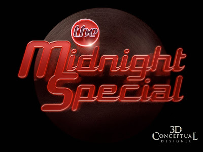
The Midnight Special
Client: Guthy Renker, Inc. via The Cimarron Group.
Art Director: Andrew Marciniak.
Project Date: Spring 2007.
A quick Home Entertainment job from my Cimarron days back in 2007 was the DVD set release of the late 70's show "The Midnight Special", and so I do a few variations on the look of the logo to match a 70's feel with neon and golds. This was a quick turn around one day job so not much time to fully explore, but we did get in about six ideas into the mix. A fun design exercise.
Cheers, THOM
You can view the DVD set by clicking the post title or cut-n-paste this into your browser:
http://www.midnightspecial.com/


No comments:
Post a Comment