Showing posts sorted by relevance for query morpheus. Sort by date Show all posts

Friday, June 18, 2010

Project Review: Cafe Morpheus-Asylum-Part II


The Tile Roofed Entryway into Cafe Morpheus.

To the Right of the Entry was the Pastry Shop, also finished in tile.

Post details, and wainscoting lighting.


Cafe Morpheus Asylum Restaurant
PART II

Client: John R. Thomas.
Art Director: John R. Thomas.
Project Date: Summer 1993.

In this second posting for Cafe Morpheus, I focus in the blueprint Designs the Foyer entryway into Cafe Morpheus. Styled after Victor Horta's, "Horta House", in Europe we used subway tile on a curved rood to give the feel of tunnels in the subway. It has brass detailing for the edging with light up wainscoting with hidden lighting for walkways etc.

Cheers, THOM

Tuesday, June 21, 2011

Project Review: Cafe Morpheus Asylum-PART IV

A side view from a big booth showing the Bar to the left, the big opposite widow [ Shh no secrets here**], and the railings to the Mezzanine.

The Counter Bar in the center of the Main Room at Cafe Morpheus with a view to the kitchen.


The revised ironwork for the staircase.[ If you watch Point of No Return] this is the staircase that B. Fonda jumps down after her first kill, that was the room we modified.


The main big windows for each side with internal lighting.


All Lamps that were handmade for the Main dining hall area.

Cafe Morpheus Asylum Restaurant
PART IV

Client: John R. Thomas.
Art Director: John R. Thomas.
Project Date: Summer 1993.

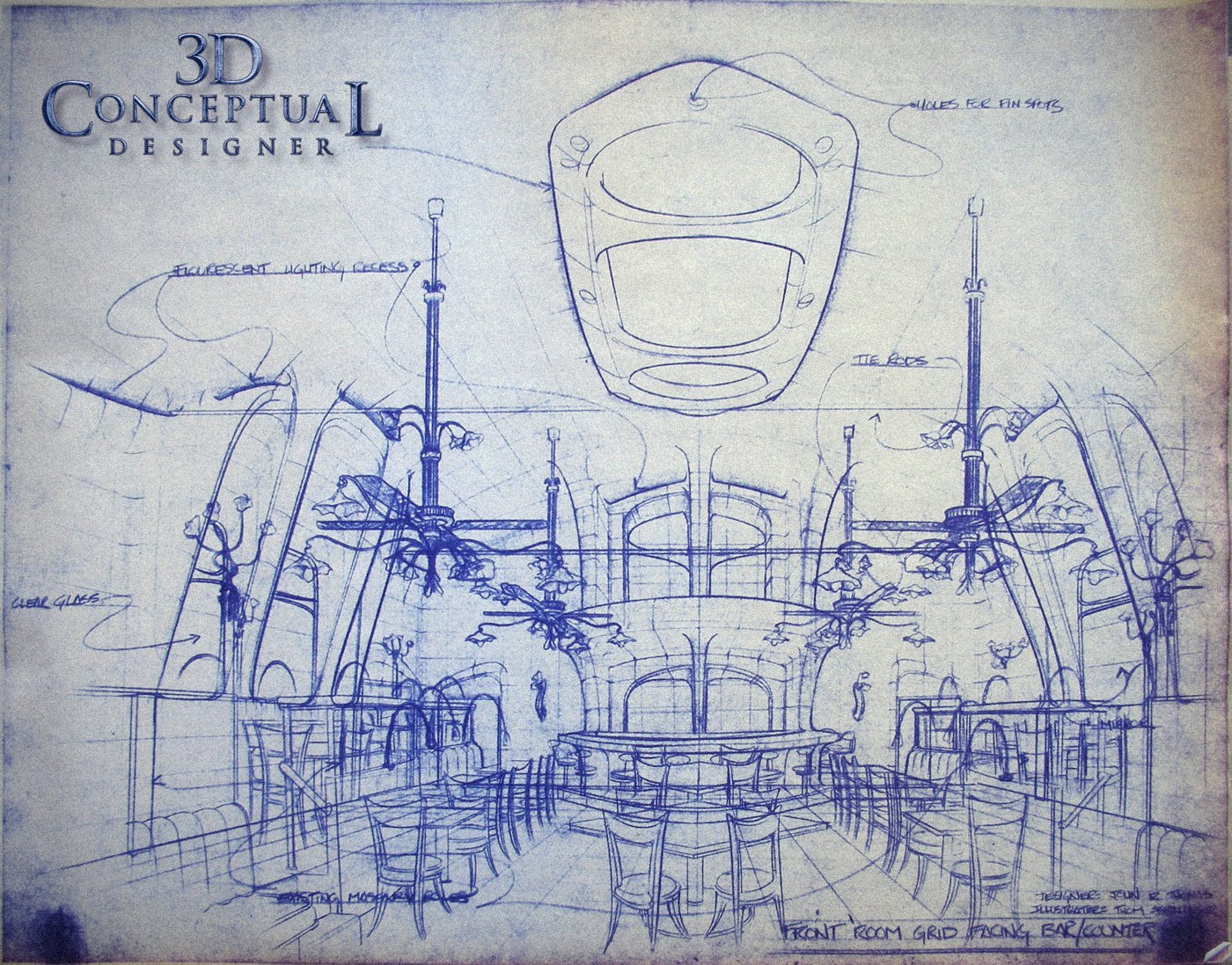
In this fourth posting for the restaurant and lounge, Cafe Morpheus-Asylum I illustrated for John R. Thomas in Beverly Hills CA. back in the very early 90's, I focus in this post on the blueprint Designs for the custom curved main dining hall.

The room had a barrel roof originally as it was a Lodge from the 20's and we converted the room to be in the Art Nouveau style of Antoni Gaudi. The rooms ceiling formed a Parabolic Audio effect where you could ***hear whispers across the room as they bounced inside the fully curved surfaces. You can also see this room in the film "Swimming with Sharks" starring Kevin Spacey.

You can also see the bent copper tube lamps I designed from my prior posting on the walls, posts and the big fan/chandeliers in the main image.

You will notice the grid work over the complex curved surfaces, this was a guild for the builders to make these shapes. I also made huge 6-9 foot long french curves for the construction crew to get the shapes right base on these.

.You can view PART I here,

..and PART II here.

...and PART III here.

Cheers, THOM

Friday, December 24, 2010

Project Review: Cafe Morpheus Asylum-PART III

The big "Blade Runner" ceiling fan for the upstairs area.


The Custom made Bar Stools for the dining counter in the large dining hall.


These Lamps had 12 separate lights with a ceiling fan and were near 16 feet tall.


The smaller Post mount and Wall Sconce versions of the lights that were made for the main hall and bath areas.


The Frank Lloyd Wright inspired Lamps that were handmade for the Mezzanine area.

Cafe Morpheus Asylum Restaurant
PART III

Client: John R. Thomas.
Art Director: John R. Thomas.
Project Date: Summer 1993.

In this third posting for Cafe Morpheus Asylum the Restaurant I illustrated for John R. Thomas in Beverly Hills CA. back in the very early 90's, I focus in this post on the blueprint Designs for the custom made ceiling fans, lighting, and bar stools that were all made entirely from scratch.

The first drawing is for the huge 8 foot ceiling fan ala "Blade Runner" with a roof lighting system so faux moonlight would stream into the smoke filled Mezzanine with the slow rotation of the giant industrial fan. The fan itself, we found it in a junkyard, a vintage fan that weighed about 600 pounds so we cast the parts from plastic and faux finished them as the weight was a liability to use the original.

The second drawing breakdown is for the custom post mount bar stools that used a VW deck-Lid sprint to give some nice "steampunk" Industrial feeling to the seats as well as function to give a bit of spring to the backs.

The bent tube lamps were all build out of solid copper and brass parts and finished with a great patina aging them to look like the originals from 100 years back.

I also designed two Frank Lloyd Wright styled lamps for the upstairs "Blade Runner" room area as well. One was a direct lift from a table lamp from his Prairie collection, and the other was a unique design with a parallelogram hinge system so the lamp could move up and down via the wall mount and remain level at all times. This one was build from Aluminum and steel and anodized with an art glass shade as well.

Cheers, THOM

You can view PART I here, and PART II here.

Friday, April 16, 2010

Project Review: Cafe Morpheus-Asylum Part I

Front cover with Logo hand drawn by Dan Hanrahan.

Entrance Facade's both front and side for The Asylum.

Contour Drawing for the Top of the Front facade over the doorway.

Internal Structure Drawing for the Top Facade Piece.

CAFE MORPHEUS
ASYLUM PART I


Client John R. Thomas.
Art Director: John R. Thomas.
Project Date: Fall 1992.

Early on in my career I worked through Phillip Mittel at Motion Artists and he connected me with John R. Thomas for the redesign of the Asylum restaurant into two distinct clubs. The front club would be renamed to Cafe Morpheus and would be an amalgamation of three to four architectural influences , but mainly Art Nouveau. The rear bar would remain Asylum, but would get revised and expanded with a better facade entrance to go along with it.

What you see above are the first four pages of the complete design package I Illustrated and helped John with to get the restaurant built. John is a creative genius and it was a great time and a fun project to work on for almost 6 months straight. This is the first in a series showcasing various areas of design.

Cheers, THOM

Wednesday, August 24, 2011

Project Review: Sherlock Holmes 2008

The first Logo I designed for Sherlock Holmes was the most simple of the three I did. This was done in a cool metal used on the X-Men 3 poster I built.


Here was the warm version done with brass aged bronze and amber art glass. I put the center of Big Ben that I had constructed prior in the center of the logo holding device and lit the glass up there too.


This last version had both the warm glass, though not lit up, and some cool lower lighting with a bit of blue/green in it to match the look of the the film as it was treated with some cooled tones in aging the look so we followed suit with the poster artwork.


Here is the model I built, using filigree from the Venetian project and a few sub-D parts including the type and main holding device.


A monogrammed Magnifying Glass I designed for the Poster Ideas we pitched for Sherlock Holmes in 2008.


Here you can see the Low Poly, and the High Poly smoothed model I built for the comp.


Project Review
Sherlock Holmes 2008

Client: via The Cimarron Group.
Art Director(s): Joseph Stamper, Calvin Sumler, and Chris A. Hawkins.
Project Date: November 2008.

I would have loved to have had a few weeks to work on this property as it was an intriguing concept and beautiful production design, so to help develop a period piece logo I was amped. I was given a single day, typical to about 80% of my theatrical work pace. While at The Cimarron Group in Hollywood back in 2008, I was given the task of developing a few logos for the soon to be released Guy Richie film Sherlock Holmes.

I had become very familiar with Art Nouveau back in the 90's while working on the restaurant design in Beverly Hills for Cafe Morpheus, so I learned all about Alphonse Mucha and his wonderful and amazing line work from his posters for that era. I found a small filigree element in a few concepts that I used as the starting point to build out the medallion you see above in the logos. I modified the Single Point Beveled text I had built for Valkyrie out of Trajen and added some Nouveau flair by moving the center up and the tails down.

We also had a huge close up of Robert Downey Jr's eye, and they needed a magnifying glass to overlay onto the comp so I created that prop design above, with some detailed 3D filigree as well.

The filigree actually was a re-use of some architectural parts I built at Cimarron for The Venetian Casino a year or so prior. Enjoy the posting.

Cheers, THOM

Thursday, December 24, 2009

My First 3D Model: Luminous Media Inc. 1994-95

My Very First 3D Model built in 1994 using 3D Studio R4 DOS w/ Metaballs.
The Finished Logo for the Company

The Final Sketch for building the "Luminous Device"

Concepts for the various lamp parts[ First Round]


My First 3D Model

After working in Television Animation for almost 3 years at Hearst Animation, I moved into the now emerging technology of 3D illustrated video games. MYST, just hit the market and it was a runaway success, and this inspired many to move into digital artwork.

I had the pleasure of working with John R. Thomas years prior on a fabulous high end restaurant design in Beverly Hills called Cafe Morpheus/Asylum, and he being trained in Architecture wanted to start up a Video Game Development company, so I joined in to help start it up with him.

Now, back in 1994 the 3D programs available for a PC[ or a Mac] were limited, I picked Strata 3D because Rand Miller used it on Myst, and I being a Mac "Kool Aid" drinker at the time, stood my ground and fought to do this on only a Mac. Well being the owner was a Auto-cad guy, and he wanted to export over the models from CAD to 3D, he chose a PC program, namely 3D Studio DOS R4 for the PC so he could do CAD on the same box. So, not only NOT a Mac, but DOS! Well, 15 years latter , I am very glad that I was forced to work on a PC and I owe a debt of gratitude to John for that.

My very first model was of a "Maiden" character for the game we were developing, which was designed by friend and colleague Nick Pugh, and I used the DOS 3DSr4 with a "Meta-balls" plug-in along with "Mesh-Paint from the Yost Group to paint the face. It took about a week to model with the valuable training from Stephen Kramer.

I also designed the "Luminous Device" as our logo ICON. The machine was inspired by artist Daniel Berg[ http://www.danielberglundlighting.com/sitefiles/table%20lamps/table%20lamps.html ], who built the lighting for the Asylum Bar that I had worked on years earlier, so I sketched it out and Stephen Kramer built it out. The type was an homage to Mr Chows in Beverly Hills and was hand lettered by the talented Dan Hanrahan.

What a great team and a great time in my life as I moved forward into the world of 3D.


Cheers, THOM

Thursday, May 26, 2011

Project Review: The Phantom 2040:PART 66-More Color Keys

Maxwell Madison, The villain Son of Rebbecca the head of Maximum Inc in The Phantom 2040 Television Animated Series from the mid 90's.


Guran, Kit Walkers side kick, is seen here with his hidden armor he wears under his regular outfit as a color key.


Jenna is Kits friend from College so she had a few wardrobe changes throughout the series and here is one for the second season.


A Color Key done for Trahn, who was always in tow with Jenna and Kit in the adventures they had.


Sagan Cruz was the primary character we saw as an "Enforcer" [ POLICE], and this is an Asian character we had in a few episodes in the second season.


Phantom 2040-PART LXVI [66th]
More Color Keys for Characters


Client: Hearst Animation Productions.
Art Director: Myself.
Project Date Spring 1993.

In this 66th post on "The Phantom 2040" television Animation Series I have posted more of the color keys I did for the full character line up for the series.

Hearst had hired Peter Chung for a freelance contract to design all the main characters for the series as his Aeon Flux characters captivated the animation world in the early 90's so David Corbett the Executive Producing The Phantom had him do a full round for all of them in 1992 prior to me coming on board.

Once I came in, I utilized Paula Lafond, our in-house character designer and she did all additional characters[ human] to match the look of the gaunt main players, and I redesigned the B.I.O.T's; as well as adjusted all the outfits of all of Peters characters to match up with the added Art Nouveau theme I had added in after he was done and gone.

I had just finished working on a Restaurant Cafe Morpheus and had to get very familiar with Art Nouveau, so I was well versed in the look, I just stretched it to a tall and thin, Cinema-Scope stretched feel, to match up to these gaunt characters. Here you can see the resulting Marker comp Color Keys I did for a few more of these players.

You can view all color keys with the tag on the right column or just click here.

Cheers, THOM

Monday, August 9, 2010

EXILE: Realtime 3D Videogame Development 1995

The Flintlock Semi Auto Pistol with "egg" bullets.

Close Up SIDE view of the flying stagecoach Fish Blimp.


One of my Favorite designs from EXILE: the Flying Fish Coach.

A One Man Flying Suit done based on DaVinci technology.

A Concept piece of The Balcony at the Villa where the game takes place with the Count.

Concept Sketches of the Villa from EXILE.


EXILE
Real-time 3D Interactive Video Game Development 1995.

Client: Luminous Media Inc.
Art Director: John R. Thomas.
Project Date: Summer 1995.

I had worked for John Thomas on his Restaurant Cafe Morpheus/Asylum Designs in 1992-3, and he was very interested in virtual worlds after seeing the MYST game so I came on board as Art Director for his new Development studio Luminous Media Inc. This was the first video game I worked on for a 3D real-time world , and I was just learning 3D software 3DS- DOS R4 while on the job designing.

These sketches were done for the presentations we did for the game EXILE, which took place in a fantasy world with a steampunk mixed with DaVinci type of technology. I developed characters, environments, and vehicles for this world. As a funny side I saw a flintlock gun with a clip just recently in the film Wanted and it reminded me of my design form the 90's so it is posted here as well.

Cheers, THOM