 In this 3D logo I designed for the film it has a one direction curve bending the face of the text back away from camera in a blue shy world.
 Here we see the above logo modified with a second bend down to curve the horizon, and placed in a "Magic Hour" sky to get the warm golds in the chrome.
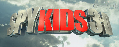 A Taller font with a cloudy sky world and bright sunlight used for this pass at the Spy Kids 3D Logo I did back in 2003.
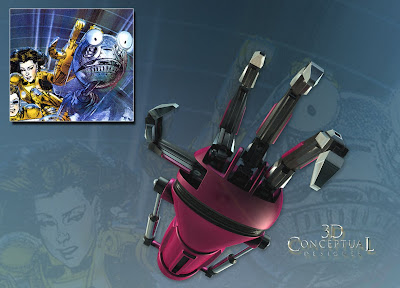 I built out the robot arm from the film in 3D and rendered it out in a few poses, this one based on a sketch by Suren Galadjian.
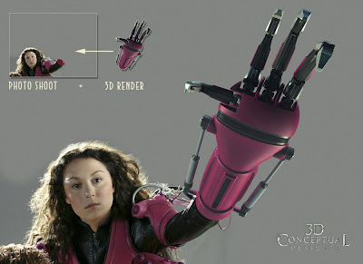 Here was the final image with a new H Photo shoot for the view and I matched the pose and lighting for the Image in 3D.
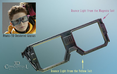 I built a set of 3D glasses for the boy to wear, and I matched the colored lighting form the final image with bounce light in magenta and yellow to line up with the bright colors of the final.
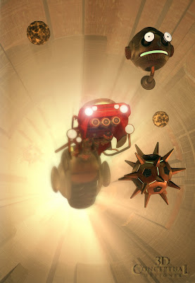 I built out the 3D tunnel and filled it with assets I made as well as some supplied by the film CGI crew to create this comp for an International finish.
 The Tag line built out in two layers with a slight double bend and some fish eye on the lens to create the fell of it bending into camera via the 3D effect.
Project Review: SPY KIDS 3D
Client: Paramount Pictures via BLT and Associates.
Art Director: n/a.
Project Date: March 2003.
I finished the 3D Logo for Spy Kids 2 about a year earlier for BLT, and I was put on the third film late in the game for these images for Spy Kids 3D: Game Over.
First up, was the 3D Logo design. I did a similar two level logo with the red inset area like I did on the finish for Spy Kids 2, and I also did an old 80's font for the tag line "Game Over". I bent the logo in two directions to force the perspective more and to accentuate the third dimension in the design itself. The Logo was not flat in any way but rounder in front and along the bottom.
I also had props and set extensions to build out as with the Robotic arm. At the photo shoot the costume excluded the claw which was a CGI post composite, yet to be done, so I built out the claw and repositioned it to match the sketches we used. This is the advantage to 3D in that I can repose and move an object and lighting to match any photo or sketch pose needed as seen in the above two examples.
I also had a small prop for the boy with some virtual glasses he work, so I built those for the poster final as well. As for the n tunnel, we were supplied the "flying motorcycle" from the CG department for the film and I re-textured and remodeled a few small parts and created the rest of the scene for the tunnel shot you see above. A fun project.
Cheers, THOM


what was the font that you used for the 3D logo??
ReplyDeleteBRG, it is IMPACT....
ReplyDeleteCheers, THOM
WHAT FONT WAS IT USED FOR GAME OVER
DeleteStep into the realm of gaming excellence with Vizent Solutions' mastery in crafting Game Assets 3D models. Our team of skilled artists and designers specializes in creating immersive environments, characters, and props that breathe life into virtual worlds. From intricate textures to dynamic animations, we ensure that every element enhances the gaming experience, captivating players and immersing them in unforgettable adventures.
ReplyDeleteFor more info,
please email at: email.vizent@gmail.com