Wednesday, September 5, 2012

Night at the Museum 2 PART II: The Golden Tablet

 Here is the HD frame from the Motion Graphics piece I designed and built for the advertising pitches for Night at The Museum 2: Escape from the Smithsonian.


 An angled camera shot of that same 3D Scene from above.


  Here is an ambient render showing the base polygon meshes.


 Here are the wires for the subdivided Turbo smoothed object. 
[over a few million faces]


 A close up view shows the smoothed mesh details.
[ NOTE the one panel that is double rez had some issues, so for time concerns I smoothed twice]


The base poly mesh with the single point beveled type.


Night at the Museum 2
PART II: The Golden Tablet

Client: Twentieth Century FOX via The Cimarron Group.
Art Director: Myself.
Project Date: Summer 2008.

For my second posting on the 3D Illustration and Motion Graphics Animation work I did for the advertising campaign for the sequel to Night at the Museum, I am focusing on the Mystical Tablet from the film that I built out as a virtual replica for the trailers.

I hand built all splines for the design of the tablet from a few screen grabs we had from the film. I then proceeded to build this all out as a quad model Pro-Boolean, which is available in 3DSmax with the n-Power tool.

This technique allows me to add a Subdivision modifier to add geometry and to soften the sharp edges out to feel more like a molded or cast part. The final Motion Graphic application I did, can be seen in my reel with the central tic-tac-toe panels all able to rotate for effect.

I used the Simbiont Dark Tree procedural bump map to get the Pumice feel to the pits and layers of gold.

You can review PART I here showcasing both films I did work on for the Advertising.


Cheers, THOM

Tuesday, September 4, 2012

Project Review The Phantom 2040 PART CX [110th] More Art Directing Color Background Keys


A Laboratory that was sketched out by me and painted by Rebecca Jo Morales


Here is my pencil drawing for The Phantom done at a 16 field Animation Layout Size, for the above painting I designed[ a re-post]


At the top of the One Mile tall Maximum Inc building is where Rebecca Madison had her main office. The layout was stretched even more [ in height]for the final painting done by Jesse M. Santos.


 The original Layout I for The Phantom 2040[ re-post] was stretched out to elongate the tall-n-thin look even more


Another Jesse M. Santos painting for the show of the Brownstone outside Kits bedroom.

My original background[ which Jesse would redraw] which was to be followed.

A layout close up on the building was based on the below design as well as my close up city shot here. This was a painting by June Miko as well.


A shot of the Mile tall building design.


Project Review
The Phantom 2040
PART CX [110th]
More Art Directing Color Background Keys

Client: Hearst Animation Productions.
Art Director: Myself.
Project Date Spring 1993.


Hope you all had a nice long Labor Day weekend!

So today for my regular Tuesday 2D post, I am posting my 110th post covering the Conceptual Design and Art Direction work that I did for the TV animated series, The Phantom 2040 from in the early ninety's, and since I recently found a full set of photos I took back in the 90's of the backgrounds we were using to promote and sell the series, I am posting a few more today.

As Art Director on the show, as well as the Conceptual Designer, I designed most major locations and had the background painters color key all areas for the teams to follow overseas. I basically Art Direct myself, which is a way to get twice the work out of me, just give me two jobs at once and I will tackle both.[ My Producers understood that benefit].

So, I have four more locations typical to the show to review.

Posted above you will see these locations. As for color theory for the show, I used warmer earth tones for the 'good guys', and acidic greens and cools for the 'bad guys'.

I was limited in that I had a very small in-house painting team with our small budget, but we accomplished a great deal in the three years of production anyhow, and that is the design in production I constantly talk about. We Industrial Designers design the systems too, not just the artwork, but it falls on deaf ears, since the artwork is what they want to see, NOT how you got there.

If you are a FAN of The Phantom 2040, and on FACEBOOK, there is a group for that....  here.

There is a TAG on the list to the RIGHT for other Phantom 2o4o entry's, but you can click this as well.

Cheers, THOM

Friday, August 31, 2012

Project Review:Something from Nothing:The Art of RAP: Key Art 3D Typography:2012

 Here is my final delivery to Cold Open for the Poster for Something from Nothing:The Art of RAP.


 A close up on a small section of the final that was 6000 pixels tall for the finish.
 

 A Polygon view shows the different heights in the various names.


  The poster from the camera view showing the Polygon grid. A simple beveled series of vectors.


 Early on we played with a black darker ambient look.
 

 I also did a pass in gold, and the Art Director was able to paint between the black and gold versions.


 Here is a screen capture shot showing the simple scene set-up, as well as how I use color in my wire frames for ID purposes.


Here is a shot of the final poster[ HAT TIP to IMPawards here ]

Project Review
Something from Nothing:The Art of RAP
Key Art 3D Typography:2012

Client: Indomina Releasing via Cold Open.
Art Director: Coby Gewertz.
Project Date: April 2012.

Back in April, I was given the assignment to do a full 3D typography exercise for the new DOcumentary Film, THe Art of RAP, for the Agency out here in California COld Open. I get regular freelance from the studio,and for this project I was able to work with Coby Gewertz again, whith whom I have worked on well over fifty posters on, so this was a nice fit.

I was given a few sets of type and directed to adjust the height, or extrusion depth for the various artists, and we even experimented with a few colors of black and gold, thoguh the orighal intenet was always to do an ambient render of white on white.

Coby added the glow of red in 2D from his end, it allowed them to move and adjust a few details in 2D , as I provided a channel, as well as a layered render with type off the back wall, as well as mattes for the micro bevels.

Cheers, THOM

Project Review The Phantom 2040 PART CIX [109th] Art Directing Color Background Keys

 Here is the final Color Key Background Painting based on my layout and design for Maxwell Madisons Hyper-Limo. Painted by June Miko.


 A Re-Post of my Layout for the above Painting.


 A Background painted by Jesse M. Santos based on my design[ though he re-drew it]

 Here is my original design for Aunt Heloises Living Room in her Brownstone.


 The Arcade entrance painted by Barbara Shade


 My Layout with Perspective Grid used for the layout of the arcade[ re-post]


 A Hallway in Maximum Inc used for Promos as well, painted by June Miko.

A shot of the final hall I designed for the Promotional Package from The Phantom 2040.
[ re-post]


Project Review
The Phantom 2040
PART CIX [109th]
Art Directing Color Background Keys

Client: Hearst Animation Productions.
Art Director: Myself.
Project Date Spring 1993.


This is my 109th post covering the Conceptual Design and Art Direction work that I did for the TV animated series, The Phantom 2040 from in the early ninety's, and I've found a full set of photos I took back in the 90's of the backgrounds we were using to promote and sell the series.

As Art Director I am responsible for the overall look of the show, as dictated to me by Producers. I in essence "Sell" my concept internally first, then I help sell it to Corporate in NYC, they I help sell it to Mattel for a toy line, and finally I help sell it to the stations to air the show.

I had an in-house team of backgound painters with four talented artists, I had to direct. The range of talent was wide with three painters well over 50 when I was just in my 20's as an Art Director. That alone can be a bit of a hill to climb, as I am the 'new kid on the block', but all in all I was accepted and the team took direction well in most cases I could control[ more on that in another post].

So, today I am posting a few finished backgrounds that were designed by me, as Conceptual Designer on the show, them I oversaw the colors as Art Director for the show. Once these were done we made copies and sent them to Canada, South Korea, and the South of France for out three teams working on the series.I eventually flew out to each studio to help them get the n look of The Phantom 2040 for the various painters we used worldwide in our production of 52 shows.

If you are a FAN of The Phantom 2040, and on FACEBOOK, there is a group for that....  here.

There is a TAG on the list to the RIGHT for other Phantom 2o4o entry's, but you can click this as well.

Cheers, THOM

Wednesday, August 29, 2012

Project Review: The Sopranos 3D Logo Exploration 2002

 The new actual 3D logo with a very deep extrusion for The Sopranos final Season.

 Here is the mesh view of the scene, the red tint on the type was due to a bit of orange in the light needed to match the 2D.


 For this variation I substituted a fully modeled 3D handgun for the simple outline used.


 Here is the polygon Mesh view of the above scene with the Beretta 9mm in 3D.


 For the last season reunite was the theme so I did this comp with the famous gun for the "r' just in the shadow. I achieved this with a shadow made from geometry.


 Here is the polygon mesh view of that same shot showing the squished font used for the shadow as well.


 Here is a screen shot from the side showing the basic layout of the scene with the fake 3D shadow tipped down using the Free-Form-Deformation[ FFD].

Project Review
The Sopranos
3D Logo Exploration 2002


Client: HBO via BLT and Associates.
Art Director: n/a.
Project Date: April 2002.

The original Logo used for the hit series The Sopranos, is actually a 2D fake to look 3D. It is a simple Photoshop exercise using the bevel tool, along with a Plug In to get the beveled look that they wanted, so my task was to do an actual 3D version of that 2D Fake.

I have copied a few 2D looks and translated them into 3D so this was a very fast project, but I did get to do a small bit of experimentation. I suggested we use a full 3D gun for the 'r' so famous in the logo so I substituted the type 'r' for the handgun one in a few comps we pitched to see if it would stick, no luck, though a fun attempt.

I also did a whole series of deep extrusions as seen above from about every conceivable angle as well. That too was canned in favor of just a simple 3D beveled type, basically an exact 3D copy of the 2D version.

Cheers, THOM


Tuesday, August 28, 2012

Personal Work Heritage High School Drafting PART II Engineering Drafting

 A Page from the full set of Engineering Drafting Pack I did in High School.

 A scanned close up from the above page with one element drawn orthographically using a grid under the velum.


 A second scan of the above page showing the dimensioned and sectioned item.


 For this exercise I had to generate the ortho view from just the two other views supplied.


 This taught us to draw an item that was not parallel or perpendicular to the drawing plane.
[ at an angle]


 Here are two Engineering exercise done at Heritage High for Engineering Drafting I and II

Personal Work
Heritage High School Drafting PART II
Engineering Drafting

Today for my Tuesday 2D post, I am posting my second in a series of foundational work I did back in High School, and with this post, I begin with the work I did for the Engineering Drafting Classes that I was in.

As someone who has spent the last twenty years in dimensional design, I can say that my training began way before I ever set foot in Collage, as I was being taught in my High School some of the foundations of my career.

What I learned in Drafting was simply how to begin to see a three dimensional object inside my head, so I could draw it, or draft it out on paper. We did many exercises where we were given just a few views of an object, and had to create added views using the information we could take from the first two. This was my first experience to actually have to think through a design of an object, something I perfected at Art Center later in life. but was taught first in High School.

I am still amazed how many 3D artists I meet who still cannot grasp this basic stuff, they were never taught it, so as a consequence they do not fully think three dimensionally. When I did finally get to Design School the first semester we hit this stuff[ again for me], so I was able to assist my fellow students in this, so I was a bit ahead from this teaching.

We also were trained in doing a hand lettered alphabet that I use every day as I still print all caps in the architectural style I also learned from Mr Fey, and Tom Q Vaxy of course!

You can view PART I , covering the Architectural Design Class I had here.

Look for more parts in the future.

Cheers, THOM


Thursday, August 23, 2012

Personal Work: Heritage High School Drafting PART I: Architectural Design


 Here is a blueprint of the house I designed back in 1984 while in an advanced High School Architecture Class. You will note the studio off the master bedroom, as well as a wood shop area off the garage, which are still to this day a part of my home layout.

 A Close up scan of the Left Side of the Home.


 Here is the foundation plan I made that was used to build out the 1" to a foot Balsa Scale Model.


 Here is a close up shot of the foundation and basement showing the Furnace location and stairs down.

Personal Work
Heritage High School Drafting PART I
Architectural Design

Today I found in my studio flat file these blueline prints from back when I was in High School, so I am starting a new series on the History of my work going back to 1984 my senior Year in High School.

I was in a bunch of Art and Design Classes in High School, as well as being an avid woodworker and metal worker I took added classes in every Industrial Arts Dept they had: Woodworking, Basic Metalworking, Drafting Introduction, Engineering Drafting, and Finally what you see above from the class, Architectural Drafting.

We were challenged by the instructor Mr. Fey[ THX mike Farr!]with designing a house for our self that would pass the Littleton City Architectural Board and be able to be built. I was blessed to have a class at this level in my High School, it was an College Level course, and I remeber how difficult it was learning all the basic rules of the city, as I just wanted to design a cool house. 

Little did I know how beneficial at the time that restriction would be in my actual career, as I ended up designing restaurants, set designs ,and theme park design.

I also was able to start an inch-to-a-foot scaled balsa wood architectural model for the house as well, but that was for extra credit, and not required. This was pre AutoCAD times so all hand drawn and lettered, a now bygone craft.

Cheers, THOM


Thursday, August 16, 2012

Project Review The Phantom 2040 PART CVIII [108th] Promo Packet Background Layouts

 
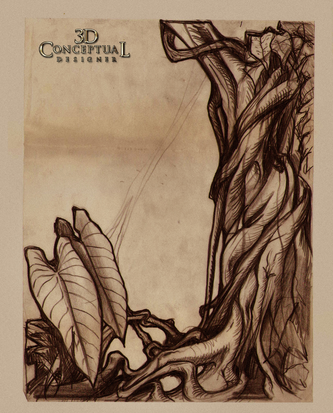
 Here is the original sketch I did on Thick Tracing paper at 9" x 12" for the front Overlay of the Jungle for the Promotional Package for The Phantom 2040 we used to sell the series to ABC.
 
 Here is the final Packet folder with the layout expertly painted by June Miko and Jesse M. Santos, two of the Layout Background Painters on the team. 
You can view the layout for the futuristic styled building here.

 Here is the very large[ so I took a pic of it] layout I did for the inside double spread which was the interior of the Phantoms Cave, it is 18" x 24" approx.

 
 A shot of the final opened up Promotional Package from The Phantom 2040.


Project Review
The Phantom 2040
PART CVIII [108th]
Promo Packet Background Layouts

Client: Hearst Animation Productions.
Art Director: Myself.
Project Date Spring 1993.


This is my 108th post covering the Conceptual Design and Art Direction work that I did for the TV animated series, The Phantom 2040 from in the early ninety's, and I've scanning in some added background Layouts that I did specifically for the promo packet to sell the show.

I mocked up the little packet and began these layouts within the first two months that I was on the show back in 92', and I used two background painters from the show, June Miko, and Jesse M. Santos, both excellent painters for the task at hand.

I loved doing the plants especially, since I was able to get the wrapping and interlocking theme into the shapes right off the bat with the vines and leaves , following the look of Art Nouveau artist Alphonse Mucha.

If you are a FAN of The Phantom 2040, and on FACEBOOK, there is a group for that....  here.

There is a TAG on the list to the RIGHT for other Phantom 2o4o entry's, but you can click this as well.

Cheers, THOM

Tuesday, August 14, 2012

Project Review The Phantom 2040 PART CVII [107th] Mini Vehicle Design Perspective Grid Layouts for Storyboards

An Enforcer Hyper-cruiser from above, you can see the design here, and here.


An Interior shot of a generic vehicle


Another overhead shot of Maxwells Hyper-Limo. the grid helps them layout the buildings as well as a UL[ Underlay]


 A shot in action of the Phantom on his Hyper-Cycle with his Multi-Cruiser right behind him with Guran inside.


Project Review
The Phantom 2040
PART CVII [107th]
Mini Vehicle Design Perspective Grid Layouts for Storyboards

Client: Hearst Animation Productions.
Art Director: Myself.
Project Date Spring 1993.


This is my 107th post covering the Conceptual Design and Art Direction work that I did for the TV animated series, The Phantom 2040 from in the early ninety's, and I've posted today these little storyboard layouts I did for the various shows.

On small budget shows, like we had on PH-2o4o, you do more front end work since it will get lost in production once they begin, so if you are diligent up front, you can get a better product with a bit of extra work.

These little layouts I did are just 2x3 in size, so about the size of a business card, and what we experienced on the shows was that in South Korea, they simply xeroxed up the storyboard frame and went from there right to production. So if the boards were vague they would be vague.

They almost never redrew the frame, which is the typical way it is done, so I decided very early on to put some perspective grids in these mini shots to help them even more, and it worked!

If you are a FAN of The Phantom 2040, and on FACEBOOK, there is a group for that....  here.

There is a TAG on the list to the RIGHT for other Phantom 2o4o entry's, but you can click this as well.

Cheers, THOM