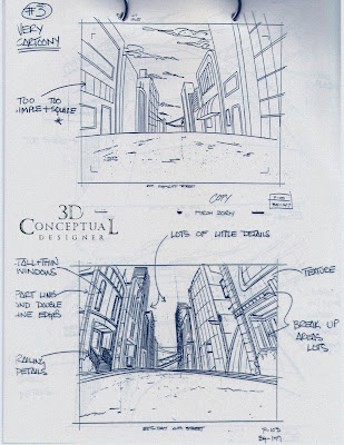
 The first Layout Art Direction Page showing the typical issues faced with three different Layout vendors in three countries.
 Another issue was getting the views more dynamic so we had really "tight" storyboards as some vendors simply Xeroxed the storyboard and blew it up for the layout.
 Tall and Thin was the established look I pushed to give the Characters a proper world to live in as Peter's character proportions were 12-15 heads tall.
Phantom 2040-PART XXIX
Layout Art Direction
Layout Art Direction
Client: Hearst Animation Productions.
Art Director: Myself.
Project Date Spring 1993.
In this 29th post on the Phantom 2040 TV Animation series I worked on in the early 90's , here I have posted my Art Direction sheets that were done while I was in Canada with our Layout vendor helping create a style booklet for the layout artists to follow.
Each Art Direction page I created takes a typical layout and compares it to my corrected Layout below. I also took these sheets to South Korea to get translated for the Animation Studio Sei Young/ Anitel to supply their workers with. We also bought ship curves and French Curves so the layout teams could correctly add in the "fish-eye" to the layouts.
Cheers, THOM


No comments:
Post a Comment