Monday, June 27, 2011

Project Review: 3D Marquee Outdoor Neon Sign for NORMS 2006

I Built out the 3D Neon Sign and rendered it out at this extreme angle at suck lighting. Originally for a MGFX portion of the pitch idea.


Here is a shot of the same model with more of a daylight environment at a regular side angle with about a 40mm lens.


An extreme down view[ birds eye] of the 3D Neon sign approaching a nice deep blue environment found in there print materials provided.


Here is the wireframe quad view of the model . It was built high poly from the start as it was a very fast build for a pitch. Normally in a case like this we might remake the item in all Sub-D quads for a better asset to animate, but this was for a first pitch and they needed it FAST....


Here is a close Up shot showing the neon pitching in to the small "O" ring for each tube on the sign.


The model of the 3D Neon sign I made for Norms in Hollywood close Up from below.


Project Review: NORMS
Neon Sign in 3D

Client: Norms via The Cimarron Group.
Art Director: n/a.
Project Date: Fall 2006.

Back in 2006, while I was n in house at The Cimarron Group, in Hollywood CA. , I did a 3D replica of the famous NORMS neon sign from Hollywood to try and s help out Corporate division score a new client.

I have built many neon signs in 3D as well as help designed real ones when I was an Imagineer at The Walt Disney Company, so this was a fun and familiar exercise.

It was a about a 5 Hour project to build it out, light, render, and texture, about 6 views for use in the pitch packages for the various NORMS ideas they pitched to this potential client. I delivered my 3D goods in less than a day, though the pitch did not secure the work for them at that time, though the process of conceptualizing these items for the various departments was always an enjoyable process from my perspective running the little One Man Army there.

Cheers, THOM

Friday, June 24, 2011

Project Review: Spy Kids 3D 2003

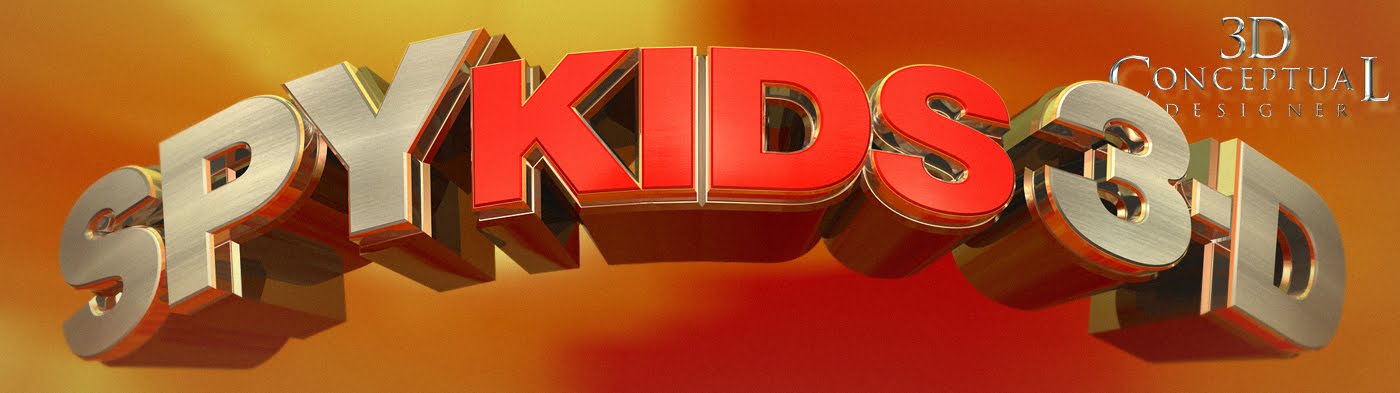
In this 3D logo I designed for the film it has a one direction curve bending the face of the text back away from camera in a blue shy world.


Here we see the above logo modified with a second bend down to curve the horizon, and placed in a "Magic Hour" sky to get the warm golds in the chrome.


A Taller font with a cloudy sky world and bright sunlight used for this pass at the Spy Kids 3D Logo I did back in 2003.


I built out the robot arm from the film in 3D and rendered it out in a few poses, this one based on a sketch by Suren Galadjian.


Here was the final image with a new H Photo shoot for the view and I matched the pose and lighting for the Image in 3D.

I built a set of 3D glasses for the boy to wear, and I matched the colored lighting form the final image with bounce light in magenta and yellow to line up with the bright colors of the final.


I built out the 3D tunnel and filled it with assets I made as well as some supplied by the film CGI crew to create this comp for an International finish.


The Tag line built out in two layers with a slight double bend and some fish eye on the lens to create the fell of it bending into camera via the 3D effect.


Project Review: SPY KIDS 3D

Client: Paramount Pictures via BLT and Associates.
Art Director: n/a.
Project Date: March 2003.

I finished the 3D Logo for Spy Kids 2 about a year earlier for BLT, and I was put on the third film late in the game for these images for Spy Kids 3D: Game Over.

First up, was the 3D Logo design. I did a similar two level logo with the red inset area like I did on the finish for Spy Kids 2, and I also did an old 80's font for the tag line "Game Over". I bent the logo in two directions to force the perspective more and to accentuate the third dimension in the design itself. The Logo was not flat in any way but rounder in front and along the bottom.

I also had props and set extensions to build out as with the Robotic arm. At the photo shoot the costume excluded the claw which was a CGI post composite, yet to be done, so I built out the claw and repositioned it to match the sketches we used. This is the advantage to 3D in that I can repose and move an object and lighting to match any photo or sketch pose needed as seen in the above two examples.

I also had a small prop for the boy with some virtual glasses he work, so I built those for the poster final as well. As for the n tunnel, we were supplied the "flying motorcycle" from the CG department for the film and I re-textured and remodeled a few small parts and created the rest of the scene for the tunnel shot you see above. A fun project.

Cheers, THOM

Thursday, June 23, 2011

Project Review: The Phantom 2040- PART LXIX[69]

All views were extreme views, with fish eye and strong perspective in birdseye and worms eye shots as seen in these two mini board sketches.


The animators were having a difficult time posing Graft correctly at first so I did a dozen poses.


Here are some sketches used in vertical pans, one with the B.I.O.T. cutting Graft out from his damaged B.I.O.T. Outer body.


Here are the two frames from when The Phantom sets a bomb under the arm of one of Grafts pincers. These little boards are 2"x3" velum overlays for the Storyboards, but were also inked for a style sheet as well for reference.


Phantom 2040-PART LXVIX [69th]
Graft Character Views from Storyboards.


Client: Hearst Animation Productions.
Art Director: Myself.
Project Date Spring 1993.

In this 69th post on "The Phantom 2040" television Animation Series I have posted some of the overlay sketches I did for the storyboards to get the main character Graft correct in the action shots.

These sketches done were of when he was in the specif mode of "Urban Combat". This was one of a few forms he took that were giant 3 person tall fighting B.I.O.T. robots that would be a huge challenge for The Phantom. It turned out that the animators needed a lot of help with this one so I jumped in and di a couple dozen views to help out.

Once the boards were done I took the little overlays I created and sent to Caesar in Character inking to ink over and create a style page for Graft for the future shows. This helped out a lot so we did this with a few more characters and especially vehicles designs I did.

Cheers, THOM

Wednesday, June 22, 2011

Project Review: Scooby Doo Too: Monsters Unleashed.

Here is the Scooby Dog Tag I did for the Second Film. I re-used the strap from the first one I did here.


I built out parts of Scooby for the poster. They had a head shot but no paw, so I built this out as the base to finish.


The Coolsonian Criminology Museum was a 3D Illustration I built and rendered out for a few Comp Ideas.


In this shot the whole gang is standing on the doorway looking in with the green backlit light from behind showcasing them.


One of many takes I did on the main Logo designed for the film.


Project Review
Scooby Doo Too Monsters Unleashed

Client: Warner Brothers via BLT and Associates.
Art Director(s): Zack Ris, Marcus Almaraz, and Jeff Barnett.
Project Date: Spring-Summer 2003.

I have a previous posting showing show 3D Illustrations here, that I did for the first film for Scooby Doo in 2001 while at BLT and Associates in Hollywood, and here I review some of the work I performed for the sequel, Scooby Doo Too: Monsters Unleashed in 03'.

I had built the Dog Tag for the first film, so we did a modified version for the second. SD2 was put on the tag and the colors were modified away from gold to platinum. I also did some virtual sets with the "Coolsonian Criminology Museum", as well as a busted down door, with a view up to the door frame with the green lighting from behind, known to the film and animated shows color palette.

I also built out a few Scooby's in 3D as static sculpts and we added in fur in finishing. I would model out the parts, skin, pads, and nails and also render a wireframe guide and we would get the lighting close and then it would go to Joseph Escareno in Finishing and it was painstakingly hand applied. The Peace symbol/ two sign, was what finished for the teaser.

I did just a few logos for AV and handed over some models to Matt Hartle to render out for the Editors.

As a sidenote, I also worked on the Scooby Doo Video Game for Sony a few years earlier so I was well versed in the Art Direction, and being a kid in the 70's it is in my memories too, enjoy!


Cheers, THOM

Tuesday, June 21, 2011

Project Review: Cafe Morpheus Asylum-PART IV

A side view from a big booth showing the Bar to the left, the big opposite widow [ Shh no secrets here**], and the railings to the Mezzanine.

The Counter Bar in the center of the Main Room at Cafe Morpheus with a view to the kitchen.


The revised ironwork for the staircase.[ If you watch Point of No Return] this is the staircase that B. Fonda jumps down after her first kill, that was the room we modified.


The main big windows for each side with internal lighting.


All Lamps that were handmade for the Main dining hall area.

Cafe Morpheus Asylum Restaurant
PART IV

Client: John R. Thomas.
Art Director: John R. Thomas.
Project Date: Summer 1993.

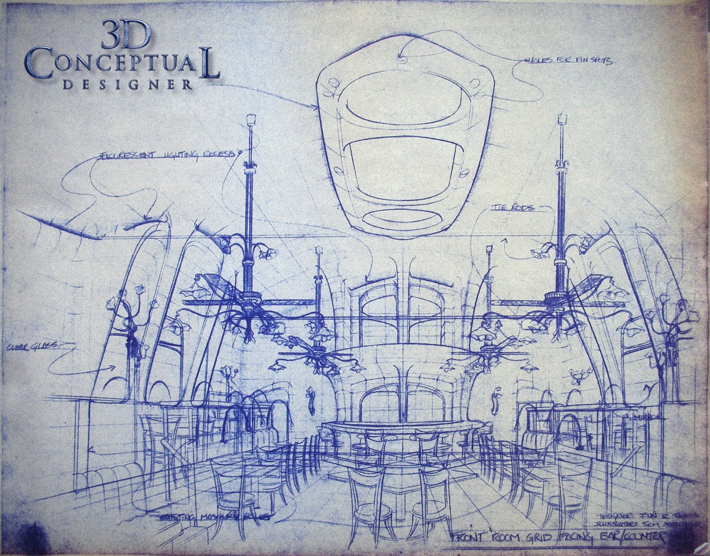
In this fourth posting for the restaurant and lounge, Cafe Morpheus-Asylum I illustrated for John R. Thomas in Beverly Hills CA. back in the very early 90's, I focus in this post on the blueprint Designs for the custom curved main dining hall.

The room had a barrel roof originally as it was a Lodge from the 20's and we converted the room to be in the Art Nouveau style of Antoni Gaudi. The rooms ceiling formed a Parabolic Audio effect where you could ***hear whispers across the room as they bounced inside the fully curved surfaces. You can also see this room in the film "Swimming with Sharks" starring Kevin Spacey.

You can also see the bent copper tube lamps I designed from my prior posting on the walls, posts and the big fan/chandeliers in the main image.

You will notice the grid work over the complex curved surfaces, this was a guild for the builders to make these shapes. I also made huge 6-9 foot long french curves for the construction crew to get the shapes right base on these.

.You can view PART I here,

..and PART II here.

...and PART III here.

Cheers, THOM

Monday, June 20, 2011

Project Review: Eloise at the Plaza (2003)

Based on the Cover from the book "It's Me Eloise" done for the Disney Film Comp Ideas we pitched in 2003.


A fast build no-quad modeling yet as was still learning that back then, so I built this in about 1.5 Hrs.


Close up details on the Mantle Design for the Design Comp for the Eloise film.


The Alternate design we did of the Elevator scene from the book.


We did this one with the doors closed all the way, half open, and fully open for various ideas for Eloise.


A close up on the Elevator Dial with the flower detail from the Fireplace being reused again.


Eloise at The Plaza 2003

Client Walt Disney Pictures via BLT and Associates.
Art Director: n/a.
Project Date: March 2003.

A quick 3D Illustration Job I performed at BLT and Associates while running the in-house 3D Design Department. I had to match some sketches from the classic Eloise Children's books as a backdrop for the One Sheet. We used the fireplace from the book " It's Me Eloise", and the elevator shot as well.

Above you see the images as well as the raw 3D models showing how I quickly built them out for the images needed in a single day turn around.

Cheers, THOM

Friday, June 17, 2011

Project Review: James Bond 007:Die Another Day 2002 PART-II

A Simple Chrome double plate logo I designed for the Die Another Day ad campaign in 02'.


Here I used the glass material I worked out for the Walther PPK here.


A rough brushed metal logo with a smooth text overlay. This one was extruded with thicker rounded profile for more weight.


Using the thick Model I did for this version for Die Another Day in golds and a warmer palette.


We liked the feel of the larger holding bevel on this version with the glowing text, I did half a dozen alternates on this model for 007 Bond.


Die Another Day
James Bond 007
PART-II

Client: MGM via BLT and Associates.
Art Director: n/a.
Project Date:Summer and Fall 2002.

This is my second posting on "Die Another Day" the Bond Film I did 3D Illustrations and Logos for back in 2002 for the Theatrical release of the film. I posted the props I build and rendered here, so today I cover a few looks we explored for the type treatments.

While designing over at BLT and Associates I always had a fun project come my way, and 007 is a great property to illustrate for. I experimented with glass and ice as the teaser had a ice gun explode and we were tasked with a few looks to compliment that existing campaign. We also explored Golds and polished metals as well.

Cheers, THOM

Thursday, June 16, 2011

Project Review: Absolut Vodka "Bot Bar" PART III

Here we have the emotions showing a smile and a "Come On", for the Emodicon chat room character "Rocker"


Here we see "Rocker" showing extreme like, and showing some lusting.


Here we have Ingratitude and Sly, for the Emodicon chat room character "Rocker"


Here we have Disinterest and Smirk, for the Emodicon chat room character "Rocker"


Here we have the base emotions of Love and Anger, for the Emodicon chat room character "Rocker"


Here we have Bummed out and fake, for the Emodicon chat room character "Rocker"


Absolut Vodka Website
"Bot Bar" Character Designs
1996
PART III


Client: Absolut Vodka via Troon Ltd.
Art Director: Chris Trages.
Project Date: April 1996

This is my third post covering the series of characters or "emodicons" for an online chat room for the website for Absolut that I created back in 1996. I was contracted by the Design Studio in Santa Monica, Troon LTD.

Here we see my designs for "Rocker" and older hip 70's and 80's rocker dude done in a Picasso-esque style as abstract art character for the chat room. I had a lot of fun with all of them but he was a combo of Eddie Van Halen, Animal from the Muppets, and Eddie Vetter.

In doing these emoticons with the variety of emotions I cannot recommend any higher the great work of Jack Hamm with his book on Cartooning as he has a veritable dictionary of emotions and what the face muscles do in each which made this task a whole lot easier to accomplish his book is here.

You can see the first character "Manhattan" here.

You can see the second " Trophy" here.

Cheers, THOM

Wednesday, June 15, 2011

Project Review: The Accidental Spy 2002 PART II=Gadgets

This "Pen" Gadget was to sit in Mr. Chans front shirt pocket in the poster.


A Tuff covered Walkie-Talkie I designed in 3D for The Accidental Spy Poster artwork.


I Handheld GPS Device made from Carbon Fiber I designed in 3D for the Project.


A Smaller Listening device[ Like a Quarter Sized Walkie-Talkie] I designed for Accidental Spy in 2001.


A PDA with a Glowing globe screen for the posters[ an early design]


Jackie Chan wore a special watch for the Poster on his punching hand at first.


The Accidental Spy
PART II Gadgets

Client: Dimension Films via BLT and Associates.
Art Director: n/a
Project Date: Winter 2001-2002

One of my early projects while running a small 3D department at BLT and Associated, was a direct to video release of the Jackie Chan Action Film The Accidental Spy, as I have posted the Logo that finished here a while back, so here are the gadgets I did.

One advantage in hiring a trained Product Designer is that when you ask of a gadget I can make one up in 3D while I go, which saves my clients time and cash. On most of these I had about 30 minutes each to design, build, texture, and render for the posters.

You will notice that most are warm glowing in color, and this is due to the finished poster background was used by my as the reflection so the p little gadgets would drop easily into the Art Directors comp ideas and match up. Here is the final finished poster.

The Main character played by Jackie Chan was a "James Bond" type, and they wanted him to be filled up with PDA's and spy watches etc. I had a lot of fun with the fast pace this one had.

Cheers, THOM