Friday, November 15, 2013

Project Review Treasure Planet 2002 PART II

The main 3D posed shot I created for the Poster Idea presentations back in 2002 for Disneys Treasure Planet.


Here is the 3D wire-frame shot of the model I built in the pose from above.


An under the board shot[ It flys!] 
NOTE: The low rez texture I made, I learned to build much higher versions over the last dozen years.


The wire frame shows the details I made even underneath the prop.


A tail shot showing the Jet propulsion attachment.


The 3D wireframe render for the above.

A back view of the Treasure Planet prop with the engines off.


The wires.


The 3/4 front view of the engine.


I built this Pre-Quads, as I was still practicing the technique a dozen years back now.


I created all the wire clips and rivets with zip-tie knots and beveled edges for good highlights.


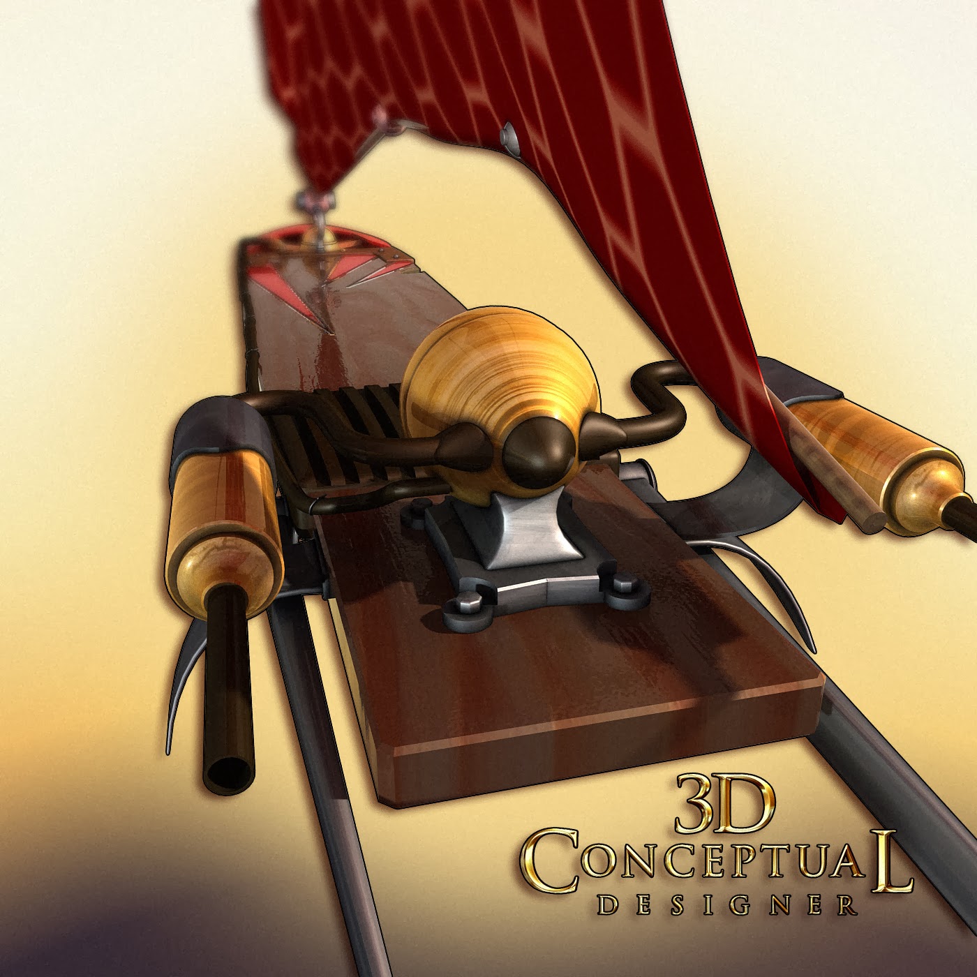
The Handrail bar details up front on the flying board from Treasure Planet from back in 2002.


Project Review
Treasure Planet 2002
PART II
 

Client: Walt Disney Feature Animation via BLT and Associates.
Art Director: Warren Nung.
Project Date: Spring 2002.

For my second posting here covering the 3D design and 3D Illustration work I performed for the Theatrical Print Advertising for the Disney film, Treasure Planet today I cover more in depth the main flying para sail space board from the film that I was asked to recreate for the comp ideas we presented.

Often I reverse engineer out a prop from a film or animation that is either not fully done and available or is just locked off to a our access, so I remake the item. Also I usually only get a single JPG that tends to be a low rez shot to make it from and in this case, that was what I had to build from.

I also get a day or less for these type of things, knowing full well the film prop was build by a team with much more time.

I jumped right in, and  recreated all the various parts and matched the pose to fit a character sketch we did in-house to sell the comp idea to the client. A fun project, and copying anothers designs in 3D always stretch your design capabilities, as you end up doing things outside your own form study.

You can review PART I here that is an overview of the various props I made.

Cheers, THOM

Thursday, November 14, 2013

Project Review: Tomb Raider 2 The Cradle of Life Part II- 3D Main Title Logo Looks


Here is the first title I did for Tomb Raider 2, it was a replication in sorts of what was finished in the print for the first film.


I was using procedural textures from Darkling Simulations early on, so I used a shader from the software and adjusted it to create a cement natural stone like texture.


 Another cement procedural, only this one I wrote in Dark Tree so I could get flat spots on the texture with the aged incursions eating into the font.


This is actually the rusty paint shader that I adjusted and added in a reflection channel that I could drop in the ray trace from the various renderers I use for reflections and then used the bit mapped sanded steel.


This is actually the lunar moon texture shader adjusted to create a s natural stone to match the theme of the second film in the fining of the ancient city.


A heavy rusted steel texture version. The green bottom lighting found on many comps as to connect to the aquatic theme in the second film.


A combo of rusty metal and stone for this pass as I blended procedurals for this pass.


A glass logo in a mild purple.


Another glass Tomb Raider 3D Logo look I created back in 02' with a blue like glass with some glow FX.


 My glass I used on the PPK with some procedural surface cracking added in[ slight].


This is a electron Microscope X-ray texture, as the second film had a' virus' element that they wanted to exploit for the teasers.


A very heavy grained ice like texture for the Tomb Raider Logo.


Here is the basic camera view of the polygons. Two plates of text with a background reflection sphere object[ hidden]


In this birds eye view looking down at the scene we see the camera and the curve added to the double stacked logo plates.


Project Review
Tomb Raider 2 The Cradle of Life
Part II- 3D Main Title Logo Looks

Client: Paramount Pictures.
Art Director(s):Rick Lynch, Warren Nung, Zack Ris, Marcus Almaraz
Project Date: Summer 2002.

For my second posting on the 3D Illustration and 3D Design work that I performed back in 2002 for the Theatrical Advertising on Tomb Raider 2, I have posted a series of looks I did for the main title I built out and rendered in 3D.

The look of the 3D title was established in the first film with the iconic double stacked logo with two plates of metal with a gold holding device behind the font. First we recreated the vectors for the title and the Font Artist there, provided me with the 'ai" save-as file ready to go in 3D.

I built the 3D type out with a sharp bevel out front and a rounded one in the back to 'roll' the reflection over the edges. I then put a slight bend to the type to give a little more curve to the title. I built this prior to learning to Quad model better, and had I needed more of a bend it would have been problematic as if you bend the face too much the triangulation will produce "folds' as artifacts. I also hand rotated each letter but the lighting made them checkerboard in value so I went with the low angle, slight curve instead.

You can review my first post here, which covers a wide range of items I created for the poster comps.

Cheers, THOM

Tuesday, November 12, 2013

Project Review: S.W.A.T. The Movie 2003 PART IV The Detectives Office

Here is a rough render showing the various virtual furnishings I created for the shot we were to use in the Teaser Trailer for S.W.A.T.


 This Polygon render shows the basic build[ non-quad].


 The main office parts[ except a floor] was exported as an OBJ for the Maya pipeline.


 As a cabinet builder I created the drawer slides and hardware for the Craftsman furniture.


 The desk from the back shows the power cord draped off the edge as well as the various desk props.


 The Mission Hammered Copper Mica Lamp I built out.


 The vintage desk plane clock is seen foreground here[ subdivision is low in this shot.]


 Here is the file cabinet with a n opened drawer showing the build details.


Project Review
S.W.A.T. The Movie 2003 
PART IV
The Detectives Office

Client: Columbia Pictures Inc. via BLT and Associates.
Art Directors: n/a
Project Date: Winter 2002-3.

It this my fourth posting for the work I did for the TV to film adaptation of S.W.A.T., from almost a decade back now, today I am covering the virtual set I built for a green-screen live action move for the Theatrical Trailers.

At the time the script called for a move from a Laptop PC on a desk in a Detectives office, out a window into the city, so I created a series of virtual furniture for the opening shot.

I built out the various pieces in an Arts and Crafts style, and exported them to the 3D Animation Department at BLT for use, however at delivery they changed direction and instead went up on the rooftop and did the move from there. A fun build and as a cabinet builder myself I enjoy the virtual woodworking as well.

I have a few more posts on S.W.A.T., that I will try and post up these in the future, so keep an eye out.

You can View the logos in PART I here.

You can view the M4 Carbine I built here for PART II

You can view PART III, the S.W.A.T. tactical van posting here.

Cheers, THOM

Friday, November 8, 2013

Project Review: Countrywide Store Remodel Visualization-Part II:Kiosk Designs-Round

Here is the primary final Kiosk design done in all wood for Countrywide back on 2007.
 

 Here is the shot of the Kiosk 3D Prototype with the base storage area opened up.


 An alternate with metal frames on the big posters up top.


 A close up 3D render of the pamphlet storage details in the free standing Kiosk design.


 I was asked to do an all metal version as well, as some stores used laminate brushed aluminum so I did this alt version too.


 This was a half wood up top, with a metal base combo design version. 3D really assists in this as the alternates take little time to do.


 A variation with different frames on the posters.

I rendered out this ortho view to get base dimension back to the architectural team at Countrywide to put into the plans. 


A shot of the Kiosk inside a Countrywide Store.
 

 Here is the polygon mesh view showing the build itself.

Project Review
Countrywide Store Remodel Visualization
Part II
Kiosk Designs: Round

Client: Countrywide Homes via The Cimarron Group.
Art Director: Myself.
Project Date: Summer 2007

In this, my second posting on the 3D Architectural Visualization I did for Countrywide back in 2004-2009, today I am covering one of the many Kiosks I helped to visualize for them, and today we are looking at the free standing round Kiosk Design.

One of the great advantages to 3D visualization is that the client can see before they build what the design will look like, and in most cases the folks who write the checks, need this service to assist in the bidding process.

I was given the architectural plans for a square Kiosk and was asked to create a few variations and this round version was build out in 3D as an Architectural visualization asset to present to the CEO of the company. Once I had it built out, then the variations were fast, as the base objects were created and lighting and textures were ready to go, so I quickly adjusted the various parts and materials to reflect the options they wanted to show. 3D really is the most cost effective visualization method if you want to see many versions, as sketching this would be a new drawing for each concept.

I did a version in all wood, wood+metal, wood+metal+glass, and a wood+glass version. I also built out the internal parts as well and linked it up to open up the storage area below to show the effectiveness of the design.

A free standing Kiosk, or Point of Sale Architectural element, and I will be posting the rest of the designs in the next few weeks.

You can view PART I here with the basic store visualization I did.

Cheers, THOM

Monday, November 4, 2013

Project Review: The Stepford Wives 2003: Key Art 3D Design PART I-Remote Control

 The final render used was this front view on the Remote Control I designed out for the Key Art for the remake of The Stepford Wives.


A render in all glass like the PPK I did around the same time @ BLT.


A glass version rendered now on a black environment was a darker version of the above concept.


 Here are the wires[ Pre-Quads]. I used N-powers Power Solids for many of these parts.


A lower angle looking up.


An alternate version with the stylized garters and lingerie in red.


Here are the wires in this angle.


Another angle on the final version of the "sexy" remote control from the Stepford Wives.


 A raised 3/4 front/side view on the final remote.

Project Review
Key Art 3D Design PART I
Remote Control

Client: via BLT Communications.
Art Direction: n/a.
Project Date:May 2003.

When I was in-house at BLT running the 3D Design Department from 200-2003, I was tasked with a fun One Sheet concept for the remake of the film, The Stepford Wives back in 2003.

They wanted was a remote control design that was a bit sexy, with just a few buttons to show the chauvinistic side of the concept with a simple, cook, clean and a sex button. I designed out the remote around the proportions of a female torso that is stylized but clearly evident.

I rendered it out in a tech metal material with glass buttons lit internally, as well as in glass. I also did a few color alts. The remote design included some garter belts and lingerie styled metal trim that I varied the colors on as well.

When it was implemented in the print work, the 'gag' was that the sex button plus "+" area was worn out from pressing in all the time, and this was done in Photoshop by the art directors who used the asset in the presentation. 

A fun fast 6 Hr gig to design, build, light, texture, and render out.

Cheers, THOM