Monday, June 24, 2013

Project Review: Herbie Fully Loaded PART V- Motion Graphics Herbie in Glass [X-Ray] 2005

The same animation move is seen in my reel, here is frame one rendered out in a glass material.


As we pass by we can see into the bonnet and the floor pan area.


A full interior was built out as well as some "Lip Doors" from a 54' were snuck in as I am a VW owner and love the 54'.


 The side shot at the door.


 The final frame in this Motion Graphics piece.


Here is a frame with the virtual 3D Herbie fully rendered out.


Project Review
Herbie Fully Loaded PART V
Motion Graphics Herbie in Glass [X-Ray] 2005


Client: The Walt Disney Pictures via The Cimarron Group.
Art Direction: myself.
Project Date Winter 2005

In this, my fifth posting on the work I did for the newer[ now old!] Herbie film starring Lindsey Lohan and Justin Long, today I've posted a look at a Motion Graphics [ MGFX] render pass that I planned to do in glass of that famous 1963 VW.

If you check out my reel on the link to the right you will see a transition we did for the Herbie from fully rendered to an X-ray type of material. Originally we planned to go glass so the team I worked with was familiar with the X-Ray PPK I did at BLT prior and wanted to see that look in motion.

 However back in 2005 when I built this motion graphic piece the render times were not forgiving so it was deemed too long a render for the production. What is nice is I opened the scene in 3D Studio Max 2013, hit render and they went very fast as the software and hardware has advanced quite a bit in the last 8 years so I was done to 8 minutes a frame in glass at 3/4 HR rez.

X-Ray modeling is done when you know up front that you will see thru the objects so you build out everything internal and two sided, and for Herbie we had all sorts of plans to fly thru the tailpipe inside the engine and around the interior and speedometer.

I included the painted render pass as well as a reference for the transition.

My First four other posts on the VW build itself, are here, along with this and this,  and this.

Cheers, THOM

Friday, June 21, 2013

Project Review: Southern California Honda Dealers: 3D Motion Graphics-2006

 The "Hero" Logo rendered out in the final seated position. This was combined in post with the background animation.


 The base polygon model as built by me for the job of the Honda logo "hood crest".


 For the background renders we did it with one subdivision level on....


 We did find that with 2 levels of subdivision on the crest the reflection were much smoother so we upped the resolution which doubled the render time as can be demonstrated below.


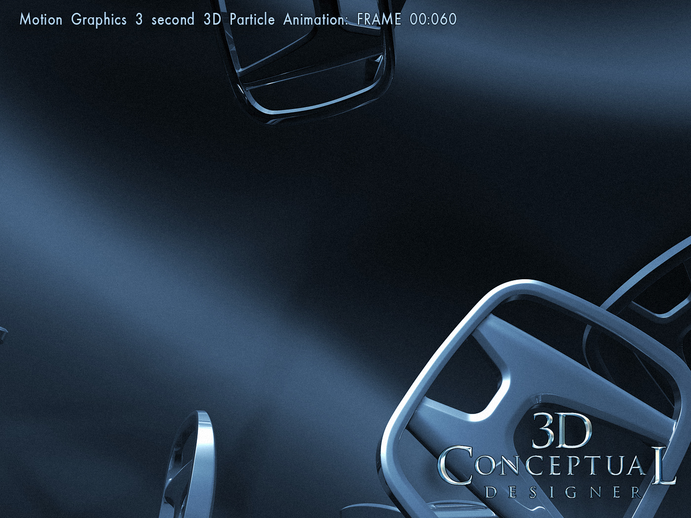
 An early frame where the particle engine has generated over 200 crests flying from behind camera in a space filed of dark blue[ Honda Blue]


 This frame shows the large 'flare' or random highlights you get with a gravity based particle system, since it is random in how it throws the crests out into space,you can get surprising results.


 The background itself had an animated noise added to it, to produce the caustic 'waves' in the fog itself, and that was modulated so we had movement with the crests, lights, and in the fog itself.


 The wave had ended and they are all now drifting back. This is where we overlaid the "Hero" crest as the space cleared up to showcase it.


 Here is the final frame of the Motion Graphics sequence Animation

Project Review
Southern California Honda Dealers
3D Motion Graphics-2006

Client: Southern California Honda Dealers via The Cimarron Group.
Art Director: Myself.
Project Date: August 2006.

After successfully getting an account with Lotus North America for the US Launch of the new Elise back in 2004, we then pursued the California Honda Dealers Association to provide advertising for them, so we did a pitch package that included some virtual cars, as well as 3D Motion Graphic as we will look at today.

I first built out a 3D model of the Honda logo for the spots, that was built as an all subdivision surface, so we could do very high resolution renders of the piece for close ups and print work. I also used this same model for the particle system base object that I set up for the creation of the Motion Graphics background for the various cards we did for the presentation.

The piece was a simple background of multiple Honda hood crest logos floating is space with a volumetric light effect to have streams of light playing on the surfaces. I rendered it out in a two pass format with a full render and a specular render so we could isolate the highlight to add post effects in Motion Graphic. I also did a Hero shot render of the final framed logo at rest as well.

I also rendered various Honda Car Models in 3D as both photo-real 3D renders, as well as a stylized cartoon shaded looks, to show the capabilities of the 3D virtual automotive solutions we were offering along with the MGFX.

I will have future posts covering those looks as well. I did eventually move ahead to work on the 2009 Accord pitch, and that can bee seen here.

Cheers, THOM

Thursday, June 20, 2013

Project Review Monsters vs. Aliens. 3D Logo Designs 2008 Part IV.-MVA Buttons

Fur and Scales were the representation of the two genres for this MVA 3D Logo from the pitch we did for Monsters vs' Aliens back in 2008.

A double plate with colorful textures with this sharper designed MVA Logo.

A MVA button design with glass metal and bright lighting FX.


A darker version with all opaque materials for this ALT of the above design.

A brushed metal look on the front of a colorful background "M". WE put the 'vs' inside a glass ball in the "A".


An all metal look here for the MVA button from above.


Project Review
Monsters vs. Aliens.
3D Logo Designs 2008 Part IV.
MVA Buttons

Clients Dreamworks via The Cimarron Group.  
Art Directors(s): Chris A. Hawkins.,Calvin Sumler, and Joseph Stamper.  
Project Date: Fall 2007.

This is PART IV covering my 3D Design work I did for the Theatrical Advertising done on Dreamworks 3D animated feature, Monsters vs. Aliens from back in the Late Fall of 2008, and Winter of 2009 while I was the in-house 3D Design Director at The Cimarron Group, and today I have button designs from the 3D Logo portion.

We referred to the film as MVA[ short for Monsters versus Aliens], and the client asked for some buttons and 3D Logos with just the initials, and not the full title as well as what we already delivered, so I was provided with vector Illustrator files from the Print Division and some base direction and off I went.

I played around with the various looks for the buttons similar to what I have posted for the main titles from the glossy typically bright toon styled ones, to a more sinister and darker look as well.

You can view my prior posts for the film as follows:

You can view the MGFX city I built in just over a day for the trailers in PART I here,
You can view the full 3D logos here for PART II.
You can view Part III with more 3D Logos here.

You can also see the final 3D Animation of the Title at the front of my MGFX reel work in the right column link.

Cheers, THOM

Wednesday, June 12, 2013

Project Review: Behind the Candelabra[Liberace] 2008- PART I The X-Ray Piano.

 The main "Hero" render was done in traditional black and all glass crystal.

 A Liberace Baldwin done in all crystal.


 Here is an exploded view showcasing all the basic parts and wireframe.


 A similar parts view render of the Grand Baldwin Piano I made in 3DSmax in basic materials.


 A Birds Eye overhead view of the piano.


 A Behind the player view of the Ivory.


 I did a few graphic orthographic renders for some comps as well, this was with the lid open exposing the full build-out if the strings and frame inside.


 A close up down the keys on this Virtual Grand Baldwin.


 A close up of the construction details with pads, wires retainers, and key mechanicals. FUN stuff!


 An exploded close up showing the wires off the posts fully wrapped around with the felt supports below.

 Another angle on the piano for a comp for Behind the Candelabra.


Project Review
Behind the Candelabra[Liberace] 2008
PART I The X-Ray Piano.

Client: HBO Films via The Cimarron Group.
Art Director: Joseph Stamper.
Project Date: November 2008.

Back in the late Fall of 2008 the Theatrical Print Division @ Cimarron wanted to do a pitch for the new Liberace Film being considered, "Behind the Candelabra", and what I was asked to build out besides the 3D Logos, was to construct a fully detailed model of the Grand Baldwin Piano used by Liberace. They also wanted to do some versions in crystal[ glass] and a regular black on black look, but they wanted it to show all the parts inside, so that meant a full X-Ray model build out, not just a shell model.

An X-Ray model is one which you build out all internal parts anticipating the fact that they will be seen, and being this is a crystal piano we'd see all the internals. I did this in the past here, and here, and since they had seen my PPK I did for Bond they wanted to do the same for this with my 3D Illustrations.

I referenced the Baldwins Liberace played and I began to create the parts inside bit by bit. As a trained Industrial Designer over half of what I do is a form of reverse engineering as I must create the parts to look relativly functional, so I must have some understanding of how the part functions so I study cut away diagrams, and How it is made books. It heped that I have a vintage upright at home so I could lift the lid and take a look up close here as well.

What you see are the various 3D Renders I provided for the comp presentations with the Baldwin.

I will be posting the 3D logos in a future post.

Cheers, THOM

Monday, June 10, 2013

Project Review FANBOYS Motion Graphics PART II Opening Title 3D Motion Graphics Skywalker Light Saber Animation

Frame One in the Lightsaber move done for the Title of Fanboys was on the butt end of the saber.

 It is a whip spin move so we are at 22 degrees in one frame already.

 In this shot from the back you can see I hollowed out the test for Fanboys:
Reason was we had neon behind it at one point[ removed]

 The light volumetric whips past camera wiping it...


 The finish of the wipe move. NOTE: These are RAW rendered frames I am showing with no post yet. The final was Jazzed up as all MGFX are in post as seen in my reel here.
 
 Eight frames in is 1/3 a second, typical for a title slam in MGFX work and we are revealing the logo now less than 1/3 a second into the move.

 The Logo seated has a slow continuation of the move as a radial drift.

 The final frame as the title has rotated clockwise about 2 degrees over the long last 2 seconds, so all the big motion is in about 10 frames, with 80 frames of subtle support.


Here is an ambient render with a screen-capture showing the 3D stars and light placement inside the sable blade.


Project Review
FANBOYSMotion Graphics PART II
Opening Title 3D Motion Graphics

Skywalker Light Saber Animation


Client: Third Rail Releasing via The Cimarron Group.
Art Director: Tom Kositchotitana, and myself.
Project Date: Summer 2006.

In this my second posting for Fanboys, I am covering the light saber 3D asset from the main Title I created for the film and the Theatrical Advertising work.

The saber move was picked for this job, as it was not a high budget gig when we got it in back in 2004, but it dragged out a few years in release limbo, so we had some time. I had built out the Luke Saber for the Trilogy packaging I did for the Home Entertainment back in 03' so we reused it for this film.

I rendered out a full 3D move including the stars. Most MGFX would use only 2D stars mapped in the background, but I chose to build out a 3D star field so we could get parallax with the stars as this was a 90 degree whip pan move and 3D stars would actually be seen as such in a larger move like this so I built out a set and scattered about 10 thousand out there for the shots.

I also filled in the background with added 2D stars as well that would not move the same, but created a multi-plane animation feel to the motion.

So what started as a SD[ Standard Definition] TV spot title treatment for the Motion Graphics team, went on up to HD res, and finally to 3K Film resolution for the finish.

The 3D Animation move is shown in my reel about 75% of the way in as seen here.

You can view PART I covering a misdirection campaign we did with Motion Graphics earlier on here.

Cheers, THOM

Wednesday, June 5, 2013

Project Review Game of Thrones Season 3 PART I 3D Sword Throne

A Bird's Eye down angle on the Throne I made for Season Three Game of Thrones Advertising work.

A low ground level shot looking up to the empty chair.


 Even lower[ in the floor;hidden] in this view foreshortening the chair back in the Throne.


Had to do an iconic front shot.


An even more extreme down angle with a 10mmlens to boot. elongated the back as desired and lost the front of the chair for this one.


 A 3/4 side view on the Throne from Game of Thrones.


 Here is the 3D wire-frames superimposed over a ambient render showing the build out of this file. I hand formed 294 swords to make this throne, less than what is in the series, but enough for the time permitted for this work.

Project Review
Game of Thrones Season 3 PART I
3D Sword Throne

Client: HBO via Gravillis Inc
Art Director(s): Vince Tran.
Project Date: August 2012.

Last season, I created the main crown[ King Richards ] for the advertising for the Season two of Game of Thrones in my prior post on Game of Thrones here, so today I am posting my first post for work that I did for this almost ended Season Three, and this time it was for my client Gravillis Inc.

I was contacted by Gravillis to build out the iconic throne made from swords for the boy king, but as ususal I had one day total to do this[ 8 Hrs. ]

They wanted to use some of the sword designs from the series[ time permitting], so I built out seven particular swords, and had about half a dozen generic ones from the past I clumped in too.

This scene is 100% subdivision quad modeled, but due to time limits I had to render these sans subdivision. I made them all at a medium resolution, and they still held up well.

I rendered out a full set of views with a dark ominous look as directed. A fun job as I am still a big fan of the series myself.

How about that "Red Wedding" this week, WOW!

I will have added posts in the weeks to come for this Season three.

Cheers, THOM

Monday, June 3, 2013

In House Project Review: The Lost Boys II [ The Tribe ]: 3D Opening Title Design 2007.

3D Double-Stacked Type over a body of water with a blood red volumetric light from behind, FRAME 001 fro The Lost Boys II: The Tribe.

 Water object animates so play the type reflections well as we drift into frame.


 By FRAME 00:066 the lighting in red is dialing way up  as we close in on the final logo.


 The final resting 3D Title fro The Lost Boys The Tribe[ PART II- 2008]


 Here are the wire frames for the scene, a basic set up with a reflection sphere, the water plane, and the type. I also duplicated out the type and floated it over the volumetric to get secondary effects in the animation.


The 3D Animation scene from overhead showing the lighting and camera set up as well.

In House Project Review:
The Lost Boys II[ The Tribe]
3D Opening Title Design 2007.

Client:The Cimarron Group.
Art Direction: Eric Powell and Myself.
Project Date: April 2007.

Back in 07' I was in the middle of my six year stint in house at The Cimarron Group in Hollywood running my little "One Man 3D Army" in my 3D Design Department, and I was asked to quickly get a main title to Eric Powell as he was editing the TV spots for the sequel to the popular 80's film The Lost Boys. We would regularly work on projects that we were not assigned to to attempt to get work from studios, this is a standard practice for agency's in Hollywood to generate business, so this was my contribution.

Usually a job like this goes directly to the Motion Graphics Department in AV, but they were swamped at the time, and could not accommodate Eric, and I had down time in 3D,  so I did a full 3D 100 frame animation that I had about 3 Hrs total to design, build, and render out 100 HD frames for the spot and this is what I got into the piece.

No time for post FX or anything so it was all in the RAW 3D TGA frames I delivered to the editor. A fast fun little gig that became a good exercise for a fast 3D turn around work flow w/o MGFX if we needed to do this again. I also got to do some water animation as the title drifts to camera and that is something I've done a few times now.[ see Battleship]

Though I have worked on well over 500 print posters, I also have over 80 MGFX[ motion-Graphics] finishes with 3D Animated titles for Theatrical Advertising, only now being freelance the need only arises every once in a blue moon, as my bread-n-butter is print 3D Illustration.

Cheers, THOM