Tuesday, February 15, 2011

Project Review: Sand's Bethworks Casino

An I-Beam Profile Logo built with heavy steel.

The Iconic Bridge still standing at the Steel Mill is used here in the Logo as well.


It is always fun to bend a Logo in half having one word on one side and another on the second one as seen above.


A glowing Metal 3D Logo designed by me.


One of my favorite Icons with the block of Iron with the Logo on it.


A cool steel version of a Logo with Holding Device.


A Warm Steel Logo with Holding Device. A bit closer to a Crest design.


Glowing metal from behind. A two pass render using Sub Surface Scattering to get that proper internal glow in the HOT IRON.


The Big Heavy Chain indicates the weight of this Design.


Andy's Final Design Proposed for the exploration.


Sand's
BETHWORKS
Bethlehem PA.

Clients The Sands via The Cimarron Group.
Art Director: Darren Keller and Andrew Marciniak
Project Date: Summer 2007.

I did the occasional project for the Home Entertainment Department when I was in-house at The Cimarron Group, and back in the Summer of 2007, we did a 3D logo exploration for a new Casino built in an old steel mill in Bethlehem PA.

This was a fun project in that I got to build heavy metal Logos with rivets and rust, and best of all HOT steel. Glowing metal produces a unique look, and with Sub surface Scattering[ internally translucent] in all major Global Illumination Renderers these days, and this project was perfect to do some experimentation on that front.

Very Fun Project all in all.

Cheers, THOM

Monday, February 14, 2011

Project Review:The Phantom 2040- PART XLVI

This Tall and Thin Bundle of Possessions was something that Sparks had in the series when he is introduced.


This little Tall elaborate Gizmo was something the The Phantom had to find that animated as well.


Aunt Heloise' Old Suitcase that she took to the Hospital.


An evidence bag with a Colt .45 gun in it[ Kits Fathers sidearm]


Phantom 2040-PART XLVI
Various Prop Designs

Client: Hearst Animation Productions.
Art Director: Myself.
Project Date Spring 1993.

In this 46th post on, Hearst Animations, "The Phantom 2040", I have posted a few props that are random for use in a few of the episodes.

As Art Director, I had to design a huge range of items since I was stylizing an entire world to a very different tall and thin look and proportion, so standard proportions of anything just looked out of place in the world of The Phantom 2040.

It was one area that required constant Art Direction from me for the teams both in-house and overseas, as they tended to go back to short boxy proportions for just the simple props.

Early on I made the creative choice to block out all props myself, and the team would do the inks and prop sheets based on my sketches. Some were like what you see above and a very complete design, while others were just a proportional sketch that I asked them to flesh out for me, as long as the prop was something secondary.

Enjoy!

Cheers, THOM

Friday, February 11, 2011

Project Review: Austin Powers Goldmember PART I

The Teaser One Sheet with my 3D Logo.


The Payoff Movie Poster for Goldmember with my 3D Illustrated Logo used.


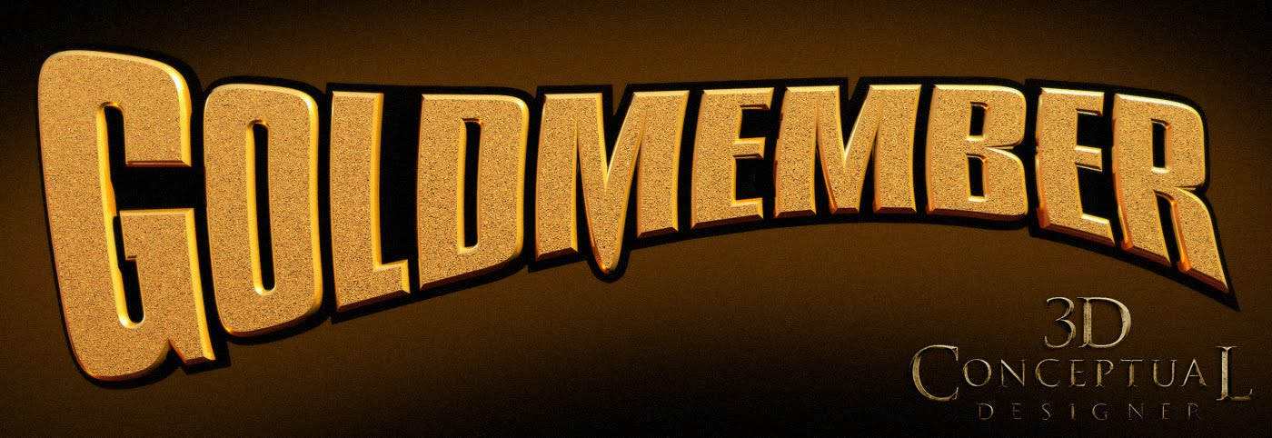
The Final Logo was a three layer Model with a black holding plate, a rounded bevel, and the glitter face.

An earlier 2 layer version with a slight texture on the face and a flat profile.


A 2 layer Logo Illustration I did with the "Chicago" airbrushed look to the reflection
[ I had to make a custom curved reflection map to get it to follow the model]


An early direction with an Austin Danger Powers silhouette.


The first 3D Logo I did for the project was fairly simple and plain.


The Icon for Dr Evil was build in 3D and done in Steel as seen here as well as "Gold".


They used this large Male Symbol for a few comp ideas early in the project.


A straight on view of the Male and Female 60's symbols I built for various comps.


Foxxy Cleopatra had her own symbol that I also did up as a 3D Icon for a few things as well.

I also hung the main logo on a chain and matched a sketch comp done by Suren Galadjian


Project Review
Austin Powers Goldmember

PART I

Client: New Line Cinema via BLT and Associates.
Art Director(s): Warren Nung.
Project Date: Summer 2002.

Nine years back I got to work on one of my favorite franchised, Austin Powers. I loved the first two films and when I came to BLT they were working on the third film, Goldmember.

I did a series of gold logos and various objects from the film as well, including the Dr.Evil Logo in both steel and in Gold. The Logos ended up finishing for the Teaser Posters, the Payoff as well as all DVD and promotional materials.

We had a lot of fun on this campaign, and the final logo is "hung" so to speak with the drop downs below the line.

Cheers, THOM

Thursday, February 10, 2011

Art Center Project: Sumi Painting and Papermaking


One of my first Sumi Paintings on Paper I made while at Art Center.

A Final Sumi Paintings on Paper I made while at Art Center.
Red block signature says Toh-Mass[ Thomas]

One of the Miniature Shoji Screens up close.


The Set of three Shoji's I made for my Final grade.

Art Center Project
Sumi Painting and Papermaking

While attending Art Center College of design in Pasadena in the Transportation department in the early 90's we were sometimes required to take a full academic term with no studio classes to fill in our credits to make sure we could get the Bachelor of Science degree which is unique to ID as the fine art majors at Art Center receive a BFA.

What was interesting is that they offered both Japanese Paper making and Japanese Sumi painting as an Academic class and it was not considered a design studio class but if fell under Art History. I have always had a fondness for Japanese culture and design so I took both classes back to back.

What you see above is both my handmade paper we made, as well as examples of my Sumi painting. My final project were the little desktop Shoji screens and I did receive a A in both classes. One of most fun and interesting classes in my 5 years at A.C.C.D.

Cheers, THOM

Wednesday, February 9, 2011

Project Review:Knowing-Living One Sheet Concepts

The Final One Sheet contained my 3D Logo and 3D Earth Render.
[It's always cheaper than a stock image to use a 3D Earth Image]


The final 3D Logo was a simple matte finished 3D beveled logo.


A Single Point Bevel with a hot and cold lighting scheme.


Here the Logo was done in a warm HOT glass material.


A darker low light concept for a logo hidden in a darker comp.


Though the type was locked in for us before we started, we did play with replacing the crescent moon with a full "O" as seen here.


Here is the Earth in four stages from normal, to all clouds gone, to dry and heated, to a fire ball.


A street scene that was filled with people rioting in the lower third done in various states for a Living One Sheet.


Lady Liberty done in a few different states of dismay.


Knowing
Living One Sheet Concepts

Client: Summit Entertainment
Art Director: Calvin Sumler,Joseph Stamper, and Chris A. Hawkins.
Project Date: October 2008.

We had done a few projects for Summit Entertainment while I was in-house at The Cimarron Group, most notably the Twilight series, so we were given this Nicholas Cage project called Knowing, a Sci-Fi film about the end of the world via a Sun flare so big it literally cooks us, so the visual concepts for selling this fun property were fully explored.

What started out as a Logo exploration of doing a set typeface in basic gray or stone and then doing various hotter metals and hot glass, then translated into concepts for animated posters, or what is referred to as "Living One Sheets".

I also did a few scenes that required a multiple pass at the render that the Art Director then painted in between. This is so much faster then a single CG scene, and allows the designer full control as they can take the before image and paint in ash or heat in the areas they want, and do multiple variations. These multiple images were also good for a Living One Sheet too.

A living one sheet or movie poster is a video poster basically that can be printed on multiple layers of a lenticular film so it moves when you walk around the poster giving it "life", hence the name. It is also played on a HD monitor in a mounted portrait position as well, at an obvious higher cost.

I did a few concepts with a before, during, and after effect, of what would happen if the Sun did flare up and cook the earth like we were selling. I did the earth image, a basic street scene, and paying homage to Rod Serling and the original Planet of the Apes we did the same treatment to Lady Liberty, The Statue of Liberty.

The living one sheets were not finished though the concepts were fun to explore and design. I did finish both the text and the earth image for the final poster one sheet, and the advantage to using the 3D earth image is that it is owned by us with no fees associated with using stock photography, so in the end the client pays less, and owns the image made, all the while having absolute control over the lighting angle and any other detail needed, that is a Smart 3D Image.

Cheers, THOM

Tuesday, February 8, 2011

Project Review: Pontiac Sunfire Gilligan's Island

The spot opens on the spinning Captains Wheel, and we find ourselves on Gilligan's Island!


The Sunfire scoots across the sand past the wrecked Minnow and wakes up the Skipper and his little buddy.


The Pontiac then makes it's way into the area with the bamboo huts.


Ginger and Maryanne look out at the car as well as The Professor...


They dance thinking they are RESCUED, and then chase the car.


The car drives through the jungle and drives out to sea on the water...


The spot ends with the car on a nearby beach with the iconic island in the background reflecting in the car as the beauty shot.


Pontiac Sunfire Storyboards
"Gilligan's Island" 1996


Client: DQ Films.
Art Director: Justin Klarenbeck
Project Date: Fall 1996.

After leaving ZEN Entertainment, I went back to freelancing for a while. In the past I had done work for Dreamquest Images in Simi Valley that was absorbed by Disney and they spun off a Design firm in Santa Monica called DQ Films, and I did both Storyboards, and visual effects [ VFX] for various car commercials.

For the Pontiac project they were taking existing footage from the late 60's early 70's television show Gilligan's Island, and having the Sunfire drive though the scenes from the show. We had to source the footage first and apply it to the script. We were obviously limited as there was only so much footage of the show, but with the A+ team in VFX, they were able to integrate the Sunfire perfectly.

Cheers, THOM

Monday, February 7, 2011

Project Review: 3D Illustration and 3D Logos for Alexander[2004] PART I

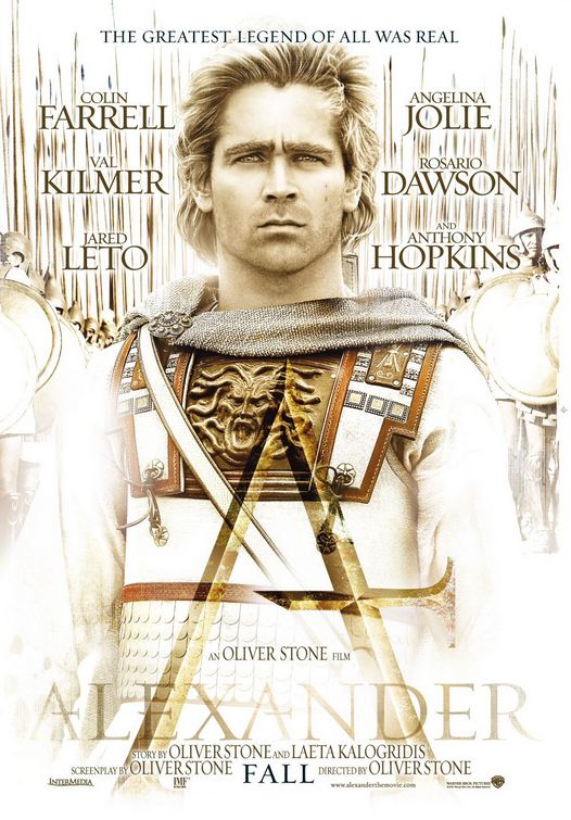
This is the final finished 3D Logo I built for the Posters for Alexander in 2004.


The first Poster that my 3D Illustrated Logo was finished for.


The Second Poster that used the Logo.


One of the first batch of 3D logos that were given to my by Art Director Calvin Sumler to recreate in a 3D font.


Another 3D logo from Art Director Calvin Sumler I then recreated in a 3D font in stone.


A metal version of the logo done for Art Director Calvin Sumler.


I love this font that Art Director Calvin Sumler gave to me to add dimensionality to.


A Bronze-Gold metal hand made logo.


A nice concrete material was put to use on this font for Art Director Calvin Sumler for presentation.

Though not a finalist, this thin font was very interesting to build out and has a very unique feel with the hand designed letters from Art Director Calvin Sumler.


Always asked to do the "BEN HUR" iconic large logo for big pictures like this.


This Icon was used for a few ideas including a teaser poster with no type just an icon with a ghosted image of Colin Farrell.

I did a few versions of the snake wrapping the letter A and this one was my favorite.

A built out a 3D Icon that was based on architectural details found during the time of Alexander and made it into an icon for the posters. This version was a verdigris copper and brass eagle that was aged and distressed.


Project Review
3D Illustration and 3D Logos for
ALEXANDER[2004]
PART I


Client:Warner Brothers Pictures via The Cimarron Group.
Art Director: Calvin Sumler.
Project Date: Winter 2004-Spring 2004

Early on when I had just started the new 3D Department over at The Cimarron Group in late 2003, I was put on the Alexander project in the Poster Department for the Theatrical release.

I started in the usual way with just some extruded logos, but I proposed to spend a bit more time to get the hand modeled Single point bevel type. I had finished the TROY logo over at BLT just before I came over to Cimarron, so I used that logo as an example and they said to go ahead.

Single point bevels are a hand modeled typeface done so they chisel to a sharp edge in the center of the type with no noticeable flat spot, apart from ones needed in the font design. My first try at this technique was time consuming at 15 to 30 minutes per letter back at BLT, but while on Alexander I tried some of the quad modeling techniques I had developed while building the Lotus Elise and the start of Herbie, the 1963 VW bug for the new Lohan film. I was able to cut the time down to less than 5 minutes per letter which made the budget a lot more feasible for the Advertising fast turnaround needed. So from this project on, I was asked when needed to recreate this look again.

I also build a variety of props and Icons including the two snakes eating each other into a circle, as well as the eagle banner icon that they used behind a few logos a in the presentation. All in all this was a very enjoyable project to work on, and I got the finish for the logo on the poster as well with the talented Art Director Calvin Sumler.

Look for a PART II in the future.

Cheers, THOM