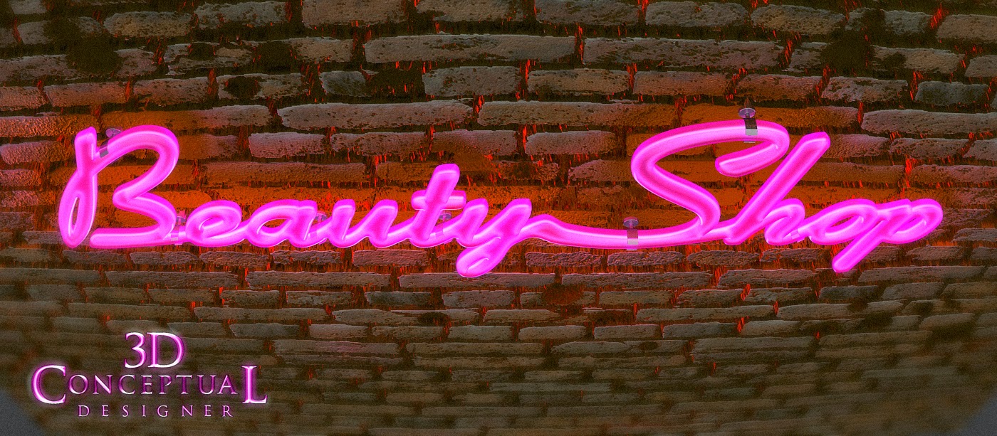
The Main Style frame front camera centered on the 3D Neon Logo for Beauty Shop.
Here is the wireframe Ambient Polygon render showing that this was a fast build scene[ Not Sub-D].
A alternate front shot with the camera lowers slightly and a 11degree fish-eye effect added to the lens.
An exploded view shows the basic build out in parts.
A 3/4 side view with a bit of DOF[ Depth-of-Field] added in.
The Polygon render of that same shot.
A Worms eye, up angle on the 3D Neon title with the glow material set up and read for animation.
The Polygon view of the scene.
A very low up angle on the title with a cooler night lighting coming down the brick wall in the background.
You can see the lens curvature in the brick rows well in this polygon render.
A severe down angle on the sign starts to get some legibility issue, however this was a start frame that centers to the main front shot up top as it seats.
A Polygon render of the last shot in 3D.
Project Review
Motion Graphics Titles
Beauty Shop 2004.
Client: Metro-Goldwyn-Mayer-Distributing Corp via The Cimarron Group.
Creative Director:Eric Floen
Project Date:January 2004.
Today I have posted style frames from a Motion Graphics project I did back in 2004, almost a decade ago now, while I was in house at The Cimarron Group running my one-man show of a 3D Department for the film Beauty Shop.
I was fairly new at the company at the time, and I was asked to develop a look in neon for the film title for the trailers. The MGFX head, Eric Floen provided me with an Illustrator file of the logo designed by them to build out in 3D, so as I had done many Neon logos in the past[ see here, and here, and here, and here], so I began construction of the logo.
I built it out with an internal filament or neon tube that lit up[ animated] with an outer glass enclosure done in a hot pink glass. I made the various clips to attach it to a surface and pulled in a 3D brick wall displaced model I had from another gig to use for a backdrop.
I rendered out a few shots at various angles, but in the end I delivered just the logo with no wall or clips. I was told it went to finish due to the size of the final render, though I never did see the final use. A fun gig.
Cheers, THOM


No comments:
Post a Comment