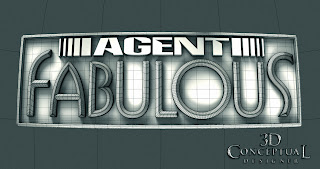
The final render delivered was a straight on shot with a bit of curve to the lens done in Final Render.
I did this alternate pass with the buckle tilted back a bit.
A version tilted even more with double the lens curve and some volumetrics.
A 3/4 side shot with some lens FX and blur too.
I offer a Color-picker option if the client will need accurate masks made to use in post production. This is what makes 3D renders so helpful for finishers.
Here is a shot of the polygons showing the build. All quads except for the "Agent tag".
Project Review
Agent Fabulous Title Design 2010
Client: BPG Print.
Art Direction:n/a.
Project Date: April 2010.
Today my posting is a quick partial day logo study project I did for the advertising agency BPG back in April of 2010 for a show pitch called, "Agent Fabulous".
I am usually always given an illustrator file to make dimensional in 3D and render out, so my first step is to interpret the feel of the font and what they want it to convey. For this project they wanted it to feel like a big shiny disco belt buckle with some 'bling".
I hand build a single point beveled font for the word fabulous, as well as a quad modeled base plate that it sits in. I use Cebas' Final Render for all my rendering needs, and so I applied the Caustics reflections and shimmers that would come from a polished metal buckle to the shot.
I also provide most clients a color picker layer in the render if they request it, and this allows the in House designers to quickly isolate sections in 3D to adjust in post in Photoshop later on. I am usually asked for this after the fact, and will render one or as many out as are needed.
The cost saving on this masking is seen in the time the client themselves need not have a finisher or designer spend in masking artwork, a time consuming chore that "Smart 3D" assets can relive a bit and ave the client some in house time too.
The cost saving on this masking is seen in the time the client themselves need not have a finisher or designer spend in masking artwork, a time consuming chore that "Smart 3D" assets can relive a bit and ave the client some in house time too.
Cheers, THOM


No comments:
Post a Comment