Monday, April 16, 2012

Project Review Sky Captain and the World of Tomorrow PART IV- Main Robot 3D Illustrations

 
 A Direct graphic Front view of the main robot from Sky Captain and the World of Tomorrow.


 A 3/4 up angle on the Robot.


 A Bird's Eye view looking down to the ground on this massive robot from Sky Captain and the World of Tomorrow from back in 02'.
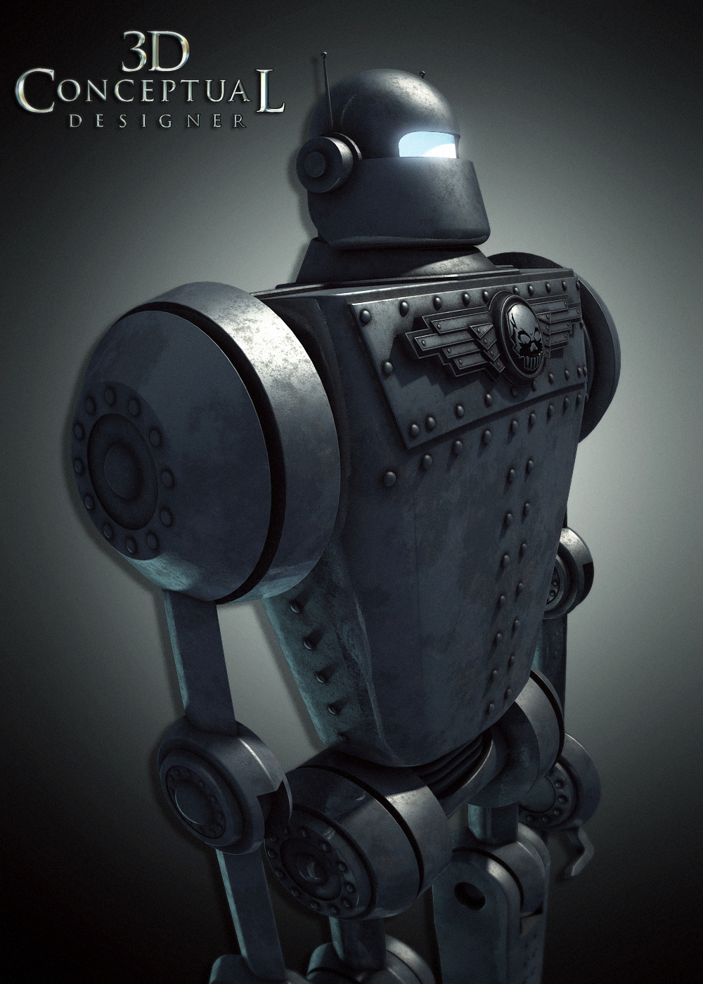
  

  A 3/4 view at head height for a comp with the P-40 flying by the face attacking.


 A Direct front view of the main robot for World of Tomorrow that I built for the movie posters back in 2002 before the CG from the film was done.


 A Polygon view showing the model I built for this 3/4 side angle for Sky Captain.


 This view shows the details I built out on the feet.


Project Review
Sky Captain and the World of Tomorrow
PART IV- Main Robot 3D Illustrations

Client: Paramount Pictures via BLT and Associates.
Art Director(s): Rick Lynch, Dustin Stanton, Jeff Barnett, Alon Amir, Zack Ris. 
Project Date: Summer 2002

This is my fourth posting on the 3D illustration [ and a bit of Motion Graphics] work that I performed when I was in-house as the 3D designer over at BLT and Associates in Hollywood, CA, for the film World of Tomorrow[ Sky Captain].

Today I am focusing on the main Robot I built out prior to the film having CG yet. Often I get a concept sketch and need to build out a 3D model based on a sketch, so I am not working form a finished refined CG model but a concept so I have to interpret the sketched design into reality[ virtual though it is]

So for Sky Captain and the World of Tomorrow, I built out the main robot from a blueprint given to us by the creators. It was used in multiple Movie Poster Designs that I did at BLT and Associates back in 2002 a decade back now.

Cheers, THOM

You can see the other posts quickly below in these links:
PART I
PART II 
PART III

Friday, April 13, 2012

Project Review Sky Captain and the World of Tomorrow PART III


Sky Captain Coming at Ya!


Sunset , time to get back to base....


Zooming up in the modified P-40 from Sky Captain and The World of Tomorrow.


I built it linked so that the landing gear could deploy for some ground shots.


Here is the Polygon 3/4 front view of the 3D Model I built out to match the film for the Posters.


A 3/4 under wing view of the P-40 Mustang.


 This view shows some close up details about the canopy and facing edge of the wings.


Project Review
Sky Captain and the World of Tomorrow
PART III

Client: Paramount Pictures via BLT and Associates.
Art Director(s): Rick Lynch, Dustin Stanton, Jeff Barnett, Alon Amir, Zack Ris. 
Project Date: Summer 2002

This is my third posting on the 3D illustration [ and a bit of Motion Graphics] work that I performed when I was in-house as the 3D designer over at BLT and Associates in Hollywood, CA, back in 2002.

World of Tomorrow was a very beautiful looking film with 40's era cars and robots and love the sepia aged look that the film captured. I built a bunch of items to use in the presentation posters, and one was the modified p40 Mustang that  the main character fly's in the film played by Jude Law, I posted some views here a few years back.

I found blueprints of the iconic WWII fighter plane, and had a green screen shot of the modified canopy from the shoot, so off I went and built this out.

The great advantage of 3D is that you have a sort of 'living photography', in that you can quickly adjust the lighting, mood, and look of the plane, once the time and investment is made to build it once. 

The first image is always the most costly, since it requires the full build to do so, but every view after that pays for the job as it spreads the cost out, and you get the advantage of speed, if you have a multiple use needed for the asset.

Cheers, THOM

PART I
PART II

Thursday, April 12, 2012

Phantom 2040-PART LXXXXVII[97th] Grafts Jet-pack with Wings+Biot's

I still fancy this older[ than 2040], B.I.O.T. from The Phantom 2040. Stealth design is always fun!

Though I do still love the female B.I.O.T. too...

Graft had a Jet-Pack and Helmet[ to steer as in The Rocketeer]


Here is the back view with the wings both in and out with the jet between.


Phantom 2040-PART LXXXXVII[97th]
 Grafts Jet pack and Wings+Biot's

Client: Hearst Animation Productions.
Art Director: Myself.
Project Date Spring 1993.


This is my 97th post for the work I did on the TV show, The Phantom 2040 from in the early ninety's, and I have some B.I.O.T. sketches as well as a fun Jet Pack for the main character Graft.

We had more than a few flashback sequences being that the basis of the Phantoms story, is that it is passed on from father to son, so there is not just one Phantom, [ Kit is the 23rd BTW]so we regularly would go back to one of the other Phantoms.

You can see the older BIOT is sharp edged, and 'stealth' in look, compared with the softer wrapping and curved Art Nouveau shaped I used for the main look of the show for the year 2040.

In the early 90's The Rocketeer came out, so one of the show scripts had a jet pack for Graft that was similar. I made it a bit different in function, where the solar wings would flip out a bit to help steer and absorb energy for the jet in the middle so it was a bit of a transforming item.

If you are a FAN of The Phantom 2040, and on FACEBOOK, there is a group for that....  here.

There is a TAG on the list to the RIGHT for other Phantom 2o4o entry's, but you can click this as well.

Cheers, THOM

Wednesday, April 11, 2012

Project Review Sky Captain and the World of Tomorrow PART I I


 Here is the first early pass at the final designed Skull logo for World of Tomorrow.

 A fun side lit dark version with the big holding device we added in to lock in the wings to the skull a bit more for Sky Captain.

 This was the final and last version I did for the project before leaving BLT to start up a 3D department at The Cimarron Group in 2003


 A side shot reveals I scaled the skull about 300% to deepen the shadow play.


 Here is the Polygon view of the model for World of Tomorrow.


 A 3/4 side view showing the angle on the wings.


This side view really shows the dome shaped face on the cut out skull.
Project Review
Sky Captain and the World of Tomorrow
PART I I

Client: Paramount Pictures via BLT and Associates.
Art Director(s): Rick Lynch, Dustin Stanton, Jeff Barnett, Alon Amir, Zack Ris. Project Date: Summer 2002

Today in this second posting for the work that I did for the film, Sky Captain, and the World of Tomorrow, while I was running the little 3D department at BLT back in 2002, I focus today on the skull logo development.

The design itself was provided by the brothers who created the film, and I was to dimensionalize the logo into an iconic logo for the posters. 
The designs are obviously reminiscent of the Nazi symbolism, and the colors of black and red pretty much seal that up, and that was the direction that I was given. The logo represented the 'Bad Guys' in the film and it was used extensively on the robots and tanks throughout. 

I built a few versions, but the main one had the skull cut into a sphere which is easier said then done especially all quads. This was one of the first times I used the Pro-boolean tools in 3DS and they helped the process out alot, as we had no time to sub-division the thing out.

Look for more in depth posts on this project, as I will be examining all the robots I built for the posters here in the months to come. You can get a sneak if you view my first post here.

Cheers, THOM

Tuesday, April 10, 2012

Personal Project Napkin Sketching and Doodles Part XXI[21st]


A Soft body Alien from the back


A stylized character similar to these I did years ago.


A bit of Bart Simpson in the Hair there...


A Bald little character face with everything pushed to the top third of the head volume.[ BIG CHIN!]

Personal Project
Napkin Sketching and Doodles Part XXI[21st]
 
 In this twenty-first installment of the Napkin Sketches, Drawings, and Doodles I ave posted, today I put up a set of characters that I have done in the last week during my free time.

I do alot of hard surface 3D models and 3D logos during the week, so I naturally change it up a bit, and do some softer characters to balance it out a bit. Above are a few of them I ddi this week. I do about 5-10 little sketches a day when I do sketch.

Today I have a few examples, all done on the little 3x5 pads of bond paper I regularly use and doodle on, in the wee hours of the night[ chronic insomnia].

You can view the other parts as follows:
PART I
PART II
PART III
PART IV
PART V
PART VI
PART VII
PART VIII
PART IX 

Monday, April 9, 2012

Project Review: History of Rock and Roll 2004: 3D DVD Packaging Motion Graphics

 A frame for the middle of the 3D animation I set up for The History of Rock and Roll's advertising Motion Graphics I did back in 04'.

 Here is a frame nearing the end of the the 'fanning out" 3D move I did in 3DS max back in 2004 for The History of Rock and Roll.


 A first and Last frame of the box for the DVD's from the animation.


 Here is the Poly view of the main file.


 A close up on the Polygon Model I built out for the TV spot.


 Here we have an exploded view showing all the basic parts I built out for the case. I build it just like the real one with hollow centers to fit the artwork on and all internal supports that would show in the plex etc.


Project Review
History of Rock and Roll 2004
3D DVD Packaging Motion Graphics

Client: Warner Home Video via The Cimarron Group.
Art Director: Susan Adams.
Project Date: Spring 2004

I had only been in-house at The Cimarron Group for a year when this little gig came by my desk, I was tasked with building out a custom case for six DVD videos for The History of Rock and Roll, for Susan Adams in the Home Entertainment Division at Cimarron.

The disc case was to open up and fan out revealing all six DVD's, as well as the liner notes etc in the front and back sleeves. 

I built it all out and set up the file for a SD final render[ Pre-HD]. I also rendered out a few images above showing the construction I did specifically for the plexiglass cases. I used n-Powers,  Power Solids Plug-in for 3DSmax for this, and converted the file over the quads. 

A fun project to build light and eventually animate.

Cheers, THOM

Thursday, April 5, 2012

Project Review:Virtual Magic Kingdom-Video Game-PART VIII: Main Street USA Curvilinear Perspective Sketches


 A better full scan of the first 360 Quicktime VR styled sketch that I did back at Disney Interactive back in the 90's.


 Here is a close up of the Left side of the sketch looking back at the entry and the train station.


 The Middle of the sketch is looking across Main Street USA at the Arcade. You can see Cinderellas Castle on the right there at the main Hub too.


 A close Up of the RIGHT side of the wrap with the Theater entryway there and a sandwich board I used as the 'seam' to link it together in a 360 like this..


Project Review: 
Virtual Magic Kingdom Video Game PART VIII
Main Street USA Curvilinear Perspective Sketches

Client: Disney Interactive
Art Director: Myself
Project Date: Summer 1996

This is my eighth post in my series on the Virtual Magic Kingdom [ VMK] project I did for Disney Interactive back in 1996-7, and with this post, I cover  last big HUB perspective wrap that I did in preparation for the project, Main Street USA.

I was originally hired as a freelance sketch artist and, Concept Designer, but after a month I was offered a 3D Art Director position on the project to direct the efforts to build this out, and happily took the offer and worked for them for just over a year.

This was also the first 360 sketch I ever tried, and the M.C. Escher technique I extracted from the books of his, definitely worked well. Here is the under drawing I did for this as a partial sketch.

I have this higher resolution scan for this hub, which was seen as a very small image posted early on, as seen here, but today I have isolated close up's of each part of the 40" wide drawing I did for Disney Interactive back in the 90's so you car review the details much better.

You may review my earlier VMK posts in these link-a-dinks:

PART I
PART II
PART III
PART IV
PART V
PART VI 
PART VII

Cheers, THOM

Wednesday, April 4, 2012

Project Review: The Palazzo Casino at the Venetian- Logo Design and Exploration 2006

 A Palazzo Logo with a look I've done before, a Triple Stack of metal bevels with enough gap between each plate to reveal a bit of the plates top face with a hint of warmth in the lighting.

 I love logos that drop the bar in the "A", as we have above, feels a bit ROMAN.


 This is the final logo they used, though not in 3D often, though it was on the website a bit early on.


 A Very Thin Deco inspired Logo similar to what I did here for Atlas Shrugged.


 A Logo with a small rotunda behind it ghosted back. For the MGFX we animated the lighting to reveal the dome and then go to just the highlights on the text to end it off.


 For this 3D logo for The Venetian 'Casino in a Casino', The Palazzo,  I did a dimensional wax pressed logo with the beautiful hand built internal design provided by Motion Graphics.

Project Review
The Palazzo Casino at the Venetian
Logo Design and Exploration 2006

Client: The Venetian via The Cimarron Group.
Art Direction: lots...
Project Date:Christmas 2006.

While in-house for six years at The Cimarron Group, I worked on a number of Casino related gigs as seen here, and here, so when the Venetian Casino approached us again, we put every team on the logo design for the new casino in the Venetian.

I had done some past work for the Venetian, so they wanted us to take a stab at the logo designs, and me being the little 3D department of One at the Cimarron Group, I too was given this task for a day or so. 

Some Logos are all my designs, and some I collaborated with Art Directors from the talented Print Department, and Motion Graphics Department to help- dimensional'ize some of their designs as well. 

The look was simple elegant platinum with hints of warmth. We did to a strong red and gold wax look, that they liked, but they loved the platinum look with the bright metals, and soft texture features. 

All in all it went a bit Deco at times, a fun exercise to explore, and I got to work with some great fellow Designers too on this one.

Cheers, THOM

Tuesday, April 3, 2012

Personal Project: Napkin Sketching and Doodles Part XK[20th]

 I always draw on the cardboard backing from my sketch pads as I use them up. I love working light and dark on them.


 I roughed in a few items, and went for the toaster w/o a slot to shade in...


 Angry Boss man smokin' a Cigar!


 Tip of the iceberg?

Personal Project
Napkin Sketching and Doodles Part XX[20th]
 
 In this twentieth installment of the Napkin Sketches, Drawings, and Doodles I do when I have a pen or pencil in hand, I have put up some mini sheets, where I  doodle away a few small 1" to 2" doodles and fill up the page, or cardboard back-sheet as it were.

I also have a few single sketches as well, which is how I usually do them, one idea per page in these little 3 x 5 pads.

I love designing most anything, and I am always wanting to sketch something, and it is a very valuable little exercise to maintain your skills as a 3D designer to keep up with your wrist skills, and experiment with anything and everything as a subject matter. Break out of your comfort zone and draw stuff you find difficult to do, it is a good stretching for you.

If you cannot draw good, and want to get better, well then, DRAW MORE, it works wonders...

You can view the other parts as follows:
PART I
PART II
PART III
PART IV
PART V
PART VI
PART VII
PART VIII
PART IX 

Friday, March 30, 2012

Project Review: Game of Thrones Season 2: PART I- 3D Crown Illustrations 2012

 Here is the final finished 3D render that I delivered to Cold Open for the final advertising work done for Game of Thrones.


 Here is the first round crown from the top I adjusted the textures lighting and the antlers designs a bit as we proceeded.


 A very early shot before the jewel and gold materials were fully dialed in but the basics were there and ready.


 This is the almost final crown camera shot used for the last image delivered.


 The low poly model I built of the crown with all subdivision removed from the models.


 Here is the medium resolution model with one level on the base parts and two levels on the bigger antler parts.

 Here is the high polygon view of the final crown I built for season 2 of Game of Thrones on HBO

Project Review
Game of Thrones Season 2 PART I
3D Crown Illustrations 2012

Client: HBO via Cold Open.
Art Director(s): Coby Gewertz, Jeff Barnett, Melchior Lamy.
Project Date: January 2012.

Season two of Game of Thrones, premiers this Sunday on HBO, and after I finished the crown image above for the 2nd season advertising campaign, I decided to watch season one via On Demand, and LOVE IT!

So here is the first post, in a series on the work I did for the project that started in October 2011, and finished this past January, and can be see on the outdoor billboard ads. 

I was contacted by Cold Open, as I have done a few projects with them these fine folks the past few years, and with some ex-BLT'ers in-house there, they are accustomed to using my 3D services for more that just an extruded logo. I was asked this round, to build out a handmade crown to match the crown from the first seasons show that was worn by the King[ R.I.P., Long Live the KING!].

Its design is a series of antlers interlocked with amber jewels to form this great crown that I had a chance to replicate in 3D for the posters and billboards.

I built this out as a full sub-division poly model so I can increase or decrease resolution as needed. I also exported the file to a web team for animated crown FX for banner ads etc. I rendered this out in Final Render using the dirt shader, to add just enough aging to make it match the look and feel from this great series.

I also built out the new crown for the boy king, as well as a few added items I will be posting moving ahead in the next weeks to come.

Cheers, THOM