Here is my final delivery to Cold Open for the Poster for Something from Nothing:The Art of RAP.
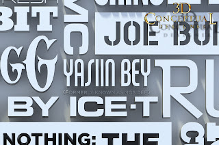
A close up on a small section of the final that was 6000 pixels tall for the finish.
A Polygon view shows the different heights in the various names.
The poster from the camera view showing the Polygon grid. A simple beveled series of vectors.
Early on we played with a black darker ambient look.
I also did a pass in gold, and the Art Director was able to paint between the black and gold versions.
Here is a screen capture shot showing the simple scene set-up, as well as how I use color in my wire frames for ID purposes.
Here is a shot of the final poster[ HAT TIP to IMPawards here ]
Project Review
Something from Nothing:The Art of RAP
Key Art 3D Typography:2012
Client: Indomina Releasing via Cold Open.
Art Director: Coby Gewertz.
Project Date: April 2012.
Back in April, I was given the assignment to do a full 3D typography exercise for the new DOcumentary Film, THe Art of RAP, for the Agency out here in California COld Open. I get regular freelance from the studio,and for this project I was able to work with Coby Gewertz again, whith whom I have worked on well over fifty posters on, so this was a nice fit.
I was given a few sets of type and directed to adjust the height, or extrusion depth for the various artists, and we even experimented with a few colors of black and gold, thoguh the orighal intenet was always to do an ambient render of white on white.
Coby added the glow of red in 2D from his end, it allowed them to move and adjust a few details in 2D , as I provided a channel, as well as a layered render with type off the back wall, as well as mattes for the micro bevels.
Cheers, THOM


