Friday, October 29, 2010

Project Review: Scobby Doo 2002

A four foot long subway sandwich from the MIB Parody Newspaper Ads for Scooby-Doo.


The first draft of the "Egg" Rattan chair for the parody ad.

The final chair had a close back and was used for print ads in newspapers on the MIB opening weekend.

They needed a high resolution collar and tag for Scooby so I made this one for a pay-off One Sheet Design Comp.

Merchandising for the film included a key-FOB and these buttons.

Some graphics applied to popcorn carriers and tubs for the film.


Scooby Doo 2002

Client: Warner Brothers via BLT and Associates.
Art Director(s): Zach Ris, Marcus Almaraz, Jeff Barnett.
Project Date: Summer 2001

One of the earl;y 3D Illustration Projects I did while at BLT and Associates in Hollywood was to do a few shall Illustrations for the Pay-Off One Sheet, but I did a bunch of Merchandising Products that went along with the film.

The Egg chairs and huge sandwich was a parody ad based on the MIB white egg chair look and rather than guns they held the big sandwiches. I had just 2 hours to finish. This project became a textbook case on 3D Illustration, as they were hunting down a wicker hanging chair around town for hours , when I let them know I could design, model, and render one for them in one hour. Once I did that the sandwich was next. FUN!


Cheers, THOM

Thursday, October 28, 2010

Project Review: The Race to Atlantis- PART IX

We continue and crest the top of a huge floating mushroom.


As we crest a Huge City in the distance is revealed as out goal.
[B-n-W sketch of city is from Stephan Martiniere's concept piece]


We are all of a sudden "HIT" with the group of creatures.


They are close , so close one take a quick look at you!


The creatures fall back, To be cont'd.

RACE TO ATLANTIS
PART IX

Client: Rhythm and Hues.
Art Director: na.
Project Date Summer 1996.

In this ninth post on my work on the 3D ride-film storyboards for the Atlantis Ride Film at Rhythm and Hues, we are flying through these huge floating crystal mushrooms that appear to be cities.

The creatures in the race that we are trying to beat are now attacking us and come right up to camera to take a peek at you! There is a good portion of the ride where these interact with the guests on the ride.

To be continued....


You can view PART I here

You can view PART II here

You can view PART III here

You can view PART IV here

You can view PART V here

You can review PART VI here

You can view PART VII here

You can view PART VIII here.

Part X Coming next!

Cheers, THOM

Wednesday, October 27, 2010

Project Review: Launch City PART III- Twitch

The Lower terminal of the Subway system in Launch City with a train arriving.


The Subway Train main shot.

An alternate view head-on with the Launch City Subway Train.

Over on deck at the lower terminal arrivals area.

The main shot for the space in Launch City with designations interactive on the fixed sign.

As a virtual city every space was there including inside the trains.

The door opening up was the first render test I did of the train.

The interface for the Lower Terminal
[ note the Pink Floyd Pig reflecting in the copper trash can- I was reprimanded for that BTW!]


Launch City Part II
"Twitch"

Client: Launch Media Inc.
Art Director: Myself
Project Date: 1999

In this third post on LAUNCH city, I was hired 11 years ago when things were booming in the "Dot-Com" boost in the 90's, and I became a part of the team latter on in the production cycle when they wanted a full redesign for the product halfway through the production cycle.

In the full redesign of the Launch City for the CD_zine I themed this area as a 1920's subway with white tile walls and heavy iron structures exposed with rounded brick tubes for the old metal subway trains.

The space was started by a great team member Cayce Justus, and it was handed back to me to finish. I build and designed the subway trains and the tie lower tubes first, then I integrated them in a 3D scene started by Cayce and finished it out.

To view PART I on Launch City you can go here.

To view PART II go here.


Cheers, THOM

Tuesday, October 26, 2010

Project Review: Phantom 2040-PART XXVIII-Multicruisers

The Fan propelled Multi-Cruiser from the Television Series.

A 3-View layout of the above design for Animation Reference.

A Wrecked Image of the above design that meets it end in the show.

The Original Multi-Cruiser that all other models were based off.
[my favorite]

Phantom 2040-PART XXVIII
Multicruisers

Client: Hearst Animation Productions.
Art Director: Myself.
Project Date Spring 1993.

In this 28th post on the Phantom 2040 TV Animation series I worked on in the early 90's , we are reviewing the Multicruiser vehicle class from the animated series.

As a graduate of Art Center College of Design in Pasadena from the Transportation Design Program, there is nothing I like more than to design out future vehicles, and to make it even better these are flying vehicle, so it is even more fun.

The Multi-Cruisers were seen throughout the show and were the flying vehicles of choice for the citizens, military , and law enforcement. The Phantom himself had a custom Multi-Cruiser as well. They would float, fly, and Rocket through space so they could land on earth and go all the way up to the space platforms where Sean One lives as well.

What you see above is a "Sleek Black Multicruiser" and there are three sketches including the typical side view, a 3 view drawing for the animators, and a wreaked cruiser as this one is destroyed by shows end. I also included an Assault Multi-Cruiser that was the base design for all Multi-Cruisers,

Cheers, THOM

Monday, October 25, 2010

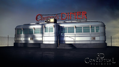
Project Review: Cherry's Diner

Various views of the finished untextured model for sale online.

The final model textured and rendered out[entrance].

A long shot view of the full Diner.

3/4 Front View of Cherry's 1940's Diner Model.


Cherry's Diner

Client: The Cimarron Group.
Art Director: Myself.
Project Date: Fall 2007

When I had down time running the 3D Department at The Cimarron Group from October 2003 to 2009, I set up a 3D Model sales business as a side income stream for the Division.

Above is a vintage 1940's Diner typical from the any city in the USA. I developed the diner based on photographs but ultimately designed my own version as a combination of a few styles. The model is a big seller for my prior employer even today and can be purchased via TurboSquid online. I was about one full day to design , build, and render out the model for sales.

Cheers, THOM

To buy this model online, you can view the model still posted by my prior employer here for sale.

Friday, October 22, 2010

Project Review: The Phantom 2040 PART XXVII

A Marker Color Key I did for Sean One who lived in Space and was 12 feet tall.

Sagan Cruz the Police officer character in her typical uniform.

Kit Walker [ aka The Phantom ] in his standard outfit.

Dr. Jak voiced my Mark Hamill was the "shock-jock" of the show.


Rebbecca Madison head of Maximum inc.


Professor Jack Archer Kit Walkers friend.


Phantom 2040-PART XXVII
Character Color Keys

Client: Hearst Animation Productions.
Art Director: Myself.
Project Date Spring 1993.

In this 27th post on the Phantom 2040 TV Animation series I worked on in the early 90's , I have a set of marker comp color-keys I did for some of the main characters on the show.

One of the design themes I implemented was that the good and bad characters used a different color pallet, so the good characters tended to go more in the warm earth tone family as seen in Sagan, Kit Walker etc. You can also see I used a cooler acidic green pallet for the bad characters like Rebbecca Madison and Dr. Jak, with the electric greens. and cool reds. Sean One was fun as he lived in deep space so his skin was pale and he was 12 feet tall.

Cheers, THOM

Thursday, October 21, 2010

Project Review: FOX Digital Copy[ DVDe] PART I

An Early Digital Transfer Icon I built.

A DVD'e Logo with blue glass akin to the apple "aqua" feel[ requested].

An alternate look to the above logo swapped out to Candy Red and Steel.

A Icon for DVD'e with a holding square.

A formal Icon for the DVD'e with it resting in the grove above.
[ animated to a tilt for AV]


An all glass DVD'e Logo at an angle.

The Tin Sign look with thin edges on the letters with a deep-set face.

Sandwiched Glass and Stainless in this new look with a forward arrow in the mark.

A Single Pint Bevel on the Mark and angled to show the shape with a holding plate.

A Glass and Candy version of the "Arrow E" idea in a warm orange.

An overlapping look with the Logo on various levels.

A chasing arrow look that animated for AV with the E in the middle stationary.

One of my favorites with the sinister "V" wrapping horns around the bubble with the "E" inside.


FOX Digital Copy PART I
DVD'e and Digital Transfer

Client: FOX Home Entertainment via. The Cimarron Group.
Art Director: Darren Keller.
Project Date Spring 2007.

FOX had developed a market to add a digital copy of the film in the DVD package when you buy the DVD so you can view the movie on a PC without having to download it, so early on we developed 3D Logos for the DVD'e as it was called back then. It became Digital Transfer next, but that changed to Digital Copy at the end. Digital Copy is used currently with FOX DVD and Blue Ray Discs. A fun design exercise.

Cheers, THOM

Wednesday, October 20, 2010

Project Review: Ford Mustang Launch 1994

We open with the camera racing down a sandy highway...

...we cut to a reverse shot and slide into the interior of the car...

We have a series of cuts of the car ending on the logo.


Launching the new 1994 Ford Mustang

Client: Telemundo LA
Art Director: n/a.
Project Date: spring 1993.

I did these storyboards for the newly designed 1994Ford Mustang to help launch the product globally as these boards were for a television spot via Telemundo in LA and was a Spanish speaking commercial. Straight forward storyboards with a quick 4 Hr turn around.

As a car design major it is always fun to sketch out a new car that is not on the road yet, as at the time the new 'stang was yet to be released.

I met the client in a funny way as back then the internet was not really up for most of use so I would FAX out a "packet" of work to self promote my services to production company's around LA. The client was in the room when my FAX came in and I was hired that day.

Cheers, THOM

Tuesday, October 19, 2010

Project Review: Launch City PART II-The Hang

An early concept for the Hang.

A wide shot of the first interior for the hang done back in 1999.

A Mission styled elevator in the lower level of The Hang.

Here is an overall shot of all the furniture I designed and made for The Hang.

The rooftop bar was sponsored by Jim Beam.

This is the main interview screen for Issue #40.

This is the main interview screen that was rearranged for Issue #44.

A ECU on a lamp from the rooftop set.

A Double-wide sliding screen for a big interview area used in one of the last issues.

When we enter The Hang we enter on the middle level and can see down to the stage and up to the Mezzanine.

Here is the establishing view outside on the street level of The Hang.

The main stage for virtual performances for the Issues of Launch from 1999

Launch City Part II

"The Hang"

Client: Launch Media Inc.
Art Director: Myself
Project Date: 1999

In this second post on LAUNCH city, I was hired 11 years ago when things were booming in the "Dot-Com" boost in the 90's, and I became a part of the team latter on in the production cycle when they wanted a full redesign for the product halfway through the production cycle.

In the full redesign of the Launch City for the CD_zine I themed each area with a architectural look and style, and for "The Hang" I used the Arts and Crafts movement as the source.

What you see above are the interior views of "The Hang" in various locations within the space, as this was a three story virtual space with a patio on the roof and a stage on the lower floor.

What is great about the virtual space model is that you can arrange the furniture in any way you want and save out the scene for a differnet location for every issue. We switched things up for each issue so you will see a main screen for a few of the LAUNCH issues above.

As a huge fan of the Arts and Crafts movement this was a joy to design out full sets of furniture, interiors and the exterior of the building as well. Very fun.

To view PART I on Launch City you can go here.

Cheers, THOM