Saturday, February 27, 2010

Project Review:The THAW 2009

Cracks in the Frozen Tundra!

Frozen block of Ice LOGO with bugs inside.


The THAW
Theatrical One Sheet Logo's

Client: Lions Gate Entertainment via The Cimarron Group.
Art Director: Chris A. Hawkins.
Project Date: Summer 2009

A very quick project that was one of my last ones while I worked at The Cimarron Group in Hollywood. Basic story: Frozen bugs thaw out and wreak havoc on the people who discovered them.

Logos were about frozen tundra or ice so we did both comps. This was a one day project favor, so I had no time to noodle or adjust the work, but I did have enough time to do two solid ideas, though they did not finish.

Cheers, THOM

To review the plot of this DVD click the Post title or paste in this text below:
http://www.dvdtalk.com/reviews/38659/thaw-ghost-house-underground-the/

Friday, February 26, 2010

Project Review: Lincoln Continental 1995

The "Elegant" wireframe metal car grid.

The Fractal liquid VFX described.

The Female Crash Test Dummy Hostess.

The Run-Flat technology animation sequence.


VFX Design for Lincoln Continental
DQ Films:Dreamquest Images.

Client: DQ Films.
Art Director: Justin Klarenbeck
Project Date: Fall 1995.

After leaving ZEN Entertainment in Santa Monica, I went back to freelancing for a while. In the past I had done work from Design Setter in Burbank, and Dreamquest Images in Simi Valley that was absorbed by Disney and they spun off a Design firm in Santa Monica called DQ Films, and I did some Visual Effects [ VFX] design work for a car commercial.

I was tasked with designing an elegant "wireframe" or body grid, as well as create ways to show of some features of the spot. Also as this was mostly a CGI spot, I designed out the female Crash Test Dummy hostess as well.

Cheers, THOM

Thursday, February 25, 2010

Street Fighter 3D Logo

The 3D Logo up on some corrugated metal.

The Cracked cement version of the Logo.

The "Blood Brushed" Logo.

The Neon Tube bent 3D Logo.

The tube logo flat in a tunnel.


STREET FIGHTER : The Legend of Chun-Li
3D Logo Exploration

Client: Hyde Park Entertainment via The Cimarron Group.
Art Director: Calvin Sumler.
Project Date: Winter 2008.

A quick one day exploration for the newest Street Fighter film. The video game popularity was a vehicle to bring this back to market so we explored the original hand painted look, as well as some big and bold 3D logos as well.

The tube version of the logo above was built using my Single Point Bevel technique, and the brush version was a displaced build to follow the original brush strokes.

A fun exercise, but none of the logos finished.

Cheers, THOM

Tuesday, February 23, 2010

Raveonettes Video: Heart of Stone

Inside the Head.[Camera, Stock Ticker, Tubes, Lights, Speaker etc.]


Inside the Stomach: The wind is gone and the butterflies in the stomach are scorching.


Exterior on the "Heart Tree".

Interior of the Rose Greenhouse.

Exterior of the Rose Greenhouse with water collection system.


Production Design:
Raveonettes' Music Video: Heart of Stone
PART I

Client: Blind.
Art Director: Chris Do.
Project Date: January 2010

Well here is my latest work from just a few weeks back. I was commissioned to sketch out the final designs to model in 3D for a section of interior and exterior virtual sets for the new video for Heart of Stone by the Raveonettes'.

This is the first sketch job I have had in a while, and it was FUN!. I love what is now called "Steam-Punk", which is Jules Verne meets a Victorian Industrial Revolution. And these sketches were quick drawings that would be used by the 3D team at Blind to build from, and each was about 3 Hrs to deliver.

Cheers, THOM

To view the video you can click on the post title or paste the text in below.

http://www.blind.com/work/directors/chris-do/heart-of-stone/

Madeline:DVD storybook Opening

Frame:000 Starts wide on room.


Frame:041 Book floats up from book stack on desk.

Frame:090 Book is out of stack and floats to center of window.

Frame:140 Book floats down to desk as camera moves in closer.

Frame:209 Book rests on desk in Left frame to open up pages for the story.


Madeline Book Reading Opening

Client: 20th Century FOX via The Cimarron Group.
Art Director: Brian Larson.
Project Date: Winter 2007.

While running the 3D Design Department at The Cimarron Group, I did many DVD, and Blue-Ray animated menus, so getting to do this was fun because I had just had become a father recently so to design a little girls room out in less than a day was a challenge,and fun!

Simple premise, a little girls room decorated to match the colors of the book, with an animated opening where the book floats out to the desk-top to be read.

Cheers, THOM

Link to buy the DVD's is in the title or you can paste this text below into your browser.
http://www.amazon.com/Madeline-America-Artist-Not-Provided/dp/B0013LRKSK/ref=sr_1_4?ie=UTF8&s=dvd&qid=1266950412&sr=1-4

Monday, February 22, 2010

Project Review: Space Pirates Video Game Development

Main Pirate Ship Design with Solar Sails.


Alternate Designed Ship.

A Bio-Mechanical Parrot for the Space Pirates.

A sketch of the interior of the main ship.
Color Key art for the interior shot above.


SPACE PIRATES

Client: Luminous Media Inc.
Art Director: Myself.
Project Date: Summer 1995

While working for John R. Thomas at Luminous Media in Santa Monica in 1995,we began development of a second video game for the new real time market, named "Space Pirates". Using Solar energy as a propulsion system these ships had huge solar sails that would be used to move from plant to planet.

Development was minimal on this project, but the results were a fun exploration into a deconstructed Architectural style most famous in Lebbius Woods works that became extremely popular in the 90's in film as a basis for design.

Cheers, THOM

Friday, February 19, 2010

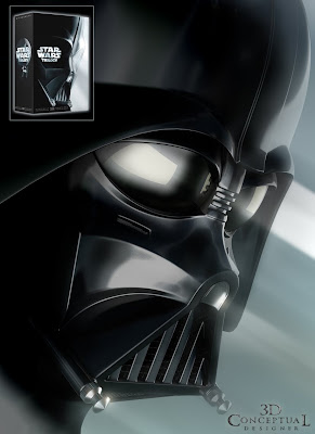
Project Review:Star Wars Trilogy DVD Packaging

The Finished Full Render[inset shows final packaging].

The Wire Reference Model with the surface model started at the nose.

Surface Model is proceeding across the face.

Surface Model almost complete for face mask part including the neck.

The finished surface model with the extra bits.


LORD VADER

Client: Lucas Film LTD via The Cimarron Group.
Art Director Cheryl Savala.
Project Date: Spring 2004.

The DVD Trilogy set was coming out yet again and we were tasked in creating the packaging for it. I was tasked with building out Darth Vaders iconic Helmet, and as usual in the Advertising world I had just over a day to do it.

This where I used techniques from automotive design to build this out quickly and accurately. You can see above that I built out a wire model for the basic structure, as the mask is basically like a car, a continuous single surface with fillets and rounds as this is a molded part.

Once I got the proportions and main surfaces of the face done in the wire "reference model", I started with a cylinder at the nose and went from there. The total time was about 10 Hrs to model the full job with 2 Hrs of material and pre-lighting before I did the 4500x 6600 LARGE final artwork. So I delivered this to Cheryl on time under budget at 12 Hrs.

Sadly the only piece that was used was the chrome points from the mouth, as they went with a stylized illustration instead for the finish.

Cheers, THOM

The Post Title links to the product at Amazon, or paste in this text below into your browser:
http://www.amazon.com/dp/B00003CXCT?tag=jackasscritic-20&camp=14573&creative=327641&linkCode=as1&creativeASIN=B00003CXCT&adid=1EA7AR7JGRFXK696FNFQ&

Thursday, February 18, 2010

Project Review: Blue Diamond Almonds Spot

The Conveyor system that carries the Almond through the scene.


The "hand crank" dispenser for the front of the main drum's.

A hoist with the beam details[ southwestern designed].


A small "Hero" prop for close up's in measuring the almonds. [ brass and oak]

The main brick oven to roast the almonds.


The Giant main prop central to the spot for loading in the uncooked Almonds.


Blue Diamond Almonds TV Spot
Set Design

Client: Design Setters.
Art Director: Myself.
Project Date Summer 1993

When I first came out of Art Center, I did set design for televeison commercials. A great variety of jobs and needs. Design Setters gave me my first job, and this was a follow up job a few years latter.

For Blue Diamond Almonds I helped design a lot of Practical props that needed to function for the spot. As an Industrial Designer vs. an Illustrator they tend to throw those jobs our way more often. Everything from roasting to checking the size of the almonds was in the storyboards so a designed out many areas.

The budgets were tight, so a single sketch for each area needed to address basic design and construction so they could get this done FAST. I delivered all the designs in less than a day and the spot was finished and aired. All and all a fun job for sure.

Cheers, THOM

Wednesday, February 17, 2010

Project Review: Splinter Cell pitch[2004]

Full View of Night-Vision Goggles.

ECU of Night-Vision Goggles.

Front View of Night-Vision Goggles.

Goggles "ON' with Head-Mask.

The Glass Logo.

The Logo behind shattered glass[ bullet hole].

The Fabrique National Herstal F2000 Custom Firearm 3D Model. [available]


Splinter Cell Pitch

Client:Ubisoft
Art Director: Eric Counter
Project Date: Summer 2004

While at The Cimarron Group we pitched for the Splinter Cell Movie back in 2004 with a print and AV presentation. I worked with both teams creating assets from the popular video game for the pitch.

The main items I built were the tri-lens glasses he wears in the game with the three distinctive green "eyes", and his custom Fabrique National Herstal F2000 that he uses in the game.

Though the pitch did not move forward I did end up building the firearm, ad it is sold on TurboSquid still from Cimarron.

If you go to IMDB, it shows that it is back in some form of Pre-Production for 2010.

Cheers, THOM


P.S> If you click the Title Link it takes you to the TurboSquid page for sales, or paste in this text into your browser:http://www.turbosquid.com/FullPreview/Index.cfm/ID/262979

Tuesday, February 16, 2010

Project Review: CYAN Kahlo World

A "Rock Bonsai" carved by the high winds on Kahlo.

A powerful dust is produced from the sand pillars as the are carved.

The Creature that the Player rides on Kahlo.

A huge ribcage embedded into the rock.

A Meteor slammed into the rock.

I SIDE VIEW of the hollow Meteor.

A floating Meteor over the sand.

A Player in a Miner outfit.


Project Review: Cyan Worlds Inc.
The Age of Kahlo

Client: Cyan Worlds Inc.
Art Director: Myself.
Project Date: Winter 2000

In the continuing series of posts on Cyan, I now focus on the Age of Kahlo. This is a windswept world with 100+ MPH winds all the time, so the landscape is carved out like the canyon of the Escalante.
There was some form of beast that is fossilized into the sandstone seen in the huge ribs in the above image. THere also was some sort of resource in the form of meteors imbedded in the rock as well.
Artistically the wind carved rock created some beautiful pillars that I called "Rock BOnsai" that would be all through the Age, kind of replacing the trees which could not exist to break up the surface landscape.

Cheers, THOM


I also did a single creature that flys using the wind for lift that the player can "ride" like a horse.

Cheers, THOM

Click the Post Title or paste this text into your browser to view the Canyon as Photographed by Marc Adamus: http://www.marcadamus.com/photo.php?id=74&gallery=canyon