Friday, September 30, 2011

Project Review: Cyan Worlds URU PART VII Submarine


 The Online version of MYST's URU had a Bubble-Sub I designed for the Venalem Age that was proposed.


 The mini sub was a one man craft all heavy iron and riveted with a Steampunk Industrial flavor.


 The "Tail" has a rotating and adjustable vane on the huge prop so it pushed pulled and steered the Personal Transport I designed back in 2000.


 An overhead render of the Ball shaped mini-sub surfaced on the ocean.


 A ocean level shot of the surfaced Bubble-Submarine Personal vessel in the open sea.


 Here is a geometry shot showing the 3D model as built for the concept art presentation.
 

Cyan Worlds URU: Part VII
Venalem Age:Ink Harvesting Submarine

Client: Cyan Worlds Inc.

Direction: Rand Miller
Project Date: Winter 2000


In this seventh Post on the Production Design work I did in the Winter of 2000 up in Spokane WA for Cyan Worlds, the makers of the popular Myst Video Game, I have posted the 3D renders I did for the Personal Submarine or "Bubble Sub", for the world Venalem that I designed.

Venalem was a world caught in a floating Iceberg and you can review the design here. The Bubble Sub was used to dive deep into the icy waters and cut the bulbs off at the base in order to create the ink needed to write the story.

I did the concept design a bit steampunk in theme, built out of heavy iron., with lots of bolts and rivets exposed. I added in some features like the variable vane propeller ball, that was ball joint hinged at a knuckle joint near the base, so it operated like a "Tail" to help steer the little personal watercraft design.


I always love submarine designs, as I did a few in 3D, and I also did a whole bunch of research in the Library way before the internet back in the early 90's to understand  "Neutral Buoyancy", since I wanted to build one someday, and since this one is a Bubble too, it follows that a bubble car and submarine are really a matched pair.


You can view PART I here.

You can view PART II here

You can view PART III here.

You can view PART IV here.

You can view PART V here.

You can view PART VI here

Cheers, THOM

Thursday, September 29, 2011

Project Review: A.C.C.D.- 3rd Term Shop class Product Model

 A 14 x 17 Marker Rendering I did for the final shop class project for the phone model.


 Here is a shot of the Product Design model I built at Art Center back in 1989 of a cordless phone and wall base.


 A shot of the same model with the phone "hung up" on the polished aluminum charging tabs.


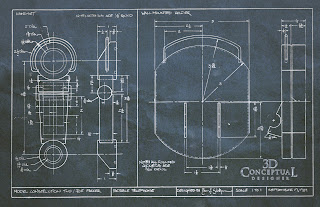
My drafting image blueprint I designed to build the model in Joe Farrar's shop class in 89'

Project Review: A.C.C.D.
3rd Term Shop class Product Model

I started Art Center in the fall of 1986, and left for almost 3 years before I returned to finish my training, and this model was built my first term back, 3rd in the fall of 1989. Joe Farrar was the instructor for nature of materials[ Shop], and we had to build a product model of some sort , so I did two, with this phone as my first one.

I wanted to use both metal, and plastic in the design, so I created a deco styled portable phone that charged on some nice metal tabs. Remember this was 1986 and pre-cell phones, so we had no idea how advanced things would get in just a few years from then.

I had been a professional Cabinet Builder the year prior, so I was well accustomed to parts drawings, and I had training in drafting from 9th -12th grade as well in our vocational programs we had in Colorado in the 80's.

The staged photos were taken in my apartment back in 89, and I still have the model today and it is in good shape.


I have additional Art Center projects up via the TAG on the right.


Cheers, THOM


Wednesday, September 28, 2011

Project Review: ASTROBOY PART III

I logo design made hollow like a glass box for a comp design by Art Director Joseph Stamper.


For this Astroboy Logo design, I cut a series of glowing channels into the face surface of the model. For the AV FX, we animated the texture across the channel. This version also had 16 stacked plates making up the box in this case.


In this version I took the logo I did for Art Director Calvin Sumler and broke it open and bent the face off for Art Director Chris A. Hawkins.


Another Astro Boy Logo version where I cut lines into the model with some shapes found in the film.


A simple red extruded plate with a light source in the "O" where Astroyboy's silhouette is the cut out.


 A 'Big A' logo done for Art Director Joseph Stamper with a full Astro Boy head in there.


Project Review
Astroboy 2009 PART III
Box Extrusion Logo Designs

Client: Summit Entertainment via The Cimarron Group
Art Director[s]: Chris A. Hawkins, Joseph Stamper, and Calvin Sumler
Project Date: Winter 2008-Spring 2009

This is my third post for the Theatrical Advertising work I perfomed for Astroboy back in 08' and 09' while I ran an in-house 3D Design Department for The Cimarron Group, out of their Hollywood main office. Today I have posted some additional 3D logos I built out for the various comps for the Art Directors at The Cimarron Group.

I cut into a few designs above some 'tech shapes' that would be self illuminated and even animate, for the Motion Graphics portion of the job[ that never came], but for my part I designed the still frame in mid glow for the posters.


I also stacked plates to make up the extruded look as well as even a tapered extrusion in the red example where I thinned out the base extrusion and thickened up the lid area.

I also took the original boxed logo, filled it with Astroboy 'guts' and broke the title through, so Astro Boy could fly through the comp. This is one of my favoirtes. I love interaction of the artwork with the title, it tends to bring them together into one world, rather than feel pasted on the top. Enjoy the project posting!


Cheers, THOM

Tuesday, September 27, 2011

Personal Project: My Bubble Car Design 1989-2011-PART II -3rd Term 5th Scale Model


  A shot of My Bubble Car Design Taken just under the bridge at ACCD back in the Fall Trimester of 1989


 A side-view taken at ground level of my Bubblecar design.


Here with a birdsyeye shot you really see the cutaway side of my Bubble Kar design I did back in the late 80's.


My 3rd Term Presentation was done as a tri-fold foam core wall that I basically just set up on a table and did the presentation for Freeman Thomas.


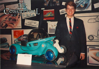
Here is the Bubble Car again  five terms later for my senior show in the fall of 1991 at my Graduation.


Personal Project
My Bubble Car Design 1989-2011
Part II- 3rd Term 5th Scale Model

This is my second post covering my personal project on My Bubble Car that was started back while I was still at Art Center in Pasadena CA. back in 1989. If you want to view the Bubble Car in it's current 2011 form, you can go here.

Above you will see shots taken back while I was still a student at Art Center, of the 5th scale model I built for the final design presentation for the class.

Our teacher at the time was, Freeman Thomas, famous for more than one current automotive design including working on the PT Cruiser, The New VW Bug, and the Audi TT coupe. He allowed us as Transportation Design One students, to build a 5th scale model, which usually took place our 5th term, not our 3rd.

If I remember right,  he caught some flack for that, but as a designer we were able to get right into a dimensional design on our first car, so the connection started very early for those of us fortuneate to have him as a Professor.  Going from a 2D sketch to an actual 3D model sculpture connects the dots that no other method can do, and the sooner you build your designs the sooner you see your own disconnected sketching style, and "fakes" that are in the sketch[ foreshortening etc.], so you adjust your sketching style to be more realistic.

The original "Orbit" was a fluid driven chariot, with swing arms that would hold each wheel independently, and move independant from the main body so the car body itself was truly animated in form. At the time of design I build a rear engine[ Think VW type 1] with a fluid drive system that went to all four wheels.

I had seen many an "Egg" cars, or teardrop shaped cars, but I had never seen a fully round bubble [ until 2008 as there was one done out of France back in the late 50's]. The "Ball" was key to the design not only in the Cabin, but for the wheel-fenders themselves as I wanted the five main spheres to be the basis for the design.

For the final design I did a half, and half model showing the interior structure, with the frame that was inside the bodywork, as well as a full interior, as I had to build out the full interior since I used a lexan hemi-sphere for the windows on the finished side rather than a solid clay or foam model as most 5th scale designs are.

I will be posting close ups of those first renders done in Vis-Com 3rd term taught by Andy Ogden in days to follow, so enjoy the posting.

PART I: here

Cheers, THOM


Monday, September 26, 2011

Project Review: ASTROBOY PART II


 Here is the full glass logo with all the Astroyboy guts I made for the boxed type modified to fit inside.


 Here is a matte shined steel logo I did as a variation on the above Tube logo.


Here is the same Astroboy file rendered with a lot more reflection on the metal surface shined up and polished out.


A One sheet comp with a stacked Logo for Astro Boy, and a series of tubes going into the back of the logo[ based on a reference given from the director]


A Single line logo with a room added into the set from above for the Astroboy Teaser Poster Ideas.


Here is the quad view showing the details of the model from the backside for Astroboy.


The front polygon quad view of the main tube SPB logo I designed for the various Art Directors at The Cimarron Group.


Project Review
Astroboy 2009 PART II
Tube Logo Designs

Client: Summit Entertainment via The Cimarron Group
Art Director[s]: Chris A. Hawkins and Calvin Sumler
Project Date: Winter 2008-Spring 2009

This is my second post for the Theatrical Advertising work I perfomed for Astroboy back in 08' and 09' while I ran an in-house 3D Design Department for The Cimarron Group, out of their Hollywood main office. Today I focus on the the soft toon styled logo I designed for the Animated Movie Astroboy, and it was based on a simple and soft tube shape to match up to the look of the main character design.

A tube shaped, or round profile logo design is built in the same way as a Single Point Bevel [SPB], type treatment is done. I put up a tutorial post on how to build a SPB and it is a slight modification to the process to create the tube profile. It is still a hand built font logo, and each letter has it's own challenges.

I also filled the logo with some of the Astroboy 'guts' I built for the Joseph Stampers, glass and steel logos I built earlier here. I had to modify them to fit inside the tube font and so I revised the profile and scale of the parts to fit. I also used a shell modifier to make the glass walls  render better with thickness to them.

I have another post in this series I will put up soon with the more boxed extruded shapes for logos I did as well, so enjoy the post.


Cheers, THOM

Friday, September 23, 2011

Personal Project: My Bubble Car Design 1989-2011


 Here is a studio lit shot of My Bubble Car I designed, taken in 1989[ 4x5] of the final 1/2 cutaway model I did at Art Center for Freeman Thomas' studio design class called, Trans-One.[Transportation Design One]


 Back in 2005 I had developed the design quite a bit more, and the newer versions since about 2000, all are looking closer to my 3D Render you see today.


 I did some color and paint tests back in 2007 on the Bubblecar, here is a bright colorful pink.


 I loved the Honda root-beer color back in 2007, so I did a version of The Bubble Car in that too.


 A full chrome version as well, one of my favorites for my Bubble Kar.


 The original project I labeled as a 'VW-Orbit' [ non sponsored project], so in honor of that I did one in the VW New Bug Turbo Green.


 My Bubble Car Concept Design had to be done in RED!


 A clean White Bubble Mini Car.


 Yellow Bubble Car in homage to my favorite band Yello!


 Here is a Geometry shot showing the basic Model, still a Work In Progress[ WIP]


 An explode view showing the base parts including the "People-Pod" the base swing-arm cage, and the wheels with separate power on each.


 Here is an alternate view from below, the mini radial engines are an option I am looking at. I had electric at one time, but the 1989 was "fluid Driven, whit a single engine in the bubbles floor.

Personal Project: My Bubble Car Design 1989-2011
Personal Project
My Bubble Car Design
1989-2011

Every car designer has a look, or specific design they fell in love with early on in their career, and I am no different. My design happened to be my first transportation design, done in my first class project during my 3rd term at Art Center. My instructor was Freeman Thomas. I had left for almost 3 years and this class took place on my first Trimester back at ACCD, so I was very into this project to say the least.

 My Bubble Car is a design that is founded in a few simple designs of the past, namely the VW bug, the Model-T, and the Jeep. All three are very iconic designs IMAO, and I wanted a design that was very unique but also a "World Car", something that would have a timeless feel to it, rather that having a trend affixed like fins or going for a specific look[ hard edge or rounded etc.], I chose the most basic and simple shape I loved, the Sphere.

My basic challenge was to design a car around a perfect sphere so that the "pod" where the two people sat could Gyroptically be balanced[ I will fill you in in future posts on this]. There are many advantages to a perfect sphere as a base for design, and one is that all impact is forced to a single point is space so the shape is the strongest shape you can have, and being this is a micro, or mini car, I wanted it safe.


I plan to post quite a bit more along with the history and sketches I did decades back in the design, and I will also continue with the development. The dream is to build at least ONE!


I plan to post many added images over the next few weeks including all the early sketches I have from school to the most current design version I have done.

Cheers, THOM


Thursday, September 22, 2011

Project Review: The Phantom 2040- PARTLXXXII [82nd]-Vehicle Design Sketches: Enforcer and Micro-Mini's

 Here is the standard Enforcer[ Sagan Cruz] Vehicle as it looked on the road.


 Here is an overlay sketch showing the wheels retracted and the side skirts extended and 'wrapped' around the car base as it is now hovering in Hypercruiser mode.


 Trahn and Jenna in College with Kit[ aka The Phantom] drove around in these little sub-micro cars that were one passenger enclosed cycles with 2 wheel, 3 wheel and ever a 4 wheel version.


 A two wheel concept with wide 'steam roller' wheels for balance.


 A four wheeled mini transport rough sketch design I did back for The Phantom.


Phantom 2040-PART LXXXII [82nd]
Vehicle Design Sketches: Enforcer and Micro-Mini's


Client: Hearst Animation Productions.
Art Director: Myself.
Project Date Spring 1993.


This will be my 82nd post on my Art Direction, and Conceptual Designer roles for The Phantom 2040, an animated kids series from the mid 1990's.

Today, I have a few more vehicles I designed for the show back in 94'. As a grad from the Transportation Design program at Art Center, in Pasadena I was trained for this stuff, and doing designs for a futuristic animated show made it even that much more enjoyable of a subject matter, or better yet a "world setting" that they lived in.

I focus today on two: First I show the Enforcers 4 door 'cop car' so to speak. I did a design that was to be a bit dated as most Police do not use the current models, but a dated standard model, so I went that direction with the car. I also did a variant for when it floated , as to what it looked like. When I was in So. Korea I helped design out the animated transition with the team at Sei-Young as well, but I do not have scans of that[ Sei-Young in So Korea did not have a Xerox machine available to me].

I also have roughs of the mini-micros, or motorcycle cars that the College kids rode around when we did shots at school with Kit.


As a side, if you are a FAN of The Phantom 2040, and on FACEBOOK, there is a group dedicated to the show here.

There is a TAG on the list to the RIGHT for other Phantom 2o4o entry's, but you can click this as well.

Cheers, THOM

Wednesday, September 21, 2011

Personal Project: Craftsman Cliff House 2003

 My Personal Project of the Craftsman Cliff House seen from the view side.


 A close up on the bridge connecting the main home with the garage guest house. I imagine a "falling water-esque' river could run under this bridge with a waterfall water feature i on the property.


 An upshot on the Tower in the Cliff Craftsman Home.


 Here I fleshed out the bridge from the main home into the lower floor of the two story library in the middle of the Tower.


 A Bird's Eye overhead view of the home I designed. Note the three story garage with an addition space below the cars for a shop in the basement.


 From the street side it looks like a standard bungalow, but the change in elevation over the cliff is deceiving to the height of the tower out back.


 A view from the back showing off all three main buildings connected by the two covered bridge walkways connecting them all up.


Personal Project
Craftsman Styled Cliff House 2003

Today's post is a design for a Craftsman styled cliff house that I have tinkered with over a decade on and off. I have not done any active design for 7 years, but I thought I would post these images here as a first posting on this personal work. It is a true Work In Progress as I have mainly blocked in the proportions and shapes and just started to flesh out the beam work, as the design lacks, doors, windows, and and porch or siding as of yet.

I am a nut for the Arts and Crafts movement, and not only follow the Architecture and associated Furniture, Lamps, and tapestry designs, I have incorporated the style into many a project seen here. This is a dream home of sorts for me, that I would love to build someday up in the mountains of Colorado where I grew up.

The base design is what is termed an Airplane Bungalow, in which the top floor is a smaller box on top of the lower floor, so with the big eaves hanging over it, it resembles the proportions of a cockpit on an aircraft fuselage.

I also wanted to add in these bridges to connect the three main buildings, The home, the garage and guest quarters, and the tower. I used the lower flatter Japanese roof pitch typical on the California Bungalow look, on the multiple buildings and walkway roofs in my design.

My favorite feature is the five story tower which houses a studio loft up top with a 360 view, a two story library below it with an addition office or den under the library with a chapel in the basement.

I may get inspired to revisit this design again, I had fun mocking this Work In Progress up. I have a Craftsman I did while at The Cimarron Group for sale on Turbo Squid here.

Cheers, THOM