Thursday, September 30, 2010

Project Review; The Race to Atlantis-PART VII

We see through the stained glass a figure descend towards us into the room.

This menacing figure continues to fill camera and come even closer to us...

This beast screams at us and proceeds to throw a fireball at us...

A few racers who stuck around try to pass, only to get nailed...

Our host suggests we turn and see the world through the wall...To Be Cont'd.

RACE TO ATLANTIS PART VII

Client: Rhythm and Hues.
Art Director: na.
Project Date Summer 1996.

In this seventh post on my work on the 3D ride-film storyboards for the Atlantis Ride Film at Rhythm and Hues, we are in the dead end room and something has appeared before us. This is a main story moment that we must pass to continue in the race. Most of the rest of the racers have left and it is just us and the comic relief there with us. Those who stayed are trying to pass the beast that has blocked the path in the race.

We end this sequence with an invitation to a city through a wall.


You can view PART I here

You can view PART II here

You can view PART III here

You can view PART IV here

You can view PART V here

You can review PART VI here


Part VII Coming next!

Cheers, THOM

Wednesday, September 29, 2010

Project Review: Twilight I 2008

A Moss Covered Twilight Logo.

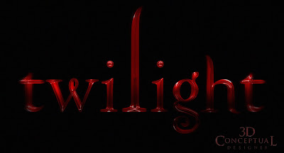
Red Glass 3D Twilight Logo

3D Illustration of the Cullen Family Crest on a Metal cast wall.

A cracked Cullen Family Crest Logo from Twilight.

The Shattered Twilight Logo in an Aged Concrete.

The above Shattered Logo in G Lass for Twilight.

A 3D Twilight Logo with a Uppercase "T".

Twilight in Stone.


Twilight
3D Logos and Illustrations for Print Advertising

Client: Summit entertainment via The Cimarron Group.
Art Directors(s): Calvin Sumler, Joseph Stamper, and Chris A. Hawkins.
Project Date: Summer 2006.

I had the privilege of working on four Twilight ad campaigns so far and I have posted today the first in a series on the 3D Illustrations and 3D Logos I did for the Print presentations we did for the first film.

I did some single point beveled logos based on the logo from the book, as well as a Cullen Family crest and a few added items too. My favorite versions were the shattered and broken ones I did for Chris A. Hawkins you see above. Though none finished for the first file, I did get some 3D Illustrations that were used here and there.

Cheers, THOM

Tuesday, September 28, 2010

Project Review: The Phantom 2040- PART XXVIII-Utility Belts

The early Utility Belt concepts for The Phantom 2040.

More early Utility Belt concepts for The Phantom 2040.

Phase Two development the design is shaping up.
[You can see the basic outer shape in the lower design]

Design "G" finished as his belt, though the process went a little more along.

A Final Design that had the basic profile of the final just a bit too busy for animation with the cutouts like the cuffs had early on.

Phantom 2040-PART XXVIII

Utility Belt Design Development

Client: Hearst Animation Productions.
Art Director: Myself.
Project Date Spring 1993.

In this 24th post on the Phantom 2040 TV Animation series I worked on in the early 90's I focus on the Phantoms Outfit and his Utility Belt he wears as a sub-section of the character design. It falls as both a character design element, and a prop since he removes the belt during the show.

The three main items designed for the Phantoms costume were the Power Cuffs, Belt, and Guns. This post shows the development of the designs I proposed for the Belt and you can see we picked version "G" above to go to final. The oval front and center was designated for the skull that was not designed yet at that time, as this was one of the first designs I did when I came on board as the Art Director/Conceptual Designer.

Cheers, THOM

Monday, September 27, 2010

Project Review: Star Wars Trilogy PART II


Darth Vaders Light saber from the Original Film[IV]

Darth Vaders Light saber Close-Up from the Original Film[IV]

Luke Skywalkers Light saber from the Original Film[IV]

Luke Skywalkers Light saber from the Original Film[IV] with the power ON.


The Lightsabers getting used for a finish on the AV work for FANBOYS 2007.


STAR WARS TRILOGY DVD PACKAGING
Lightsabers.


Client: Lucas Film LTD via The Cimarron Group.

Art Director Cheryl Savala.
Project Date: Spring 2004.

The re-re-release on DVD of the Star Wars Trilogy packaging ended up using my Darth Vader 3D Illustration to blend into it, but early on, one of the first jobs I did for Cheryl Savala ,who was Creative Directing in Home Entertainment at The Cimarron Group was these Light sabers.

Always a fun project to build out Sci-fi stuff, and Star Wars came from my own childhood so the job was a pleasure.

As a Side the Model was re-used for the FANBOYS trailer and ended up being used for the trailers and was also put on the title sequence of the film itself.

You can view the prior post on the Vader Helmet here.

Cheers, THOM

Friday, September 24, 2010

Project Review: Race to Atlantis PART VI

We turn up to the sky and fly past the steps on a Pyramid.

We are inside the Pyramid in a great Corridor.

The other racers hit into the walls and parts start falling...

For some reason the other racers turn and leave us alone.

We head to a seemingly dead end at the end of this long journey...


RACE TO ATLANTIS PART VI

Client: Rhythm and Hues.
Art Director: na.
Project Date Summer 1996.

In this sixth post on my work on the 3D ride-film storyboards for the Atlantis Ride Film at Rhythm and Hues, we are now in heading into a Pyramid and a great glass hallway. We follow the rest of the the racers doen a glass ceilinged corrideor and then ethya ll turn around and head back at us hitting and shaking our POV. We continue to the dead end at the end of the corridor. I will post the next set of this story soon.


You can view PART I here

You can view PART II here

You can view PART III here

You can view PART IV here

You can view PART V here


Part VII Coming soon.

Cheers, THOM

Thursday, September 23, 2010

Project Review: Pirates of the Caribbean 2003

A Banner with an open Chest of Gold at the floor of the Sea.

A Banner with a pile of Gold at the bottom of the Sea.

A Skull pile at the bottom of the Sea with some light beams coming down to the floor.

Skeleton Posing for Art Directors using body shots of Pirates for painting in the look.
[ No CG at that time was done]


Skull and Crossbones a must have item.

A Banner looking down in shallow water at a skull with the coin in the mouth.


Pirates of the Caribbean 2003

Client: Walt Disney Pictures via BLT and Associates.
Art Director: Warren Nung.
Project Date: Winter 2002/3.

When I was still doing 3D Design Illustration over at BLT and Associates I worked on the Poster campaign for the first Pirates of the Caribbean film. I did some Skeleton rendering and posing to line up with some photography, as well as some banner designs for underwater concepts containing skulls and treasure. The film was still shooting and we had no elements except for the body shots of the main characters so I built it all from scratch. Fun stuff to do!


Cheers, THOM

Wednesday, September 22, 2010

Project Review: Dark Justice PART II

The Limousine Final sketch: This was the main Characters car in the show.

Here is the underlay rough of the Limo with a Perspective Grid as well.

A Final Design for a Taxi Cab used in the Series.

The underlay rough I did for the Taxi design.
[ Note: grid-work on body for checkerboard placement]

The Final Design for a Deco Styled Zeppelin that floats through the city.

The rough sketch underlay I did for the Zeppelin design above.


Project Review: Dark Justice
PART II Vehicle Development

Client: Brandon Smith via Hope Ranch Productions
Art Director: Myself
Project Date: 1999

In this second post on Dark Justice, the animated cable show I did Production Design work for in the early 90's , we look at a few vehicles I designed and the underlay grids I used to rough them in.

As with my prior post on using an underlay grid, sometimes I do a full grid, and sometimes I only do a partial one for some key objects like the wheels. I always do a rough for two reasons; first it gives the client a first-look at the design before I have put much time into the design so basic proportions and design elements can be identified. I next flesh out the design in the final and deliver. For these tere was no coloring stage so I delivered monochromatics.

You can view the Set Design work I did for this show on another post here.

Cheers, THOM

Tuesday, September 21, 2010

Project Review: The Revenge of the Mummy-The Ride

Some of the material that my 3D Illustrations were used in.
[Includes original One Sheet Design from Chad Robertson]

A Mock Up of the interior of the ride with an empty car to fill up with people.

A Back Shot of the car going into a tunnel.

The main Side View that was used in the Brochure work.

The Universal Studios Logo built from sand that beat like a heart.

A Pile of Gold for a 30 Sheet Billboard design.

The Revenge of The Mummy-The Ride
Universal Studios Hollywood 2004

Client: Universal Studios Hollywood via The Cimarron Group.
Art Director(s): Chad Robertson, Mary Ellen Schrock.
Project Date: Winter 2004.

One of my first jobs I did 3D design and Illustration work for while running the 3D Department at The Cimarron Group, was for Cimarrons' Corporate Division on the 4th floor. The work was on the new attraction at Universal Studios Hollywood for The Mummy, The Ride.

The attraction was not built yet, so I had to do mock-ups of the ride car and the tracks for some illustrations they were going to use to pre-promote the ride with. I also worked on some of the Television AV work with a few animations as well. I did a Universal Globe made out of sand that beat like a heart that was used for a good year to advertise the attraction, as well as a few wireframe aniamtions of the ride car. At the time I did work for Universal Studios for a few years through The Cimarron Group.

You can view some of the finished designs Creative Directed by Mary Ellen Schrock at her site here.[ page 15,16, and 17]

Cheers, THOM

Monday, September 20, 2010

Behind the Art: Perspective Grid Tutorial

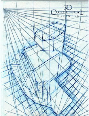
STEP I: Here is the 8.5 x 11" Perspective grid made using Ship Curves.
[ No Straight Lines]


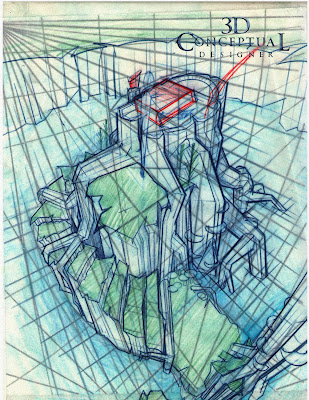
STEP II: This is the blocking model done on velum over the grid.
[ For basic design proportioning using Ship-Curves]

STEP III: This is the second overlay over the blocked sketch done.
[Freehand and tighter sketched with Ship-Curves]

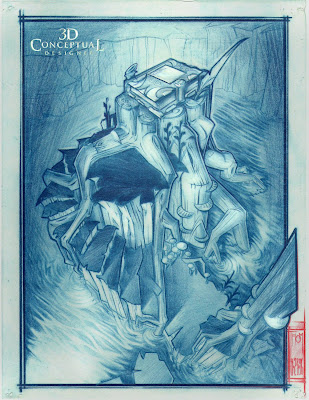
STEP IV: This is the final Artwork done on Velum.
[Clear-print Velum,Color-erase Pencil, Indigo Blue Prismacolor and Markers]


Perspective Grid Tutorial

When I design using a traditional 2D approach via hand sketching I use a Perspective Grid as an underlay almost every time.
The reasons are simple; I want to spend my time working out a great design, not spending the time making sure it is drawn accurately in perspective. If you struggle with perspective drawing you spend most of the time adjusting and correcting the way you have drawn a design to make it more accurate to a real world perspective, so if you can minimize perspective mistakes you have freed up your time to focus on the design itself.
The second reason I use a perspective grid is I get a faster blocking of the design early on as I can sketch over a grid with velum or tracing paper taped to the grid I have made and block out an accurate volume in 3D.

I then take the blocking with a grid and do a tight design over the top using freehand and french curve techniques. A great benefit of the grid-underlay is that I can do fish-eye sketches since I can use all curved lines in the view giving it a dynamic view based on an extreme lens.

I save all my grids and have dozens I can reuse with straight lines or curved from almost every conceivable angle.

Cheers, THOM