Tuesday, May 31, 2011

Project Review: The Phantom 2040 PART 67[ LXVII]

Some of the concepts Ideas for the big "M" for Maximum Inc. that would be used on Heli-pads large doors and on the Mile high building itself.


A second page of Ideas. We did use the negative spaced tall one on the lower right in a few applications in the backgrounds done.


A Page of Numbers used as Icons in backgrounds and for screen countdown effects etc.


A second page of ideation sketches for simple numerical logos.


Phantom 2040-PART LXVII [67th]
Added 2D Graphics for Background Layouts


Client: Hearst Animation Productions.
Art Director: Myself.
Project Date Spring 1993.

In this 67th post on "The Phantom 2040" television Animation Series I have posted more logo ideas used by the layout artists for graphics within the backgrounds themselves. As Art Director/Conceptual Designer for the 52 episodes, I designed the majority of this world for The Phantom 2040, and that included these simple 2D graphics.

Small idea sketches are a part of every designers life and process of how we do the detailed final presentations, here is a look into that process, sometimes simple as these images show.

A major limitation we had was how many graphics we could put in the series sine with translations they would not be usable, so we limited it to a few items. Maximum Inc was called that in French, Japanese, and German, so I designed out a large "M" for maximum. This icon was spread around the backgrounds we did for Maximum Inc on Iron Doors, Com Phones etc. The multiple use of these images required a large variety of looks so I cam up with a bunch as seen above.

Numbers however were used in all the background images no matter the language , so I came up with some holding devices that would have a number in it, or near it for use in backgrounds, countdowns, and the various needs the series had.

Our graphics needs grew so large, we were able to hire a Full-Time Graphic Artist, Thomas Kim from A.C.C.D. and he came in and set up a Mac Workstation to do all our graphics and motion graphics animatics as well, and we got him about 6 months into development. It was uncommon for a 2D animation team to employ a 2D Graphics artist full time , but we were able to do that and it made a huge difference.

You can view prior GRFX [ graphics] I did for the main title and outside the series here.

Cheers, THOM

Friday, May 27, 2011

Project Review: The Longest Yard- Motion Graphics Titles

I built the title logo with 3D curved text, barbed wire, and a 3D football animation for the TV spots[ see in reel].


The TV spot cards look was a stenciled font built out of rusted steel with barbed wire again as a holding bar up and down.


The Adam Sandler card done up the same way.


I built out two guard towers and we did a goalpost field goal shot with the fence as the way out.


This X-ray shot reveals that this prison has a football stadium in the middle.


Here is the first shot in the teaser I built out of a low resolution prison set.


The Longest Yard
Motion Graphics Titles

Client:Paramount Pictures via The Cimarron Group.
Creative Direction: Roland Mesa.
Art Director:Myself.
Project Date: February-November 2004.

I did Motion Graphics work for the Theatrical release of the remake of The Longest Yard by Adam Sandler back in 2004 for Roland Mesa back at The Cimarron Group. I worked early on for a teaser trailer, where they needed some images of a prison for interstitial MGFX -Images, so I built out a prison set with a football stadium that we referenced in some flash graphics between cuts of type, to hint at what the film was.

Then, many months later I did cards, and titles for TV spots once the film was about to be released as seen above in the AV MGFX cards. We used barbed wire as a graphic both on the football logo itself, as well as around the cards for the Motion Graphics spots we did to match up to all the prison images I did earlier.

Enjoy your Memorial Day weekend all!

Cheers, THOM

Thursday, May 26, 2011

Project Review: The Phantom 2040:PART 66-More Color Keys

Maxwell Madison, The villain Son of Rebbecca the head of Maximum Inc in The Phantom 2040 Television Animated Series from the mid 90's.


Guran, Kit Walkers side kick, is seen here with his hidden armor he wears under his regular outfit as a color key.


Jenna is Kits friend from College so she had a few wardrobe changes throughout the series and here is one for the second season.


A Color Key done for Trahn, who was always in tow with Jenna and Kit in the adventures they had.


Sagan Cruz was the primary character we saw as an "Enforcer" [ POLICE], and this is an Asian character we had in a few episodes in the second season.


Phantom 2040-PART LXVI [66th]
More Color Keys for Characters


Client: Hearst Animation Productions.
Art Director: Myself.
Project Date Spring 1993.

In this 66th post on "The Phantom 2040" television Animation Series I have posted more of the color keys I did for the full character line up for the series.

Hearst had hired Peter Chung for a freelance contract to design all the main characters for the series as his Aeon Flux characters captivated the animation world in the early 90's so David Corbett the Executive Producing The Phantom had him do a full round for all of them in 1992 prior to me coming on board.

Once I came in, I utilized Paula Lafond, our in-house character designer and she did all additional characters[ human] to match the look of the gaunt main players, and I redesigned the B.I.O.T's; as well as adjusted all the outfits of all of Peters characters to match up with the added Art Nouveau theme I had added in after he was done and gone.

I had just finished working on a Restaurant Cafe Morpheus and had to get very familiar with Art Nouveau, so I was well versed in the look, I just stretched it to a tall and thin, Cinema-Scope stretched feel, to match up to these gaunt characters. Here you can see the resulting Marker comp Color Keys I did for a few more of these players.

You can view all color keys with the tag on the right column or just click here.

Cheers, THOM
Wednesday, May 25, 2011

Project Review:Intrepid Pictures PART II Wing Details


A Side view posed with the wings down and ready to go


I posted a front view in PART I, so here you can see the actor pose it fit into.


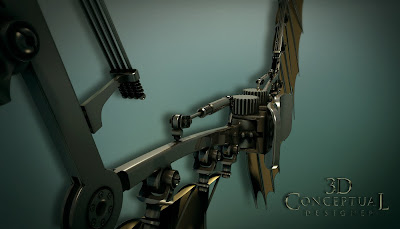
We were to fly around the apparatus so I gave it some details.


The "knuckle" area near the last joint in the wing frame.


The "Rib Hangers" are seen here for the cloth to seat into.


The pads in the center were fused to the actor and grew out of them in the final idea.


A Side perspective on the Intrepid Pictures wings concept design I did for them.


INTREPID PICTURES PART II
Mechanical Wing Details


Client: Intrepid Pictures via The Cimarron Group.
Art Director: n/a.
Project Date: Christmas 2005.

I did early development of a logos for this p motion picture company, but I also had a very exciting side development for it with some mechanical wings. The client wanted a modern version of some DaVinci wings that could allow man to fly, so I came up with this version that is a bit steampunk as requested.

We shot some actors in various poses and if the client was ready we would motion capture the actor and add the wings into the scene later on. They went with a simple logo, but this was a fun road to take a spin on anyhow.

PART I can be seen here.

Cheers, THOM

Tuesday, May 24, 2011

Art Education: Commercial Art Prep School C.A.P.S. 1984

The C.A.P.S. Class of 1984 Photographed in Downtown Denver August 1984.


Colorado Institute of Art
[ Now the Art Institute of Colorado]

Commercial Art Prep School =C.A.P.S. 1984

Getting a good art and design education cannot be underestimated for someone seeking to go pro. Yes, it can be done without it, and it could be done well if you knew the right people, but for most folks who do not personally know a working artist in the field they wish to go into who will mentor them[ the best method], then this is the way you want to go.

I was blessed to have been a part of a new experiment at Colorado Institute of Art in the summer of 1984 just prior to my Senior year in High School in Littleton Colorado. I was a participant in a Commercial Art Preparatory Program offered to soon to be seniors to put us into the college classrooms for 3 weeks. It was awesome. We had students from all the states around us, Texas, New Mexico, Arizona etc. so I met some great artists.

Cheers, THOM

Monday, May 23, 2011

Project Review: SWAT movie- 2003 Part II-M4 Model

The SWAT M-4 firearm I built for the Motion Graphics Teaser Trailer back in 2003.


We were going to go inside the gun, so I built it hollow which takes double the time, here is an exploded view showing the components built.


The bullets and all internals were built.


An overhead view of the S.W.A.T. M-4 rifle.


This render shows the geometry and topology of the 3D Model I built.


An overhead view of the Model I built for Matt Hartle to animate for MGFX.


S.W.A.T. The Movie 2003PART II: M-4 X-Ray Full Model

Client: Columbia Pictures Inc. via BLT and Associates.
Art Directors: n/a
Project Date: Winter 2002-3.

It this second posting for the work I did for the ad campaigns for the release of S.W.A.T. back in 2003 for the Motion Graphics teaser that our in house Animation Director Matt Hartle set up.

I built the models in 3DSmax and exported them out to him via OBJ[ Pre FBX days]. It should be noted that these are not quad models, as I was still developing the modeling technique to be able to do that fast enough for the turn around times usually associated with advertising, so I did a fast model of this one.

This model had a complex camera move go around it in the original concept, with assembly and disassemble done, so I built all parts two sided with enough internals to fire a bullet out of the 3D representation as a virtual M-4.

You can view the render in glass here from a prior posting.

Cheers, THOM

Friday, May 20, 2011

Project Review: Banana Shpeel on Broadway 2010

The Tag line for Cirque Du Soleil hanging at an angle with clean letters.


Here is a straight on version against a wall of brick with an aged text all gunked up.


A slight fish eye view of the "Beacon Theater" in rusted Tin for the bottom of the posters.


A Single Line final Logo.


A Stacked more square mark of a Logo version was done as well.


Cirque Du Soleil's

Banana Shpeel

Client: Cirque Du Soleil via The Cimarron Group.
Art Director: Calvin Sumler, Chris A, Hawkins, and Joseph Stamper.
Project Date: March, 2010.

I did some quick 3D Logos for The Cimarron Group last year for the Broadway show from Cirque Du Soleil, called "Banana Shpeel". The logo itself was designed by another company, so we did our version for the comps presented.

I had some room to make the tag lines and the Beacon Theater sign in 3D too which was new to the projects look. I also used Sub Surface Scattering to get the glow right on the plexi-glass covers street signs that have a filament inside. I developed the look for City of Ember here.


A fun exercise, about one day of work plus some larger renders. Sadly the show flopped and closed 6 weeks in.

Cheers, THOM

Thursday, May 19, 2011

Project Review: The Phantom 2040-PART LXV 65th post


This is a re-posted image looking done at the whole mile high building from the sky.


This is an earlier sketch developing the tip of the spire where the Madison's live.


A SIDE-VIEW cut away showing the various levels in the spire tip in Maximum Inc. in Metropia.


A noted Background Layout design drawing I did showing the sectors in this huger building.


Some floorplans for a few of the main levels in the spire tip of the building one mile off the ground.


Here is Frank Lloyd Wrights Concept from http://www.goodart.org/artofflw.htm


Phantom 2040-PART LXV [65th]
Maximum Inc. Detail Drawings


Client: Hearst Animation Productions.
Art Director: Myself.
Project Date Spring 1993.

In this 65th post on "The Phantom 2040" television Animation Series I have put up the drawings I did explaining the set up inside Maximum Inc. the mile tall super building in the center of Metropia the city in The Phantom 2040 Television Animated Series.

One of my favorite architects has always been Frank Lloyd Wright and he did a mile tall building concept that I took as the base idea to execute in 2040 in Metropia. Rebbecca Madison and her son Maxwell live and plan the demise of Kit Walker from this location.

Jungle vines wrapping and twisting around architecture with the jungle taking back the city,was a visual theme I followed for the show, so I did freeways that wrapped this huge "tree" of a building as well.


Cheers, THOM

Wednesday, May 18, 2011

Project Review: Priest- 3D Logo Exploration 2009


My First pass at the new 3D version of the Comic Script Logo.


Here I use a Procedural Texture with a Dirt shader that finds the intersections in the model and deposits a second material so you can "age" you designs.


Here I adjusted the material to add more "blood color", and we removed the cross holding device as well.


A Bronze and Silver version tilted a bit back.


Here we have a simple extruded flatter version with only a single layer with no outlined seat.


A version made out of a blood material as well as the geometry was melted and a few subtle bumps added.

Here is a view showing the Low Poly Subdivision Model used to get the SPB[ Single Point Bevel ].

PRIEST
3D Logo Exploration

Client: Sony Pictures International via The Cimarron Group.
Art Director: Joseph Stamper.
Project Date: January 2009.

When I was at The Cimarron Group in 2009 we did a quick half day project where I was to build a 3D version of the script logo found on the Graphic Novels for Priest, and I then did a series of texture and lighting treatments to them all. I built a single point bevel with a small landing on the top of the letters to get the molded feel to the model that would match the comic book. Some include a "cross" stylized in the back as a holding device to grab the font, and one is made from pools of blood.

I get to do a lot of fast 4-6 hour 3D Logo projects in the area of Theatrical Advertising as they have a bit of budget "leftovers" to go this route on an occasion, for a big budget or high profile Motion Pictures.

Cheers, THOM

Tuesday, May 17, 2011

Project Review: The Phantom 2040-PART 64 Opening Title PT-V

Cont'd from last week...We are now right on the running B.I.O.T as we overtake him.


We cut to a close shot on the hyper-cycles skull motor with a diagonal pan up the bike.


A longer mover with a zoom out and a pan down in the city as we follow the Phantom 2040 on his hyper cycle.


We CUT TO the Ghost Jungle underneath the city as we see the throne for the Phantom...


We cut to the Phantom 2040 hero shot as he slowly folds his arm ending is the famous pose he is known for. ...END.


Phantom 2040-PART LXII [64th]
Storyboards for Opening Title Sequence PART FIVE [final]


Client: Hearst Animation Productions.
Art Director: Myself.
Project Date Spring 1993.

In this 64th post on "The Phantom 2040" television Animation Series I have put up the last post of five for the storyboards I did for the opening title sequence for The Phantom 2040.

Here we reveal The Phantom 2040 and his nemesis Rebbecca Madison as well as show off some more technology.

You can view the Title on YouTube here.

You may view pages 1-5 here.

You may view pages 6-10 here.

You may view pages 11-15 here.

You may view pages 16-20 here.


Cheers, THOM