Tuesday, April 27, 2010

Project Review: Space Miners 3D Animation Pitch

The Preliminary Concept for the Miner.

The Final Version of the Miner that was built in 3D and animated for the tests.


Space Miners

Client: Brandon Smith Prod.
Art Director: Brandon Smith.
Project Date: Summer 1997

I did a few pitch packages for Animated shows, and these two sketches were a few concept ideas I had that were modeled and animated in Alias for the pitch. Fun design stuff, but the show was never picked up beyond the pilot tests. Total time was about 3 -4 Hours work to design and execute the concepts for delivery to Brandon.

Cheers, THOM

Monday, April 26, 2010

Project Review: Levi's Pitch

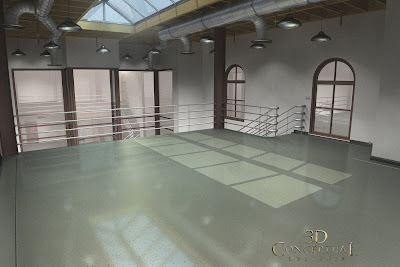
First Floor from Back of Store.

Second Floor Loft with Skylight.

First Floor Main view from Entryway.


LEVI's STORE

Client: New Venture Studios.
Art Director: Myself for Tom Kositchotitana
Project Date: Winter 2009.

I was tasked with creating a generic retail space for outfitting into a Levi's Store. The Room was created as a blank slate in 3D, but it is what one would find in a newly renovated historic piece of Architecture in a shopping district or "Old Town" area. I included electrical, plumbing, HVAC, and a basic finish ready to design into any space possible.These images were used to secure a client.

Cheers, THOM

Saturday, April 24, 2010

Project Review: Kids Show Pitch-"Sand"

The "bad guys" lived under the sand and traveled in these Jules Verne like Drillers.

Concept sketch for the 4 seater buggy.

Color Key for the Two Seater Fighter Buggy.

Concept Sketch for the 2 Seat Fighter Buggy.


SAND!

Client: n/a
Art Director: Myself.
Project Date: Fall 1994.

When I left Hearst Animation in the mid Nineties, I did a few pitch packages for kids shows, and these sketches are for a live action kids show like "Power Rangers' that took place in a post-apocalyptic desert world.

I did sand buggies and underground drillers as conceptual designs for the pitch. The show was never produced, but fun sketches and the concept of painted up buggies like WW II fighters was great to execute.

Cheers, THOM

Thursday, April 22, 2010

Project Review: United Artists Logo update

Taking the big UA icon and adding in the text into the shape.

The UA Icon in glass.

A "positive-negative" cut out block Logo.

A single Line Text Logo in stone with dramatic lighting.

A Fun exploration with Bauhaus with a "filament" inside the tube logo.

Mr Chaplin leaning on the Logo in shadow.

Chaplin s trademark Cane with Charlie in shadow walking towards camera.

Revisiting the 70's "Candy bar" concept with a two line Logo.

All Four Founders in a vintage styled Logo.

Another Charlie homage with Shadow and Cane for the full effect.

United Artists Logo Update

Client: United Artists via The Cimarron Group.
Art Director: Myself and others.
Project Date: Fall 2007.

When you try and bring in a new client often it is to start with the company logo and revisit the design to see if an update is in order. While running the 3D Design Department at Cimarron I had a chance to develop the look for a good number of logos both fully spelled out and the famous UA icon they use as well.

This was a very fun project not just to design, but to learn the history of how United Artists was founded and why. Chaplin, Pickford, Fairbanks and D.W. Griffith wanted to give some creative control to the artists themselves[ sound familiar!], so they started their own film company in 1919 and the original studio is still standing on Santa Monica and Formosa to this day in Hollywood.

Cheers, THOM


You can click the link title to read a bit of history on UA or paste this text into your web browser and go!
http://en.wikipedia.org/wiki/United_Artists

Wednesday, April 21, 2010

Project Review: Molecule Man

Molecule Man early concept sketch as "Vapor".

Molecule Man Final sketch as "Metal".

Molecule Man Final Costume design.


Molecule Man Final 'Liquid" design.


Action Scene of Molecule Man vs. Alligator Enemy.

Action scene with Molecule Man in "Vapor" mode avoiding a Vulture Rocket attack.

Molecule Man Costume in sub-atomic particle morphing design.


Project Review
Molecule Man
Part I

Client: SEGA Interactive Group.
Art Director n/a.
Project Date: Summer 1995.

After finishing working at Hearst Animation I moved into digital media for a while and would take on Conceptual Sketching jobs in Interactive games as it was just starting to boom. I was introduced to SEGA by Rachel Coleman whom I knew from my A.C.C.D. days at school. I was to design the main character for a pitch on a new interactive game called "Molecule Man" who had the ability to re-arrange his molecules to become and material from solids, liquid to vapor. Fun project never was produced as far as I know.

Cheers, THOM

Tuesday, April 20, 2010

Project Review: King Kong 2005- 3D Logo Designs PART I

King Kong Logo with big rivets and pitted cast Iron.

A rock wall carved King Kong Logo.

An ancient alter Logo.

A Second Carved Stone Logo.

A Large Metal Logo scratched and scraped up.

A One-Line Logo with a heavy pitted volcanic look.

A Dark Metal logo with medium rivets and lots of rust.

A Metal logo built from rough plates of metal.

A rough but bright version of the King Kong Logo.

Heavy Metal with big Rivets and lots of Rust on the Logo.

A King Kong Logo within itself.

Project Review
KING KONG[2005]
3D Logo Designs PART I

Client: Universal Pictures via. BLT and Associates.
Art Director: Creative Directed by Warren Nung.
Project Date: Summer 2003.

One of my last 3D Logo projects I worked on at BLT and Associates, before moving on to The Cimarron Group was for the new Peter Jackson adaptation of King Kong.

I did well over 100 Logos, and here above are a few examples of what I did. I have more posted if you search.

Cheers, THOM

Monday, April 19, 2010

Project Review: Phantom 2040 PART XII

Color Key Art for the Phantom 2040 main Vehicle the late 90's Mustang "HERO".

The Phantoms Flying Wing, opened up for clarity of design.

The Hyper-Cycle became the most used vehicle and it was the shortest design time. It started as a one show item and became the main transport.


Phantom 2040
Phantom Vehicle Color Keys

Client: Hearst Animation Productions.
Art Director: Myself.
Project Date: Summer 1993.

In this twelfth part on the Television Animated show I worked on in the early 90's The Phantom 2o4o. This part focuses on the Color Keys for the three main Phantom Modes of Transportation.

We have the vintage for 2040 late 90's Mustang HERO in full Phantom mode with all guns and cannons armed and out. This was based on the show-car that Ford had in 1991 at the car show and was modified slightly to fit the characters. I also have the flying wing and his hyper-cycle color keys as well.

The Flying wing originally was to be his main transport in the show but it was only used in one or tow episodes. I fully developed the vehicle and will post the original opening title sequence is storyboard which focuses on the wing and the hidden skull images in it's design.

Cheers, THOM

Saturday, April 17, 2010

Project Review:Sure Grip International 3D Logo

The first themed Logo for the "Wilderness" theme with camo textures on it.

The Final 3D Logo for the Trade Show with blowing leaves.
[It is always nice when the client picks your own favorite!]

A Thick extruded 3D Logo specific to animation flips.

A single sided thin extruded and beveled 3D Logo.

Simple 3D Logo following the 2D Logo with little extrusion and mild effects.


Sure-Grip International 3D Logo Design

Client: Sure Grip International.
Art Director: Myself.
Project Date Spring 2010.

I have been an avid speed skater on quads since the 80's so to be able to help out Sure Grip International , the largest and oldest skate manufacturer in the USA was more than a pleasure, it was a childhood dream.

During some recent design discussion with Sure Grip, I learned they were going to the big trade show in Las Vegas so I assisted with some themed Logos along with some standard 3D logos as well as a small part of my services to them. This is early exploration stuff you see here, as well as the "Wilderness" themed logo that Steven Ball directed me on, with the blowing leaves specific to the show.

Cheers, THOM

Friday, April 16, 2010

Project Review: Cafe Morpheus-Asylum Part I

Front cover with Logo hand drawn by Dan Hanrahan.

Entrance Facade's both front and side for The Asylum.

Contour Drawing for the Top of the Front facade over the doorway.

Internal Structure Drawing for the Top Facade Piece.

CAFE MORPHEUS
ASYLUM PART I


Client John R. Thomas.
Art Director: John R. Thomas.
Project Date: Fall 1992.

Early on in my career I worked through Phillip Mittel at Motion Artists and he connected me with John R. Thomas for the redesign of the Asylum restaurant into two distinct clubs. The front club would be renamed to Cafe Morpheus and would be an amalgamation of three to four architectural influences , but mainly Art Nouveau. The rear bar would remain Asylum, but would get revised and expanded with a better facade entrance to go along with it.

What you see above are the first four pages of the complete design package I Illustrated and helped John with to get the restaurant built. John is a creative genius and it was a great time and a fun project to work on for almost 6 months straight. This is the first in a series showcasing various areas of design.

Cheers, THOM

Thursday, April 15, 2010

Project Review: NINE 2009 PART I-3D Logos.

One of the first ideas from Calvin Sumler that helped bring in the work, a wall of lighted text.

An architectural metal grate idea from Joseph Stamper with light beams eliminating from behind.

A beautiful crystal version of the logo for Joseph Stamper.

A logo built from the scaffolding from the film that was to be filled with all the women done for Joseph Stamper as well.

A logo built from steamer trunks shaped like letters with Danial Day Lewis as the "i" in Nine, done for Chris A. Hawkins.

The logo built from a row of Brownstones for Chris A. Hawkins as well. [ my favorite!]

A "Neon" nine done for Chris A. Hawkins.

Another architectural logo using set props for Joseph Stamper.

A logo made from architectural elements and stage props for Joseph Stamper.


Project Review
NINE-2009 PART I 3D Logos

Client: The Weinstein Company via The Cimarron Group.
Art Director(s): Calvin Sumler ,Chris A, Hawkins, and Joseph Stamper.
Project Date: Spring 2009.

The successful Broadway Play 'Nine" was made into a feature film last year, and I was tasked with some concepts using 3D to illustrate the main title logo.

What a fun exploration to match the lighting and beautiful sets from the film in the logo., I had a great time on this one. I did some made from stage props and scaffolding, and more as architectural elements as well. I even did a row of NY Brownstones spelling out NINE as was done years earlier for Sin City[ See other Post].

Sadly for me, the client went to pure 2D flat white logo for the finish, but it still was a fun ride going through the motions.

Cheers, THOM