Friday, May 29, 2015

Project Review: Speed Shooters United: 3D Logo Design-2014

Step one in designing a 3D logo is to layout the 2D type with a font picked and hand adjusted. I then present it in high contrast for legibility concerns up front.

 The final design was Alt-A with post effect added for Motion-Blur and glow.

The first pass 3D render for approval of Design A for Speed Shooters United.I used a Carbon-Fiber[fibre] material for the back plate holding device.
 A Second Design Pass presented as version "B"with a darker metal back-plate w/o the textures.

 The final design provided to keep the budget under control. I did just three versions to choose from.

Here is the simple wireframe showing this is beveled splines, so a fast build up and quick to adjust for the clients needs.
 Here is an overview render done to show the light box rectangular lights I often use in these shots that as standard in my Plug-In renderer of choice Final Render.

Project Review
Speed Shooters United
3D Logo Design 2014

Client: David Bogie at Speed Shooters United.
Art Direction: Myself.
Project Date: December 2014.

I get cold calls for quick small jobs from folks who find my blog here and contact met for work , and back in December I was contacted to help create a 3D Logo for a company in the Trap and Skeet shooting arena called Speed Shooters United.

The client saw a few designs on the blog that inspired them to contact me to do a pass on  their logo, so off I went. 

First step I do is to pick a font[ typeface], and l layout a few designs in both black on white as well as white on black. This is what I was taught at ACCD in the early stages to ensure any design will work in the most simple one color design for both dark as well as light background usage.

Once a style is picked I did three versions to choose from. The final was then rendered big format at 5000pixels wide for poster use, and some post work glow effects color adjustments,a s well as some motion blur was added to enhance the RAW 3D render output.

A fun and fast little gig that was less than a full day to deliver. Small Jobs like this one, help fill in the cracks from the larger ones, and I get to do some fun stuff and get a new client as well.

Cheers, THOM

Friday, May 15, 2015

Project Review: King of Queens DVD Artwork 2002-PART II Menu Concepts

 Here is the final wide shot I did over a decade ago for the Hing of Queens DVD/Blue-Ray Menus.

I also always add a Z-Depth channel if the client asks for it so they can do post effects a lot easier in Photoshop.

Here is the basic wireframe ambient render showing this is a simple build out using primitives and lofts[ Pre-Sub-D quads for me]

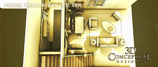
This Birds-eye shot from up at the ceiling area shows the layout.

 This side shot shows the Arts and Crafts cabinet there in the dining area as well as a bit more of the blocked in kitchen thru those shutters.

 I removed the roof box to show the full simple build out I did for this DVD menu.

 A Right Side[ stage Left] of this three wall virtual set.

A reverse angle showing the fourth wall is not there.

 A shot looking down from the staircase to nowhere.

Close in the dining area.

 A shot inside the fake blocked in kitchen seen in blue thru the shutters in the main shot. A bit of 50's and 60's shaped going on in there.


Project Review
King of Queens DVD Artwork 2002
PART II

Client: Columbia Tri-Star Television via BLT and Associates.
Art Director: Carlos/Matt.
Project Date: Fall 2002.


Today I am posting PART II after a long break between posts for this pproject, and today I am covering the DVD/Blue-Ray Menus I designed out for the pitch packages as well.

I was asked to recreate a wide shot fo the main room for the show and was givne a some reference for the room and off I wnt to build it out.

I worked in actual Set Design for a few years so I understood what needed the big details andf what could be faked, like the kitchen in the back room seen thru the shutter blinds, so off I wnt to build this out.

Delivery was a single render, though for today's posting I have multiple angles of the geometry showing this three way typical set.

I also developed the 3D Logos and house artwork used for the First Season DVD release of King of Queens while running the 3D Design Department at BLT, and that PART I can be viewed here.

I will have other posts in the future on this project, covering the other builds in more detail as well.

Cheers, THOM

Monday, May 11, 2015

Project Review: Dinotopia[II]-2002 TV Mini-Series-Key Art-2001.

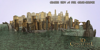
 Here is the primary render I was tasked with making for them for the pitches for the Key Art for Dinotopia back in 2001.

This is an ambient render showing the geometry in this simple build out. You will see the texture rusty projection still on the lighting in this shot.


I also did a bit of a zoomed in shot with a 22 degree curve to the camera to add some slight fish-eye effects to the shot.

 Here is the matching ambient render showing the polys for that 2nd 3D-Image.

An overhead view of the full scene I built out for Dinotopia.

The overhead in Polygon render.

A shot in the city showing the little bits of detailing I added in to this one day job.

I even had small crowd as originally they wanted a higher sot showing the city full of people.


 A side view elevated polygon render of the city for Dinotopia Key Art.

Project Review
Dinotopia[II]-2002 TV Mini-Series-Key Art.

Client: ABC via BLT Communications.
Art Direction: Team of AD's.
Project Date: September 12th, 2001.

Today I have dug up a project from 13 years back, while I was the in-house 3D Designer @ BLT Communications for a TV mini-series based on the popular books Dinotopia. This was done for a regular client @ BLT, ABC Television.

I was responsible for all 3D Illustrations for the Key Art ans well as web and AV use, and this was an early project where I was asked to take a 2D sketch and build out a 3D city for the Key Art presentations, so off I went to build this out.

I built this all out of basic primitive shapes and a few lofts, as this was before I had enough practice doing Quad Subdivision modeling, which is how today I would have built it.

I interesting side note for this project, is that I was to start this the day before which was September 11th, 2001. I worked in the CNN building and due to the attacks that day in the uSA, the CNN building was closed off until the 12th.

Cheers, THOM