Monday, May 31, 2010

MEMORIAL DAY!

An Old Kodak "Brownie" Similar to what the photos were in.


NEVER FORGET

I am grateful for the freedom I have today and the cost that so many gave so I can remain free.

My Father is in a vintage Camera club and owns many old cameras, and sent me these images. An old Kodak "Brownie" was bought by a club member and had undeveloped film sitting in it since, well once you see the pictures you will know. No other info was available as to who owned the camera or were they killed at Pearl Harbor, but quite amazing stuff.


THOM

Friday, May 28, 2010

Project Review: The City of Ember [AV] PART I

The Web Card using a higher reflective surface to get the "hot" spots.

The Main Title Card in the final font picked at mid glow.

An Alternate font using the same filament inside but very thin letters.

The Standard serif-ed font version with a filament inside.

The Electric "E" Ember mark used on the One sheet in the glowing inner filament style.


Project Review
The City of Ember

AV-PART I

Client: Walden Media via The Cimarron Group.
Art Director: Myself and Tom Kositchotitana
Project Date: Spring 2008.

For the AV [ audio visual] trailer campaign for the film I was tasked with coming up with a look for the cards that would be used in the trailer. The client was one that usually went simple 2D white on black so we did have our own expectations very high that they would go tin a more artful direction, but we were asked to explore anyways. What a fun concept to make all the type into glowing filaments inside the text that would slowly come on and glow to emulate a mood of "Amber" to match up with an energy glow associated with the plot of the film with the big generator.

I experimented with a few fonts and the "electric" E mark that was used on the teaser One Sheet. I used sub-surface-scattering to achieve the inner glow look inside the font with a filament object embedded inside. Fun to do and work out, but ultimately they went with white text.

Cheers, THOM
Thursday, May 27, 2010

Project Review: Phantom 2040 PART XIV

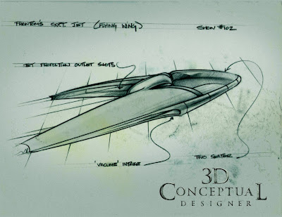
PLAN VIEW of The Phantoms S.O.F.T Jet inn all Modes.

The S.O.F.T. Jet in Standard Mode[ hidden].

The Jet in Battle Mode opened up reveling the skull.

In Full Attack Mode.


Phantom 2040: The Phantoms S.O.F.T. Jet
Flying Wing.


Client: Hearst Animation Productions.
Art Director: Myself.
Project Date 1993-4.

In the continuing series on the Conceptual Designs that I did while working as the Art Director at Hearst, was this fun Flying Wing for the Phantom. As a Transportation Major any vehicle is fun, but a flying wing that transforms is REALLY FUN! I made sure the hidden skull log that The Phantom uses was iconic in the design of the SOFT Jet. It had multiple modes from battle to full attack and the plane would transform from a civilian look to the skull looks as needed to fight crime.

Cheers, THOM

Wednesday, May 26, 2010

Project Review: Changeling

A Flat vintage steel logo with a warm top glow.

A Two level metal logo in warm metal colors.

A Large BOLD flat logo.

A Dirty metal two level logo.

A shiny Metal logo with a heavy bevel and random surface pitting.

A Handwritten Font rendered to look like metal.

A rough handcrafted logo made with heavy pitting.

A Hand Scrawled Font in Metal.

A bold thick rounded font with main actor names done the same.

A Modern simple font top lit in steel with a bit of lens blur.

A heavy beveled metal logo in darker old metal with plenty of pitting.

A Natural textured logo floating over the surface.

Changeling 2008

Client: Paramount Pictures via The Cimarron Group.
Art Director(s):Calvin Sumler,Joseph Stamper, and Chris A. Hawkins.
Project Date: Early Spring 2008.

While running the 3D Design Department at The Cimarron Group I was given about 6 Hrs to come up with a pass on the logos the Print Division was presenting and add in a bit of dimension and tone using 3D Illustrations of the type. AN enjoyable exercise though the client went 2D for the finish.

Cheers, THOM

Tuesday, May 25, 2010

Motion Artists Samples

A Concept sketch of an "Old Western" Facade for a small storefront.

A typical 90's Lexus Set Design using high end architectural elements with a bit of Theatrics.

An Architectural interior layout.


Motion Artists Samples

Client: n/a Myself via Motion Artists.
Art Director: Art Director.
Project Date: Spring 1992.

Back in 1992 when I graduated from Art Center my portfolio was full of futuristic cars and Sci-Fi images as most Transportation Majors Portfolios did, as I was there before they added an Entertainment Major to the Curriculum, and I did not have enough images of regular items and places. I added in a few images of work similar to what I would eventually get in Television Set Design and Automotive commercials. I was properly instructed by Phillip Mittel ,at Motion Artists to look in an Architectural Digest and get some inspiration for a typical interior sketch. They worked ,and I have been busy every since.

Cheers, THOM

Monday, May 24, 2010

Project Review: The Taking of Pelham 123: 2009

A Simple Logo built using train-like siding and rivets.

An alternate 3D Logo built for train Materials.

A re-Creation of the original concept for the 70's version of the film.

Using the same 3D Model to achieve a posterized look of the train.

The Realistic Render of the Train for the One Sheet Ideas.


The Taking of Pelham 123

Client: Columbia Pictures via The Cimarron Group.
Art Director: Joseph Stamper.
Project Date: Spring 2008.

A small 3D job for the Print Department was to design elements for the Taking of Pelham 123 Posters. For the re-make the client wanted us to re-vision the old poster from the 70's with the text superimposed over the train. Always a rush in Print-Department design work, I had less than a day to build out the exact subway train used in the film. I had already built the wheels for another project so I focused on the body design and textures.

We also did a few loose logos made out of train parts as well. A fun exercise that did not win the finish.

Cheers, THOM

Friday, May 21, 2010

Project Review: Phantom 2040 Part XIII

A futuristic "old van" up on blocks.

A Hypersonic Transportation Jet for MAXIMUM INC.

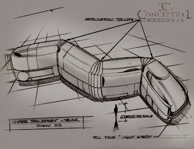
An articulated Hyper Transport Truck.

A Tall and Thin styled "Vintage 1990's truck.

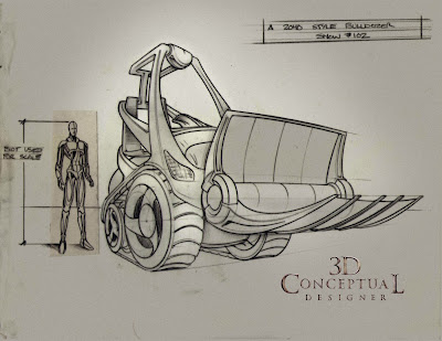
A Biot Bulldozer.

A Flying Air Freighter.


Project Review: Phantom 2040 Part XIII Misc. Vehicles

Client: Hearst Animation Productions.
Art Director: Myself.
Project Date: 1993-4.

In the continuing series on my designs for Phantom 2o40 the Television Animated Series from the mid-nineties I here present a selection of the various vehicles I needed to design for the show. As a trained Industrial Designer in Transportation there is no more fun to have then to be designing all sorts of flying, floating, and driving vehicles. Lots of fun!


Cheers, THOM