Friday, April 29, 2011

Project Review: The Bourne Identity 2002

Here is the exploded view showing the elements I built for the case from The Bourne Identity in 2002.


The above image in primer showing complexity of the modeling.


The Case fully closed for Jason Bournes Identity Kit from the Swiss Bank used as the top cover art.

The Lid turned over with a DVD i inset in the cover.


Right inside there was a plastic tray with a green felt lining on the bottom as shown for this layer.


The bottom of the case held the cash and firearm.


The Bourne Identity 2002
DVD Packaging Design

Client: Universal Pictures via BLT and Associates.
Art Director: John Cua.
Project Date: Summer 2002.

While running my small 3D department at BLT in 2002, I was tasked with doing a DVD case design based on a prop for the first film, The Bourne Identity in a series of films.

In the film when the main character finds out who he is there is a custom case he finds at a Swiss bank and I needed to replicate that case. We had no assets for the film so I walked over to the then brand new Arc-light Theater in Hollywood and watched the film so I could get the design for this case.

I rendered it out in multiple layers so we could have each fold of the package have a level going down to the bottom filled with cash and the Beretta firearm.

A quick one day project, but loads of fun to do!

Cheers, THOM

Thursday, April 28, 2011

Project Review: The New Adventures of Flash Gordon[Animated] PART VI

Dr. Zarkoff from the Flash Gordon Animated Series Original pitch package.


Ming the Merciless as a full on Lizard man.[ we went more human in the end]


A Bird Beast I designed as a secondary character for the series.


The Price of the Hawk Men is shown here.


A Bodyguard for Ming the Merciless from The animated series The New Adventures of Flash Gordon from 1996.

The New Adventures of Flash Gordon PART VI
More Character Designs-Flash Gordon.


Client: Hearst Animation Productions.
Art Director: Myself.
Project Date: Spring 1994.


In this sixth installment on the work I performed on the Television Series The New Adventures of Flash Gordon for Hearst Animation Productions back in the mid 90's while I was overseeing the final episodes of The Phantom 2040 finish up.

Today, I focus on more characters I designed and worked out for the series above. You will see both secondary and primary characters, though most main players were devloped much further once we hired in Nick Pugh to push them more and more, which he did an amazing job.


Cheers, THOM

PART I: here

PART II: here

PART III: here

PART IV: here.

PART V: here.

Wednesday, April 27, 2011

Personal Project:: Harley Davidson Old School Chopper 2001

A decade old design I did for an Old School Chopper.


A must have springer front end with bee-hives.


Hardtail frame or it 'aint a chopper!


The proportions follows all long frame choppers but the shapes are early Harley.


A Baseball Mitt seat.


Top View Primered model of the Chopper from 2001 I designed.


Personal Project
Harley Davidson Old School Chopper 2001.

Back almost 12 years back I built this design for an Old School chopper. This was just before the American Chopper phenomena was in full bore, and it was coming in strong in transportation as a huge resurgence in the art form.

I wanted to try my hand at it virtually, as I did not have the iron myself so I built this instead. I have not revisited the design in a decade and plan to return to it, finalize the design and build one for real.

As a Transportation Design major from Art Center, chopper design is a very satisfying art form as it allows old and new design techniques as well as it suits itself to thematic design with the various looks that can be achieved with the same bike.

Cheers, THOM

Tuesday, April 26, 2011

Project Review: The Phantom 2040 Part 59

Here is the stack of mini Backgrounds I did on velum shown at scale.


A mini-background design I did for the lower city camera move up-pan.


A wide porch shot for Kit's Aunt Heloise.


A design for the VR Arcade destroyed by B.I.O.T's.


A close up on the front door for the show.
[ You can see a faint mock-in for Kit on there that was added by the board artist for the final]


Here is a Middle City wide mini background storyboard layout I designed.


Phantom 2040-PART LVIV [59th]
Storyboard Background Layouts


Client: Hearst Animation Productions.
Art Director: Myself.
Project Date Spring 1993.

In this 59th post on "The Phantom 2040" television Animation Series I have put up additional mini background layouts to view.

A mini background is a perspective-grid accurate frame with the guide grid visible so the overseas animation teams can properly reproduce the frame correctly. We had issue with our vendor just xeroxing up the boards for layouts and i most storyboards just rough in the backgrounds and provide a key layout to follow, but in TV work they don't do that, they simply scale up your boards and paint.

I always loved doing these mini drawings as they were only based around a 2x3 inch frame so these were smaller than a playing card. I love detailing out a mini sketch, I got used to doing that in English class on the margins of my notebook :o)

I posted other Phantom 2040 mini storyboard backgrounds here.

Cheers, THOM

Monday, April 25, 2011

Project Review: The Strangers 2008

A frame for the Motion Graphics asset I built for the film, "The Strangers", main killers mask.


I built a Poly Model first, did one smooth pass, then collapsed and added more details as seen in this quad Sub-D model image above.


One of the girl killers wore a "Betty Boop" looking mask as I recreated above.


Here is the mask base model i made along with the final Turbo-Smoothed version next to it.


The final Mask I recreated for the Trailers for the film The Strangers back in 2005.


Here is the Quad Model view showing both the base model and the smoothed model used for this mask image.


The Strangers
Motion Graphics 3D Illustrations

Universal Pictures via The Cimarron Group.
Art Director: Myself.
Project Date Spring 2005.

I ran a 3D Design and Animation Department for six years in-house at The Cimarron Group in Hollywood up through the winter of 2009, and this was one of my last projects.

I got to work on this with Scott Fliesher whom I had also had the pleasure of working with at BLT and Associates in Hollywood as well years earlier, and it was always a pleasure working with him as you get familiar with what they expect as an Executive Producer, and you build up a relation with them to fill the expectation in design when doing Motion Graphics.

We did a bunch of MGFX teasers for films that had no footage shot yet to use, so we custom created all assets ourselves, and they were called a "Graphic Teaser Trailer". The above masks I built from shots from the film but in this case we had footage, just nothing high enough in resolution to use for the trailers, so I was tasked with rebuilding three masks worn by the killers in the film that attack the family.

Once built I did a few shots and some short animated moves on the masks that were presented with the trailers. A fun fast one day project to model, texture, light, and animate for our Motion Graphics team for The Strangers.

Cheers, THOM

Friday, April 22, 2011

Project Review: Superhero Movie 2008-PART II-Logos.

A Single-Point Bevel type treatment done as a tube with a Booleaned center.


We did a few green themed logos as the main character in Superhero Movie wore green, which is kinda popular at the moment for this genre.


A two line Logo broken out and kerned W I D E.


A brushed Metal Logo with a red key plate surround.


A Fun "toony" styled look in metal with a dragonfly in there as well.


This volumetric lighting exercise was for AV and print work back-lit.


A Softer font used for this green look with animated clouds in the some.


A green glass 3D Logo done for Superhero Movie Advertising in 2008.


Trajan Pro is a must use font for a superhero move as of 2008 so here it is.


A Postcard speeding logo with a slight italic and all metal similar to the X-men work I did.


A double tube font design in two layers of glowing neon.


A glass/Chrome Logo design using the above double tubes done in an x-rayed look.


Superhero Movie 2008
Part II-Logos

Client: Dimension Films via The Cimarron Group.
Art Director(s): Calvin Sumler, and Joseph Stamper.
Project Date: Fall 2007.

In this, my second post showing the 3D Design work that I did for the movie campaign for the film Superhero Movie done in 2008, I am showing some of the 20 plus logos I did for the payoff posters and the AV Motion Graphics Look and Feel for the name of the film as a Logo.

As usual on a project like this, a few Art Directors will give me Illustrator files to work out in 3D with some direction. I tacked a few looks making sure to include the glowing green from the films main characters suit colors as he is a dragonfly superhero as a parody of Spiderman.

There are a few single Point Beveled Logos and some done as round tubes with Booleaned inner tubes as well. A fun exercise to go through.

If you want to view PART I and see the Dragonfly Icons you can go here.

Cheers, THOM

Thursday, April 21, 2011

Project Review: The Phantom 2040: Animated Series PART 58

A Large 28" wide Background Layout I designed for The Phantom 2040 Animated Television Series back in the 90's.


A 22" wide background sketch done as a multi-plane two layer move in traditional filmed animation back in the mid 90's.


Here is the foreground layer overlay that is panned at a faster speed to simulate depth in 2D Animation.


Here are the two above layouts combined.


Phantom 2040-PART LVIII [58th]
Freelance Background Layouts


Client: Hearst Animation Productions.
Art Director: Myself.
Project Date Spring 1993.

In this 58th post on "The Phantom 2040" television Animation Series I have put up some more of the layouts I designed for the key areas for, The Phantom 2040 back in the mid 90's.

As Art Director full time as my day job at Hearst I oversaw and did design and animation work for the series , but I also had plenty of freelance work I farmed out to folks like,Nick Pugh and a few others freelancers including, myself.

I never work for free and they wanted me to do the backgrounds over the weekends, so I offered to do them freelance. At first they were hesitant, but I jokes "I know the Art Director very well and can give him what he is looking for first round", and thy got it! I did a bunch, and here are a few I just discovered rolled up as Xerox copies.

Cheers, THOM

Wednesday, April 20, 2011

Project: Review A Series of Unfortunate Events PART II

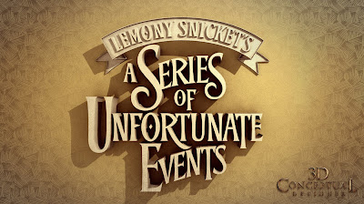
A Logo done for Jeroen for the presentation.


We almost always do a version of a 3D Logo with a holding device.


One of the final door designs we pitched for the teaser poster artwork.


I did a more "Industrial Metal" looking concept for the Eye Door for Lemony Snicket as well as seen here.


This concept was a 3D version of a sketch done by Suren Galadjian for Dawn Baillie.


This second concept was a 3D version of a sketch done by Suren Galadjian for Dawn Baillie as well.


A Series of Unfortunate Events
PART II

Client: Paramount Pictures via BLT and Associates
Art Director(s): Dawn Baille, and Jeroen
Project Date: Fall 2002.

In this, my second posting for the film adaptation of the book, Lemony Snickets A Series of Unfortunate Events, I am posting the finished door designs we went with in 3D Illustration for the teaser Poster Ideas, as well as a few Logos we did and presented. My prior post was for a few monochromatic designs of just doors, and this was the range we went with for the final presentation as to the doors.

At the time of production, the film was far from being in the can and we had no assets from the film to design from, so we designed based on the book series and the graphic illustrations that were used in the popular series as a starting point for our designs. We knew the "eye" was a central feature, so that is found all over the designs. A fun project that we had for a month or so.

You can view my prior post for the door variations here.

Cheers, THOM