

One of the many grouping shots I delivered to the big Art Direction team over at BLT and associated back in 2003 for Sky Captain, and the World of Tomorrow.

This was the first delivered grouping with three to four posed wings , as they are robots that flap their wings.


Its magic Hour at night as they fly home to base in this shot.

Here you can see the geometry of the magic hour shot from above.

This is a underside view of the flying wings.
Project Review
Sky Captain and the World of Tomorrow
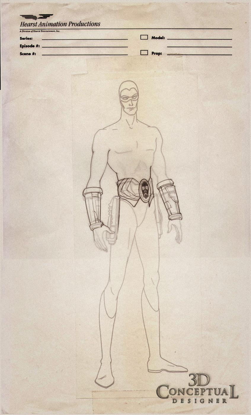
PART IX-Flying-Wing Robots
Client: Paramount Pictures via BLT and Associates.
Art Director(s): Rick Lynch, Dustin Stanton, Jeff Barnett, Alon Amir, Zack Ris.
Project Date: Summer 2002
Project Date: Summer 2002
This
is my ninth posting on Sky Captain and The World of Tomorrow, and
today I have posted the flying wing robots from the film that were used on the final posters in some applications after I left BLT.
I built out these little flapping winged beasts from some screen shots we got from the film makers, and as usual I reverse engineered them and built out these duplicates for all the advertising ideas we pitched for the property.
I built out these little flapping winged beasts from some screen shots we got from the film makers, and as usual I reverse engineered them and built out these duplicates for all the advertising ideas we pitched for the property.
Cheers, THOM
You can see the other posts quickly below in these links:
PART IYou can see the other posts quickly below in these links:
PART II
PART III
PART IV
PART V.
PART VI.
PART VII.
PART VIII


