


This is a shot of the custom Displacement map I made for the final blood Moss 3D logo.
Project Review
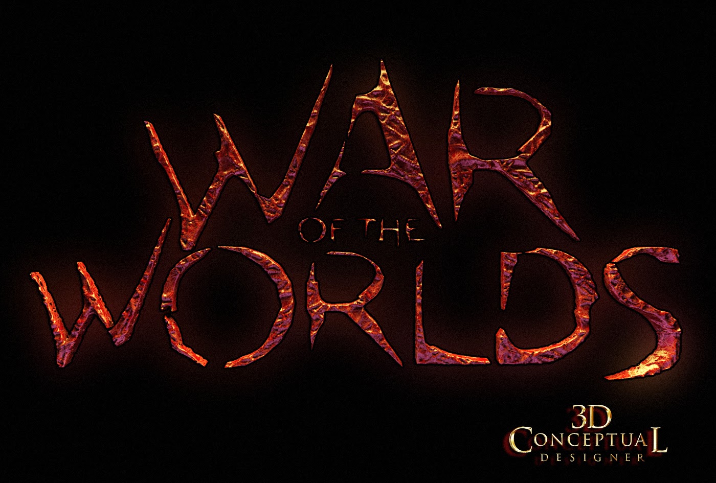
Key Art 3D Illustration for
WAR of the WORLDS
PART III- Blood-Moss Logos.
Key Art 3D Illustration for
WAR of the WORLDS
PART III- Blood-Moss Logos.
Client: Paramount Pictures via The Cimarron Group.
Art Director: Calvin Sumler.
Project Date Fall 2004
Today I am posting PART III, covering the 3D Design work I did for the Theatrical advertising pitches back in 2004 for the Spielberg remake of War of the Worlds, and today I am covering a pass I did on a blood moss 3D logo.
The blood moss seen in the film was a direction that we were asked to explore, and I was provided a great hand built font from Art Director Calvin Sumler to address this and I created a series of looks that would still be legible, but would have an alien feel to them.
I had done the standard big block San-Serif Font choices for various versions up front[ that is what finished], but they gave us room to explore early on in 3D so off I went with these displaced bloody font looks.
I did about 100 logos during the process before we finished. The one sheet contains the 'BIG LOGO" and the 3D iron look for the world ,and these are my 3D contributions that went to the final, or finish for the Movie Poster.
You can view an overview posting in PART I here.
You can view PART II: The blood Moss 3D Illustrations for Print and AV here.
Cheers, THOM
The blood moss seen in the film was a direction that we were asked to explore, and I was provided a great hand built font from Art Director Calvin Sumler to address this and I created a series of looks that would still be legible, but would have an alien feel to them.
I had done the standard big block San-Serif Font choices for various versions up front[ that is what finished], but they gave us room to explore early on in 3D so off I went with these displaced bloody font looks.
I did about 100 logos during the process before we finished. The one sheet contains the 'BIG LOGO" and the 3D iron look for the world ,and these are my 3D contributions that went to the final, or finish for the Movie Poster.
You can view an overview posting in PART I here.
You can view PART II: The blood Moss 3D Illustrations for Print and AV here.


