Friday, May 11, 2012

Project Review Sky Captain and the World of Tomorrow PART VII-Whip-Arm Robot

Here is the final Image produced for this Whip Robot from Sky Captain and the World of Tomorrow that I built out while at BLT in 2002 for the posters.


An overhead close to torso view of this robot from Sky Captain.


The details I built were based on a screen grab from the film model.


Here is a ground eye view looking up after it just stepped on you!


A Mesh-Poly view showing the NURBS conversion on the main body parts.


This is a torso view showing the details inside the glass dome for the head.


Project Review
Sky Captain and the World of Tomorrow
PART VII-Whip-Arm Robot

Client: Paramount Pictures via BLT and Associates.
Art Director(s): Rick Lynch, Dustin Stanton, Jeff Barnett, Alon Amir, Zack Ris. 
Project Date: Summer 2002

This is my seventh posting on Sky Captain and The World of Tomorrow, and today we look an another robot I had to build out for the posters for the film, the Whip-arm Robot.

This robot has a very small part in the film ,when the main base of the hero is attacked by a group of these rascals. I had just under a day to build, texture, and render out these views for the in-house Art Directors to use in their comp ideas for the presentation to Paramount and the Director.

This robot was a fun one, with the body being built using nPowers Power NURBS plug-in, and I then converted to them to Polygons for render. Lots of compound molded parts on this one, and I had just got that great plug-in tool for 3DS max over at BLT so I used it on this design.

Look for more robots from the film in the weeks to come.

Cheers, THOM

You can see the other posts quickly below in these links:
PART I
PART II 
PART III 
PART IV 
PART V. 
PART VI.

Thursday, May 10, 2012

Project Review Out Takes PART IV Universal City Walk 1992


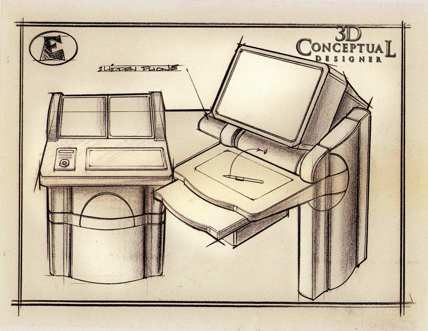
 I had seen a custom all Mahogany PC back then and with the fine wood inlays I developed this look for Out-Takes for City Walk.


 In this design I added in polished metal bands thru the desk sides and the main components would be powder coated.


 Every design I tried something different. Above this you see the keyboard tray as convex, here concave. I tried as many options as possible and combined them for the finals.


 The Custom Cabinet with another band of brass this time with some softer edges in this design for City Walk Mall.

Project Review

Out Takes PART IVUniversal City Walk 1992

Client: Out Takes Via Eric Allard at All Effects.
Art Director: Eric Allard.
Project Date Summer 1992

Out-Takes was a blue screen photography studio at Universal's City Walk Outdoor Mall in California, and in my fourth posting today, I have put up a design direction path that we eventually abandoned for the 'girder look". They closed up in the late 90's , and if interested, you can read about that here.

In the early 90's when I did this work, and they wanted to add in some of the look and feel of a luxury car, so I added in wood and metal inlay trim as was the fashion in the Lexus models just coming out back then, and they loved it as a direction to refine.

Also I was on my first Mac, a IISi, and they wanted the case to resemble a bit of the look of the early Mac design language with some rounding.

Look for PART V , as I found a big folder of xeroxes of the rest of this project recently[wish I had the originals sitting in a drawer somewhere...].

PART I can be seen here.

PART II is here.

Part III is here.

Cheers, THOM

Wednesday, May 9, 2012

Project Review Indian Jones and Kingdom of the Crystal Skull PART IV Home Entertainment Motion Graphics Cards

I did these HD Motion Graphics cards for Indiana Jones, that were slammed via After Effects for the Home Entertainment Department at The Cimarron Group.


 All Type was hand built as there is no exact font. Here is my smallest card.


You will see that I bent the extrusion down in back to exaggerate the perspective done in 2D for the Indiana Jones DVD release.


I did about 10 cards in all, every one hand laid out and built in a day for Motion Graphics.


 The Main Indiana Jones Title in 3D I built for the DVD Release.


Here is the model as I built it in polygons for Indy Jones IV.


A Quad view of the Indian Jones Final MGFX Card, exploded out to show the three main objects with three various textures used.
Project Review

 Indian Jones and Kingdom of the Crystal Skull
PART IV Home Entertainment Motion Graphics Cards


Client: Paramount Pictures
Art Director: n/a
Date: Spring 2007


This is fourth posting for the work I did for Indiana Jones four, The Kingdom of the Lost Skull, and today I look closer at the Motion Graphics work I did for the Home Entertainment Department at Cimarron for the DVD release after the film was in theaters.

This work was done to match a 2D effect provided to us, so if you look close, you will notice I did not cap the face of the bevel, but the bevel is hollow, thus creating an internal shadow. The final design we followed from the client was done in Photoshop, and I had to match this 2D faked 3D look in actual 3D, which is always time consuming, as the perspective and bevels in Photoshop are "FAKE" [ and wrong] so you end up bending and twisting the object to match the fake look that was bought off.

Someday a 3D logo will be presented all in 3D, right from concept down to completion, then these types of expensive back-fits making 3D look 2D/3D, would be a thing of the past.


You can view PART I here.
You can view PART II here with a detailed look at the DC-3 plane I built.

PART III can be viewed here.


Cheers, THOM

Tuesday, May 8, 2012

Project Review: SEGA's Molecule Man Part II- 1995

 Here is the final Color-erase line art for Molecule Man in Metal. You can see the Marker Comp Color Key here.


 Here is the rough sketch that preceded the above drawing, a bit quicker of a comp.


 Molecule Man as Vapor. I had his extremities 'leak' a bit of smoke constantly in the design.


 Molecule Man as water. The Color is here.


Project Review:
SEGA Interactive- Molecule Man 1995
Part II

Client: SEGA Interactive Group.
Art Director n/a.
Project Date: Summer 1995.

This is my second posting for the brief work I did for Sega out in Diamond Bar CA. back in 1995 for the video game called Molecule Man.

They hired me as a conceptual designer to develop the looks of the character as he would transform from one element to another. I did the various versions in Water, Vapor, Metal, Glass etc.

For todays posting, I have the final line are for a few designs as well as the rough sketch for the metal version we used to move ahead with the poses. I happened to have just finished my Phantom 2040 work so was versed in tight fitting superhero drawing as I had been doing it for a few years by then.

You can review my first post here.

Cheers, THOM

Monday, May 7, 2012

Project Review Sky Captain and the World of Tomorrow PART VI-Underwater Crab Robot


 Here is the main shot requested fro Sky Captain of the underwater Crab Walker Robots.


 A 3/4 overhead view of the "Bot" from World of Tomorrow from 2003.


 A shot from the surface looking down to a 3D walker from Sky Captain and The World of Tomorrow.


 A closer shot sowing some details and the main logo on the machine.


 A Ploy Mesh view showing the complexity of what I built for the Posters.


This is similar to the main view showing the massing and modeled details I put on the character piece.


Project Review
Sky Captain and the World of Tomorrow
PART VI-Underwater Crab Robot

Client: Paramount Pictures via BLT and Associates.
Art Director(s): Rick Lynch, Dustin Stanton, Jeff Barnett, Alon Amir, Zack Ris. 
Project Date: Summer 2002

This is my sixth posting on Sky Captain and The World of Tomorrow, and today we look an another robot I had to build out for the posters for the film, the Underwater CRAB Walker-Robot..

I worked from two screen views sent over of the work-In-Progrss in Maya, on the walker robot, and I built a copy in 3DSmax. It is very typical that you do not have access to the digital files for films so you do a lot of re-building, and Sky Captain was no different.

What you see above, are some views I provided to the "Pod" working on World of Tomorrow at BLT on the posters, as well as some polygon views showing the construction details I put into the assets to create it.

I had about 6 Hrs to complete, and I hit that deadline with room to spare.

Cheers, THOM

You can see the other posts quickly below in these links:
PART I
PART II 
PART III 
PART IV 
PART V.

Friday, May 4, 2012

Project Review: The Majestic 2001: 3D Illustration PART I

 Here is the first tall format 3D render I did for The Majestic Hollywood Reporter Reviews a decade ago, pre-GI.
 
 
 Here was the two page spread I was directed to create as well, a 4K final render.


 I made a reflection sphere from the screen position to have a map of the theater for reflections for the back of the room.

 
 Here is a 3/4 view showing the fast high-rez modeling that I did that day.


 Here is the two page spread view showing the level of complexity I added in.


Project Review
The Majestic 2001
3D Illustration PART I


Client: Warner Brothers Pictures via BLT and Associates.
Art Director: Tracy Weston.
Project Date: December 2001-January 2002.

Back in 2001 I was still the in-house 3D Department of one at BLT, and I was asked to create a quick one day build of the theater from the Jim Carrey film, The Majestic.

The ads ended up being Black and White, but I did this work in color none the less as that was the deal.

I built out a quick interior first, used for reviews in The Hollywood Reporter, so the majority was filled with quotes. I built out the neon sign from the facade horizontally and put in above the screen as well.

A fun project and a fast turn around. I builtthis theater based on a few screen shots only from the film in a day with two 4K renders.

For the lighting I used a technique based on HDRI which was new at the time and I created a reflection sphere to use an my reflection space for the non-GI renders.


Cheers, THOM

Thursday, May 3, 2012

Phantom 2040: PART 100! B.I.O.T. Development sketches

An Developed design I did for a female B.I.O.T., it was not finished[ One-Leg] when I changed direction a bit. I still love the hollow heel shoes I did for this one...

Speaking of Heels, here is the final simple design, it is partly based on the proportions of a Quad Speed Skate boot[ I raced in the 80's].


The B.I.O.T Hands consisted of just 4 fingers with a tube that could bend as the center of each finger[ minus the thumb]. 


Here we  have a B.I.O.T. in a trench coat from the show.


Phantom 2040
PART 100!
 B.I.O.T. Development sketches

Client: Hearst Animation Productions.
Art Director: Myself.
Project Date Spring 1993.


This is my 100th post my work from the TV animated series, The Phantom 2040 from in the early ninety's, and this marks my 100th post today for Phantom.

I was given a great opportunity very early in my career with Hearst to develop and help produce the 52 episodes for The Phantom twenty-forty, and I am glad that I have been able to share these scans of my artwork and design contributions to the look of that show.

Today I have B.I.O.T. stuff up to review. The BIOT's were the AI robots from The Phantom, and what you see above is the development work. I have an early Female bot as well as my roughs for working out the hands and feet for the robots as well. Also a trench coat B.I.O.T. in there too.

Here is to 100 more!

If you are a FAN of The Phantom 2040, and on FACEBOOK, there is a group for that....  here.

There is a TAG on the list to the RIGHT for other Phantom 2o4o entry's, but you can click this as well.

Cheers, THOM

Wednesday, May 2, 2012

Project Review: CNN 3D-Logo Color Design PART II

 I had developed this glass technique for the Bond 007 PPK here so we tried it on the CNN Logo.


 A Brushed Aluminum with a glass red tube in the center for this 3D Logo look.


 Red Glass with an etched face and a chrome tube running in the center of the type for this look.


 A feminine look with some pink and magenta in the all glass logo for CNN here.


 A Warm metal with the red glass center again in a warm reflective sky environment.


 As a Motor head, Carbon Fiber with a Hot red center, had to do it!


Project Review
CNN 3D Logo Color Development.
PART II

Client: CNN via BLT and Associates.
Art Director: Na.
Project Date: Summer 2002.

In part II for the work I did back at BLT and Associates for CNN a decade ago, we look at the development of some 3D looks to the CNN logo without changing the overall design of the log itself. I could use color and dimension, and lighting only.

I was at the time, back in 2002, working in the CNN building in Hollywood and we wanted to show the team on the other floor, what we could do for them in a pitch, so they asked me, the 3D dept of one, to develop some looks to add to the pile. Each Dept sent stuff down to pitch what we could do for them at CNN from BLT.

I posted some of the motion graphics tumbling looks I helped develop here, in my first post, but these here today, were stand alone logos for the corner of the screen and for print use as well. I also experimented with a bit more detail in the textures since these were static graphics, and textures show up well when they are stills.

Cheers, THOM

Tuesday, May 1, 2012

Behind the Art The Under Drawings PART III

 For the Men in Black attraction at Universal Studios Florida ALIEN ATTACK, this is inside Edgar the Bugs mouth, the finale.

 For Men in Black as well, this is inside Edgars windpipe.


 This was done for Michael Ninn for his futuristic City in Dark Justice here.


 The underdrawing I did for the Jungle Cruise Building sketch here.

Behind the Art
The Under Drawings
PART III

I have posted here PART III  in my series of under drawings for various 2D projects.

The under drawing is a vital part of the process I use, to get a speedy result. In advertising and in design work in general, it allows me to work faster, so my clients will get more work. I have developed a few techniques I use to create my designs in a timely fashion.

Today I have a few under-drawings from a variety of my projects to show, some from the Universal Studios Tour MIB attraction Alien Attack, one from the VMK,[ 'Virtual Magic Kingdom'] project, as well as the Futuristic City I did for Michael Ninn for the 3D series he produced Dark Justice.

I have linked a few finals to these as well, to get you into the process involved in the design a bit more so you can see the final results from these. I lock in at this rough stage then finish it up.

 I use a hand made perspective grid I make using ship curves,and I do most of these on copy paper, which is abundant and cheap for this. I overlay on Clearprint or 'Vincent' Vellum.

My Prior posts in the series:

PART I  here.
PART II here.


Cheers, THOM

Monday, April 30, 2012

Project Review:Daredevil PART III-Building Icons


 A worms-eye view looking up to the sky at two Iconic D's that form the Double D Icon for the teaser for Daredevil.

 I took this design further and added details with windows, railings, fire escapes, AC units and a building brick exterior for this final pass on Dare Devil back in 2002.

 A big floating block with each "D" cut into connecting sides on the block.


 A version where the two D"s crisscross each other to form a Daredevil Icon up high in the sky looking down at the city.

 Another down angle comp idea with the top surface of the building,  baloney cut to form a 'knife angle' look to the two D's for Daredevil.


Project Review
Daredevil 2002
PART III Building Icons

Client: 20th Century FOX via BLT and Associates.
Art Director(s): Josiah Ludovico

Project Date: Summer 2002.

It has been a decade since I worked on this advertising campaign for the film Daredevil, and in this post, my PART III for my work on the project, I have put up a series of 3D illustrations that I did for Art Director Josiah Ludovico at BLT.

His idea was to do a variety of stylized buildings that together form the two D's in the Daredevil Icon with the Double D's. I did a variety of designs, and angles with cross-crossed D's, and parallel ones, and some floating in the clouds[ like I did for World of Tomorrow].

Some were very cartoon-ish and stylized, and some were more realistic. These realistic passes did go the final round, but were passed by for the finals by the client.


You can view:
PART I here.
PART II here.
 

Cheers, THOM