Pages

Friday, September 27, 2013

Project Review: Monsters vs. Aliens Part VI-Main Title City Build

Early in the move at the end of the hill in the city we are into the street scene I made for the Title for MvA.

In using the 24 unique buildings I made each one asymmetrical so I cut mirror and turn them to achieve a bit more variety.

As we've moved into the set we are at the first intersection which afforded me a bit of width in the design for these very brief "blips or beat" in the seamless old town wall of structures. 

At frame six we are almost another block in as we cut the move from one full second to 1/3rd, so we fly by this stuff.

By frame 8 we are out of the Old Town Tunnel and to the open facade row by the part


As we move closer to the seat position we see the full city coming into view.


The final seat just before the Logo drops into frame.


An overhead Birds-Eye view of what I made for the move. I only build what is seen, a trick I leaned in Set-Design work and miniatures early on, just out of Art Center.


The base blocking model shows off the total number of structures needed to fill int he shots: 140 small Old Town Buildings, and 22 larger structures on the flanks.

Project Review
Monsters vs. Aliens.
Part VI.
Main Title City Build

Clients Dreamworks via The Cimarron Group.  
Creative Director: Steven Viola.
Art Direction: Myself
Project Date: Fall 2007.

This is PART VI covering my 3D Design work I did for the Theatrical Advertising done on Dreamworks 3D animated feature, Monsters vs. Aliens from back in the Late Fall of 2008, and today I have more details on the city backdrop I made for the Theatrical Title as seen in my reel linked to the RIGHT.

I was called in to assist the Motion Graphics department in building out about six blocks of a stylized city that was similar to the screen cap reference we had at the time for the film Monsters vs' Aliens.

I used the pre-made sets of vintage buildings I was already selling for the company on Turbo-squid, the largest online 3D stock model house, and I then created 24 unique designs for structures that would populate te edges of the the main street we travel down in the camera move.

It needs to be noted that I was competing against another company that was attempting to get the finish on the trailer as well and they had a team of almost a dozen I had to go against. As a 3D Designer, I modeled and designed simultaneously and this alone allowed us to design and build so much faster, that in just 12 Hours, I had the city finished completed on a weekend when it was given to me to do.

I first built out a blocking model with the building proportions and placement done with simple boxes. I also put taller background buildings off the the sides and checked the perspective parallax as the camera moved thru this little city.

Once the move and timing was all set, I began a assembly line build-out for the two dozen unique buildings I designed and built for the city. I also then created all the various little items on the street from  the store outdoor signs, to fire hydrants, to newspaper vending sets, and awning and power poles.

I was given a good budget and my portion came in at less than one fifth the projected cost[ NOT projected by me the 3D Design Department head BTW].

You can view the MGFX city I built in just over a day for the trailers in PART I here,
You can view the full 3D logos here for PART II.
You can view Part III with more 3D Logos here.
You can view PART IV here with added button logos.
You can view PART V here covering the color adjustments for Stereoscopic 3D-SS.

You can also see the final 3D Animation of the Title at the front of my MGFX reel work in the right column link.

Cheers, THOM

Wednesday, September 25, 2013

Project Review: 300-[aka: Three- Hundred] Website 3D Shield renders 2006

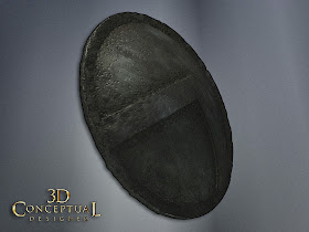
 A tilted down front and center shot of the final shield prop I made for the 300 website launch.


 A true centered camera shot for the graphic version on the shield.


 A left side extreme angled view showing off the dimensionality of the shield. This was used as an interstitial screen sweep element.


 A High right side shot, and the final delivered image.


 Here is the final subdivided and displaced geometry for the shield. I was still learning the Quad Mesh function for Pro-Boolean so this ended up as triangles with a quick turn around.


 The base mesh with displace on.


A screen capture in 3DS max 2013 of the various elements used in creating the dirt shader using Darksim procedurals and various bitmaps.

Project Review
300-[aka: Three- Hundred]
Website 3D Shield renders 2006

Client: via The Cimarron Group.
Art Direction: Eric Person.
Project Date Fall 2006.

Many jobs I do 3D Illustration for are a full edge to 3D Illustrations like what I finished out for the first Night at the Museum. A full 3D background as the set hallway was both too narrow and to shallow so a virtual set allowed us to modify it to meet the clients needs.

This shield prop represents the other side of that spectrum where all is needed is a simple or small prop rendered out, and in the case of Frank Millers Three-Hundred[ 300], they wanted a 3D shield made for various areas online.

I built this so it could be displaced as the film prop was a rough item , hand made so I did what I had time for in the fast turn around to get close to what was needed. 

Also this was to be small, around 400 pixels wide, so I rendered it at 2X size [ 800 pixels wide] as the renders were fast at about 5 minutes even with the Darksim procedurals and Final Render dirt shaders which take more time to go, but deliver much better results. 

I usually will go 2X[cubed in surface area] in final render size if the client can afford it, as the file is bigger in case their client wants to see it larger, so they don't need to come back for more renders from me.

This was a 2 hour job, fast and typical for something like this. I delivered four renders at a modest 800 pixels width with an alpha channel [ 32 bit TGA file]so they could Flash-Animate them[ in 2D] and drop them into the various online pages needed.

A fun 1/4 day job and budget friendly.

Cheers, THOM

Monday, September 23, 2013

Project Review: Saleen-3D Logo Style Cards 2005.

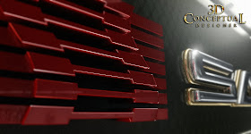
For Saleen, I built out a Carbon Fiber panel with some Allen heads attached to it to compliment the 3D logo I made from their 2D version.


 A top down view on the double layered logo.


 This shot is an extreme side view looking right into the virtual lights with a bit of 'flair'-[ 15 pieces!]


 A close up on the Red Icon from their design. This was a frame for a MGFX animation pass down the font.


 A 12 Degree bend on the lens for this fish eye shot.


 A more severe 33 degree bend on this one.


 The base set up is a simple model for SALEEN.


A screen shot of the entire scene with a Rectangular light up top[ Final Render] rendered in frame to reflect in the carbon-fiber material I made.

Project Review
Saleen-3D Logo Style Cards 2005.

Client: Saleen Motors.
Direction: Myself with the Corporate Division.
Project Date: November 2005.

In 05' I was running my department of one in-house at The Cimarron Group, and my main clients were the other six divisions of the company, and I was approached by the Corporate Advertising branch to help with some style frames for a presentation they were making to Saleen Motors, famous for their super-cars as well as the conversions they do the the Ford Mustang.

I had helped them acquire the Lotus cars account a few years back with my virtual model of the ELISE before they were here in the US market, so it was a fun fit.

I built out a 3D version of their logo and built out a carbon fiber background plate that we could us for the Motion Graphics and print work we did to pitch them. 

I rendered out a series of shots as seen above and they took them to pitch the company. Unfortunately at the time they were on the verge of a restructure so we did not get to seal the deal, though I did get to create some fun style frames in the process.

A fast 3/4 to one day gig.

Cheers, THOM

Thursday, September 19, 2013

Project Review: Timeline 2003-PART II: Helmet Material Ideas

A pass at the "Tee Helmet" I designed out for the advertising ideas done up in a procedural rusted metal look for Timeline 2003.


 A Hammered Copper one is always a pass I do as I do a bit of Copper-smithing myself and am an avid Arts and Crafts buff.


A very heavy rusted helmet version here.


I used a procedural rock texture and replaced the color with a DA metal texture bitmap for this pass.


A 3/4 shot of the above scratched up steel look for this Timeline helmet.


 This texture is called rusty paint, but I modified it with a reflection channel and added the scratched steel on this too. One of my faves.


 The base mesh built is "non-quads" with a Boolean thru for the parts.


The 3/4 shot of the polygons.


Close up on the lower lip overhang and rivets.


A close shot of the Tee hole opening and overlap[ purposeful] to get a double highlight.


 A Dirt shader version with low levels of dirt.


I went 10X on the dirt for this second pass.


The final has almost no reflectivity due to full bleed on the dirt out on the steel.


Project Review: Timeline 2003
PART II: Helmet Material Ideas

Client: Paramount a Viacom Company via BLT and Associates.
Art Director(s): Rick Lynch, Zack Ris, and Jeff Barnett.
Project Date: Fall 2003.

This is PART II covering the work I did a decade ago now while in house at BLT Communications out in Hollywood for the film Timeline, and for this second part I cover the material texture work I did in finding a material for the helmets used in the One-sheet presentations.

I used Darksims Dark Tree editor sorftware to adjust and use shaders from the Simbiont Max plug in. Once the mesh was ready to go, I did a variety of pases of various materisla from copper to lead some new, and some aged.

Once the project was done, a new plug in for my renderer Final Render came out with a Dirt Shader, and I did a little experimenting with that, as seen above using the Simbiont Procedural Shaders as well. 

You can dial in and out the total amount of aging you desire, and for jobs like this I will typically render a few passes at various levels so the Art Director can paint between a few version to get the right ammount of scuff where they want it, as this method gives them total control.

I ended up getting the finish for the posters and for AV, but the helmets were never used in the finals. You can view PART I here.

Cheers, THOM

Wednesday, September 18, 2013

Project Review: Menagerie Creative-FOX Studio Classics: Key Art Home Entertainment 3D Design Illustration 2009

The final 3D Illustration that I delivered for FOX Studio Classics.


Here is the first draft image that was adjusted in color and details[ neon added]


 An ambient render of the final design set


A close examination shows bulbs and bases for each lite in the main title. A neon edge wraps both front and back and is 'clipped' to the tin sign itself.


 A close shot on the big Arrow shows the neon inset in the edge channel as well as some higher resolution vintage 'nipple' bulbs.


 The 3/4 view in polygons as a screen-cap shows the extent of the build for this 3D Illustration work I did.


Project Review
Menagerie Creative 
FOX Studio Classics Key Art 
Home Entertainment
3D Design Illustration 2009


Client: Menagerie Creative.
Creative Director: Cheryl Savala.
Project Date: December 2009.

I was asked to help create a 3D illustration for a new Home Entertainment One-sheet promoting the Studio Classics from the FOX collection, as they were re-releasing a series of older movies on Blue-Ray Disc and wanted to promote the launch using the iconic FOX marque in the design.


This build only used a few base parts from the marque, along with the specific lights, and I built out a neon and bulb based marque topper with a big reel of old-school 35mm film as the main item sitting on the big cement base.

I delivered it with a brighter red neon and more tin and steel up top at first, but then we moved to the lighter yellow bulbs with some added cool blue neon around the film reel as well as around the base sign area. I also adjusted the colors over to the warmer cement colors from the existing logo.This finished out and I rendered it at 5000 pixels tall for the final 3D Illustration I delivered.

I rendered this in multiple layers with and without the type, as well as with and without the volumetric lights, so that Cheryl's team could paint as needed to use the 3D asset for the Key Art finals both online and in print media. A fun 10 Hr job.

Cheers, THOM

Thursday, September 12, 2013

Project Review Monsters vs. Aliens. Part V. 3D Logo-Main Title Color Variations

Here is what finished for the Theatrical Trailers for the 3D main Title Logo I made in 2009.


 This is the same model form above put into a red environment for the plate match shot for the TV spots.


 The first pass at different colors was to remove the orange so the stereoscopic glasses with orange and green would work better.[ a Non-Anti-aliaised render BTW]


Here we went with brushed metal and blue completely away from green and orange.


We did a more acidic green which would still read thought the 3D effect was compromised.


A blue green version with bubbles int he monsters.


A closer version with just the orange to yellow and green to acidic green shifts here. All were tested Left and Right renders


A close up shot reveals the cuts int he alien type.


 The subdivided "Monsters' type in final form.


The base mesh consisted of four elements for "Monsters": The extrusion, the face with edge, and the bubble overlay "gel' layer with spherical bubbles inside.


Project Review
Monsters vs. Aliens.
Part V.
3D Logo-Main Title Color Variations

Clients Dreamworks via The Cimarron Group.  
Creative Director: Steven Viola
Project Date: Fall 2007.

This is PART V covering my 3D Design work I did for the Theatrical Advertising done on Dreamworks 3D animated feature, Monsters vs. Aliens from back in the Late Fall of 2008, and today I have to review the variations on the final logo that were done for the various applications.

We had to produce the 3D main title I built out for the Theatrical trailer in stereoscopic 3D for a few 3D delivery systems and each had some color issues.

One version, done for a 3D television system was for the super bowl that year, and it had orange and green lenses, so we needed to address the fact that the logo was orange and green and would have issues, so we experimented with variations using blues and colder metal colors to get a better 3D effect.

I also had to drop the logo into a film clip and I colorized and reflected the scene itself into the logo and this toned the textures to fit the shot colors and lighting.

The logo design itself was finalized at Dreamworks in 2D, but I reproduced the look as a real 3D asset including the cuts into the metal "Alien" type which was a 2D fake in the scrap, though I chose to cut the part-lines into the type itself.

You can view the MGFX city I built in just over a day for the trailers in PART I here,
You can view the full 3D logos here for PART II.
You can view Part III with more 3D Logos here.
You can view PART IV here with added button logos.

You can also see the final 3D Animation of the Title at the front of my MGFX reel work in the right column link.

Cheers, THOM