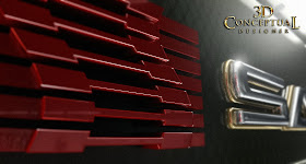
For Saleen, I built out a Carbon Fiber panel with some Allen heads attached to it to compliment the 3D logo I made from their 2D version.
A top down view on the double layered logo.
This shot is an extreme side view looking right into the virtual lights with a bit of 'flair'-[ 15 pieces!]
A close up on the Red Icon from their design. This was a frame for a MGFX animation pass down the font.
A 12 Degree bend on the lens for this fish eye shot.
A more severe 33 degree bend on this one.
The base set up is a simple model for SALEEN.
A screen shot of the entire scene with a Rectangular light up top[ Final Render] rendered in frame to reflect in the carbon-fiber material I made.
Project Review
Saleen-3D Logo Style Cards 2005.
Client: Saleen Motors.
Direction: Myself with the Corporate Division.
Project Date: November 2005.
In 05' I was running my department of one in-house at The Cimarron Group, and my main clients were the other six divisions of the company, and I was approached by the Corporate Advertising branch to help with some style frames for a presentation they were making to Saleen Motors, famous for their super-cars as well as the conversions they do the the Ford Mustang.
I had helped them acquire the Lotus cars account a few years back with my virtual model of the ELISE before they were here in the US market, so it was a fun fit.
I built out a 3D version of their logo and built out a carbon fiber background plate that we could us for the Motion Graphics and print work we did to pitch them.
I built out a 3D version of their logo and built out a carbon fiber background plate that we could us for the Motion Graphics and print work we did to pitch them.
I rendered out a series of shots as seen above and they took them to pitch the company. Unfortunately at the time they were on the verge of a restructure so we did not get to seal the deal, though I did get to create some fun style frames in the process.
A fast 3/4 to one day gig.
A fast 3/4 to one day gig.
Cheers, THOM


No comments:
Post a Comment