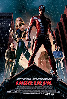
DAREDEVIL!
PART I
PART I
Client: 20th Century FOX via BLT and Associates.
Art Director(s): Rick Lynch and Eddie Segura.
Project Date: Summer 2002.
Having done a few Superhero logos so far during my first year at BLT, I moved on to many more including the new Daredevil film with Ben Affleck and Jennifer Garner. The logo with the interlocked double "D"s was essential as well as a stylized version of the comic name. I experimented with leather, steel, and glass in the logos, as well as doing some ultra high contrast 3D logos that feel almost 2D. I also hid a bit of braille into the rivets in a few ideas playing on the main characters skills as a blind superhero. they all spell out daredevil.
Cheers, THOM


No comments:
Post a Comment