Pages

Wednesday, January 30, 2013

3D Model Sales:Part XI-Hardware Nail Set 1

 A wide shot of all 27 nails in low resolution showing the full subdivision build in these high resolution surfaces.

 A Render with subdivision[ Turbo-Smooth] added showing the built out groves and indentation sin each type of nail.


 This shot shows the various head designs on the nails with grippers and the indentation on the brad for finish work.


 Here is is with one level added to smooth out the polys.


 A Worms Eye Render showing the full 360 nature of these little pieces of hardware, and since the details are built in the reflections come out wonderful fully rendered.


 Subdivision added and rendered in this repeat shot at a different resolution.


 If you have a super close up shot needing a high resolution nail this set will have most needed.


 Smoothed out the nails have hand chiseled tips with a bit of crown to the surface as most are stamped.


 The smaller roofing nail[ stepped on a few in my life OUCH!] usually galvanized with gripper rings as modeled.


 Smoothed out with a soft feel as these are always cast items.


 A birds eye elevated shot of all the nails


 The smoothed view of all 27 nails in the set I sell online here.

 
 A close shot on the vintage ans specialty Nails all Sub-D ready in FBX nad OBJ formats as well as the native 3DSmax formats too.


 The smoothed mesh close on the Masonry, Umbrella, and vintage Nails.


3D Model Sales
Part XI
Hardware Nail Set 1

I sell my 3D models online at Turbosquid, the leading stock 3D model house,  so for todays PART XI[11th], I am showcasing a model set I have put up for sale a set of twenty seven high resolution nails online here.

I always build out a collection or parts that I use all the time , and with the various close up work, as well as particle animations, I have need for good subdivision models for these uses, so I make them available online for other artist to use as well.


For this set of Hardware in my series, I put together as many nails I have ever used including some antique and hand made versions, as well as all the various types found in the construction business. I never know when I need some details, and having them pre-built and named to find quickly in the merged scenes,  I can add more to my work for a better price to my clients with my Virtual Home Warehouse I have been building up these past two decades.
   
I export all my 3D assets to FBX and OBJ so my friends in Cinema 4D , Maya, and Soft-XSI can use these assets as well.

To view all my 3D models I sell, you can go here. If you want to see a couple of hundred of 3D models I built in the past that my prior employer still sells, you can go here too.

Cheers, THOM

Monday, January 28, 2013

Project Review: Agent Fabulous Title Design 2010

The final render delivered was a straight on shot with a bit of curve to the lens done in Final Render.

 I did this alternate pass with the buckle tilted back a bit.


 A version tilted even more with double the lens curve and some volumetrics.


 A 3/4 side shot with some lens FX and blur too.


 I offer a Color-picker option if the client will need accurate masks made to use in post production. This is what makes 3D renders so helpful for finishers.


Here is a shot of the polygons showing the build. All quads except for the "Agent tag".

Project Review
Agent Fabulous Title Design 2010

Client: BPG Print.
Art Direction:n/a.
Project Date: April 2010.

Today my posting is a quick partial day logo study project I did for the advertising agency BPG back in April of 2010 for a show pitch called, "Agent Fabulous".

I am usually always given an illustrator file to make dimensional in 3D and render out, so my first step is to interpret the feel of the font and what they want it to convey. For this project they wanted it to feel like a big shiny disco belt buckle with some 'bling".

I hand build a single point beveled font for the word fabulous, as well as a quad modeled base plate that it sits in. I use Cebas' Final Render for all my rendering needs, and so I applied the Caustics reflections and shimmers that would come from a polished metal buckle to the shot.

I also provide most clients a color picker layer in the render if they request it, and this allows the in House designers to quickly isolate sections in 3D to adjust in post in Photoshop later on. I am usually asked for this after the fact, and will render one or as many out as are needed.

The cost saving on this masking is seen in the time the client themselves need not have a finisher or designer spend  in masking artwork, a time consuming chore that "Smart 3D" assets can relive a bit and ave the client some in house time too.

Cheers, THOM

Wednesday, January 23, 2013

3D Model Sales Part X Vintage 1920's Fire House

 A front shot of the firehouse I sell online at TurboSquid now.

 The base Polygon Model of the firehouse in the front view with doors open.

 The back and roof is seen in this higher angle on this 1920's fire house..

 The base model is ready for subdivision to as high a level as your machine will allow.


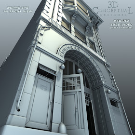
 A Worms eye shows the ceiling detail in the main entryway.

 Smoothed with one level of subdivision, 2 levels is over 5 million faces and super smooth!


 A higher up angle right on the third floor of the fire station showing the bay window and Spanish tile roofing.


 The Base Polygon Quad Model of the Firehouse from the elevated position.


 A front view of the old vintage firehouse.


 All subdivision ready as FBX, OBJ, and native 3DSmax 2013 formats.


 High angle Alley shot of the 1920's vintage Fire Station.


 The smoothed render from the back[ 1 level of subdivision]

 The roof has two AC units and three water towers.


 The smoothed geometry is 4X in size with one subdivision.


 The base Poly model of the firehouse as it is exported out.


 The smoothed mesh out back on the fire house.


3D Model Sales
Part X
Vintage 1920's Fire House

I sell my 3D models online at Turbosquid, the leading stock 3D model house,  so for todays PART X[10th], I am showcasing a model I have put up for sale, a vintage firehouse that was made famous in the 1980's in the Ghostbuster films.

I love vintage buildings and firestations are especially cool, so I decided to build out my version of the LA Station 23, which was used for all the interior filming for the Ghostbusters movies, but I love the exterior design so I built that part for this round[ I plan interiors latter].

   
I export all my 3D assets to FBX and OBJ so my friends in Cinema 4D , Maya, and Soft-XSI can use these assets as well.

To view all my 3D models I sell, you can go here. If you want to see a couple of hundred of 3D models I built in the past that my prior employer still sells, you can go here too.

Cheers, THOM

Monday, January 21, 2013

Project Review Hellraiser Pitch Materials 2008 PART IV Even More 3D Title Treatment Designs

 A double stacked 3D logo I did for the Hellraiser ideas, back is red glowing sub-surface material behind an aged brass.


 A visual theme for the films with the hooks on chains attempting to rip the logo apart[ for the AV side that was the intent as well as for a living one-sheet too]


 The 3D flayed Hellraiser logo has the outer metal skinned off to reveal the red center.


 I used a DarkTree procedural texture I wrote to displace this version out to be a pound of raw flesh.


 Red glass with the filigree elements taken from the Lamont Box I built here.


 A wood and brass version with the same metal applied to the letter form lower legs.


 Here is a shot with a wood logo edge lit to match a lit up Lamont Box comp here.

Project Review
Hellraiser
Pitch Materials 2008 PART IV
Even More 3D Title Treatment Designs

Client: N/A we were pitching a re-boot
Art Director: Calvin Sumler.
Project Date: June 2008-November 2008.

This is my fourth posting in the series of work I performed for a pitch to re-boot the franchise for Hellraiser back in 2008. 
Today my post has a bit more than half a dozen added title treatment looks I created in 3D for the print and AV adverting for the pitch to bring back the film franchise back to life in 2008.

A fun design concept to work with, as it has an established history and iconic look with the main characters, and the Lamont box, so I tried to establish an updated but recognizable feel to all the titles I designed. 

A fun internal exercise for us that was never pitched, but I most thoroughly enjoyed to do.

You can view my first logo post here.
You can view the "Lamont " box I made here.
You can view PART III with more logos here.

Cheers, THOM

Thursday, January 17, 2013

3D Model Sales Part IX Vintage 1930's Diner

 Maddy's Diner is open for business, that is if you need a 3D subdivision model of a diner.


 A full subdivision surface shown with a single level of turbo smooth added.


 A shot near the end of the dining car, this is the base polymesh in OBJ, FBX or 3DSmax formats.

 The smoothed out model shows the bent tin corners as was typical in the early diners. By the 5-'s this was fully bent and curved.


 I build all my 3D models as turntable 360 viewable, so here is the back alley.


 The subdivided render of the backside of this early Diner.


 Serious details are found on the roof AC unit as well with two needed to keep this virtual space at a virtual 72 degrees!

 And the same shot of the Diner smoothed out for above.
 

 An Iconic long shot of the front of this 1930's Diner.

 
 The base polygon shot[ what is exported as OBJ and FBX from max.


 My rooftop sign has neon tubes as well as nipple bulbs typical to the 30's around the edge.

 The subdivided surface is seen here. Set at three it is super crisp, but renders are lengthy.

 
 The back door details include electrical, gas and roof access. Door is grouped with a pivot to open and close for your animations.

 The base mesh with gas meter and set dressing on the back of this Diner.


3D Model Sales
Part IX
Vintage 1930's Diner

I sell many of my 3D models online at Turbosquid, the leading stock 3D model house,  and every few weeks, I cover one of those designs, and for todays PART IX[9th], I am showcasing a model I have put up for sale, a vintage American 1930's diner.

This is my third Diner I have designed and built in 3D, with the first done back in 1999 for Launch.com's virtual city I redesigned, and can by seen in this post here. I also build one for sale on Turbosquid for my former employer, and is still sold online here, and I did a full render here.


I am a transportation Design Major from Art Center, so it is said that we have gas in our veins and vintage Diners are the natural gathering spot for Hot Rods and car shows, so this is a fun endevor for me to design my own.

I have done a more 50's styled diner, so I deciced to model this after the true traincar diners that were all over the USA in the 30's as these were all converted traincars so the body was limited to that size, and style.

This model is my first 100% subdivision model of a diner, and my speed is increasing in that modeling technique so I was able to make this one in roughly the same time as my first which had no subdivision at all.
   
I export all my 3D assets to FBX and OBJ so my friends in Cinema 4D , Maya, and Soft-XSI can use these assets as well.

To view all my 3D models I sell, you can go here. If you want to see a couple of hundred of 3D models I built in the past that my prior employer still sells, you can go here too.

Cheers, THOM