Pages

Monday, June 28, 2010

Project Review: 3D Logos for The COTAI Strip: Asia's Las Vegas

A Logo with Wax Imprint done for the final round.

An early Logo using concentric circles as a theme.

A Chrome version of a logo with playful elements on the "A's".

An extended "tall" version of a Logo.

We did a few logos in the RED direction and used the Dragon Ball in the Logo.

A Gold and Chrome Two Line Treatment.
A Silhouette version of the logo using various building from the Strip.

An alternate using the silhouette artwork.

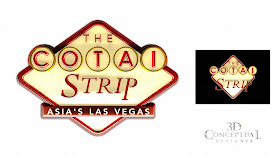
A copy of the Las Vegas Sign look, in a few variations.


Using a flower motif in the Logo with a warm glow of Red again.

Another Vegas styled logo treatment.

The final Design Presented.

The COTAI Strip

Client: The Cotai Strip via The Cimarron Group.
Art Director(s): Myself and many others.
Project Date: Winter 2007.

While at The Cimarron Group we worked on many Casino Projects for Vegas and around the globe, and this project focused in Singapore on The Cotai Strip, a purpose built island that is Las Vegas in Asia. I did about 40 logo myself as well as making 3D versions of various Art Directors in both Print and AV. FUN stuff, though nothing finished.

Cheers, THOM

No comments:

Post a Comment