Pages

Thursday, December 31, 2009

Project Review : Phantom 2040-Flying Fan Powered Vehicles.

Troop Transport Phantom- 2o4o Show #2


Hyper Tracker Phantom -2o4o Show #21

Max's Single Fan Vehicle [ All Shows]- Phantom 2o4o

Levitation "Skates"- Phantom 2o4o


Big Rig- Phantom 2o4o Show #23

The Phantoms main Cruiser in Attack Mode- Phantom 2o4o

Max's Transport-Phantom 2o4o Show #17

Max's Fan Engine Limo- Phantom 2o4o

Vaingloria's [ Debra Harry V.O.] Limo- Phantom 2o4o Show #5

Fan Powered Flying Biot Robot- Phantom 2o4o Show #18

Air Freighter- Phantom 2o4o Show #3

Dr Jak'[ Mark Hamill V.O.] Transport-Phantom 2o4o Show #2

Sagan Cruz's Multicruiser-Phantom 2o4o Show #4 Color Key

Ambulance- Phantom 2040 Color Key


FAN POWER!
The Vehicles from the Animated Series Phantom 2040

This is the first in a series of posts on Phantom 2040. In 1992 I was hired on by David Corbett with the recommendation from the most talented Paul Lasaine [ http://paullasaine.blogspot.com/ ] to be an Art Director for the new Phantom Animated TV show. I worked at Hearst Animation for almost 3 years and had the privilege to do 56 Half Hour episodes of The Phantom, as well as help develop the New Flash Gordon show with my friend Nick Pugh.

For this "new" Phantom it now took place in the future in 2040 ALA Bladerunner, and this was the 23rd Phantom, Kit Walker. I worked with the writers Gar and Judy Reeves -Stevens in developing the technology used for flying in the future. I ended up using mostly fans vs jets or levitation, primarily because they look great animated.

For animation done in 2D, I needed to make the shapes all unique , and more of a simple shape so the overseas teams would have a better chance of getting the vehicles "On-Model". ALso details needed to be minimal for easy of animating as well. All and all, I am a "fan" of the FAN!

Cheers, THOM


There is a FACEBOOK group for the show here:
http://www.facebook.com/pages/The-Phantom/10018458247?v=box_3&ref=mf#/group.php?gid=23686844916

Wednesday, December 30, 2009

MMA Awards on TONIGHT at 10:30 ET

Source: http://www.lasvegassun.com/news/2009/dec/31/2009-mma-awards-show-honors-top-moments-year/?fighting


MMA Award 3D Model becomes a Reality!


I was privileged this year to Model the Award for the 2009 MMA Awards airing today for the very talented Will Ragland at Ragland Inc. Once it airs I will post screen shots of the 3D model I built.

We provided the 3D model and the manufacturer had a Sterolithography model built as a base to manufacture these.[ 3D printing] If not familiar with Stereolithography, it creates a 3D model from a digital file built in 3D on the computer so there is no need to sculpt it twice. [ look here http://3darttopart.com/ ]

I did some MGFX for the show as well and hope to see them in the finished form.


Cheers, THOM


Click the Post title to link to the site or paste this in:http://www.fightersonlymag.com/blog/index.php

Project Review: ASTROBOY

Various Astroboy 3D Logos

Close Up of the 3D "Heart" Illustration I did that finished

The finished Teaser One Sheet

Project Review
Astroboy 2009

Client: Summit Entertainment via The Cimarron Group
Art Director[s]: Joseph Stamper and Calvin Sumler
Project Date: Winter 2008-Spring 2009

NOTE: Apparently Blogger lost this posting, so in doing a 2nd post I realized that it needs to be re-posted....


Animated films are always fun to do logo's for especially when they use 3D animation, so getting to take a stab at Astroboy was a bunch of fun.

I experimented at first with the direction of having the logo contain pieces from inside the robot boy's body. I did a variety of versions in metal and glass as well as a few that were bent and broken. I also did a very static red one as well. though what finished was not my logo.

I was however able to build out the "heart" of Astroboy as the CGI for the film was not available for us, so I built it from scratch. This artwork did finish for the teaser.

Cheers, THOM

Friday, December 25, 2009

Thursday, December 24, 2009

My First 3D Model: Luminous Media Inc. 1994-95

My Very First 3D Model built in 1994 using 3D Studio R4 DOS w/ Metaballs.
The Finished Logo for the Company

The Final Sketch for building the "Luminous Device"

Concepts for the various lamp parts[ First Round]


My First 3D Model

After working in Television Animation for almost 3 years at Hearst Animation, I moved into the now emerging technology of 3D illustrated video games. MYST, just hit the market and it was a runaway success, and this inspired many to move into digital artwork.

I had the pleasure of working with John R. Thomas years prior on a fabulous high end restaurant design in Beverly Hills called Cafe Morpheus/Asylum, and he being trained in Architecture wanted to start up a Video Game Development company, so I joined in to help start it up with him.

Now, back in 1994 the 3D programs available for a PC[ or a Mac] were limited, I picked Strata 3D because Rand Miller used it on Myst, and I being a Mac "Kool Aid" drinker at the time, stood my ground and fought to do this on only a Mac. Well being the owner was a Auto-cad guy, and he wanted to export over the models from CAD to 3D, he chose a PC program, namely 3D Studio DOS R4 for the PC so he could do CAD on the same box. So, not only NOT a Mac, but DOS! Well, 15 years latter , I am very glad that I was forced to work on a PC and I owe a debt of gratitude to John for that.

My very first model was of a "Maiden" character for the game we were developing, which was designed by friend and colleague Nick Pugh, and I used the DOS 3DSr4 with a "Meta-balls" plug-in along with "Mesh-Paint from the Yost Group to paint the face. It took about a week to model with the valuable training from Stephen Kramer.

I also designed the "Luminous Device" as our logo ICON. The machine was inspired by artist Daniel Berg[ http://www.danielberglundlighting.com/sitefiles/table%20lamps/table%20lamps.html ], who built the lighting for the Asylum Bar that I had worked on years earlier, so I sketched it out and Stephen Kramer built it out. The type was an homage to Mr Chows in Beverly Hills and was hand lettered by the talented Dan Hanrahan.

What a great team and a great time in my life as I moved forward into the world of 3D.


Cheers, THOM

Wednesday, December 23, 2009

The Chrysler Building NYC

Multiple views of the 3D Model for sale

A shot looking up

A Magic Hour shot looking across

Close-Up of the main "Eagles"

Beauty shot


Mom and her Plymouth


My relationship to Chrysler

I have a special relationship to the Chrysler corporation and this has something to do with my modeling of one of the most beautiful Architectural masterpieces in modern history.

My uncle, Jim Keir worked at Chrysler for over 30 years, and was on the team that developed the Turbine car in the 60's [http://auto.howstuffworks.com/chrysler-turbine-concept-cars1.htm]. My mother worked as a executive secretary for Jimmy Hoffa in Detroit in the 50's and had a beautiful Plymouth. [ see pic above]. We grew up driving a Dodge Aspen throughout the 70's and 80's, and when I finally went to Art Center in Pasadena CA., I was awarded a scholarhip by Chrysler, so I have a soft spot for them.

Oddly, I have built the Chrysler building twice! Once while at BLT and Associates for the "How to loose a Guy in 10 Days" advertising campaign, then at The Cimarron Group. I proceeded to build this Art Deco building once more, and this time very accurately. All small Deco details including the magnificent "Eagles" were build with all details and welds as Sub-D quads.

The model is still for sale via Turbosquid if you have need for this model.


Cheers, THOM

P.S. You can click the Post Title to see the model online for sale, or paste this text into your browser:

http://www.turbosquid.com/3d-models/3d-art-deco-nyc-chrysler-building-model/297331

Monday, December 21, 2009

Project Review: Cats the Musical-Diner

Booth Close Up Detailed Shot

Entryway into "CATS" the Diner

Ramp up to upper level dining area in Junkyard.


Project Review: CATS the Musical Diner Concepts

Client: Landmark Entertainment Group
Art Director: Michael Marquez
Project Date: Summer 1998

Back in the Summer of 1998, after finishing the M&M's World for Vegas, I moved on to doing a few concept sketches for a themed restaurant based on the Broadway Musical from Andrew Lloyd Weber , CATS.

The diner would be an old junkyard Set made using actual old wreaked and rusted out cars. I used all sorts of car parts and used the bench seats from a 57' Chevy for the boothes. Very fun to sketch, though the project was canned I enjoyed the design.

Cheers, THOM

Saturday, December 19, 2009

Personal Project: Quad Speed Skates

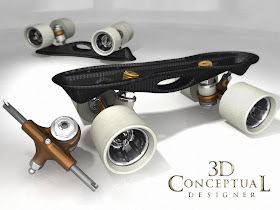
A removable hub Quad Speed Wheel concept based on a large Diameter Indoor Configuration

A Carbon Fiber based NTS plate popular Down Under.

Parts Render of the Carbon Fiber Plate.

3 view of Carbon plate.

A second concept with forged cast "hangers" or trucks with a carbon spine.
Clip axle quick release is the only option!


SPEEDSKATING on QUADS


In Littleton Colorado in the early 80's I was an avid speed skater racing on a team throughout the Midwest region. I love to skate and when the Rollerblade was introduced it decimated the "Quad" skate market, and innovation etc. shrunk. Currently there is a resurge in Quad Speed , so I experimeted with a few designs based upon some of the best stuff from the past.


Cheers, THOM


P.S. Anyone interested in quad speed equipment I linked the Skatelog Forum in the title post, where you can always find great stuff.

Friday, December 18, 2009

Project Review: X-Men 3 Teaser and Logo Design

X-Men 3 Doorways to continue from X-Men 2 Concepts.

X-Men 3 Type Exploration with Phoenix intro into logo.

Outdoor "X-Energy" Campaign. Building Side, Billboard, and Bus-Side.

The FINISHED Teaser One-Sheet US Market.


BIG GIANT Metal Logo Part II


Client: Fox via. The Cimarron Group
Art Director(s): Calvin Sumler and Joseph Stamper.
Project Date: Summer 2004

Having worked on X-Men 2, I continued along the same path of design that I explored on X Men 2. In fact we sold our designs to Fox partially based on the continuity between the films via the look of all assets used for advertising.

I explored the type and revisited the door concept as well. A 3 in front of the Cerebro Doors to match the 2nd film was the starting point. The tech in 3D had advanced so with this exploration I added in "Caustic Reflections" from the metal creating artifacts and glints of light throughout the scenes. It can be clearly seen in the sheet of 3 Doors, as well as with the Finished One-Sheet.

Once designed we explored outdoor campaigns for the sides of buildings, bus sides, and also freestanding billboards. The idea was that "Energy" blasted throuh leaving only an "X". Never finished though it was a strong concept, IMHO.

The FINISHED Teaser One Sheet ended up with the Wolverine claws representing the 3 over the X. Can't say this was a unique idea, as it was present on many Comic book covers and was decided to be the best solution by the client. The claws are 3D, as well as the metal X, and background. Only the glove is a Photo-shoot and the photography existed already from X-Men 2 and we merely found a good shot of the glove in our own archives from the prior film.


Cheers, THOM

Tuesday, December 15, 2009

Project Review: Cyan Worlds "Venalem Age"

"Ink-Bulb" after Harvesting used for living quarters in Arctic Venalem World

Entry 3rd Person view as one enters the "Venalem" Age.

Surface of water P.O.V. of Bay.

Ink Pods growing under the Ice.

A cut-Off Bulb for Harvesting.

A Cutaway of inside a "Ink-Bulb" showing use of space.

PLAN VIEW of Venalem Age.

SIDE VIEW of Venalem World.

Cyan URU: The World of Venalem

Client: Cyan Worlds Rand Miller
Creative Director: Myself
Project Date: Winter 2000

After being laid-off from Launch Media Inc. after the "Dot.Com" boom in Y2K, I was recruited to go up to beautiful Spokane WA. and work for Rand Miller at Cyan Worlds. I have a previous post with some creatures I designed as well if you seach "Project Review" tagged to the right>>>.

At Cyan as a freelance Creative Director, I was responsible for coming up with worlds from scratch as possible locations to "jump" to from within the URU online game. Usually I am handed a treatment or outline of a concept already created by a writer or producer, but at Cyan I designed the entire world myself.

Venalem as a concept was in offering a wide variety of locations to "jump" to, and we had dessert planets, planets on fire, and flooded ones. Venalem was a frozen planet where you arrive in an enclosed iceberg "bay" and must figure out what to to and where to go.

Within this world, natural giant "Pods" were used to create the special "ink" that was used to write in the books for the various worlds. The age had the pods themselves, the harvesting machines, and ink production, as well as the re-use of the hollow pods for arctic living quarters.

I was responsible for the creatures and basic back story of the "Age" or world.

Cheers, THOM